
Designing the Alphabet of the Film, “The Matrix.”
The metaphors of threading, rain, flow and
the loom of meaning in context
Working with Warner Brothers, Joel Silver and the Wachowski siblings on “The Matrix” was a highlight in a string of theatrical advertising design encounters. Enthusiasm and embracement of the holistic concept of the film’s premise — a coded sheathing of the reality of one world perceived, concealed behind the encryption of a filtered film of transportive coding that layered the folded sino-anglo numeric and alphabetic time of one world
with the digital layering of another.
And when it comes down to it,
perhaps there’s some truth to that promise.
That: we see what we know, that how we see things is
a coding of characters and layers of comprehension
that flows in an endless flowing input of the sheathing of understanding.
Understanding is “inner standing” —
like sentinels of perception will be how close we are to the action —
insight, [innsihht] a word from the 13th century means to “see inside,”
a mental visioning, with the eyes of the mind.
We grasp what we see in an electrical interpretation of molecular configurations,
how that information is arranged is how holistic sensation is coordinated.
The closer we are, the more we see
to the detailing of perception in experience.
And being closer, we know more —
we’re here in the telling momentum of now.
Could how we see, and read, be an increasing deepening of
the real, and the veils of patterning that layer one sheathing of comprehension to another?
But could that be a code?
Working with the Wachowski’s, it was GIRVIN Seattle’s design team
challenge to build not only an identity for the film,
but an alphabetic concept that spread from
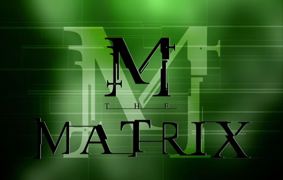
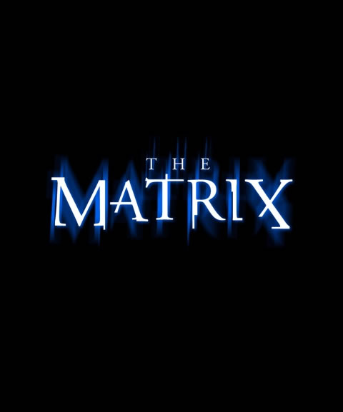
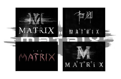
GIRVIN’s design of the logo for The Matrix,
but as well, a holistic layering of how
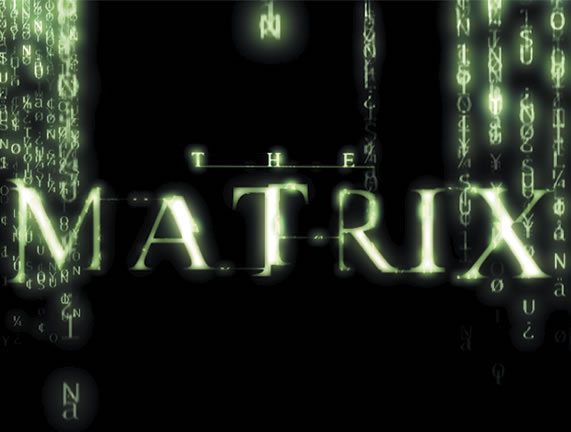
the sino/anglo ideographical “fonts” could be defined
in collateral, merchandising and promotional strategies.
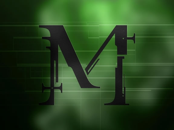
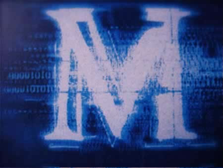
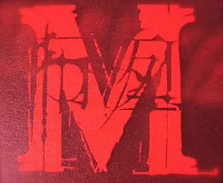
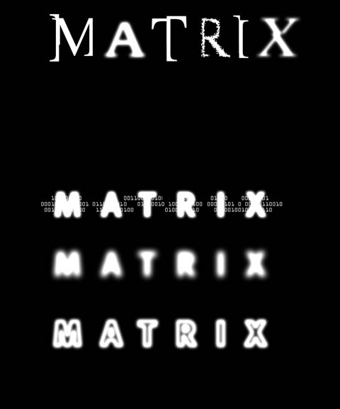
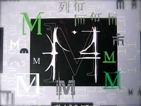
That started with monogrammatic interpretations of an alphabet — single letter studies of the letter M, and how that could be capitulated to an entire way of translating and illustrating the notion of
the raining alphabet codeworld of The Matrix.
Working iteratively with the Wachowski siblings, we offered sets of interpretations that focused on how a logo could work as a key recognizable design element and linchpin for the movie, but broke that down to subsets of linguistic and graphical translations.
That thematic content found its way into
the visual narration of other aspects of the storytelling,
like the animations of Animal Logic [Sydney, Australia and WB | Burbank].
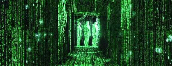
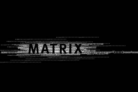
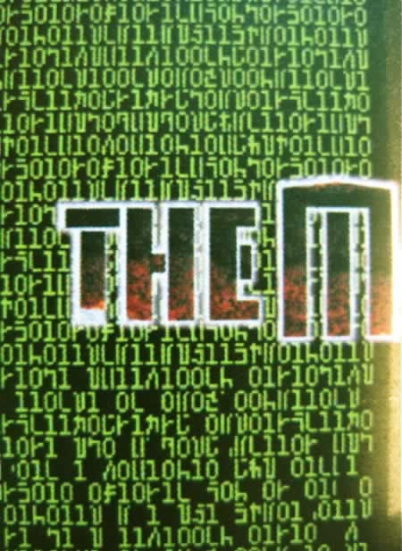
Or the beginnings of the digital rain in the titling:
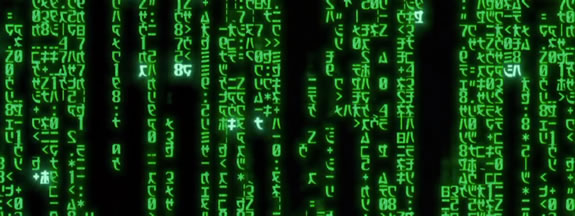

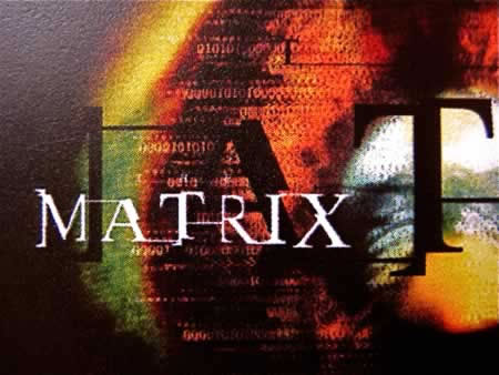
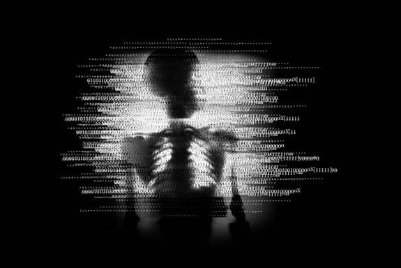
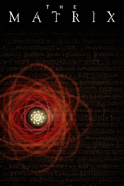
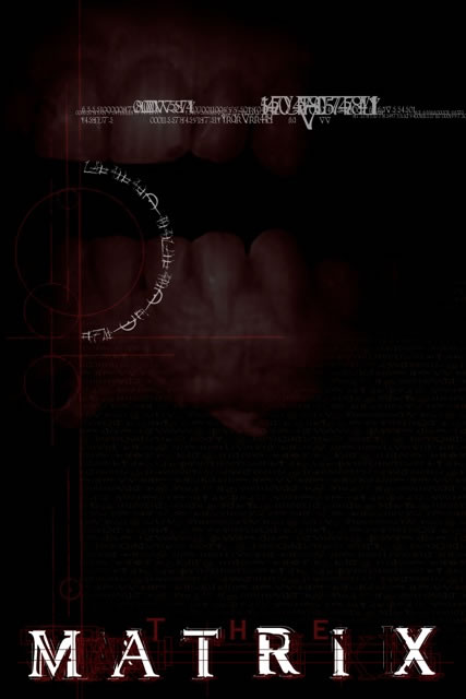
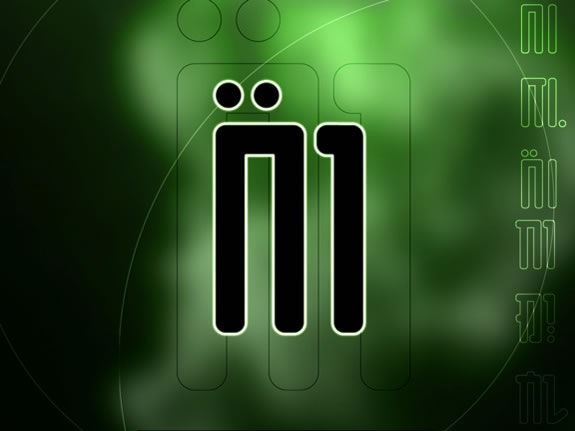
Backgrounder studies for the alphabet of The Matrix movie.
When it comes to making magic —
the transporting and transformational magical and witchcraft journeys from plane to plain —
a translation of portals from one realm to another,
a visualization of one idea,
that becomes another and another,
the notations of the alphabet, in special glyphs and character interpretations, sigil-like markings,
become that code.
They bridge the mind, the ancient memory,
and the characters of magic
that translate the reading and the read,
from one layer of perceptive understanding, standing in —
to a new realm of seeing in.
It’s been said that the real balance of comprehending how an alphabet works
isn’t in the markings of the letterforms themselves,
but what is not marked,
the spaces that demarcate
the mysteries of what lies between
their strokes.
Tim | GIRVIN | LOS ANGELES
…..
G I R V I N | DESIGNING MOVIES
THEATRICAL BRANDING + ENTERTAINMENT
IMAGINATION: AND THE TOOLS TO MAKE IT HAPPEN
http://bit.ly/1afeVIQ