What calls, from ancient halls, the spirit of that other distant world, far more than a thousand and five hundred years back in the balled skein of time? Beowulf!
Palaeography, or the history of the written world has long been a strategic underpinning of what Girvin does, in reaching back, building on the past legacies, to create the tuned rendering of an idea. Typography is not merely the digital outflow of the last 25 years, but stretches to the legends of more than four thousand years of evolution of the hand, the movement, the rhythm of writing, speech and culture.
We reach back — and we reach in — to find the heart of things.
In developing identity, the reading of the logo is the first grasp of expression and understanding; any typographic solution is about the content of the shapes and forms that conveys the attributes of memory and mission. The treatment of the name — what does it say? Read first, the name — visuals are secondary impressions. You see something in a design and it reminds you of something — a lean sans serifed font approaches character — reaching back the modernist 1930s, a certain elegant script might connote the character of quality exhaled during the Victorian times, a classical rendering could speak of another discipline, formality in values. It’s all about what’s seen, what’s recalled — what is referenced. Designing to speak to memory, we reach in, reach back, find the notes that resonate.
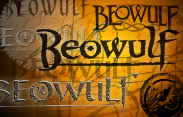
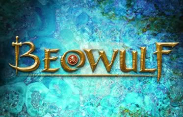
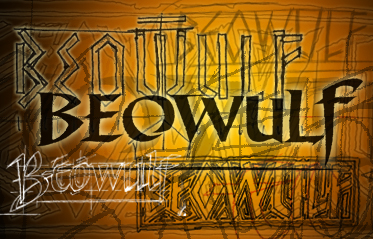
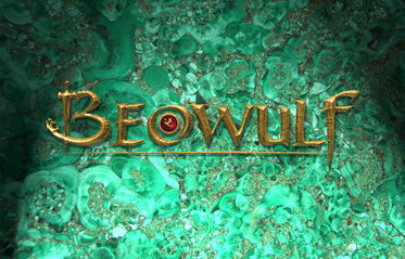
Rarely then, do we reach back to another, more distant era — to style the letterforms on something that never reached paper, but rather found its way only to animal skins and sledge-roughened stone, polished wood and battered bronze, ivory and hammered iron…The scripts of the Viking age, that found their way from the mysteries of the Runes to the interpreted intimations manuscript on vellum. For Robert Zemeckis, Paramount Studios, vast volumes of study we considered to arrive at this, the character of golden, wrought forms of Beowulf. The stony Chrysocolla or Malachite was, in the beginning, the substrate that we used as part of the coppered character of the distressed field — something to contrast. This was the strategy in the design of the logo, creating not only the sense of the dimension of the brandmark — and the story that was being told — but the implications of material. The patinized field was replaced with the stone expression, to carry this feeling into a merchandising vocabulary.
verdigris VER-duh-greess noun
: a green or bluish deposit especially of copper carbonates formed on copper, brass, or bronze surfaces
Sentence use:
The stony field did render that ancient character, coppered shields, aged in battle — the warriors ventured forth, a wall of verdigris.
See a map of “verdigris” in the Visual Thesaurus.
“Green of Greece” — that is the literal translation of “vert de Grece,” the Anglo-French phrase from which the modern word “verdigris” descends. A coating of verdigris forms naturally on copper and copper alloys such as brass and bronze when those metals are exposed to air. (It can also be produced artificially.) The word “verdigris” has been associated with statuary and architecture, ancient and modern, since it was first used in the 14th century. Some American English speakers may find that they know it best from the greenish blue coating that covers the copper of the Statue of Liberty.
TSG | Seattle
Discover more from Girvin | Strategic Branding & Design
Subscribe to get the latest posts sent to your email.