ALPHABETICA | THE STROKES OF THE ALPHABET
STROKES, FINISHES, GESTURES, DETAILS — ON THE SERIES OF THE RIGHTFUL MOVES.
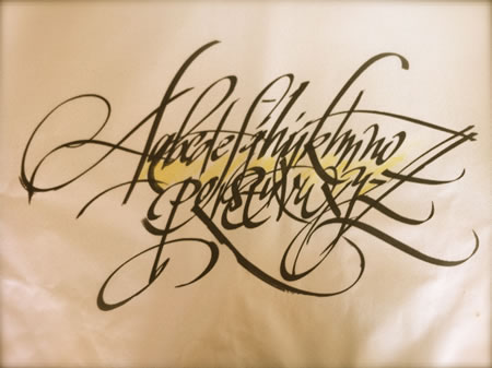
Teaching calligraphy: the craft of the letter at Girvin.

A broadside from 1975, still used in the calligraphy classes at Girvin
There’s a classical tradition in the approach to the letter, based on proportion, structure, height and width relationships and the hand-drawn treatments of the alphabet. 4,000 years later, the foundation of drawing scriptura, the basic letter still remains the same.
At Girvin, the idea of drawing letterforms is inherently a potent component of nearly everything that we do. Rough brushed, bamboo penned, steel nibbed, pencil ruled, brass blade slashed, and digitally posited, there’s something that happens with the rendering of the lettered form nearly every day.
The word-strewn alphabet lies at the root of any message, lettered imagery or drawn, while photographic illustration acts as a support to the propositions of textual content. But there is the craft of drawing the letters by hand that builds a concrete basis for the formation of the rightly lettered rendering. And in the notion of rightly, there are substrates to understanding the balance and structuring of the characters.
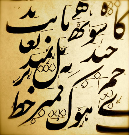
In studying Chinese and Japanese calligraphy, Arabic, Sanskrit and Tibetan systems of writing, there are rules to the nature of rightful proportioning, as well as the character of the stroke. One can find the ancient rule books for these manifestations — and in studying the visual forming of letters or ideograms — these characteristics should be mastered. A grouping of rule charts, for the rightful rendering of strokes in classical Chinese forms is noted below. These strokes are the bend, the right turned upstroke, the hook, the waved stroke, the left downstroke, the vertical downstroke, the dash and the dot — from which all strokes are seeded.


The idea of learning any system of writing will settle on the basics, then add the details of expanding on the system of movements to grander illustrative gestures. These formations, a series of movements involving touch, specialize on the right structuring that is expressively extended. What that can mean, too, is about finding the energy that lies within, that can be interpreted — and extended in the work of drawing language.
the long stemmed curve
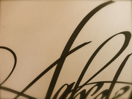
the whiplashed flourish
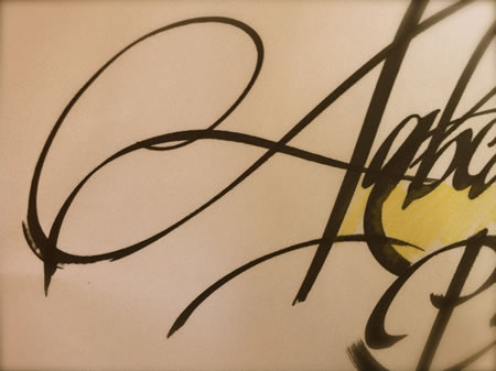
the ellipse inside, squared brush lift
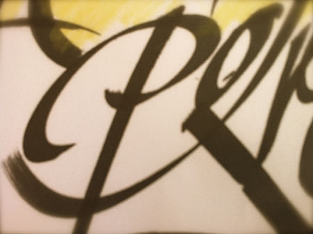
the woven knot
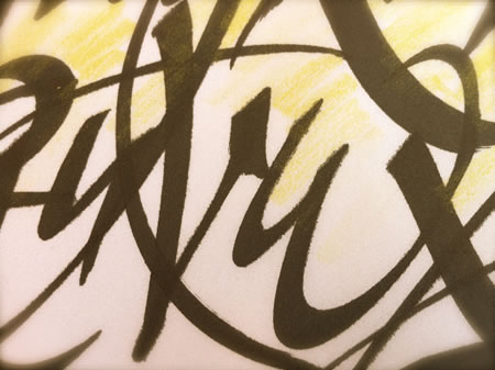
the finished scythe
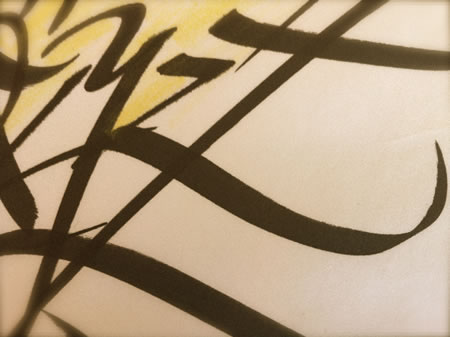
the double strike
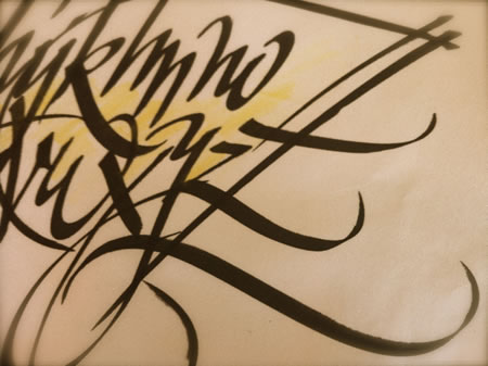
the scimitar
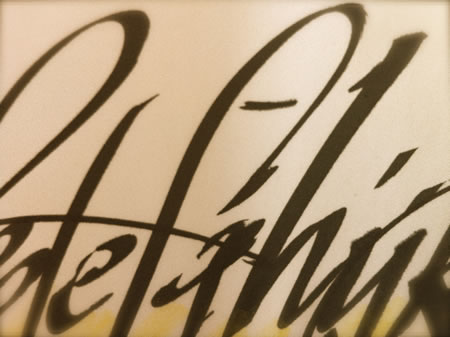
the lifted stroke
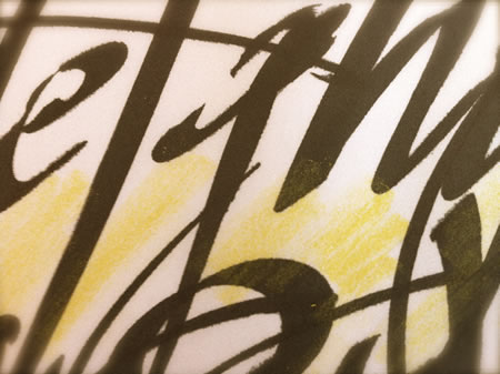
the cusped, white scene
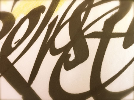
the springboard
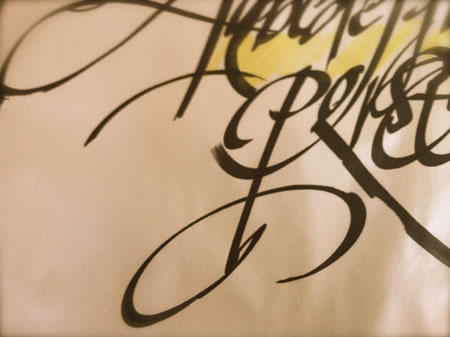
the held brush, bled
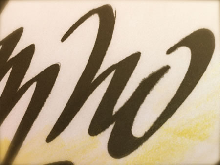
the arced dragon
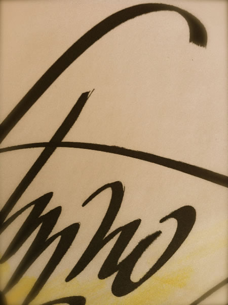
the roughened ruins
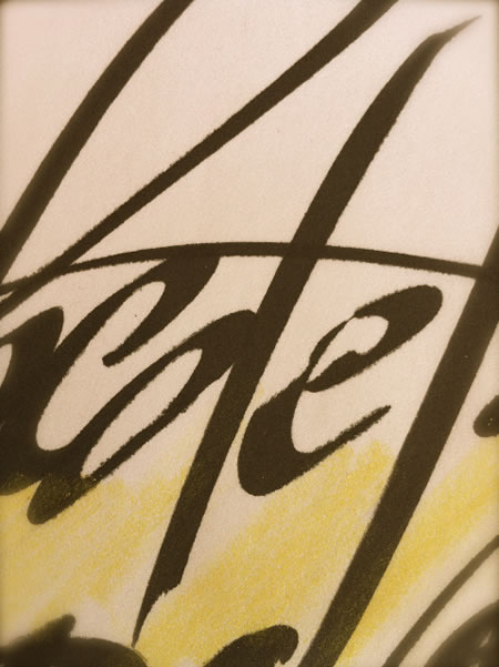
the swing through
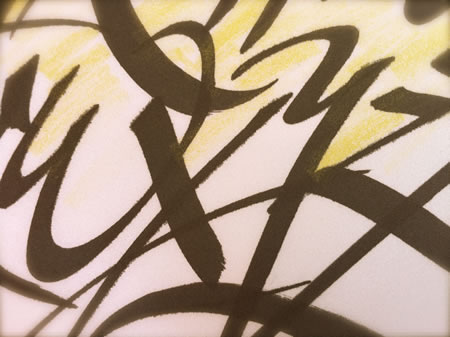
ravenstroke

My approach in working with the students at Girvin really relates to the idea of working both big and small, with varying tools, and all without guidelines, letting the practitioners examine and find the right balance, seeing the balance of the forms, dancing with their tools and the letters. Alphabet is a long wander for us, even to the heart of this retired site from the 90s:
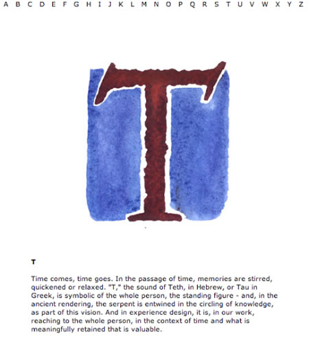
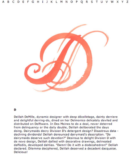
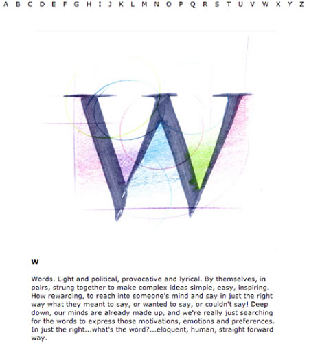

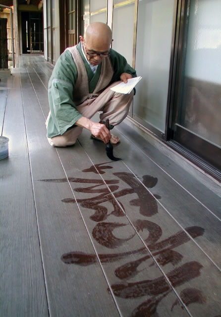
That idea of dance, gesture, finding the energy, reminds me of another image passed to me by a friend, Chisan, the translator of the Zen master, Roshi Harada Shodo, the spiritual leader of Sogenji, a monastery in Osaka, Japan with whom I have a relationship. A master calligrapher, he practices with water in the hall floors of the zendo, the illustration of the brush-drawn forms forming the moisture of knowledge, evanescing with the emergence of the day.
Write on, that heart.
Tim
–––
G I R V I N B L O G S O N C A L L I G R A P H Y:
https://www.girvin.com/blog/?s=calligraphy
the reels: http://www.youtube.com/user/GIRVIN888
girvin blogs:
http://blog.girvin.com/
https://tim.girvin.com/index.php
girvin profiles and communities:
TED: http://www.ted.com/index.php/profiles/view/id/825
Behance: http://www.behance.net/GIRVIN-Branding
Flickr: http://www.flickr.com/photos/tgirvin/
Google: http://www.google.com/profiles/timgirvin
LinkedIn: http://www.linkedin.com/in/timgirvin
Facebook: http://www.facebook.com/people/Tim-Girvin/644114347
Facebook Page: http://www.facebook.com/pages/Seattle-WA/GIRVIN/91069489624
Twitter: http://twitter.com/tgirvin