THE DRAWING OF MOVIE LOGOS AS A STATEMENT IN THE ARTISAN INSIGHT: FROM MIND TO EYE TO HAND AND THE ILLUSTRATION OF LANGUAGE AND IDEALS.
When I was in college, I didn’t really study conventional “graphic design,” in fact, I skipped it altogether. The module on “commercial graphics” I never completed. Ignored, basically.
What that taught me was that to survive, I had to rethink what skills I had and how they could be repurposed into some form that could be indexed as a commercial, paying enterprise, since I was paying for part of my college time, the habitual collection of books to study. To that effort, working on the front of tactical calligraphy, custom-type forms, hand-drawing everything—
even the tiniest type, I needed to know how to build
these into reproducible
and printable forms.
Hand-cut stenciled alphabet studies, sandblasted on glass
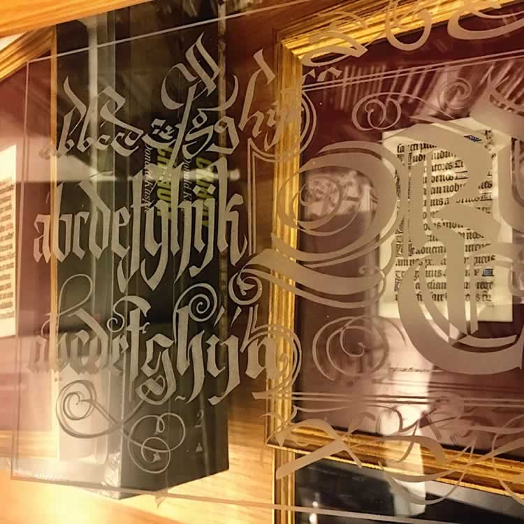
So I struck out to other fronts—silkscreening, hand-cutting stencils, incised, scratched and sandblasted glass, pre-digital fin-based and decal-oriented sign-painting and shopfronts.
Being inordinately curious, as I am today, I’d mix that up with reaching out to old-school sign-writers—Seattle, LA, London, Paris and Firenze, as well as type/craft driven aficionados like Doug Fast and Splendid Sign, Peter Katz, wandering the hallways of the old Cooper Union, sitting in on talks by, and with, Herb Lubalin, Milton Glaser and others, as well as the varying rippled circles of my times hanging out with Lloyd Reynolds at Reed College [and his house, library, basement and floors
where the fleas weren’t too jumpy.]
I took off for NYC, Chicago, Dallas and SanFrancisco, with a massive custom-build, handmade portfolio of work that I’d expanded to include “made-up” and dreamily imagined clients and design solutions. Not having any real clients I made them up.
I taught myself how to take the principles of calligraphy and turn that into design thought: strategic letter-thinking for logos, then shopping bags and packaging, signing and shopfronts, interiors and finally building and interior color schemes, furniture and arrangements, merchandising and shelving systems, brand palette management and visual patterning languages.
Curiosity and experiment[ing] as well as—the inveterate salesman—taking my show and talking it—on the road.

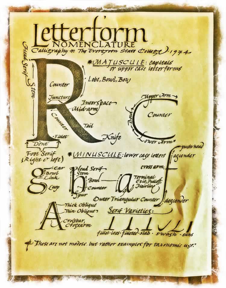
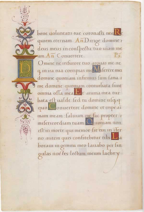
Teaching calligraphy taught me stand-up routines to give talks and improvisational presentations—they were loosely catalyzed historical overviews, manuscripts and book references, palaeographical studies and discussions, talking the earlier principles of “breathing time” in type and letterform drawing—below a completely hand drawn exemplar on “parts of a letter” done in 1974–45 years back.
But this hand-made legacy finds its way to this day, and I’m finding that training teams to draw is a far better pathway to knowing the form of the work—you can “fist it out,” in meetings, a good presenter can “draw out the idea.” And isn’t it so that metaphor—to “draw out” the idea—it’s pulled from somewhere. Like water drawn from a wellspring.
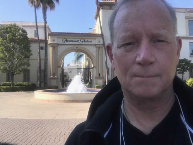
Tim Girvin at Paramount Studios
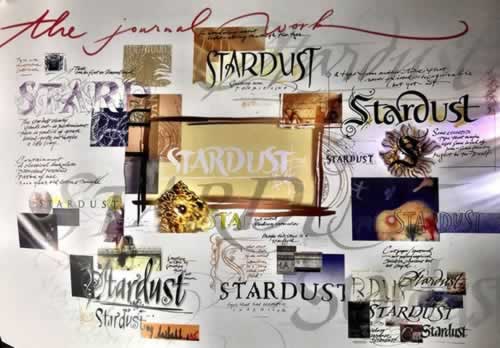
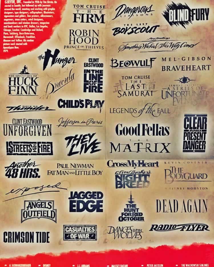
Traveling to LA, the movie studio circuit, I’m making presentations about the history of the work—team demos and talks to entire firms, nearly all of their talent, to talk about what’s been done, GIRVIN’s design work historically, the journal-form of the working film design ideations which is built on the practice of collecting groupings of thoughts as an amalgam of solutions.
These are thematic journeys—interlinked and
woven—as a loom of contributions.
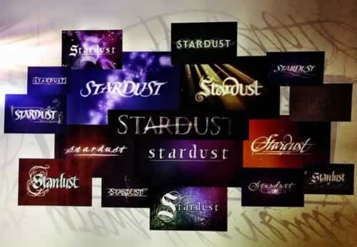
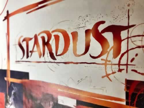
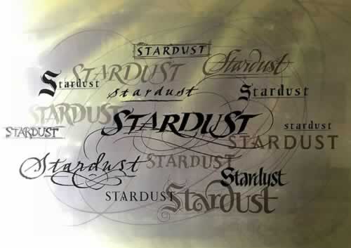
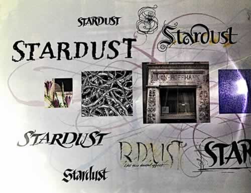
Like Stardust
—a sprinkling of light—
solution studies:
S T A R D U S T
And then, in these sessions, showing pathways in drawing everyone’s name—meanwhile defining the style, what century and time period, and what was happening—
“this letter type is from the age of Humanism, an enlightened stride to earlier, classical Roman ideals—and I’ve drawn your name from 15th century Italy.”
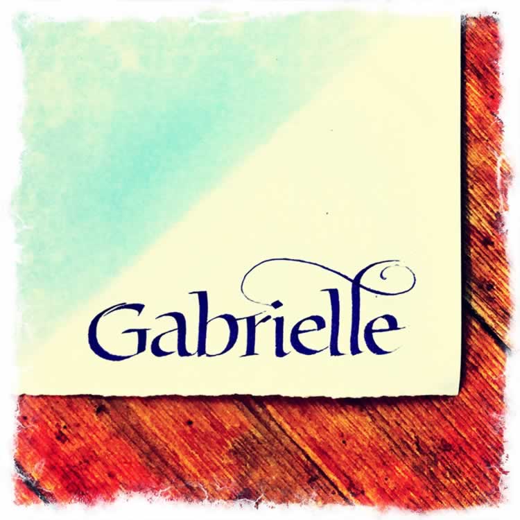
Off-the-cuff, improvisationally—gestured on-the-spot.
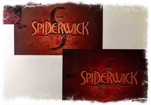
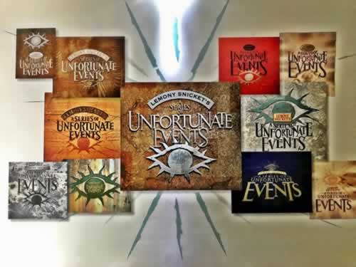
That premise of the hand-made revelation of a name, becomes the hand-crafted point of differentiation in our movie picture and theatrical branding work, which is all about extreme customization.
Walking that story, I gather-up folders and leave-behinds that reach into the storytelling of the work.
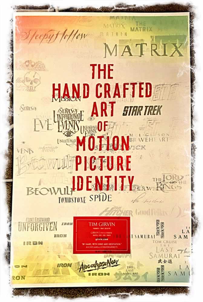
“By hand, with mind and meditation,” as one Italian Renaissance sculptor intoned— and with a digital team, you can build it out for implementation in other media locations. These days, I focus more on the work. I stay in the center, the “drawing-out of the story” and the implications of how that drawn-out rendering could be something unforgettably telling. Since surely, for all,
that’s where we live, as designers,
which is in:
the telling.
I put those tellings into a grouping of ideations and finishes. The “finish” is an antiquated term for the build-out of the master “final art” for “key art” and theatrical production mechanicals, press and digital deployment. In the old days, this was a point of embattlement—“who did the finish on this…?”
 G
G
As designers, we oftentimes submitted solutions that could conceivably drive in response to production strategy—the styling of the work creates a vibe that works itself from the film,
or back into it.
Sometimes, you’re working on finish art, but then another agency takes over, and you find that your customized font—hand-drawn, hand-built as a concept is now, merely, a conventionally available off-hand font. And that’s the “finish.”
And you either persist in the practice,
or perish in the peril.
–––
T. | S E A T T L E GIRVIN | the waterfront
G I R V I N | DESIGNING MOVIES
THEATRICAL BRANDING + ENTERTAINMENT
IMAGINATION: AND THE TOOLS TO MAKE IT HAPPEN
goo.gl/BsoZ6y
Movie Storytelling design:The Scream Online