cold steel |raw materials in architecture
I savor materials that are used in the rawest of fashion(ing).
Places, building interiors, external details, fastenings and material applications. Large scale applications of raw industrial materials oftentimes reflect a kind of aesthetic elegance that is nearly Zen-Asian in appearance. It’s the degradation of these “surfaces” and materials, over time, that can be nearly wabi-sabi in quality — the zen contemplation of the cherished beauty of the rustic utility, honest formality of objects enhanced by age.
In the sense of place at the offices of Girvin, Seattle, the design uses many materials that are unfinished and raw. Stone, blasted concrete and distressed metal. Worn woods and industrially reclaimed timber. All wabi-sabi, touched by shibui(http://en.wikipedia.org/wiki/Shibui).

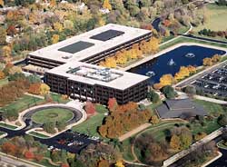
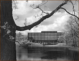
I was just at Kraft HQ, in one of the suburbs of Chicago. Out there, the neighborhoods are a mix of older homes, and new ones. Kraft, the Northfield(http://www.northfieldil.org/)group headquarters, right in the middle of a community that stretches on and on — and, as well, in other locations in the Chicago area. Northfield, over all, is perhaps one of the biggest corporate campuses, for Kraft. I’d not been there in several years, having worked there more extensively in the 90s, early 2000s.
Actually, most of the time, corporate campuses are really boring. They fail miserably at offering anything inspirational or grandiose in visioning.
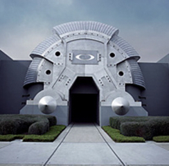
Other times, the focus of the campus is to create a message. And more about creating a sense of place and story — even theatre and spectacle:Oakley.
Oakley, the global hardware manufacturer, from sunglasses, art-tech sports and military protective gear, believes in the sense of place and materials to define presence. There’s a statement in their thoroughly conceived corporate site.
Like this. Above and below.
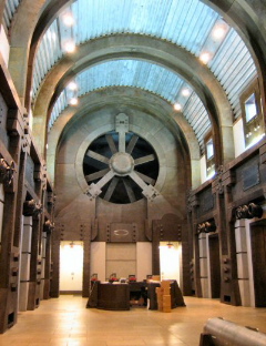
I’d blogged this content, earlier, — both to the aesthetic ethos of corporate design and visually aligned headquarters here:https://www.girvin.com/blog/oakley-branded-environments-architecture-brand-storytelling/
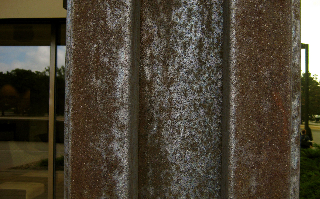
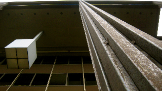
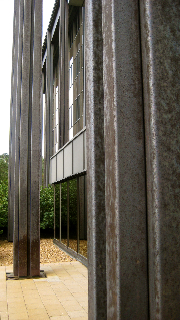
Interestingly enough, at Kraft, being back there recently, I saw things slightly differently. There is the central drive into the campus ending at the main building. This structure is a five-floored edifice, internally glass clad and supported, simply enough, by Cor-ten steel welded pillars, arranged in a colonnade supporting the external, overhanging roof plate. The simplistic nature of the design has a kind of hard, elegant discipline to it. But for me, another component is the character of the materials, that are degrading — in a beautiful way.
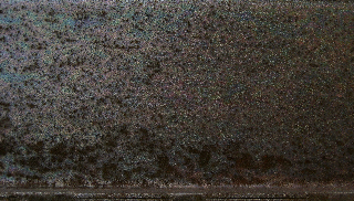
Like this, from Kraft’s pillars, the grainy, “raven-winged”and oiled texture is something that’s not noticeable from a distance; up close, it’s beautiful:
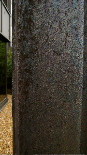
This is part of the character of the material — Cor-ten steel. Its character of degradation, like the raku teacups of Zen ceremony, deepens beauty. The founding architectural application of this new composite was at the John Deere corporate headquarters, designed by Eero Saarinen.
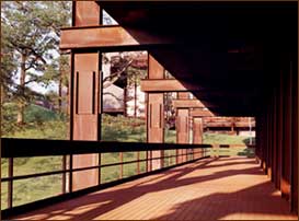
He used it simplistically, elegantly, spanning the structured corridors of the compound. Cor-ten is U.S. Steel’s trademarked name (http://en.wikipedia.org/wiki/Weathering_steel)for their amalgam — a corrosion-resistant, and weathering steel formulation, that responds to the elements in creating a protective coating of iron oxide when exposed to the atmosphere.
This responding rust layering becomes a protective skin when fine crystals of early rust recrystalize to form a dense barrier that retards further degradation. Contrasting other steel composites form an oxidation layer that is porous, flaky and penetrable by environmental elements.
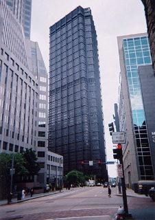
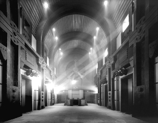
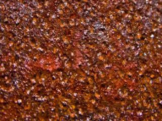
US Steel, in Pittsburgh: the building (above) is all the more beautiful in its material dissolution. It’s rusting — even metaphorically — but it still stands, dissolving in time, yet resurfacing itself, in its “encrustation”.
Rust, in its glory:
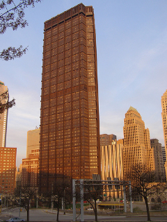
The United States Steel Corporation, one of the largest steel producers in the world, wanted to make a statement about the strength and beauty of steel — and designed a structure as testament to this visioning. The original concept was to design the tallest building in the country, with an outer facing completely made of Cor-ten steel — a dramatic advertisement for the steel industry, then centered in Pittsburgh.
Completed in 1970 it became headquarters of U.S. Steel Corporation. The towering 64-story skyscraper did not quite eclipse the tallest buildings in the country, but in 1970 it was the third tallest in the United States, behind the Empire State Building and the Sears Tower. The steel tower rose to a height of 841 feet.
It was the first structure in the nation to use liquid-filled, fireproofed columns as a safety feature. The 18 support columns are filled with a mixture of water and anti-freeze. It was the exemplar of the steel industry, remaking the Pittsburgh skyline and towering over the city landscape.
What about Kraft’s HQ? Same principle:
Beauty in dissolution.
tsg | chicago
—-
Other explorations, beauty dissolved:
wabi | sabi:https://tim.girvin.com/?p=254
gross grandeur:http://blog.girvin.com/?p=393
Tom Kundig | Eaton Studio Architecture:http://blog.girvin.com/?p=399
Tim Girvin + MoMA + Richard Serra + Cor-ten:
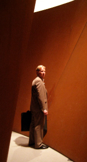
Photo by Dawn Clark,
AIA LEED AP