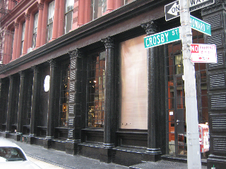
Exploring store design — a collaboration between designer Raf Simons and artist Germaine Kruip — and a contrary study in contrast: De Vera. At the corners of Howard & Crosby: NYC.
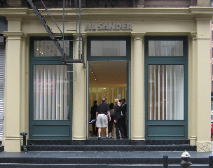
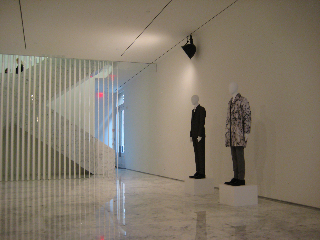
The hyper minimalist white space and laboratorium that has entered the retail fray is located in south SoHo — the Jil Sander store is accessed from Howard Street (at Crosby). It was designed by JS Creative Director Raf Simons and the artist/designer Germaine Kruip.
It’s right across the street (Crosby Street, that is) from the very opposite sentiment in both design, visualizations & merchandising — Federico De Vera‘s apotheosis of complex display (and objects) – the De Vera store NYC.
I’m interested in that idea — exploring place and diversion — retail contrasting. On all levels.
First Jil. The store concept is all about experiment and profound “whiteness and lightness”. There’s more here to explore: http://www.nytimes.com/.
I savor that idea of collaboration, fashion vision and story, creative direction and art. But then again, you know that about me by now — if you’ve read anything here…
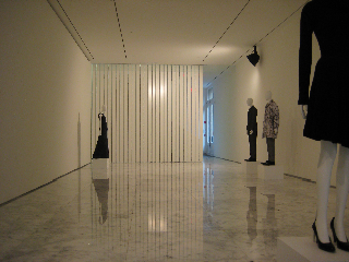
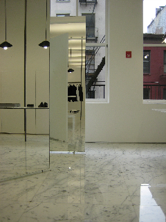
Imagine a space as a series of rotating mirrors that reflect in 360º everything in the space — that is: what’s here, what’s newly refracted, and what is your place in it? You are the store and the story; and the store, and story, are you. There’s not much else. But the conception is beauty full. I’d only hope that their sales improve (along with everyone else).
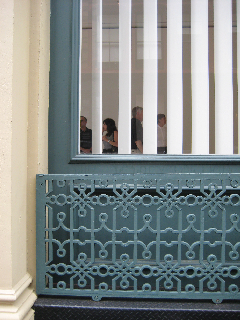
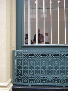
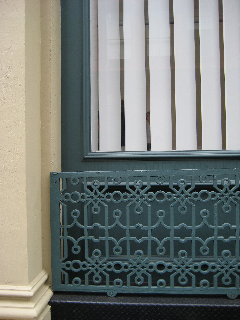
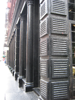
Imagery, outside in:
the skin:
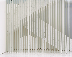
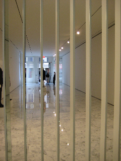
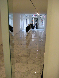
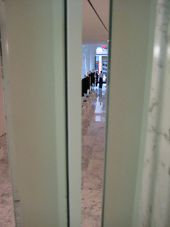
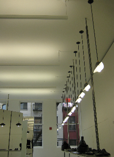
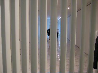
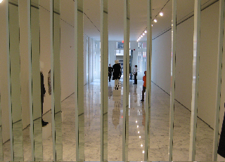
the vertical slats:
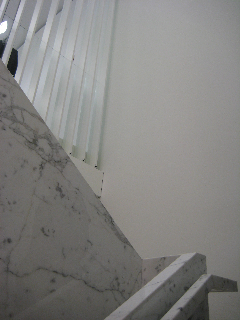
interior transitions:
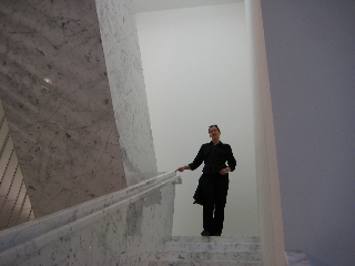
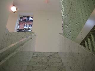
the stairs (with Dawn Clark, AIA, NBBJ):
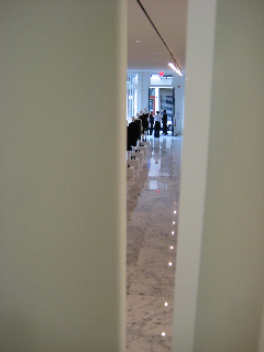
southview to Howard and the entrance:
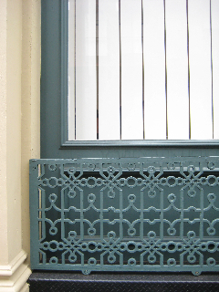
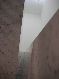
stair detail to the second floor:
slatting details, in rotation:
girvin documentation:
southview, second floor:
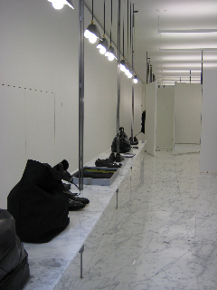
stairway down:
southview, slatting:
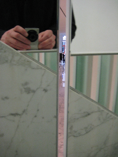
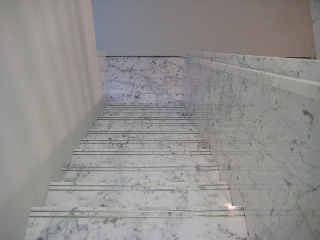
staircase marblework:
You get the picture.
There’s a metaphor there that’s interesting, in terms of fashion relationships that I’ve been pondering — how like a great retail concept, are galleries. Art galleries. But true galleries are about relationships — that is, you’re going to buy “art” from someone that you can trust. Someone that you’re connected to — have a way of speaking with, that knows you. There’s that bridge here — from Jil Sanders http://www.jilsander.com/.
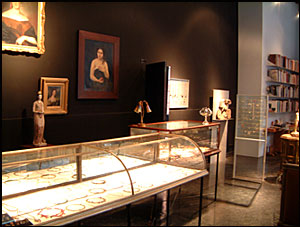
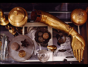
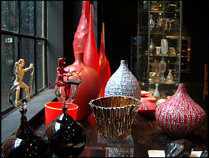
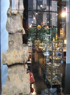
What about Federico De Vera?
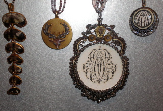
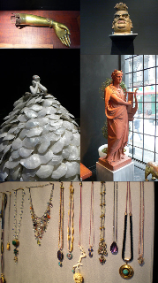
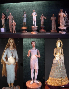
New York Magazine expresses: “This is not your usual store. “It’s like walking into a museum where you can touch and buy things from someone’s personal collection,” says De Vera. The 41-year-old Philippines native travels the world buying objects that appeal to him (often only to take them apart and make them into something else). The mix is incredible, from architectural remnants to vintage and contemporary glass pieces to nineteenth-century dolls from India. But the real star is the jewelry. De Vera designs most of it himself, and, like his store, it’s a mixture of old and new in such a way that it’s a challenge to discern which is which. Rose-cut diamonds are De Vera’s obsession, in rings, earrings, hanging from leather cords, or set into a dazzling necklace. Sounds pricey, and on average it is—from $45 for a hand-blown glass ant from Italy to $95,000 for a necklace of sixteen big rose-cut diamonds. That’s a lot of rock for the buck.”
Imagery, follows:
de vera’s jewelry assemblage:
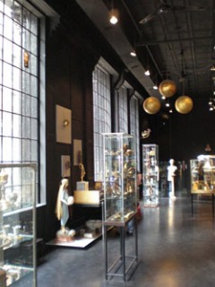
interior, south to Howard:
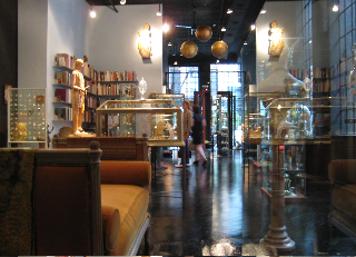
the lower level, viewing north:
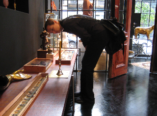
retail designer and architect: dawn clark, studying:
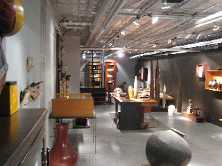
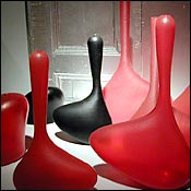
blown work:
down:
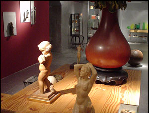
casework and collections:
glasswork:
outside in:
at the corner of Howard and Crosby.
What’s your take on the concept of contrast — the simpler picture, the merchandise; the complex picture, the store. What is the balance? How is diversity spelled in the context of design?
tsg | soho – nyc