
Aberdeen
The Challenge
A Wishkah for Change
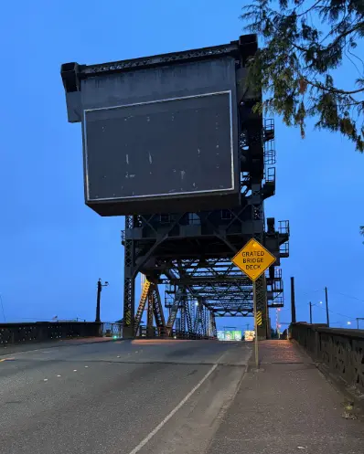
When Aberdeen leadership posted that they wanted to update the iconic but weatherworn sign over the Wishkah River bridge, we leapt at the chance to enhance the beloved local landmark.
The Solution
Bridging Past and Present
As Western Washington natives—and with Tim being a resident of Grays Harbor—we have often driven to and through Aberdeen. Our strategy was to freshly redefine and honor the history and legacy of the town, and we submitted a grouping of ideas for the Aberdeen leadership council.
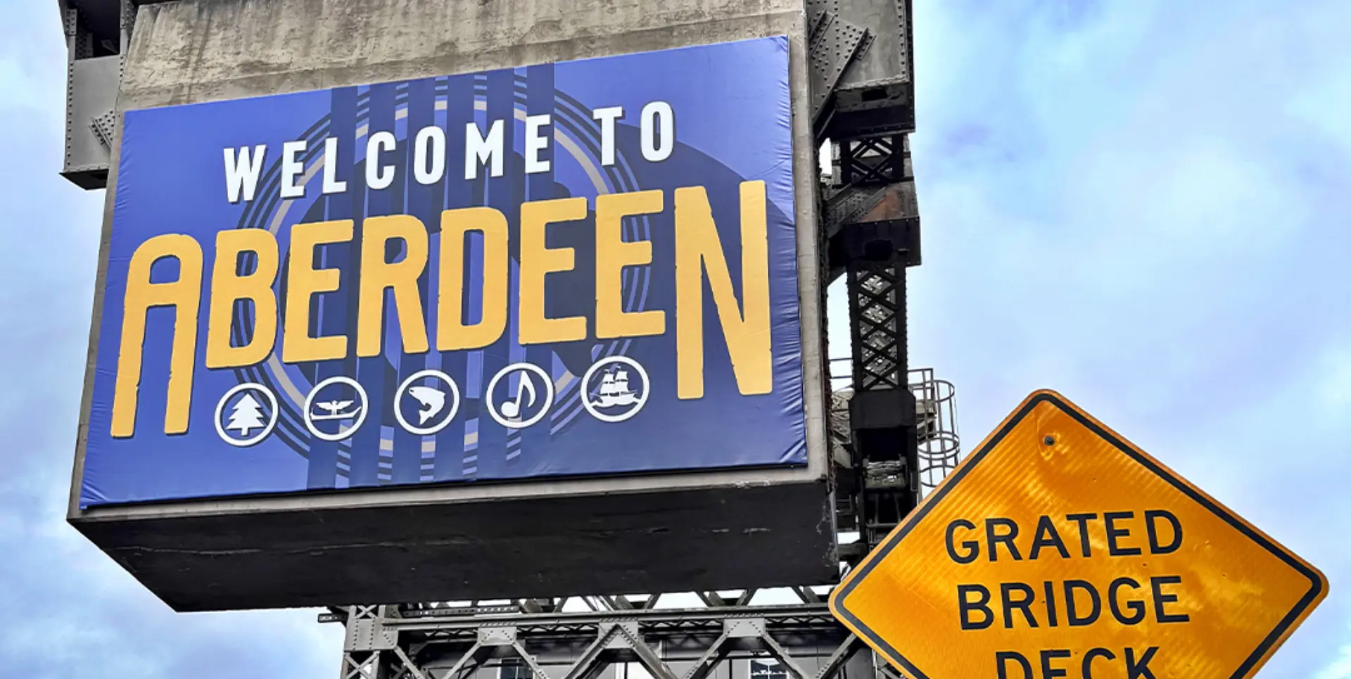
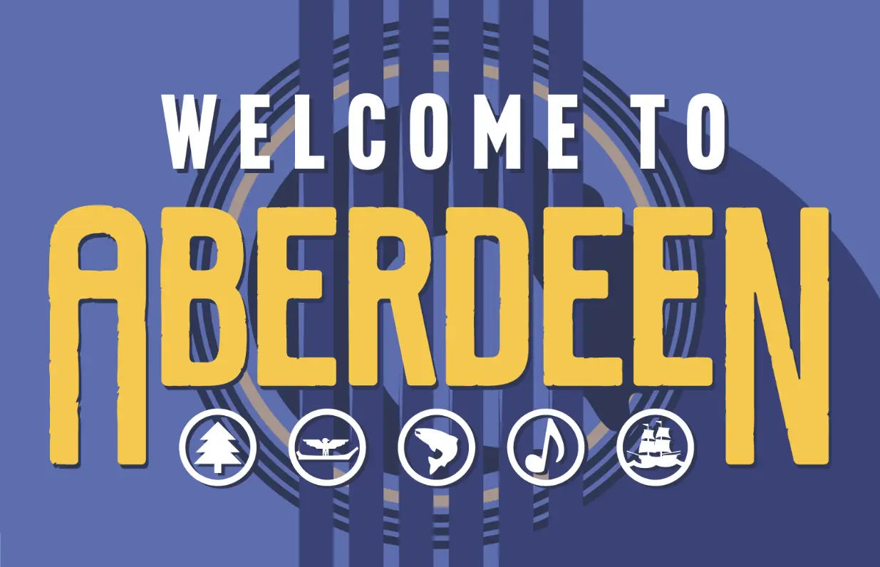
All of our designs newly reflect the emerging attitude of Aberdeen—in a drive-through portal that sees roughly 16,000 passengers per day—the signage should be mnemonic of the earlier sign, yet strikingly refreshing. This was a competitive presentation—and the Aberdeen City Council chose GIRVIN’s design: the purple and yellow color scheme was inspired by their pride in the local high school as well as an homage to the old sign; the word Aberdeen is shaped like a bridge, which is a nod to the bridge and the former tagline “Gateway to the Olympics”.
Though the tagline was well known, we replaced it with icons that represented Aberdeen itself—to celebrate Aberdeen as a destination, not just a place you drive through to get to somewhere else. These icons represent the local attractions, industries, and historic and cultural heritage of the area. The background, the sound hole of a guitar in various shades of deep purple, represents the depth and diversity of the community and a tribute to the musical legacies that put it on the map..
 Environmental
 Illustrations
 Messaging
 Type Design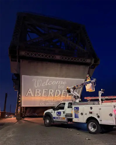
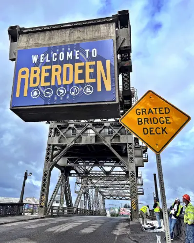
Here is a description of the icons: The tree and fish icons stand for the thriving timber and fishing industries; the canoe represents the Quinault Indian Nation; the ship marks Aberdeen as the home port of the famous tall ship Lady Washington; and the music note represents the birthplace of musicians like Kurt Cobain, Patrick Simmons, and more.
“
GIRVIN’s work has already generated a great deal of positive community commentary and support. It’s a dramatic shift from the previous sing and celebrates a first step in evolving our city’s presence as more than a mere drive-by location … GIRVIN’s team was a pleasure to work with. They worked with our Public Works Department, Department of Transportation and our Art Commission to ensure a timely installation of the project. Couldn’t have asked for a better team to work with."
Douglas Orr | Mayor | City of Aberdeen
Discover more from Girvin | Strategic Branding & Design
Subscribe to get the latest posts sent to your email.