
Nordstrom
The Challenge
Well Suited to Survive
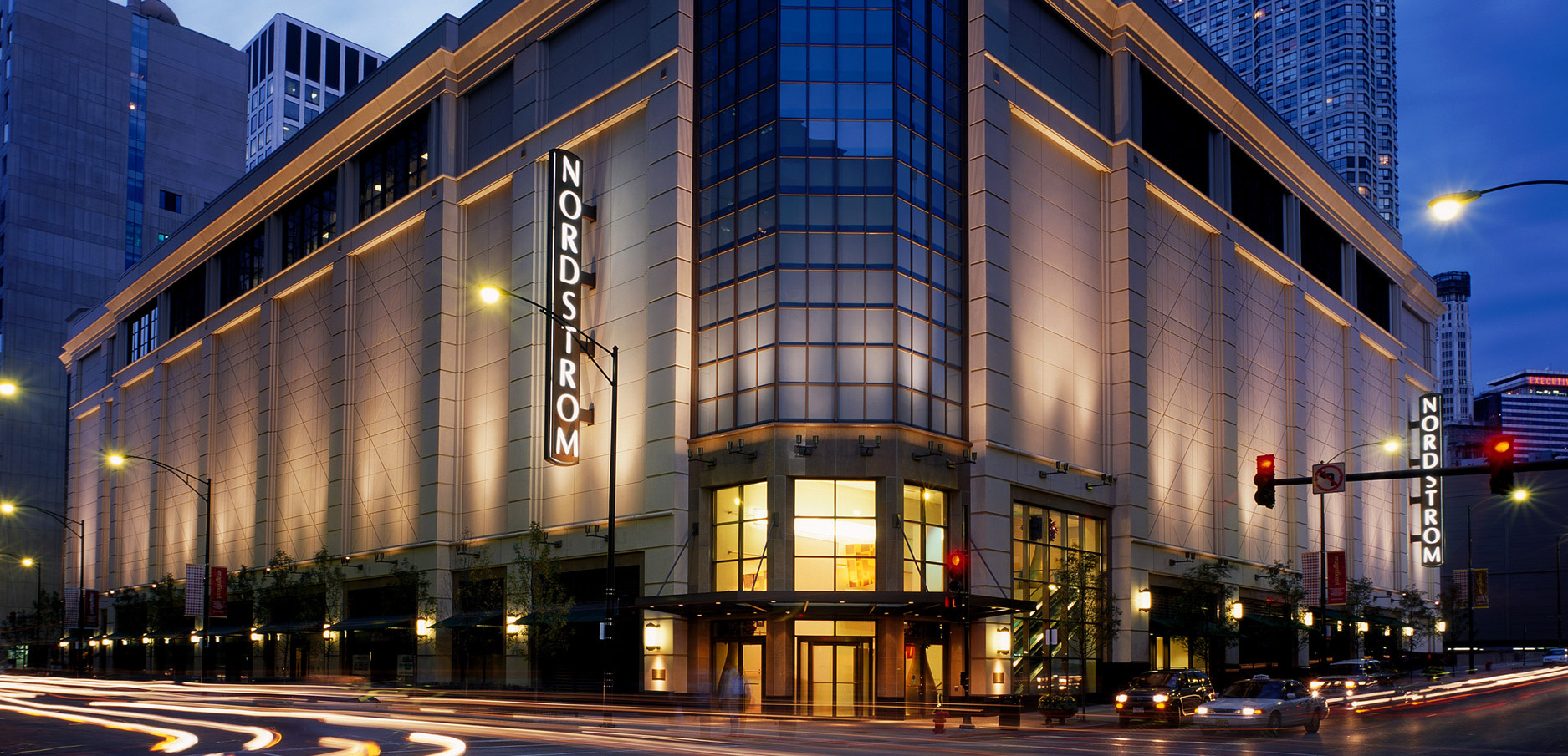
Nordstrom is a family retail empire that dates back to a shoe store founded in 1887 by patriarch John W. Nordstrom. After generations of growth and change, Nordstrom came to GIRVIN with a legendary reputation for customer service but with a gradually aging, “establishment” persona. Nordstrom’s challenge was to infuse vitality into their brand with fresh, invigorating ideas and approaches.
The Solution
Oh, the Urbanity!
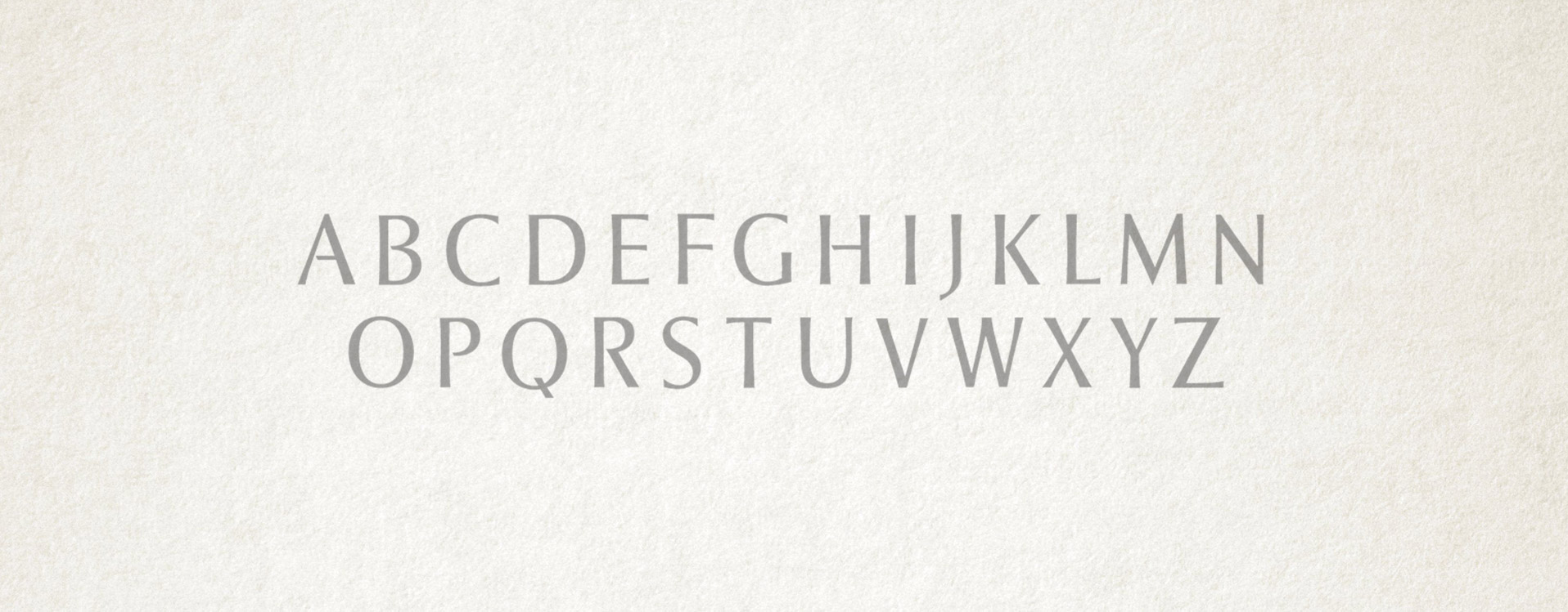
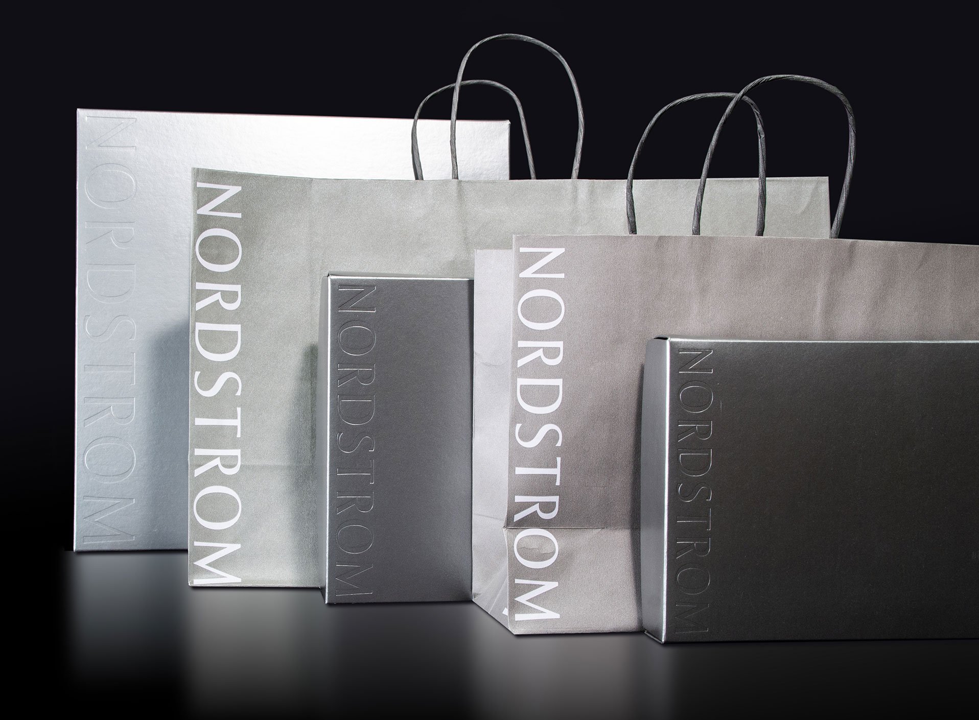
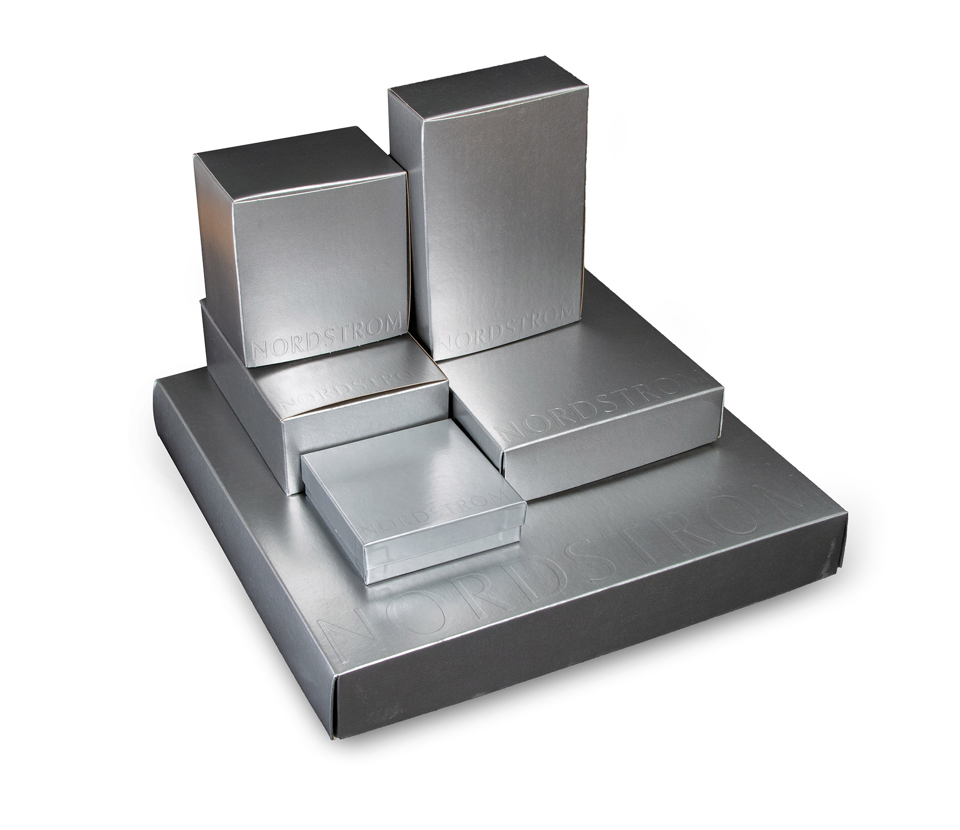
GIRVIN’s team engaged with Nordstrom over the course of a 25 year relationship. At the heart of their comprehensive identity is a custom-designed alphabet created solely for Nordstrom. From that basic DNA arose a broad and cohesive program of brand communications, from brandmark and color palette to retail support, packaging and environmental graphics with the spirit of authenticity and exceptional craftsmanship that defines the brand.
 Strategy
 Identity
 Environmental
 Messaging
 Naming
 Packaging
 Print
Print Type Design

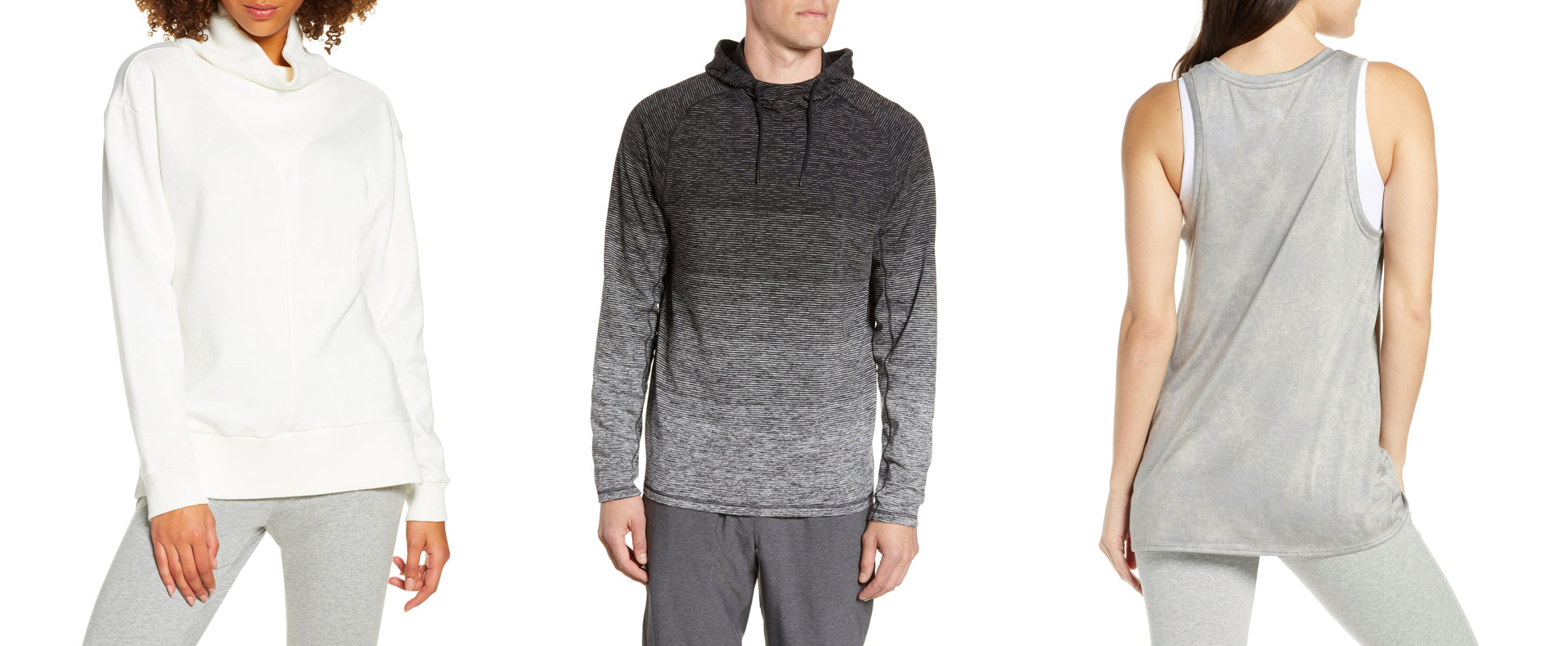
GIRVIN’s Ideator® naming and brand development team was asked to create a naming strategy for an active women’s brand (now expanded to include men and girls) then in development by Nordstrom’s internal brand development group. The new product line retained Norsport’s utilitarian nature, but injected a greater focus on fashion, which liberated customers to go straight from the gym to brunch—what has now become known as “athleisure”.
Our only constraints for naming were that it reflect athleticism and be short enough to be easily applied to clothing. Our initial rounds of names explored diverse tacks, including totally abstract, created names. “Zella” appealed in a number of aspects—including being memorable and easy to say. Our thinking behind this word: at its roots is “bella”, Italian for beautiful, but contemporized with a “z”—it’s beauty with a zing! Additionally, the name recalls “gazelle” and harbors the suffix “-ella” which is typically used to make a noun feminine. The logotype we developed evinces a lean physicality in the thick-thin character of the custom type forms.

And Beyond
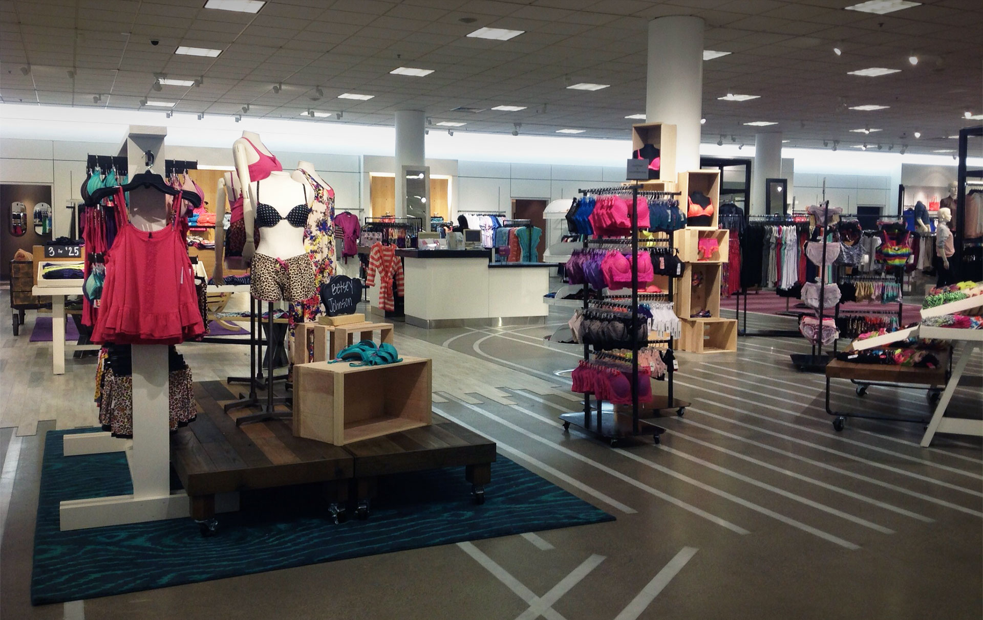
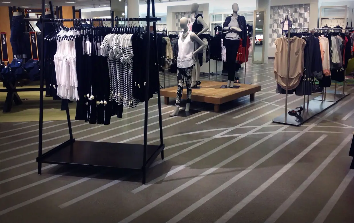
FLOOR PATTERNING
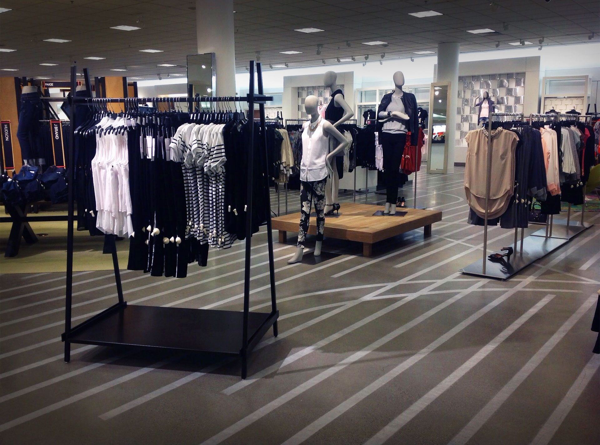
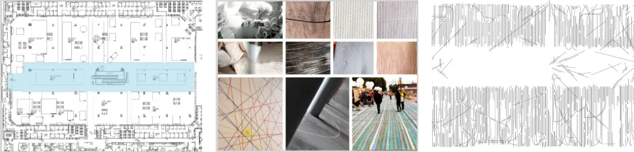
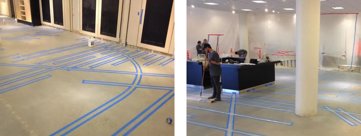
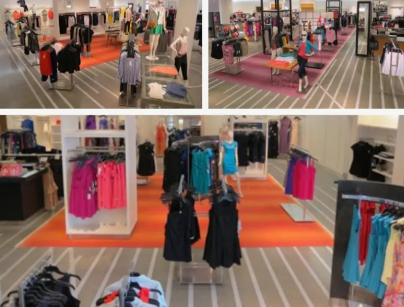
We developed an intentional patterning language that would guide consumers, renovate a retail environment, simplify guest movements and sales engagement, and eliminate excess furniture—all in three months at 25% the cost of a normal renovation program.
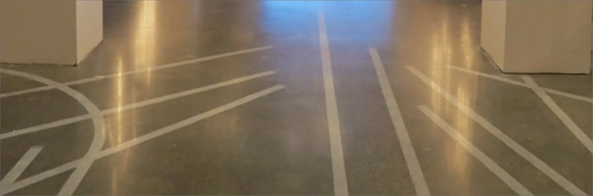
This pattern language was developed from studying brass screed patterning and morphed into the metaphorical design thinking of “woven and weft”. This was first worked out in the floors of the Seattle flagship store, then implemented in Chicago and Irvine.
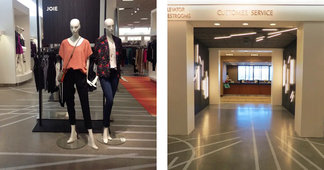
In the LA location, the carpeting and tiles were removed to the polished concrete structure and the deployed strategy played toward a pathway metaphor that was applied in a manner to accentuate guest journey—creating shopper trails without creating guest blockades or salespeople impediments. It was widely defined as strikingly successful. Customers were enchanted and store managers were delighted with the store still being operational during much of the renovation process.
Discover more from Girvin | Strategic Branding & Design
Subscribe to get the latest posts sent to your email.