Tim Girvin’s writing on motion picture design,
originally curated by GIRVIN friend and motion picture composer,
Stuart Balcomb.
Beginning with “Apocalypse Now,” Tim Girvin has designed over 400 film titles.
We present to you his writings about the Process of Branding.
GIRVIN’s Tailored Typography | Movie Logos
How to illustrate a story with letterform design. My kickoff work on Francis Ford’s Coppola’s "Apocalypse Now,” began with a question: he said, ["can you send me some graffiti logos, I saw your work in U&lc.”] I had no idea what he was talking about, never had...
Brandwisdom in Bold Brushwork
The font work of the road, the remote walls, restroom stalls and using industrial brush tools. I was influenced by graffiti artists and hobo code markers. To know graffiti, practice the art. In the 70s, I started marking stalls in funky bathrooms in NYC, marking over...
Strategic Branding and the Game of Chess
Integrative moves on the brand board of enterprise. The logo above, for the US / China Chess Summit, is a global tournament that GIRVIN created for a group of chess aficionados that see chess as a investment forum for growing acute thinking—the agency to strategic...
A chat with Robert Evans | Schulberg Building | Paramount Studios
A walk-around hello, on the Lot, Summer, 2007 When I was working on the Paramount lot on Melrose—with the executive team in the theatrical advertising office—I frequently worked onsite in hand-drawing and tuning, improving logo art for various projects, including, for...
The Kimber Script Logo
Classical lettercraft meets a precision draft, engraved in steel. In the spring cleaning of our moves to GIRVIN’s 16th office location, in the West Queen Anne Elementary School, in Seattle I was sorting through a grouping of files—like a large grouping, dozens of...
Blandism and the Detailing of Typographic Design Linguistics
What sways to blandishment? A lot of discussions around last week’s blog— and the notion of brand blandism, and some asked, “wait, so you’re saying that san serif is too bland, too plain, not… ‘exciting’ enough?” No, that’s not the point. As I’d mentioned before, in a...
Celebrity Brand Development | Legendary Stories about GIRVIN Logo Work
Everyone has stories about logo projects. What’s yours? Speaking of recognizable brand relationships, working with Doug Osborn, an Oregon photographer and designer, and Cameron Healy—the founder of Kettle Brands. And there’s a story about a logo for new type of potato...
Theatrical Branding and Type Design | Logo Workshops in LA
For motion picture studio teams, agencies and theatrical producers, I’ve been giving these workshop presentations as a proposition to linking marketing strategy, brand storytelling and narrative illustration. In a manner, thinking of movie logos, the identity offers a...

Mary, Queen of Scots Movie Titling: It’s No Hatchet Job
By delving into these women, Elizabeth I and Mary, their history, and their passions, we developed ten identity renderings for Mary, Queen of Scots.
Protected: DESIGNING THE IMPOSSIBLE: MISSIONS IN GRAPHIC IDENTITY
There is no excerpt because this is a protected post.
LOGO JOURNALISM | DESIGNING IDENTITIES AND TITLING FOR MOTION PICTURE BRANDING
Designing Identities And Titling For Motion Picture Branding.
The Brand Design of the Doc Savage Legacy
What goes around, comes around— youthful lettering dabbles becomes a full time career. In GIRVIN's history as designers for theatrical marketing and advertising, we’ve got legacy, a heritage of literally hundreds of motion pictures — starting with kickoff logo studies...
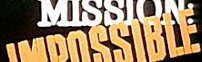
The Design of Mission: Impossible; Hand-Built Titling Fonts in Movie Logos; the Brand Identity for Tom Cruise
Customized, illustrative typographic design for motion picture titling design. First off, to clarify, we didn't work on Ghost Protocol, out today -- but seeing the opening campaign, as well as the film launch in Dubai (and working there reminded me of earlier efforts...
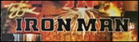
Tony Stark | The Iron Man
Anthony Edward "Tony" Stark is the man in disambiguation -- confused on one front, solid as iron, in another. His metal clad skin covers a soul that is torn and sheared in seething pain. Iron, clasps heart. And exploring the signature of Tony Stark -- at once, the...
The Spiderwick Chronicles: Exploring story in journal narrative
For about 15 years, I've been using the journal as a kind of narrative to my life. More like a scrapbook, it's a gathering of ideas and experiences that relate to what I've seen, reacted to, contemplating, in the spirit of my creative examinations. The journal is the...
Direct marketing and brand identity
As a developer of campaign theming, in direct marketing development, ranging from department stores to retail products, theatrical marketing to entertainment design, the soul of the direct marketing story can lie in the very heart of the conceptual visualization --...
Inspiration: the finding, the depth, the found
What did influence me? Practice for one, looking for another. I look, I find. I research, I uncover. I dig, I excavate. When I was in college, I did this one section, this one grouping of studies of the history of the letterform. What is that, anyway? Palaeography....
Beowulf: the movie
Beowulf What calls, from ancient halls, the spirit of that other distant world, far more than a thousand and five hundred years back in the balled skein of time? Beowulf! Palaeography, or the history of the written world has long been a strategic underpinning of what...
JJ Abrams | Transformer trailer virus
The Transformers trailer virus, Paramount sown...
Notes on The Matrix design
There's another symbolic value to the O and the 1 beyond the nature of the digital translation of content and interpretation. O, the curved enclosure -- is, in sequence etymologically -- from Sanskrit -- the sunya; Arabic, sifr; Medieval Latin, ciphra; the cipher, the...