Starport Foods
The Challenge
Clear out the clutter
David and Cheryl Tsang approached GIRVIN to help bring David’s culinary legacy into the future and strengthen their chef-focused food brand, Starport Foods, with a new website and clear and compelling storytelling.
The Solution
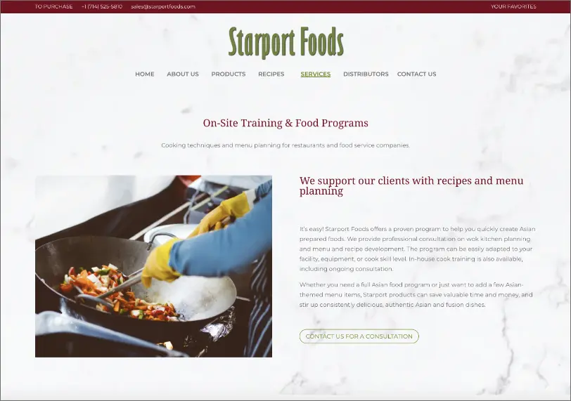
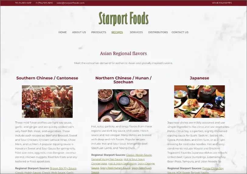
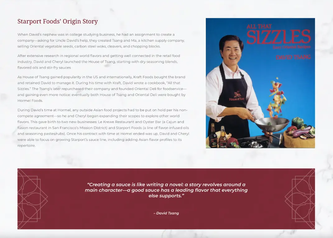
Clean and classic
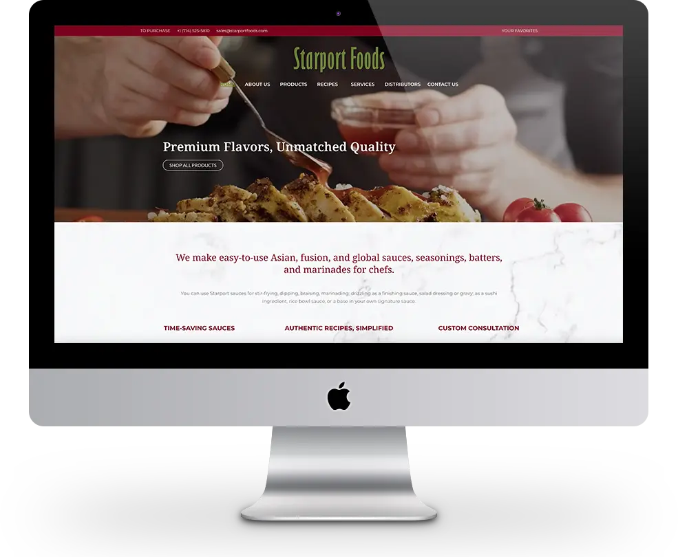
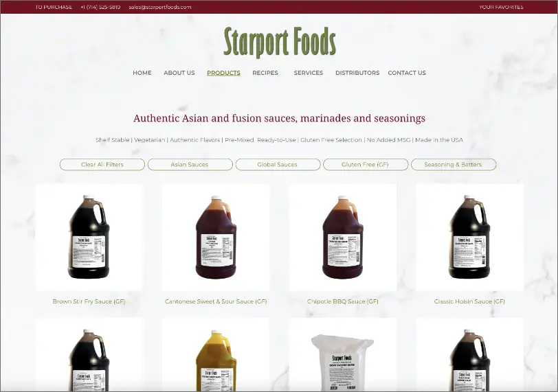
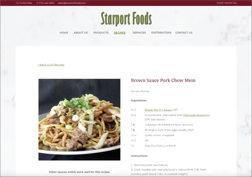
After a kickstarter session, we conducted an interview with David and his wife Cheryl to get to know them, the brand, and the heart of their story. We rewrote the brand story framed around David’s culinary history, Cheryl’s partnership, and their vision for accessible and authentic Asian and global flavors. Then we built the website with imagery and textures inspired by clean kitchen surfaces and an appetizing color palette, with special attention to organization, accessibility, and easy navigation. Small tweaks to their existing logo also helped to clean up the look of the brand aesthetic. Additionally, we created a custom icon that combined the shape of bowls into a star symbol as a decorative element for further brand patterning and storytelling.


The star icon was designed as a nod to both the name and food to symbolize the sharing of a meal. Combining bowls as a universal symbol for food into a linked star pattern conveys community and sharing, a core value of Starport Foods’ foundations. The name Starport itself combines “star” (aspirations and dreams) with “port” (a place of trade, sharing, and bringing new and far-away things closer to home).
“
We LOVE, LOVE, LOVE the new website!!! You guys are amazing! I can’t thank you enough. I’ve been praying for a beautiful website my whole life!
We love the new logo, logo color, banner color, creative writing, products and recipes…everything!”