
Magic Chocolate
The Challenge
Same-same but different
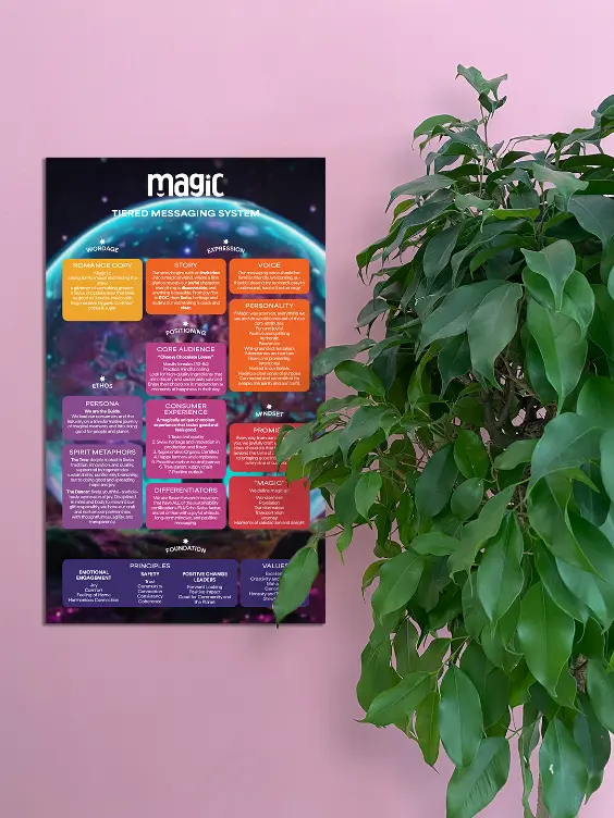
Maestrani, Swiss chocolate manufacturer with a 150-year legacy, was acquiring the Magic Chocolate brand from Dr. Bronner’s, for whom they had been producing the chocolate. It was to become a new brand but they also wanted to leverage the equity of the fans of the Dr. Bronner’s chocolate to claim a spot in the US market. They approached GIRVIN for help with a brand strategy as well as naming, identity, and packaging evolutions.
The Solution
A shift in perspective
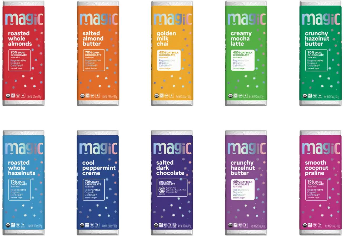
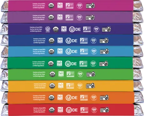
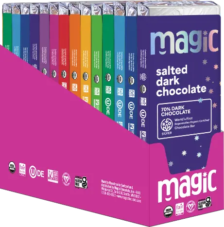
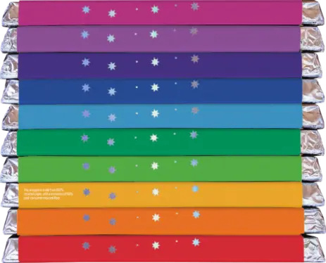
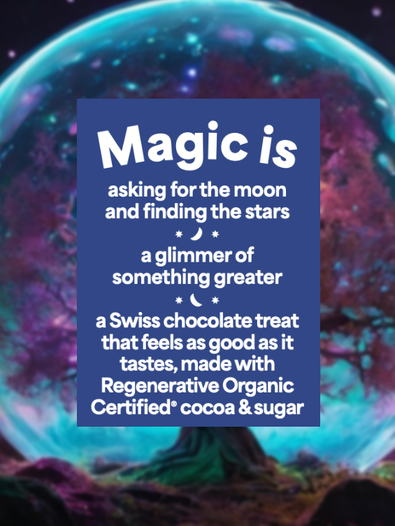
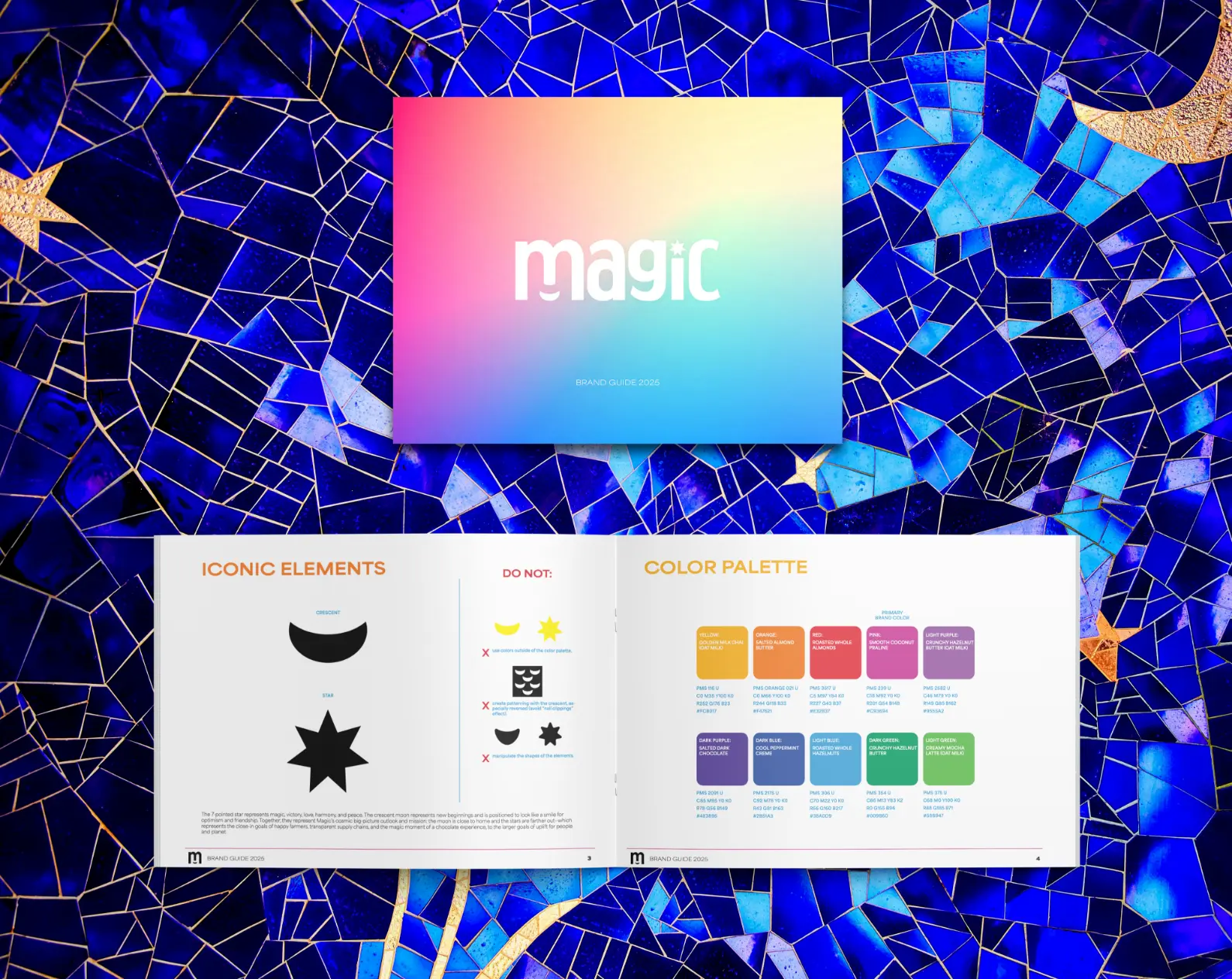
After a BrandQuest in Switzerland with the Swiss and US teams, we got to work on naming and packaging design, starting with positioning and naming strategies. After much debate, it was decided that the Magic Chocolate name would stay—but with a different frame of mind: built around the magical moments of satisfaction and delight and in celebration of the surprisingly transparent and discoverable process of production, distribution, and earth-conscious practices. Staying, too, was the brightly colored packaging and holographic foil—we updated the color palette and created a new layout that was less cluttered and emphasized flavor and category (dark vs oat milk chocolate). Everything was designed around happiness and uplift, including the new logo which utilizes the bouncing forms of lowercase letters and a smiling crescent moon.

And Beyond
The logotype was inspired by the straightforward yet versatile sans-serif font Helvetica, which, significantly, was created out of the Swiss typographic tradition. The shapes of the letters follow the bouncing movement of the ‘m’, the motion also emphasized by the up-and-down eye pathway created by the positioning of the bowls of the ‘a’, ’g’, and ‘c’; the ‘a’ is a flipped version of the ‘g’ which suggests a subtle rotating motion of continuum that represents the brand’s regenerative agriculture practices. The condensed lowercase letterforms all share the same height, creating a rectangular shape reminiscent of the product itself.
The 7-pointed star represents magic, victory, love, harmony, and peace. The crescent moon represents new beginnings and is positioned to look like a smile for optimism and friendship. Together, they represent Magic’s cosmic big-picture outlook and mission: the moon is close to home and the stars are farther out—signifying the close-in goals of happy farmers, transparent supply chains, and the magic moment of a chocolate experience, to the larger goals of uplift for people and planet.
“
Wonderful thanks to the GIRVIN team for guiding us through these two amazing workshops!”