
Custom Lettering
Overview
Logotypes and typefaces
All of the logotypes and typefaces we build are custom made for each client, bespoke for each scenario—from identity work to promotional purposes to extending design language across multiple platforms. Here, we showcase a handful of clients for whom we’ve designed both the logotype and typeface.
When creating custom type, we design for a larger context: a unified design strategy serves to communicate brand values, character, and story at a glance and in a consistent brand language to orient the experiencer. The finer detailing of consistent font treatment (on packaging, that translates to way finding, that supports the logo, etc.), coalesces to unify the brand as a whole—leaving the experiencer with a profound, memorable journey.
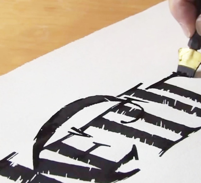
Many of the lettering we build are hand drawn, converted to digital applications and frequently integrated to key-strokable font solutions for use in authoring unique design systems. We often use ancient tools, handmade paper, hand-ground pigments, special inks, brass and brush-tipped implements.
 Strategy
 Identity
 Messaging
 Print
Print Type Design
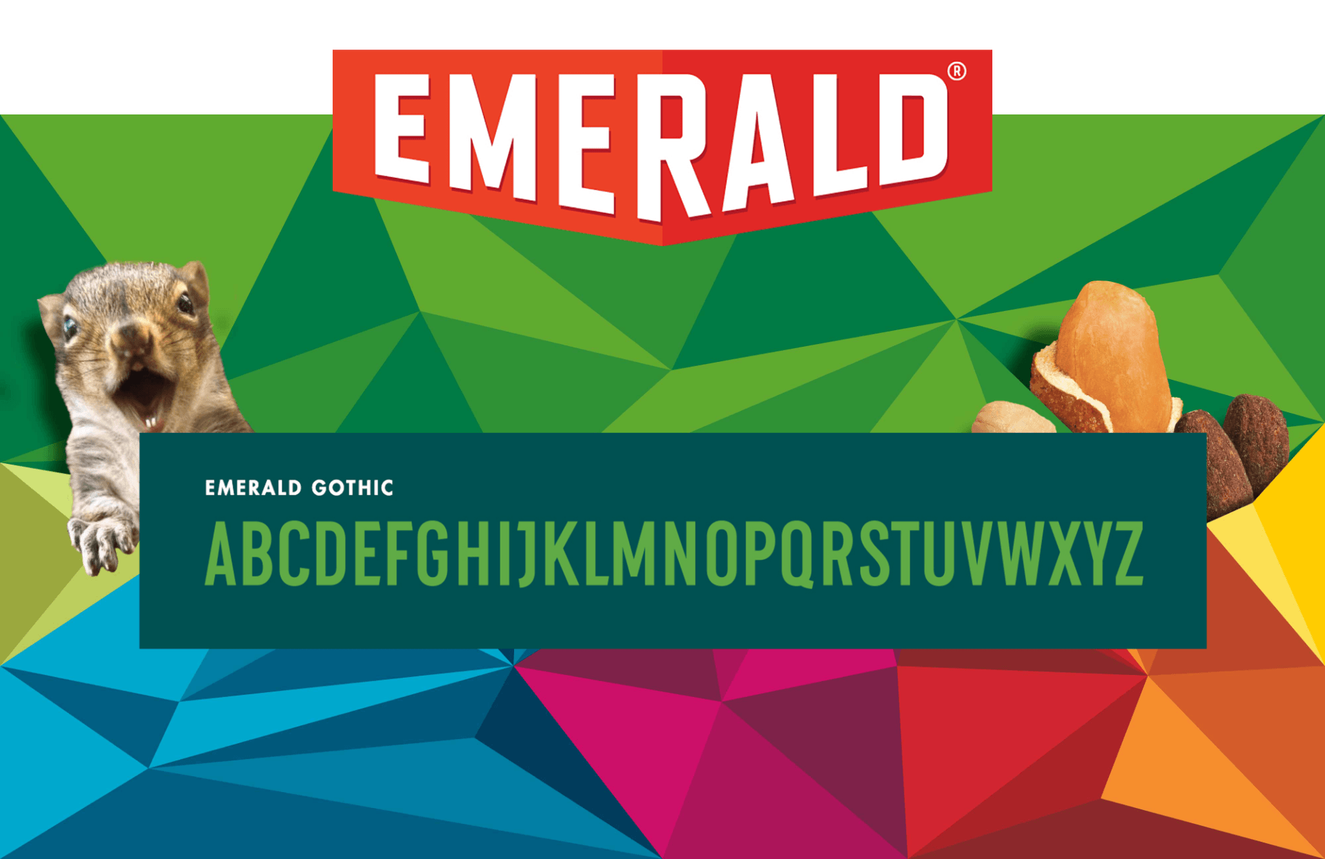
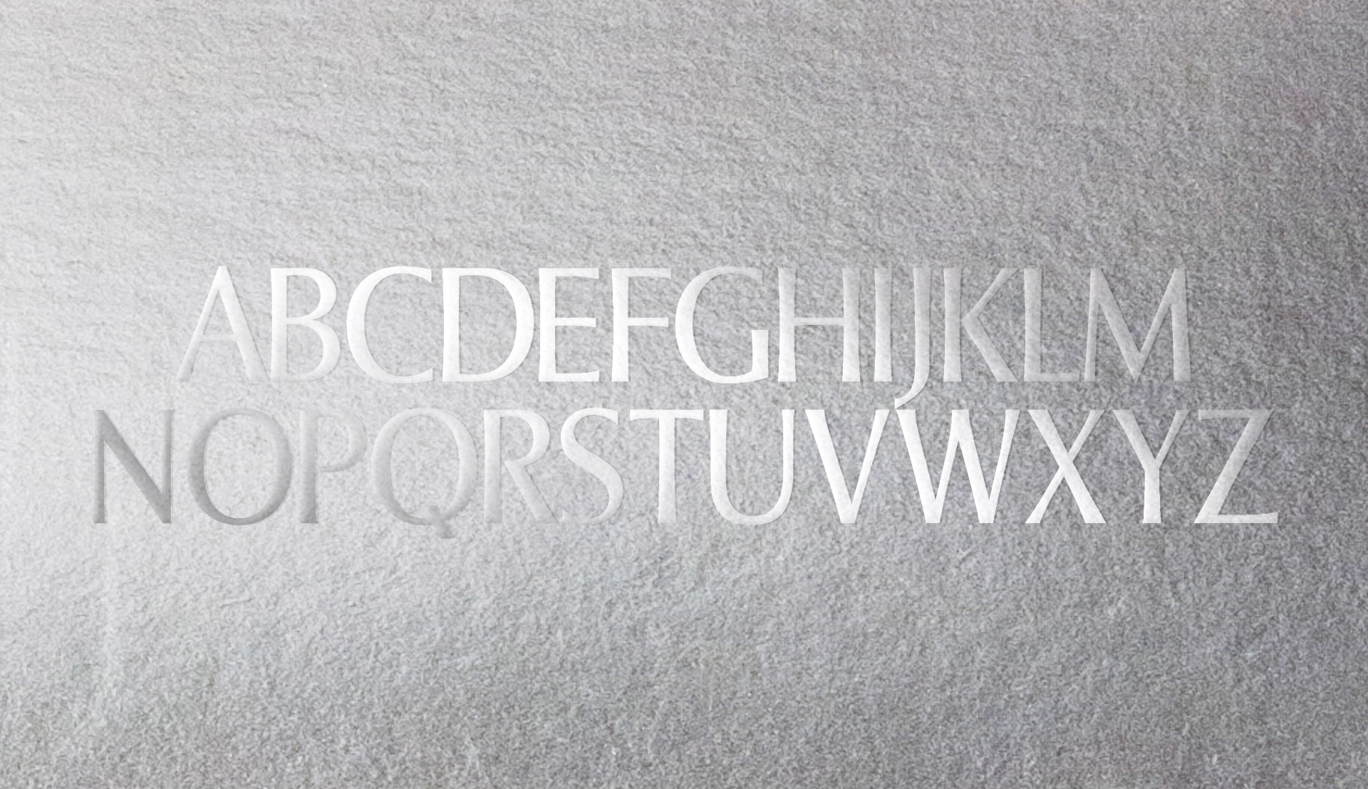
Emerald Gothic
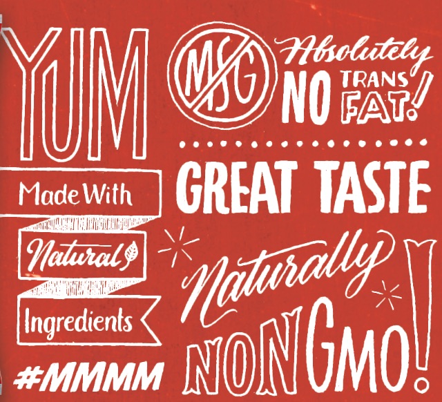
Emerald came to us with one goal in mind: create a brand strategy that’s nuts and disruptive. So that’s what we did! Along with completely overhauling their brand—from the logo and personality to their packaging and social media presence—we also created a font system to convey the new Emerald and to differentiate each offering. The custom alphabet, Emerald Gothic would serve as a foundation for product names.
Kettlebet
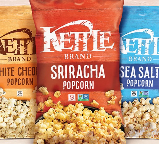
As the original creators of the Kettle Brand logo, we came back at their request to update the brand while respecting their humble artisan beginnings. Along with refreshing the packaging design, visual language, and social engagement, we crafted a custom hand-drawn typeface for use in conjunction with illustrative elements, to generate a unique and authentic feeling.
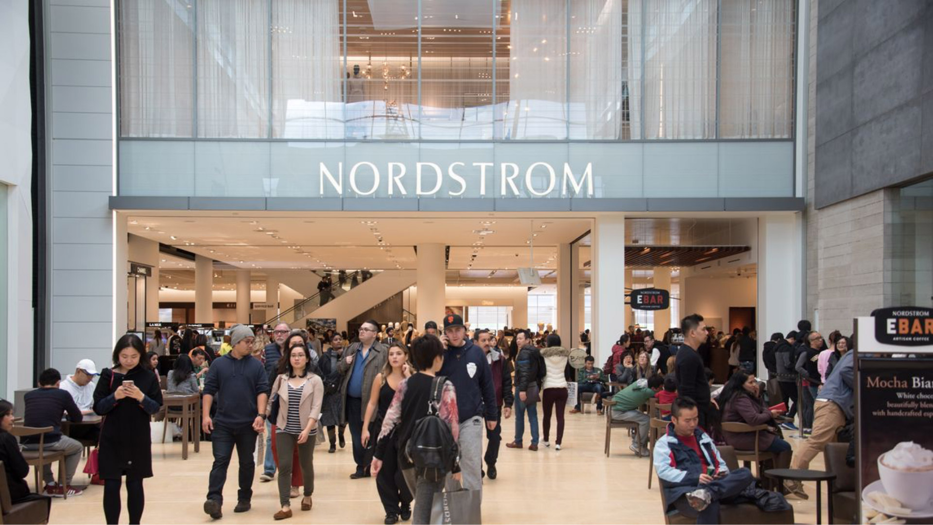
Nordstrom
Building on our 25+ year history with Nordstrom—starting with their logo, color palette, and environmental signage—we developed an elegant font solution based on the logotype that tied everything together for a cohesive, consistent, and elevated brand experience.
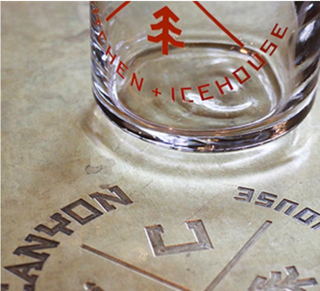
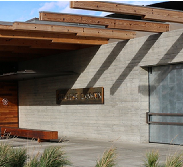
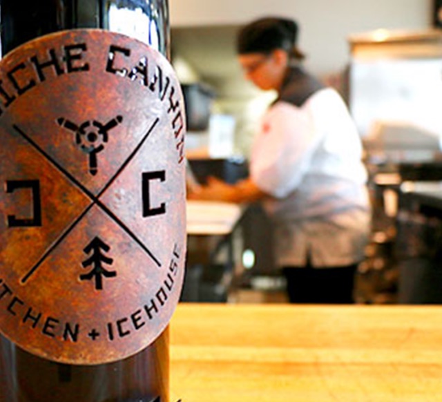
Cowiche Canyon
Cowiche Canyon was born of combining an upscale all-American take on dining with hard-working materiality. The chiseled alphabet, based on the characters of the logo we created, unifies the brand across multiple media and applications with a unique yet grounded aesthetic like the land and community it hales from.

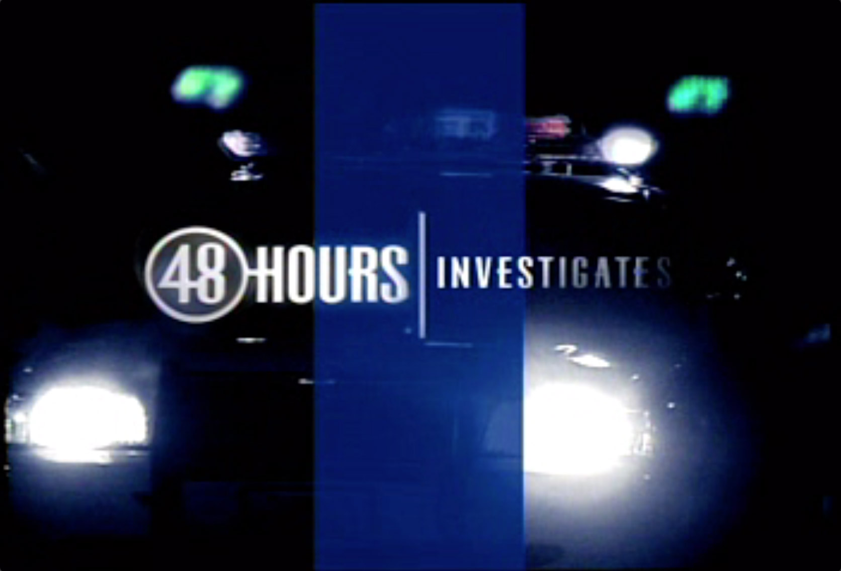
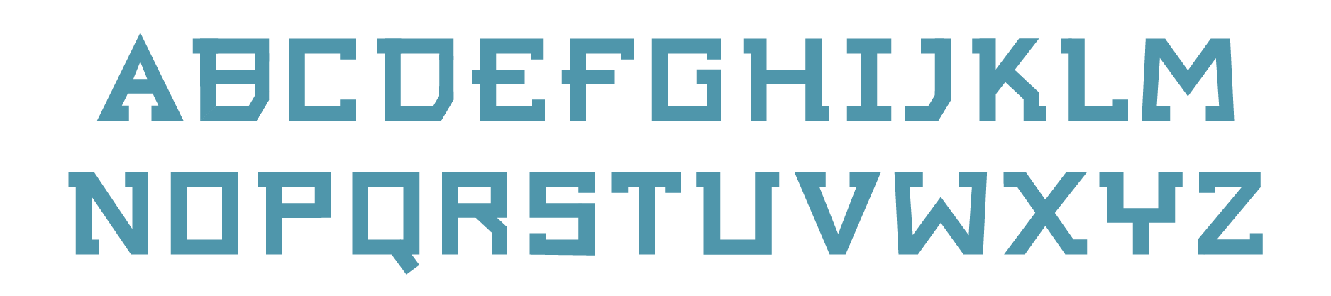
48 Hours
The CBS show 48 Hours | Investigates wanted to upgrade their image through the creation of a new on-air graphics package. Our team created elements that mirrored the intensity of the correspondents’ quest for truth: a new logo, a richer color palette base, images of real people in real-life situations, light effects that suggest the revelatory nature of the content, and images that serve as icons of the investigative process. The typeface was designed specifically for television viewing: the ratio of the characters’ thick and thin strokes are optimal for cathode-ray TV (CRT) rendering and can be displayed clearly and accurately on any scale.

Omeros
We worked with Dr. Greg Demopulos, founder and CEO of Omeros, to develop an entire custom font to use in titling and interactive contexts for Omeros Marketing. The font is based on the character of the Omeros logotype, which our team had designed back in 1994.


Scotto for Oki
GIRVIN, and Tim Girvin, have a long history with Scott Oki, the decades long CMO of Microsoft Asia, then as executive visionary, mentor, investor in a string of technologies that GIRVIN was working with. As well, GIRVIN’s worked on Scott Oki’s books and poetic efforts, including hundreds of haiku, every one, hand drawn by Tim Girvin. With a new set of poetic explorations, Tim Girvin and Scott Oki chose to develop a typeface which is built on the compressed Italic calligraphy that they’d been using in various evolutions in previous volumes. We named this ScottO, or scotto.


Viathon
GIRVIN believes in tightly synchronized brand statements and design systems, where every moment is thought through. To our thinking, bicyclists are smart, active people; they are proud of their commitment, grasp of bicycle industrial design, chain and gear dynamics. So for us, our work on Walmart.com’s product development, we want to see deep integration of design thinking and component expression—including the detailing of the bicycle’s livery, the slickly produced instruction manual and full size shipping box. To holistic experience management, we built a custom typeface for Viathon, built from the identity, and utilized in product series numeration and on bike design and merchandising.


Fairmont Princess Acapulco
GIRVIN’s team partnered with property owners, Jennifer Chase and Laurent Poole, in positioning, naming and supporting the development of a premier resort evolution for the brand—Princess Diamante Mundo Imperiale—specific to the property’s expansive array of differing hotel types and experience opportunities. Being Acapulco’s premium hotel property, GIRVIN’s team examined the evolution of the properties and created, with Chase and Poole, an amalgamated strategy—including design systems for the properties and customized font designs for signage and collateral—the Diamante and Pearl proprietary fonts.


Discover more from Girvin | Strategic Branding & Design
Subscribe to get the latest posts sent to your email.