
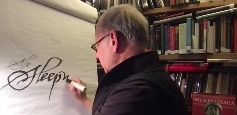
There’s a conversation that’s floating around—about the notion of handwork, handmade things; the other, start-up side of ai design.
Everything’s digital, of course, in the final interpretation, and application.
But to my thinking, “by hand, with mind and meditation,” might be another rendering, pardon the gesture to the draftsperson.
The mind side, of course, is the close-in listening, the lean-in to the story,
to hear and grasp its depth and gravitas.
And the “by hand” attribute is the drawn outcome of the listening—
there’s the GIRVIN dictum: “the story,
who’s it for, what’s the voice of the telling, what’s it feel like, and finally, most critically, who cares?”
In any brand work, it does come back to this premise, an operating principle of GIRVIN, “brands, built by humans, for humans” would have the emotional alignment with this most deep-in-time proposition, “what’s the story?” Storytelling, you might frame it, is the most ancient cultural adhesion—it’s the rule that binds clans, communities, towns, cities, states.
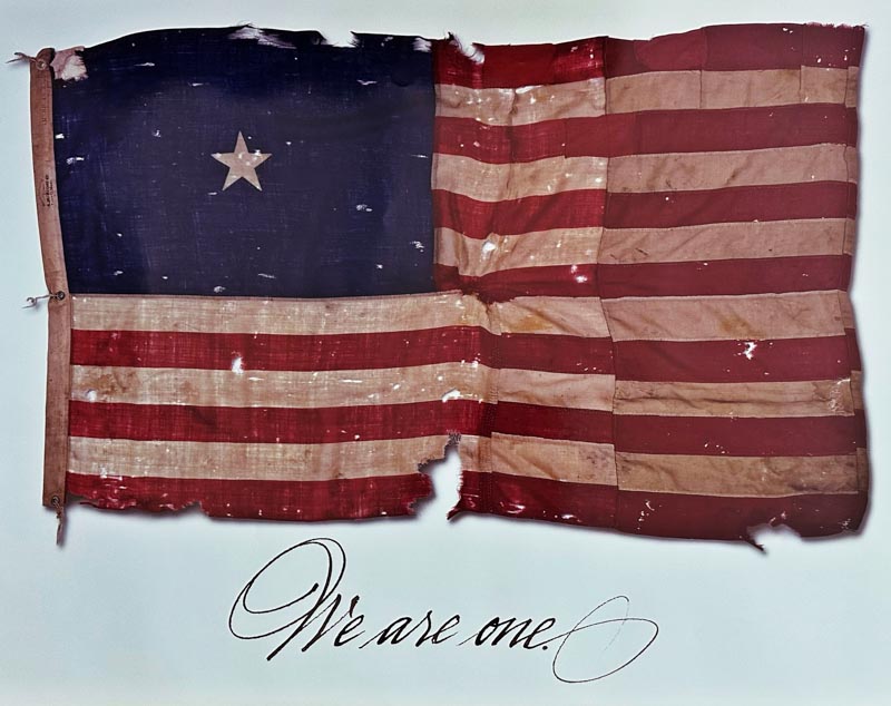
Poster design for The Richards Group, Dallas, Texas, 35 years ago.
And hopefully, finally, the reckoning of all Americans as we return
to some renewed semblance of humane gentility and togetherness.
That’s another story.
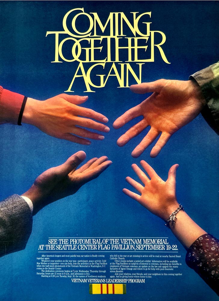
GIRVIN Vietnam Veterans Poster
It’s a story.
And, presenting to the AIGA Design community in Las Vegas—those selfsame narratives continue.
Designing for motion pictures is about listening, reading proprietary scripts in secrecy, studying the landscape of production design and shoot locations and—in the one medium that everyone is familiar with—the name of the film, this becomes an apex audience move of captivation. More likely, it’s the central point of merchandising or the “title” of the story.
And that’s a referential expression—“what story is that—you’re reading / listening to / telling?”
It’s…
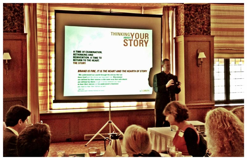
A RestaurantPoint presentation at The Coronado, San Diego
So, in a manner, this talk is about the exploration of story, research, craft and the lustration—the shining—which, historically, links back to lustrum, a ceremonial offering or purification. And that’s the work isn’t it—purifying the idea[l]?
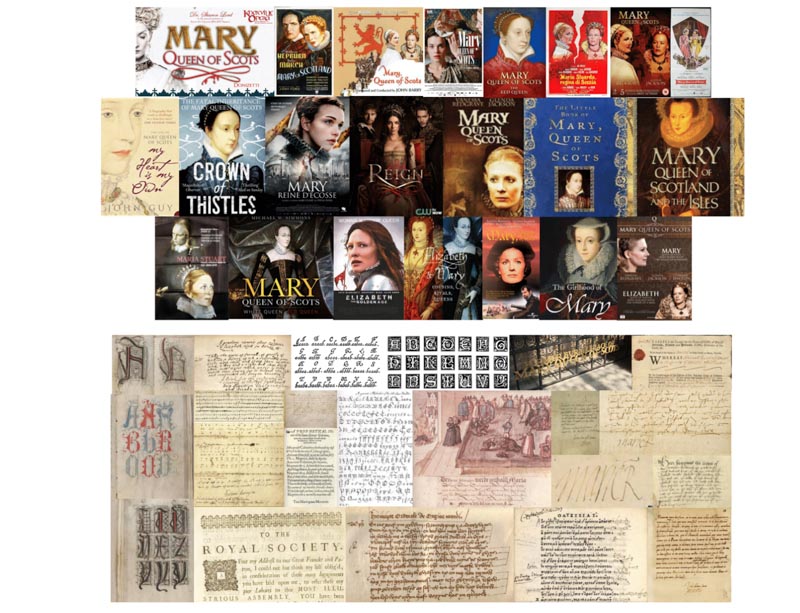
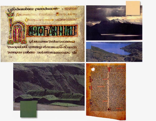
The core precept in this string of images—as I intoned in the talk—is the link-in to the landscape of time—the paleography of the period, the stylistic oeuvre of the narrative, the photographic framing, and production design. Of course, the celebrities, and their role in the premise of the arc of the plot.
Each sets a compass point, a sense of direction in approach.

Journals—portals of hand-crafted contemplation of arrangements: meaning, messaging, calligraphy and illustrations.
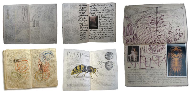
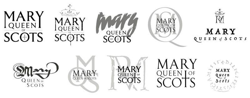
Research for Mary Queen of Scots
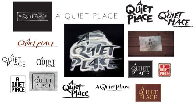
And A Quiet Place
How do you illustrate the characteristics of

?
Read the script in a
locked room, on Lot, to start.
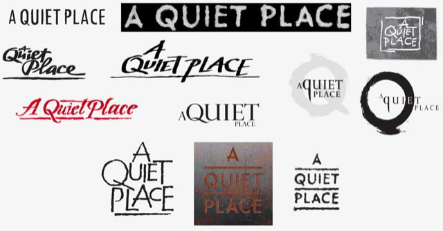
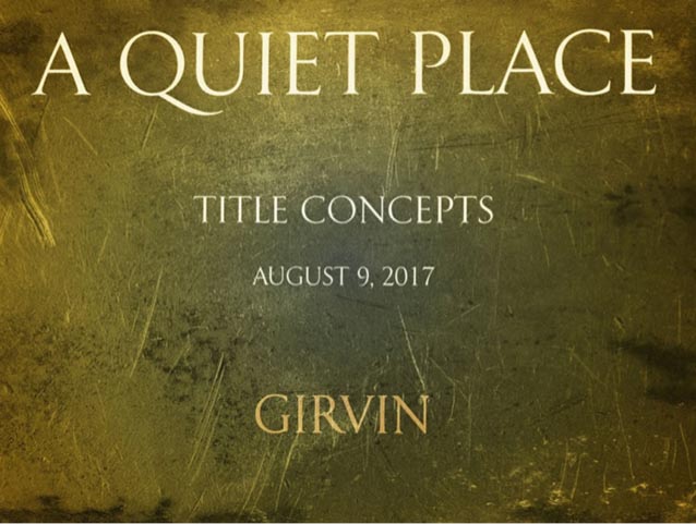
Could be that it comes out to the sublimity of classical restraint—
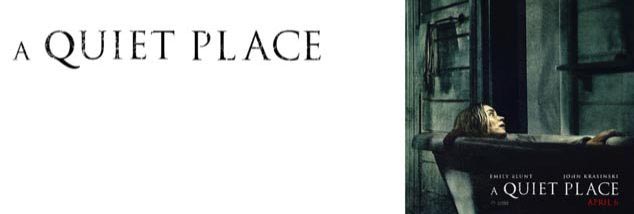
in this finalized pathway, a customized, proprietary font—we call it Girvalia.
There are several marketing interpretations of this launch.
Including font treatments that bear no resemblance to this 1st century visual perspective.
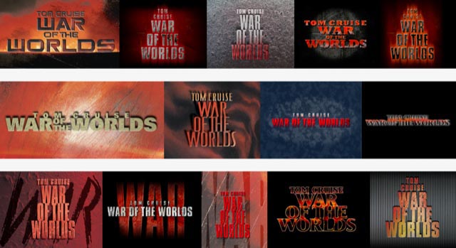
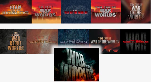
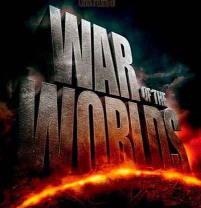
And what of an alien war, how could that be developed?
The journal renderings for Steven Spielberg and Tom Cruise,
delivered for discussion with the Paramount Studios production team
and studio theatrical marketing executives—walking palette and materiality.
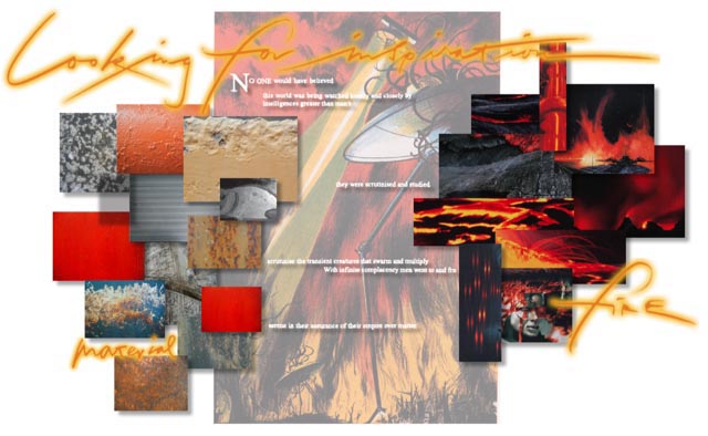
Preliminary look and feel renderings, gathered for discussion—a journal.
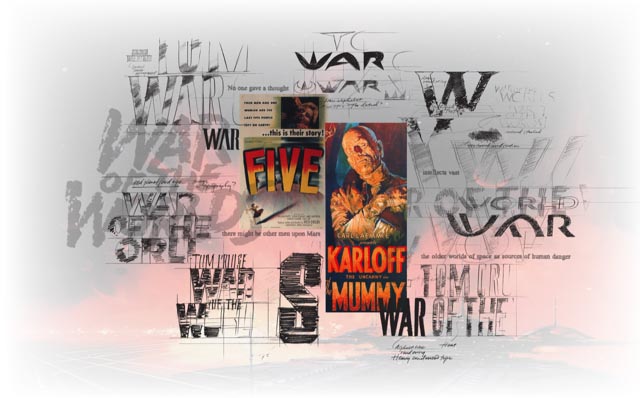
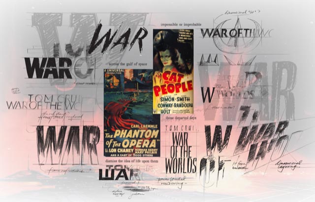
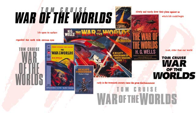
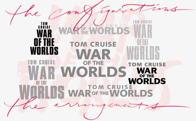
And materiality and dimensionalized renderings—still, the journal.
And, in all that journey,
what’s been,
evolves to the
what is.
What if one were to take that challenge and run back 200 years?
And in an entirely different aesthetic amalgam.

Working for Warner Brothers, aided by dozens of years of working in Asia, we were synced-up to work on this property with WB Studio theatrical marketing executives, again for Tom Cruise—who, too, we have history in supporting the marketing of his efforts.
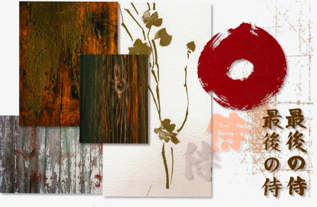
And with those characterizations in play—texturality, material intimations,
paper stock and traditional Japanese tools, coupled with
Western expressions in typographic history—the latter 19th century.
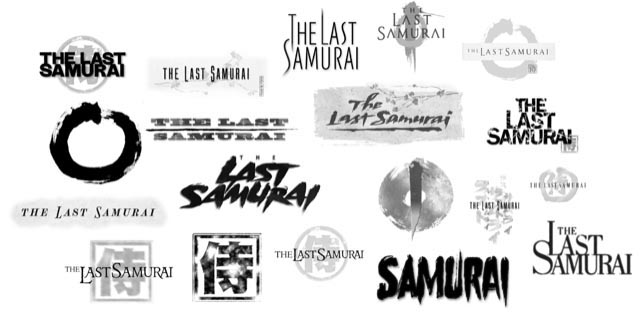
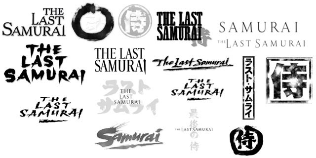
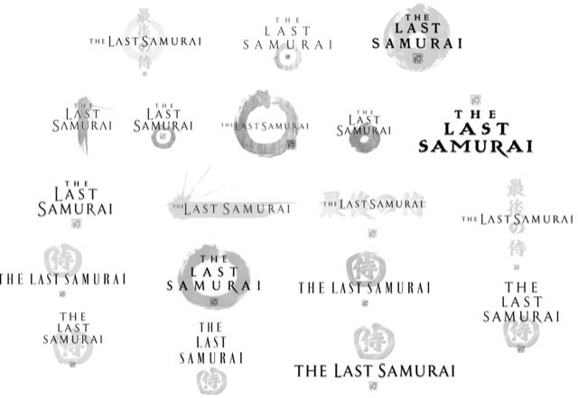
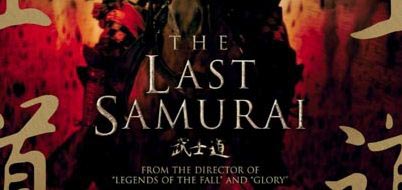
Coincidentally, for the director of the film, for Edward Zwick,
we designed his earlier efforts on “Legends of the Fall,” and “Glory.”
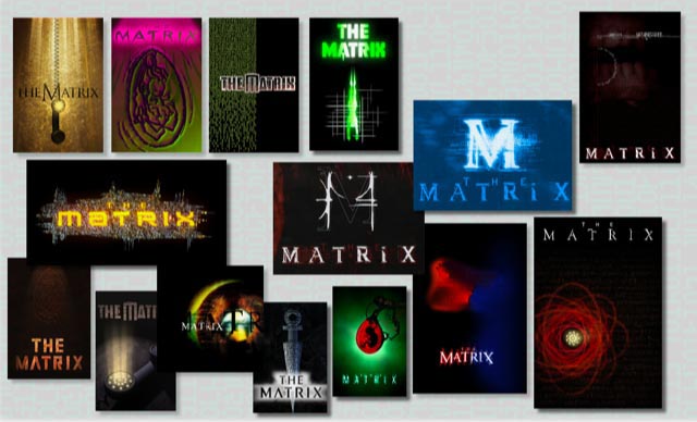
And speaking with the Wachowski siblings, working in Joel Silver’s office on the WB lot, just down the street from Clint’s Malpaso, and across from the Warner Brothers corporate tower:
so too—research, reading scripts, talking with the Wachowskis, studying storyboards, studying production drawings
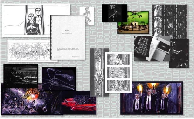
working with them onsite, on Lot, we walked around strings of ideas in live sessions—
as well as working remotely in Seattle, Burbank and LA, and too, Sydney, AU.
Typologies, monograms, devices and coded alphabetics—the rain of the Matrix code.
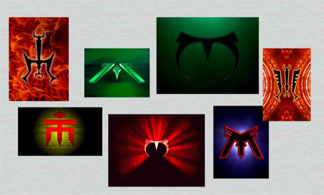
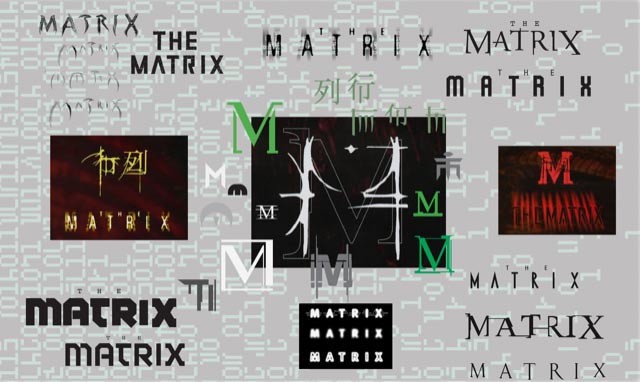
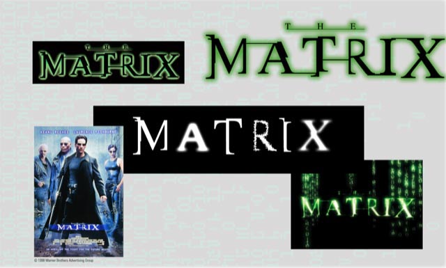
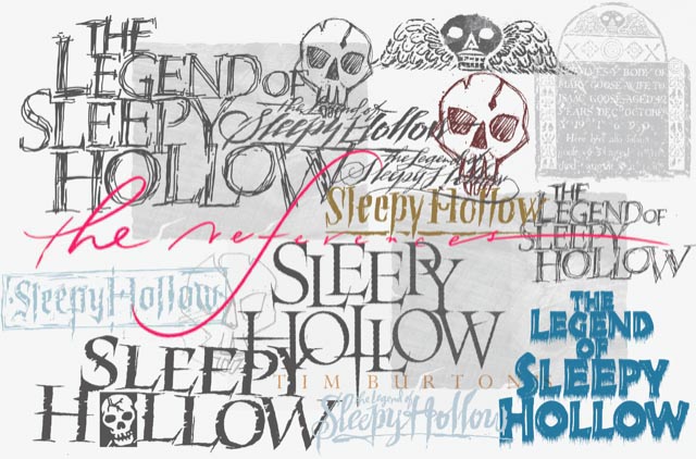
And more journaling, for Tim Burton. Period gravestones—
and the scripts of the period, production drawings from Tim,
and a scrawled emotional matchup—the 18th century.
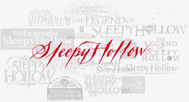
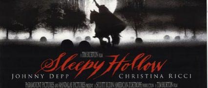
Time does tell.
And, to production planning, set design, digital environments—
working under the direct supervision of Robert Zemeckis,
walking around the perimeters of the film, and the presumptions
of 6th century paleography we gather palette, manuscripts and environmental constructs,
to draw a precisely-tuned, millimeter-by-millimeter rendering, with a symbolic, bejeweled sigil.
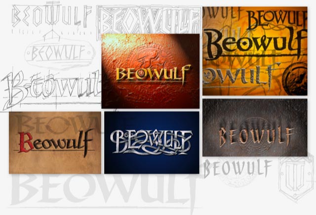
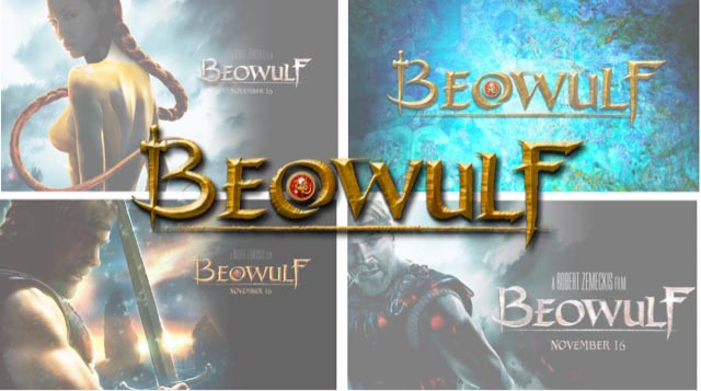
And in the spirit of lesson-giving, walking the notation of font work—
what art drives the detailing of the alphabet?
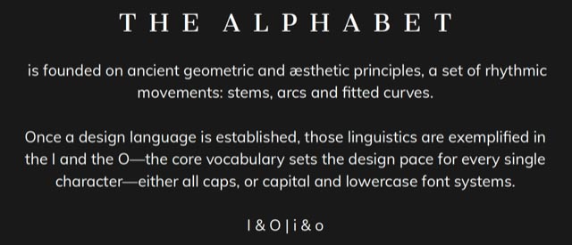
As I note in the talk, it’s the stylistic discipline of the I, and the O—the alphabet is a song of movements, a form-based design language and detailing.
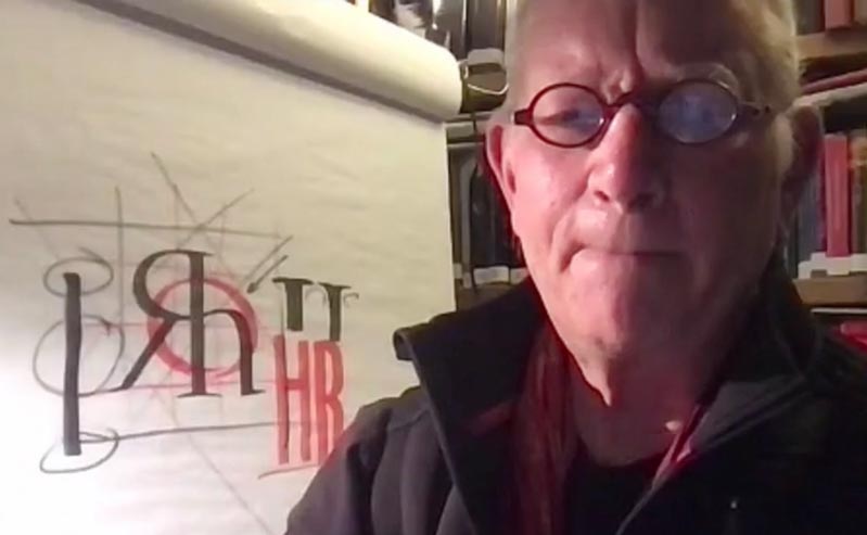
There is something, of course, to geometrical thinking—but, as Paul Standard, a calligraphy aficionado from NYC, noted, “geometry can produce legible letters, but art alone makes them beautiful.”
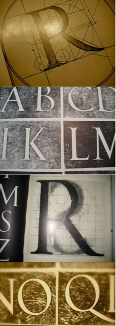
A base foundational commentary.
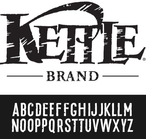
A handbuilt font for the Kettle Brand
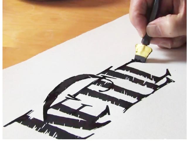
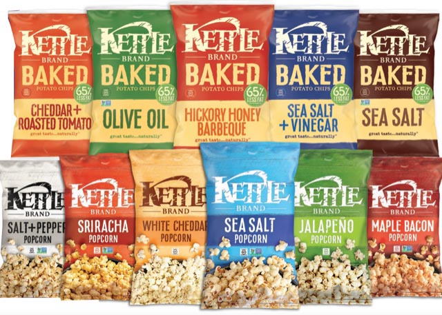
Hand-drawn, hand-crafted—a signwriter’s legacy [mine.]
I drew the Kettle logo in 1982, then returned more than three decades later.
In this talk, there was an event bomb—the founder of Kettle showed up—Cameron Healy arrived at the Zoom session—stories were shared, my early collaborations with Doug Osborne, the early drawing, then decades later, the leaned-down treatment.
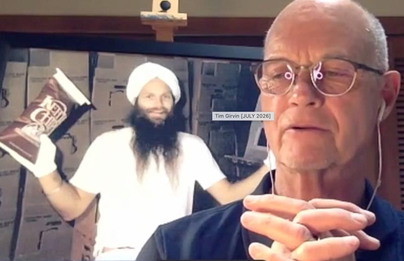
A series of moments involving touch—so voiced by mentor Lloyd Reynolds, when I was staying, and working with him at his home in Portland, as well as sitting in, and demonstrating my techniques in his classes at Reed College.
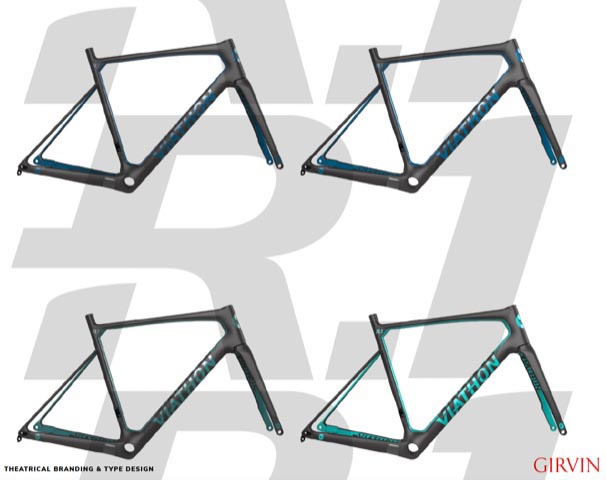
And a premium bicycle brand that we named and created for Walmart’s Viathon, the studies:
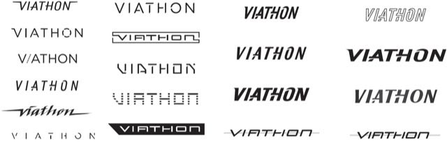
The master art.
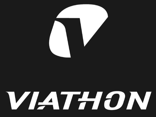
The font system for bicycle labeling.
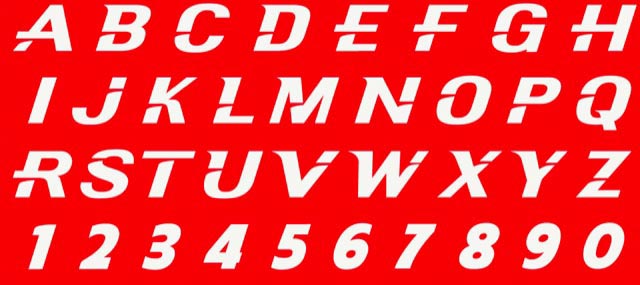


The core principle of alphabetic design lies in the characteristics of two core letters—the I,i and the O,o
define those four and the discipline of the expressions continue to mobilize in
the genetic qualities of the rest of the letterforms, including numerals.
A custom font for a Seattle-based, international pharmaceutical group.
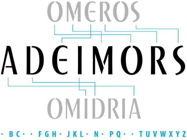
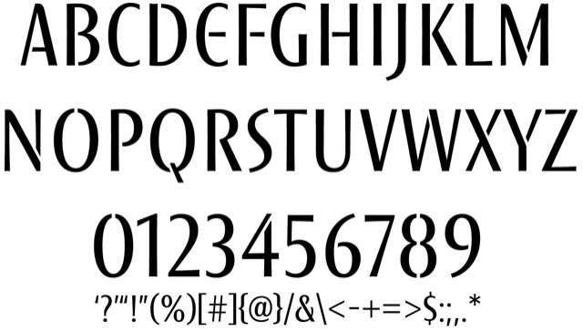
You might be wondering, what about more recent film logos?
I’ve referenced our dragon-related work, Godzilla, and Kong—and, too, Amazon Studios.
Other new custom fonts? Check out our work on Flow for Tom Roberts.
Looking forward to hear about your thoughts on font design.
Tim | Queen Anne | Office, Library, Exhibits
––––––––––––––––––––
Girvin | Osean | Tim.Girvin | Wanderer
Follow Us:
Facebook LinkedIn Instagram Behance
Promo created by LV | AIGA
Discover more from Girvin | Strategic Branding & Design
Subscribe to get the latest posts sent to your email.