
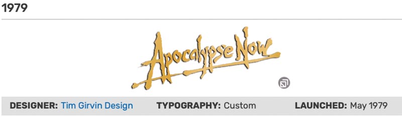
How to illustrate a story with letterform design.
My kickoff work on Francis Ford’s Coppola’s “Apocalypse Now,” began with a question: he said, [“can you send me some graffiti logos, I saw your work in U&lc.”]
I had no idea what he was talking about, never had done a “logo for a movie.”
I took out handmade Japanese washi, Mulberry made—brushes and drew up dozens of ideas—and shipped them all off. All the original art. Which then became:
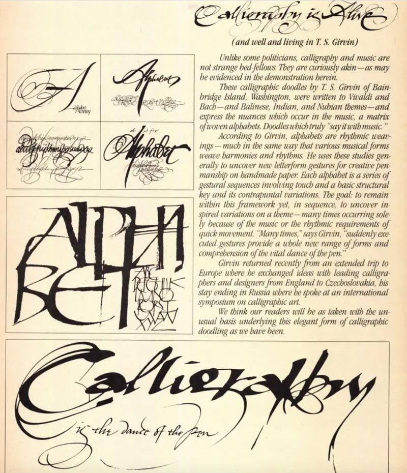
That was 1977—these published items were some demonstration scrolls that I sent to legendary designer, Herb Lubalin, CCO, Type Director and Editor in Chief, U&Lc. Magazine.
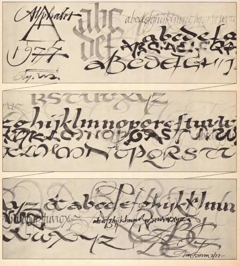
I used to draw these scroll-treatments to music as a demonstration for my students—drafting the alphabet in a structural rhythm that was cadenced to style and culture to the music, Arabic Oud, Balinese Gamelan, Spanish Flamenco, Japanese Koto and the Italian Antonio Vivaldi—and with this different music, the rhythm layers different alphabets, drafted with varying tools—brushes, markers and bamboo sticks.
And these characters speak the language of sound, and the rhythmic vitality of the alphabet. The scroll, shown above, was drafted in a class session with various tools on butcher paper, was about 30’ long.
Another spread, below, and the story—along with some other alphabet demonstrations.
That intro led to Apocalypse Now—1979,
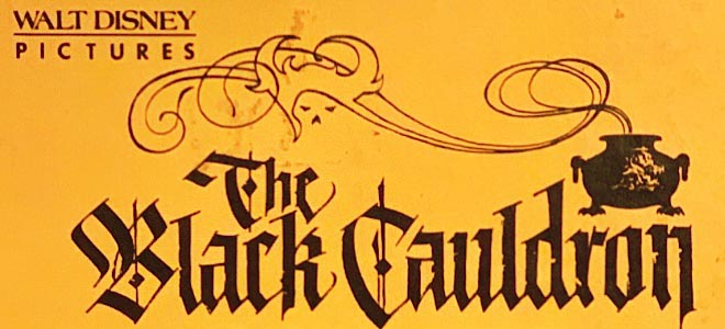
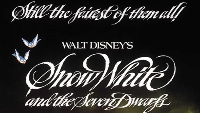
then another call from the team at Disney’s Theatrical Marketing
to work on Black Cauldron,
And Snow White.
I began a wondering wander around the entire motion picture scene in Los Angeles—working for, and in, the major studios, Columbia, Disney, Paramount, Warner Brothers, Universal—I was also working for a string of agencies in LA, particularly around consulting on logos and systemic typographical design.
A key foundation was my collaborations with Tony Seiniger and his teams, at Seiniger Advertising, a real legend in the industry. Working with him on dozens of projects, many of his employees went on to creating their own agencies—and I was called-in again.
Still, I was an outsider in the era of faxes, USPS, couriered deliveries, and overnight shipments. I was a ronin—I’d come in on special projects, work on site—LA, or designing in Seattle. And sometimes even flying-in to LA, Anaheim, or Burbank to deliver, by hand, project art.
But I kept circulating—making my way around, presenting my work in a metal portfolio that weighed around 60lbs—11×17” laminated sheets. I sewed a carrying case with a shoulder strap so I could lug it from one studio to another.
I still have the portfolio.
What I pitched was distinction—and diversity. As a long-running student of typography, as well as paleographic history, I developed a sense that the best work was distinguished in a complex litany of detailing—never, alone, the mere “typesetting” of a title, or any logotypography, for that matter.
Research helps.
But I always consider the careful adjustments of individual character scale, kerning—lettering distance, and leading—the character of the stacking alignments, line to line, in the designed narrative of a typographic rendering.
Any selection of a core font has impact—its key rulings would be:
Is this functional as a systemic font—capable of integrative expansion? Can it be extended as a brandcoded element of the holistic experience?
Inspired by the first century
For example—this grouping could be said to relate to more classical traditions of letterform design, the epigraphy of Ancient Rome—but still, not one of these GIRVIN typefaces is, one—the same, or two—without customization and detailing.
The gift of time and the indices of style
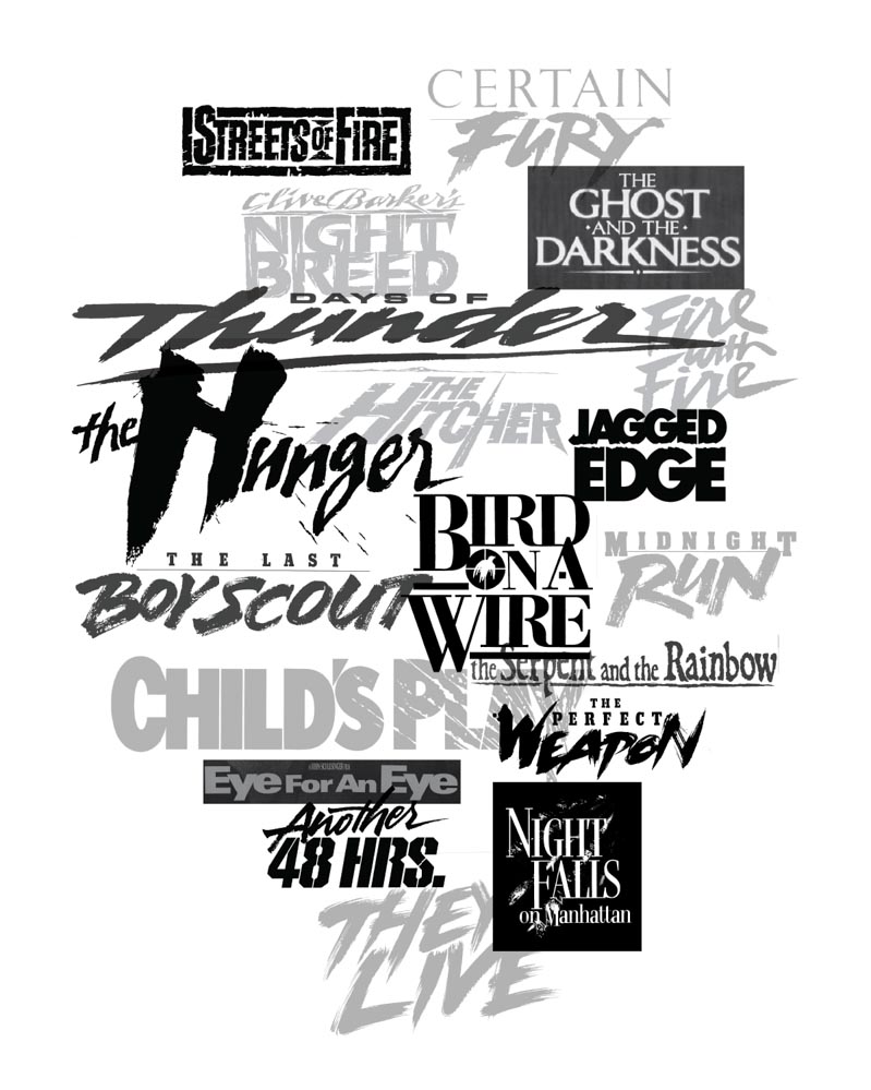
This group of illustrations relates, more particularly, to aligning typographical period, or the paleography of letterform history to synchronizing time, place, meaning and memory to lustrative expressions. That is, the ritual of design offers presence—and, in many instances—it’s the first stake in the ground for experiencer revelation. Most viewers know, or experience, that “idea” of the motion picture in the logo.
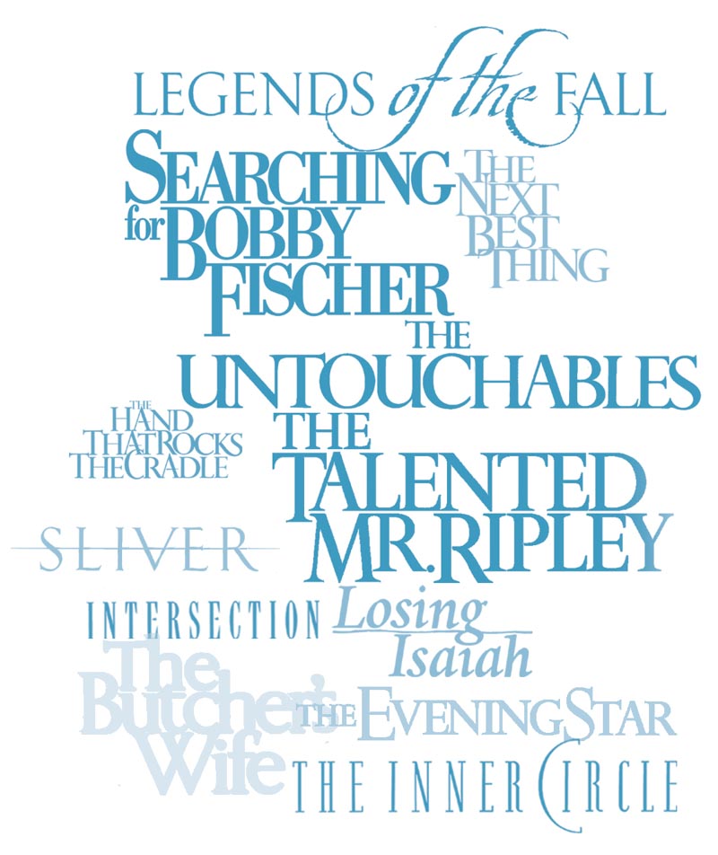
Celebrity branding and motion picture identity
There is another challenge to movie logo design, particularly in the weaving of celebrity and movie titling, it’s our thinking that they should be stylistically integrated.
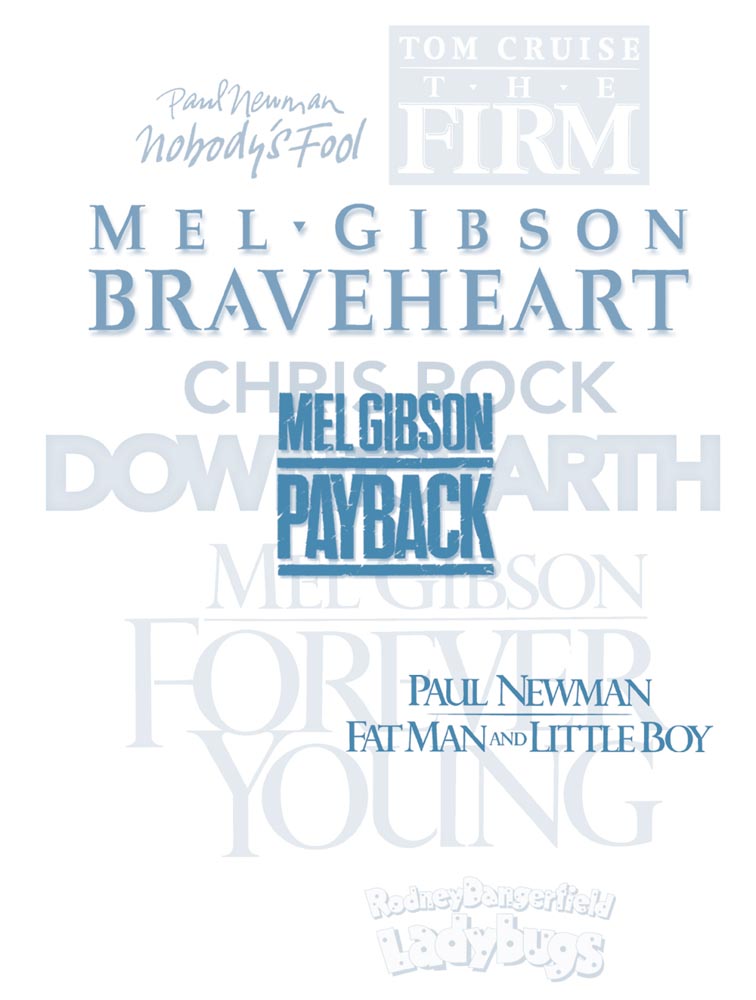
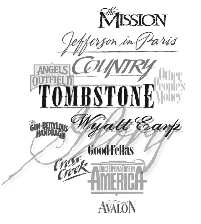
The intimation of action
Sometimes, the capture of drama, action and energized portrayal, even in the intermixture of stylistically-balanced logos and their narrative, is a matter of layering and the interplay of—in some instances—contrastive evidences.
The strategic branding and design lessons would be—
for design thinkers, and creative activators:
Think of your story.
Ask yourself, your Brand team, community impressions or known audiences, “what’s your story, who’s telling it, what’s it sound like, feel like—and most critically, who cares?”
Answering each one of these queries will help set your creative strategy—and likely, you do this already.
Time and place
While this is a common point of analysis for me, it might be something for your review, as a designer, in building solutions—“what’s the history of the story, where was it made—this story, what’s it location? Provenance, and the spirit of typographical history—the geology of the time’s typography—is a detail for consideration.
What’s the media?
While it’s been suggested that print is dead, this is an unlikely premise—not every single point of community connection actually operates on a power source. There are plenty, many, exposures, that are print-related, so understanding the scaling of your media applications are important to frame. For example, what if this is a sign—where does it go, what is it made of, how is it attached? And scaling—how well will this treatment work at the larger scale of billboards, marquee applications, standees—and still functioning down to a 1/4” rendering in newsprint?
Diversity of format?
What happens if the design needs to be single line, or stacked—thinking through the multiples of formatting is an important tactical plan, and allows for extreme horizontal rectangles, as well as square or vertically-arrayed rectangles.
The details of the typography
Considering scale, it’s appropriate to examine the use of stenciling, letterform joints / ligatures, kerning character and their survival as recognizable artifacts in massive, or micro, applications. For example, in some instances, you might need to build in “light-traps” in the lettering, which allows for these delicate details to be perceived in the smallest applications, and—non-digitally—how they might work on various print surfaces. Worth strategizing, as well, is the notion of press-type and impression media, for example: engraving, letterpress, stamping, embossing and debossment—where an actual metal punch, or foil-related uses of film media for color.
Actualization of the read, and the reader
While we, as designers, like to play with the visualizations of letter-formed ideas, the key is that the fast read is still critical. And it’s a watch-out for any lettercraftsman to ensure that the working result can be seen, grasped, comprehended and embraced.
Protectability
Generic font renderings are less protectable as distinctly unique graphic expressions. In detailing copyright and trademark registrations with the USPTO, the more customized and discretely made solutions are—more memorable, and more definitive as recognizably unique. And registrable.
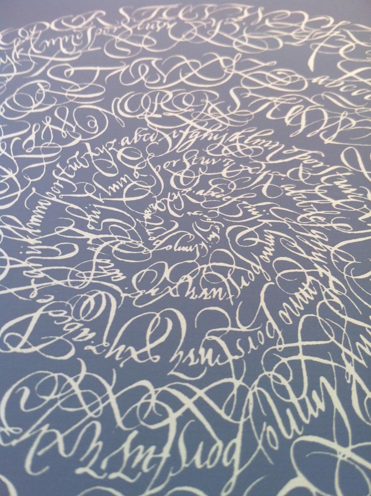
Calligraphic Mandala
San Francisco Public Library | Alphabet Alchemy poster and show
At the Richard Harrison Collection
My Dad once said, “Hey Tim, it’s getting so I can read any of your work anymore…”
He was referring to the wilder shores of my calligraphy,
but I never forgot that remark—
and now, a year past his death,
it still holds.
Another, performance media—design that crosses over from idea, execution to live expression.
Think about the work, all-in, defined as an onliness factor,
as Marty Neumeier has expressed.
Could the solution be an
“only made here” solution pathway?
Tim | Osean Studios
Come. Co-create. Collaborate. Connect.
GIRVIN | Strategic Brands
Design for Hollywood
––––––––––––––––––––––––––––––––––
Follow Us:
Facebook LinkedIn Instagram Behance
Listen, find the story, capture the energy.
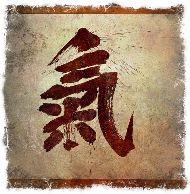
GIRVIN’s Ch’i Calligraphy
Discover more from Girvin | Strategic Branding & Design
Subscribe to get the latest posts sent to your email.