Frango
The Challenge
A Classic Reimagined
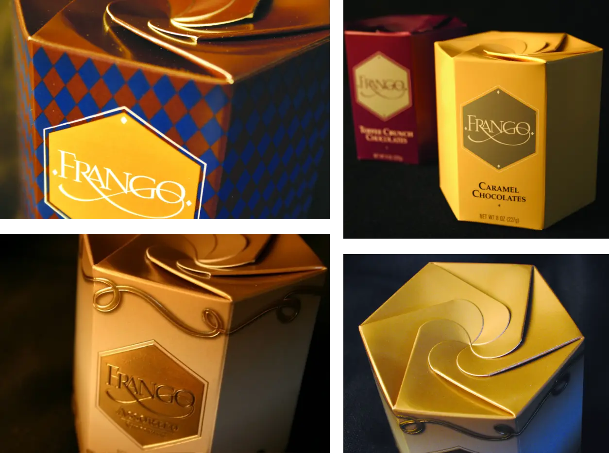
Frango had a varied look—one in Chicago at the Marshall Fields department store, and another in Seattle at its flagship and creative point of origination, recipe and production. Its packaging was generic, a conventional rectangular box, not exemplifying the luxurious quality of the complex flavor of the Marshall Fields chocolate production—which was founded in recipes from the early 20th century at Frederick & Nelson, a “carrier trade,” upscale department store in downtown Seattle.
The Solution
Grand Geometry
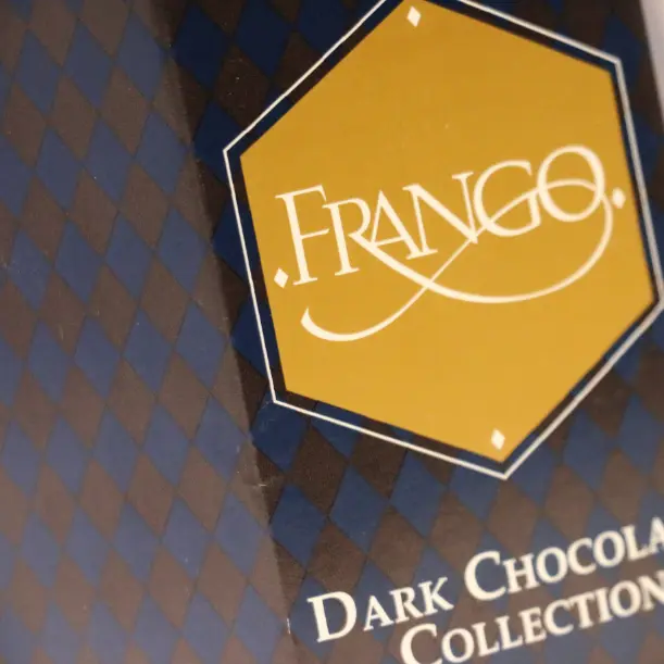
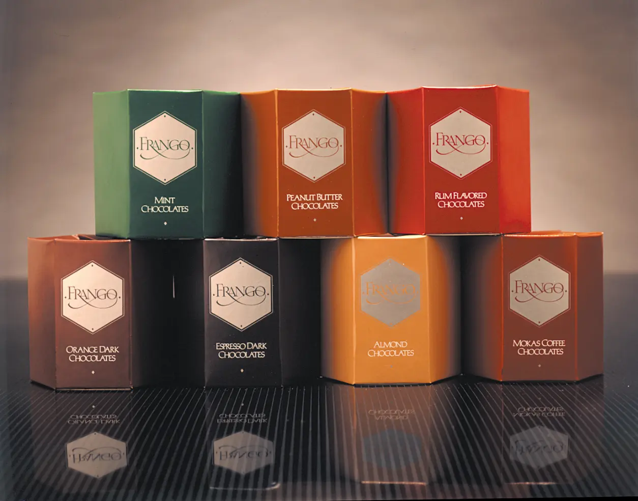
GIRVIN was hired by the leadership team of the F&N to design a new overarching brand program for the department store, as well as re-envisioning the Frango Chocolates brand. Our team conceived, with Container Corporation of America, a new paper engineering and recognizable, stackable and geometrically self-fitting, shelf-display premise founded on the hexagon and a iris-like folding mechanism for containing the chocolates. This product packaging is widely available in the Pacific Northwest, as well as select US locations.

“
Fantastic work to develop a logo that our leaders and others throughout the company really like. We’ve been very proud to reveal it to our colleagues. You definitely set us up for success and gave us a new mark that will last for the coming years”.