
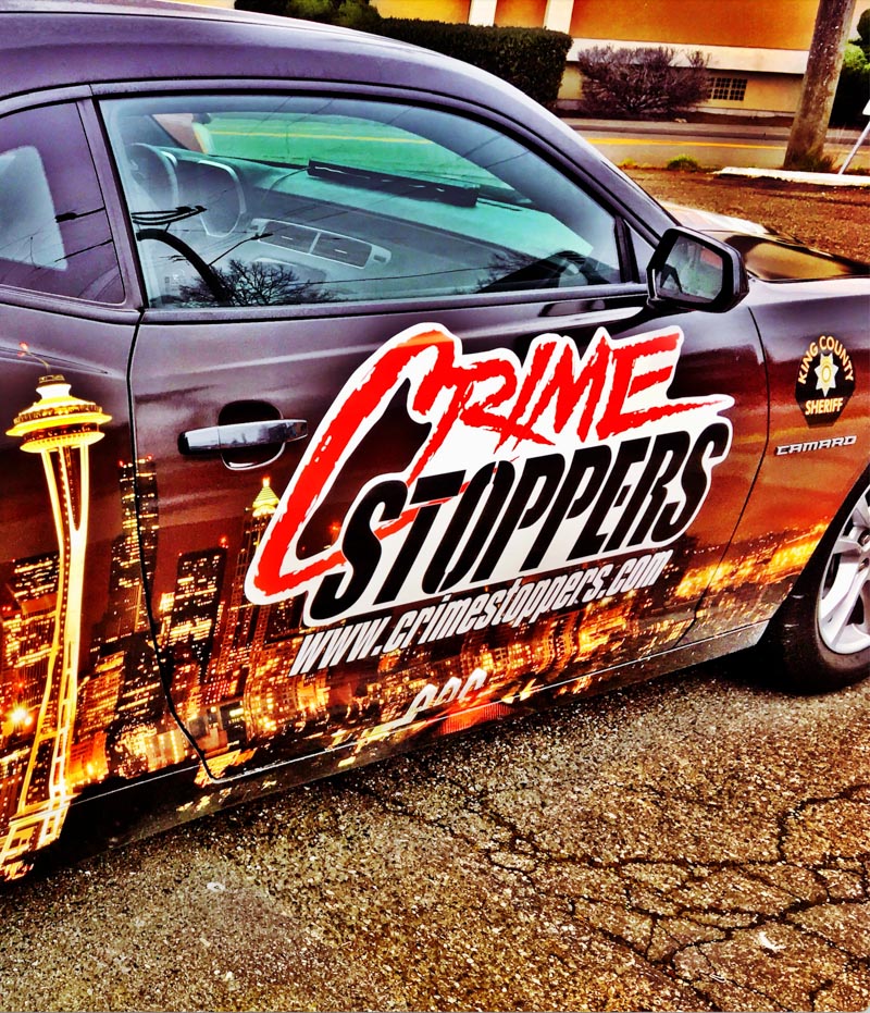
The world of brand strategy, and design, extends to crime-fighting.
GIRVIN’s bespoke brand design of Crime Stoppers.
In our history, we’ve consulted for various police agencies, patrol and security groups, building brands around protection of assets, people and their communities. It takes a particularly assertive sense of presence—something, as a brand that is, shall we say, gripping and powerful.
Things go around, and they come back, like GIRVIN’s donated effort for the branding of Crime Stoppers. I designed this logo earlier in my career; and I’d forgotten about it, then it came back in the form of a King County Sheriff promotion with Burien Chevrolet.
I designed the Crime Stoppers logo within a particular strategy, almost as an archetypal expression—an illustration of crime—counterposed with stenciled, customized and condensed italic font as a leap between an almost graffiti-like impression
and the assertion of assertive counter action—the fight against crime.
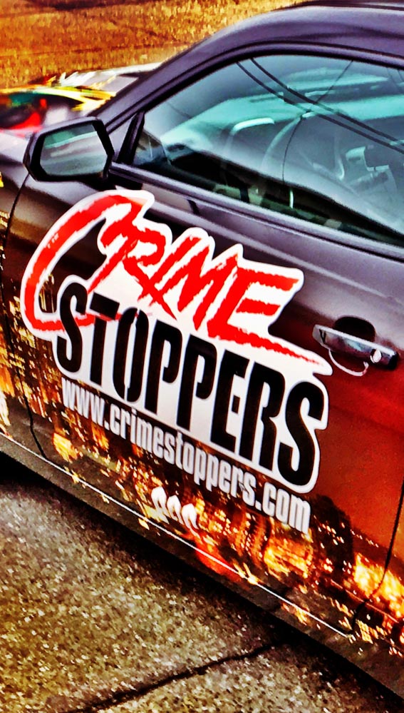
Courtesy of Jim Fuda | Public Safety Advisor
CrimeStoppers is a community-focused, not-for-profit organization, actualizing the ability for community members to offer tips to the local police, which provides crucial insights in many instances that offer answers to cases under investigation. Fuda’s leadership has expanded CrimeStoppers to global missions in cybercrime, human trafficking and terrorism.
What I know about crime-fighting leadership in US scenarios—is in a sequence of conversations— with deputies, sheriffs and police in both rural, urban and international discussions. And sitting with a US Sky Marshall on a flight talking about agency architecture and enforcement hierarchies.
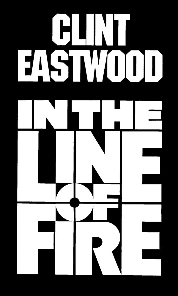
There’s branding history in our enforcement, justice-serving and protective agency-related work—particularly our theatrical brand design and motion picture work, particularly in the crime-fighting genre, like our design programs for Eastwood’s US Secret Service profile in “In the Line of Fire.”
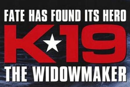
Or, to the nature of crisis-based international containment
in GIRVIN’s logo design for “K-19, The Widowmaker”
in the nuclear failure of a Russian submarine.
In another Harrison Ford performance, crime protection narrative, with Tom Clancy’s Jack Ryan
premise in “Clear and Present Danger” I designed this logo for producer Mace Neufeld.
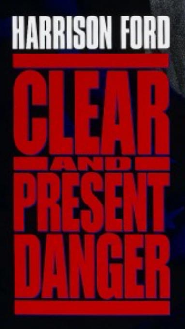
Working with Tony Seiniger, as well as Paramount Studios executives Arthur Cohen and Nancy Goliger,
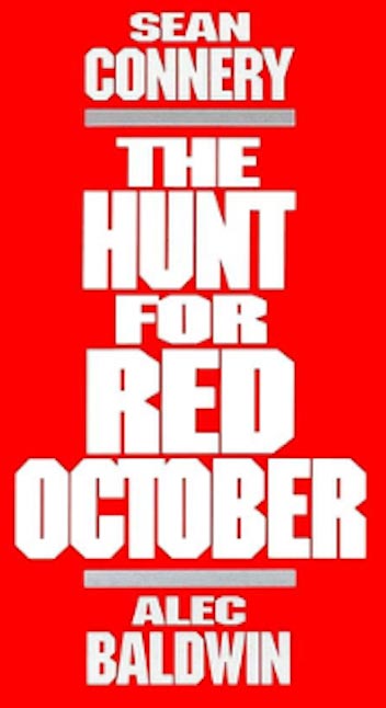
I designed other Tom Clancy Jack Ryan logo narratives, analysis and “protection”—and here the storytelling
again speaks to bold customized font clustering—a statement of urgent, thriller-based typographical illustration.

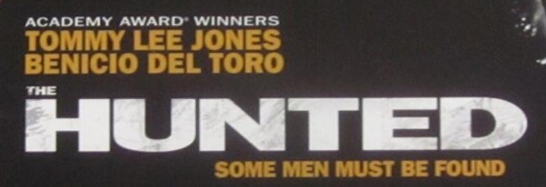
Working with William Friedkin and the team on the Paramount Studios production of “The Hunted,”
a sheriff’s hunt for an expert criminal, I designed this logo as a compressed, bold statement of action—
the surface treatment is distressed in keeping with the tensile tenor of the production.
Speaking of global adventure, espionage and “crime-fighting,”
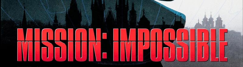
in our string of logo designs for Paramount Studios’s Mission:Impossible series—
which we began at M:I:I—
we set out to define the design language for the series,
which the standard to this day.
Bold plays out, the message is dynamically large and masculine.
And we worked from the early studies of complete titles
[i.e. Mission: Impossible | Merchant of Chaos]
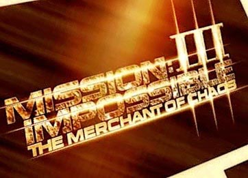
towards the development of a typographical design language and styling.
This is the third in the series, combining complete title, as well as a monogram numeration.
A custom font systems, designed by GIRVIN’s team, with discussions with Mr. Cruise evolved towards angled, condensed
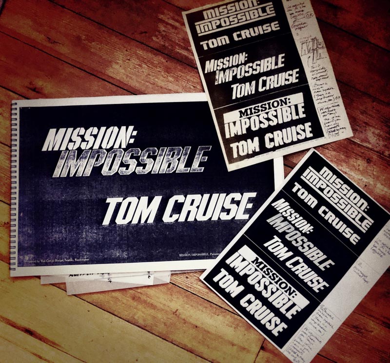
And, over time, evolving from fully articulated titling treatments, as noted above in the Mission:Impossible | Merchant of Chaos—to a monogrammatic compression, the crime-fighting brand tenets hold true. The monogram was actually Tom’s direction, after seeing some other monogram-related work that we’d done.
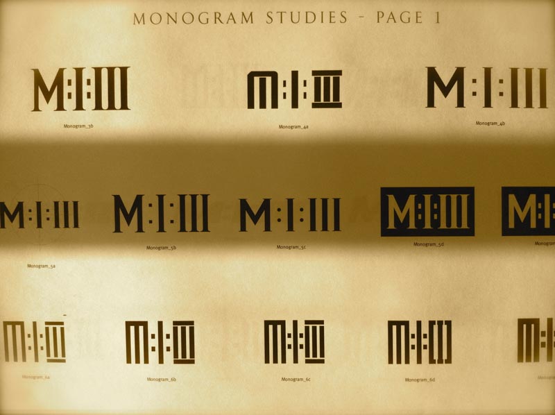
You’d note that all of these treatments speak
to a bold brand design assertion—pushing hard.
Appropriate to the subject, the expert fighter, the skillful protector.
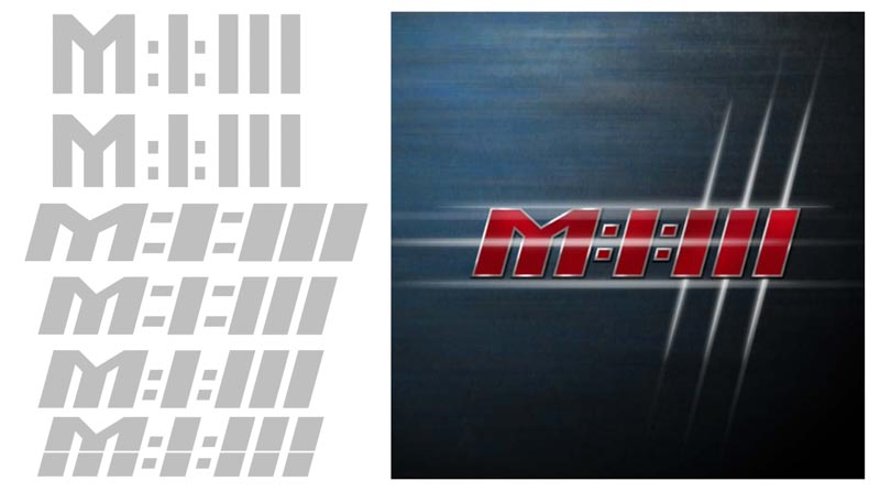
Such would be the nature of crime-fighting,
grit on grit.
Even in an upscale, corporate interpretation:
I designed the logo for Cruise’s portrayal—and pursuit—of criminal,
law-firm racketeering monopolies—in Paramount Studios film “The Firm.”
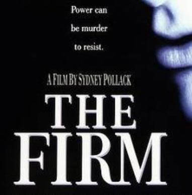
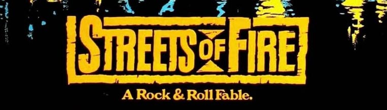
Working as a designer on Walter Hill’s theatrical logo for “Streets of Fire,” which is a redemptive mercenary narrative,
plays to a rougher vocabulary. My logo strategy and execution aligns with the styling of David Reneric’s poster art direction.
To the so-called Stargate protocols of “surveillance” storytelling a troubled,
if not a felonious, FBI agent, and his attempts to capture a serial killer,
I designed the logo for “Suspect Zero”—
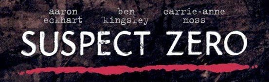
here, the illustration is diaphanous, ghostly and layered—speaking to the illusion of “remote viewing”—to capture an elusive criminal.
I designed this working with Kirsten Conran and her team partnering with Paramount Studios leadership.
My logo grouping:
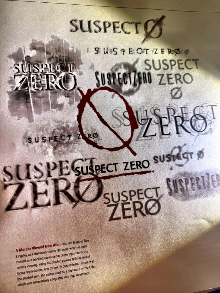
To a contrastive legacy, there are other GIRVIN motion picture logos that speak to a different telling.
Another crime-stopping team—our logo design package for Paramount’s “The Untouchables,” the legendary story of Elliot Ness’s Prohibitionary bootlegging bust.
This is a GIRVIN custom typeface—a hand-drawn variation on Eric Gill’s lapidary font Perpetua.
I cut the kerning to a locked-up line of titling story—a classically disciplined narrative—packed as a sinuous unit.

And, to the contrary of crime-fighting, protection and security, there’s the other side: crime creation. This design package, my logo drawing for Good Fellas, is a redrawn and rebuilt Bodoni—hand-sliced and condensed, stacked and packed as a message—a design solution that almost intimates cruelty in a precisely incised elegance—peculiarly upscale, this is GIRVIN’s rendering towards a Mafiosi depiction.
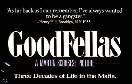
People are captivated by the notion of crime, the dark-side of humanity, the rule breakers,
the other—and the stories about these people in action is a source of endless historical fascination.
“Why did they do that, and how did they get caught?”
To the quest for goodness and the banishment of the wrong, the evil, and chaos in the darker side of the human equation—who works against that tide, how do they work, what do they do; and what can we do? What could we learn?
Every one of these projects runs both to the directly illustrated—“yeah, that’s crime for ya,” to the more abstract and subtle insinuations—intimations of expression—even upscale, more precisely disciplined lines of action.
Such, the illustration of ideal and context in the nuances of
language, the alphabet, the detailing and their arrangements.
Tim | GIRVIN Queen Anne Studios
––––––––––––––––––––
Girvin | Osean | Tim.Girvin | Wanderer
Follow Us:
Facebook LinkedIn Instagram Behance
Discover more from Girvin | Strategic Branding & Design
Subscribe to get the latest posts sent to your email.