
Omeros
The Challenge
Visual and Scientific Advancements
Omeros Corporation is a biopharmaceutical company advancing a pipeline of product candidates for use in orthopedics, rheumatology, urology, cardiovascular medicine, ophthalmology, pain management, and neurological disorders. Beginning in the 90s, GIRVIN has partnered with Omeros leadership in advancing their brand through visual solution strategies. Working with the founders, GIRVIN supported the building of a wholly new concept for pharmaceutical healing.
The Solution
Design From Beginning to End
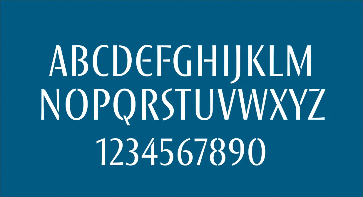
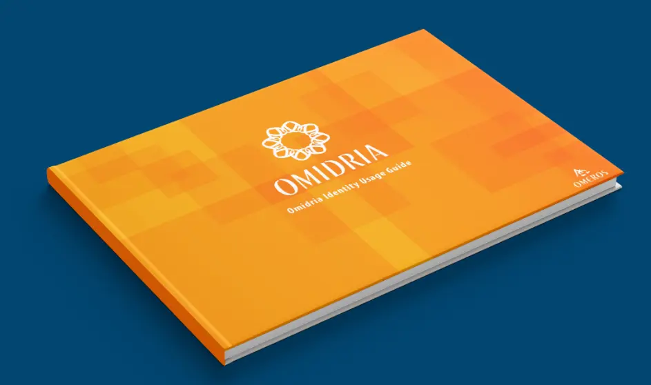
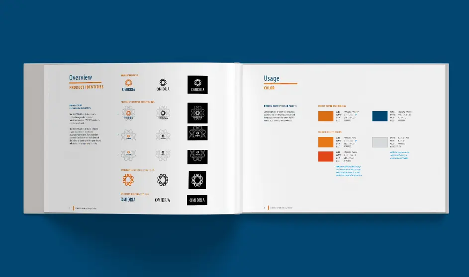
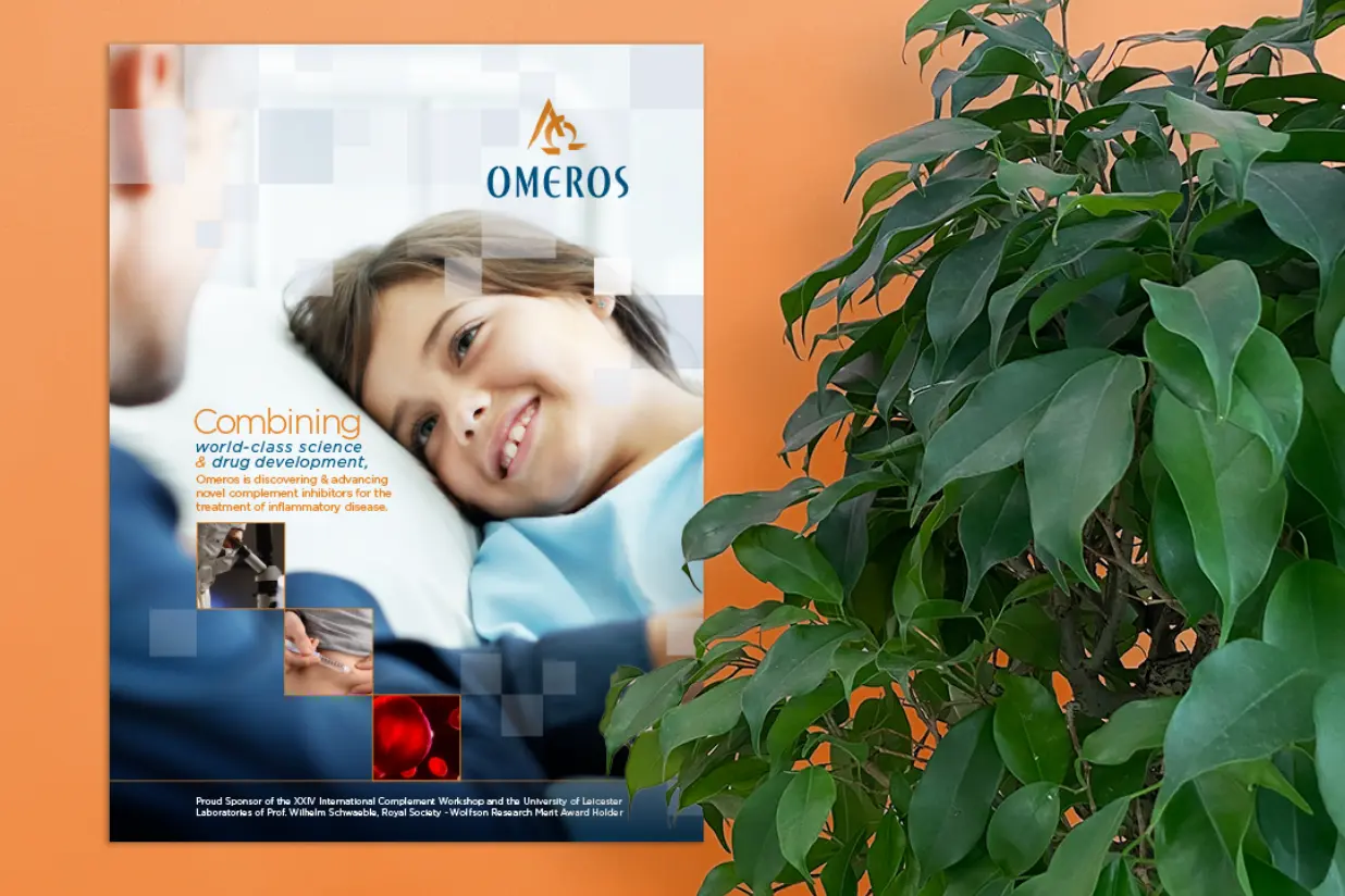
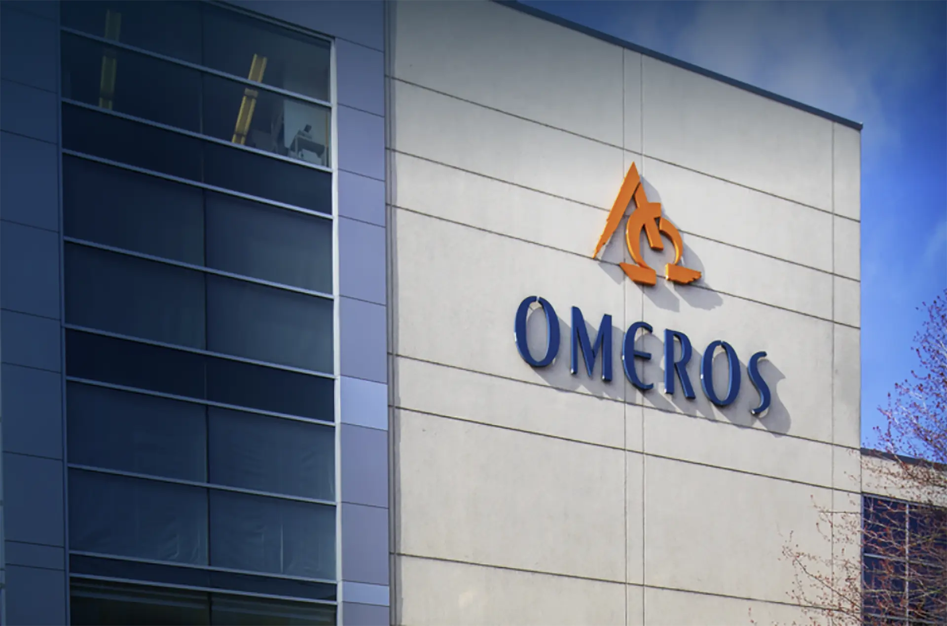
Our team offered visual solutions for strategy, storytelling, and messaging concomitant with creating product offerings. We focused not only on the tactics of the products in development, but on the very character of the brand itself and the philosophies of its research, testing, and future offerings to market. The CEO’s Greek background became the foundational character for the Omeros brand, resulting in our design of the Alpha-Omega logo and influenced our design of the logotype’s letterforms. We extended these letterforms into a full typeface, the Omeros alphabet—which we then applied to the logotype and icon of their sub brand, Omidria. The Omidria mark is a floriated symbol made with a layered O pattern, which looks like the iris of an eye. With the brand language established, we applied it to designs for the website, signage, brand guidelines, and marketing and print materials, including several annual reports.

“
The Omeros and Girvin collaboration extends back to the very beginning of our development, literally a decade back, as we first began to formulate our research and product development. Tim and his team have been with us since the very start – like partners, responding to every new evolution in our modeling – to create our identity, collateral, presentation materials, investment overviews, legal documents and our site. Great story, great work, great collaboration!”