What goes around, comes around—
youthful lettering dabbles becomes a full time career.
In GIRVIN’s history as designers for theatrical marketing and advertising,
we’ve got legacy, a heritage of literally hundreds of motion pictures —
starting with kickoff logo studies for Francis Ford Coppola’s “Apocalypse Now,”
to nearly 400 other logos over time.

As a renegade design consultant [not having an office in Hollywood,] we come in as specialized design resources for directors, movie stars, production designers and motion picture studios. That led to direct alliances, first-off, a key mentor, and theatrical designer extraordinaire, Tony Seiniger, along with select advertising agencies and key talent to work on films.
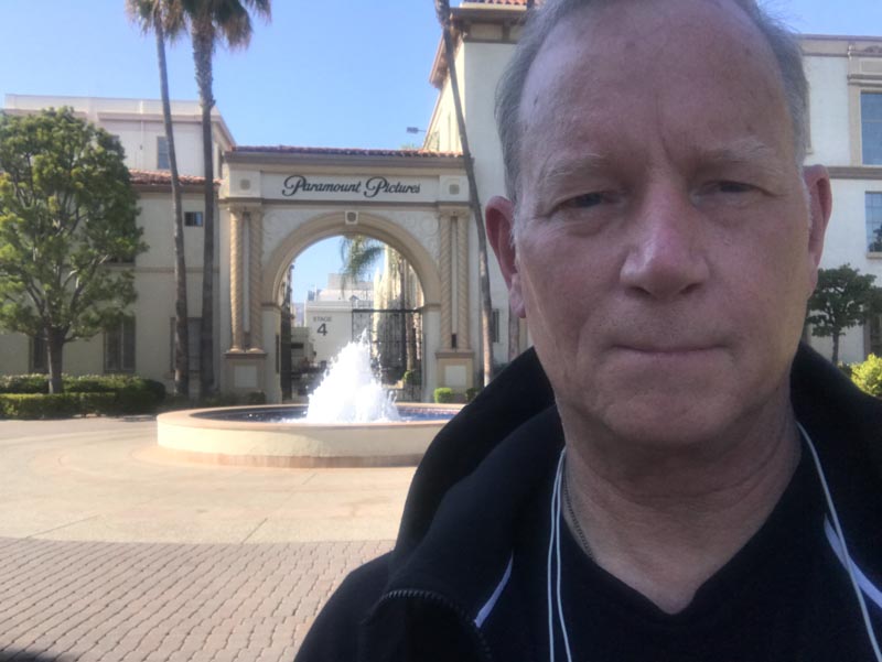
My own history is meeting with film production teams at the Lot or shooting location. Much of my earlier career was at Paramount Studios, where, for years, I was working on Paramount productions, with Arthur Cohen, Nancy Goliger and Lucia Ludovico, later with Michael Oh and Rodd Perry, along with project-relationships with Tom Cruise, Tony Scott, Don Simpson, Jerry Bruckheimer, Eddie Murphy,
Robert Evans and Mace Neufeld.
This was a talking sequence, a listening, a conversation– “this is my vision for the film, here are my storyboards, my production sketches, here is the set design, this is where I’d like you to go, after you read the script.”
These discussions are fascinating—it’s inspiring and curiosity-riven, listening and learning about theatrical dreams and envisioning narratives.
And, how, in my instance, to illustrate them.
The work in this marketing space—working on movies—came as a point of questing on new project types, fresh explorations, and linking-up early in my career, the late 1970s and early 1980s on movie logo designs.
I was as shocked with my first call from the
office of Coppola’s request for graffiti renderings of the concept of “Apocalypse Now,”
as I was in a call from
Clint Eastwood, decades later, the narrative character and redemptive
values of the story arc, its deeper emotional symbolisms in
the thematic intentions of “Unforgiven.”
Mostly, it’s about research, study and digging-in,
Digging into the story, reading, asking questions—
and listening to the film’s production team and actors.
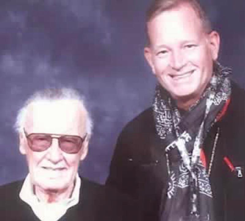
Like my earlier forays with Stan Lee, Nancy Goliger and Lucia Ludovico before their retirement from Paramount Studio’s advertising offices—“how could you transition the legacy of Iron Man to a major motion picture series—what would the design strategy be, syncing-up Marvel—with Paramount Studios as the lead producer on the series?
Bold, illustrative, industrially textured—not slick.
And that’s how it played out.
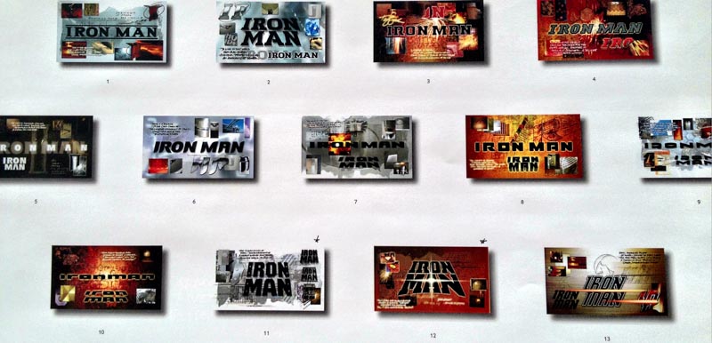
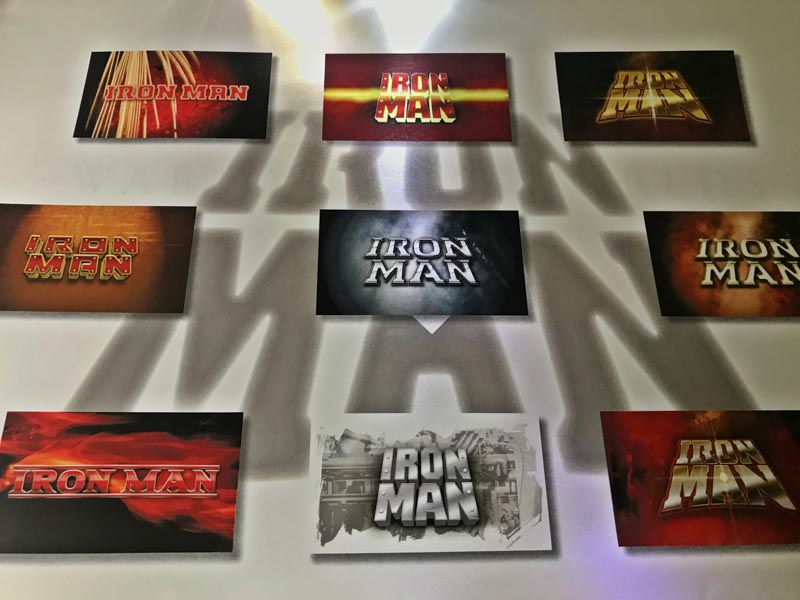
I had history with IronMan—as a young enthusiast—of the “scientific legacy” of Tony Stark.
I studied the art of armor, in a collection review at the Metropolitan Museum of Art—
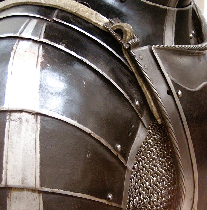
I built that into my presentations, and design studies.
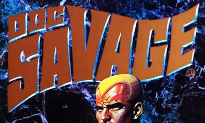
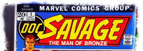
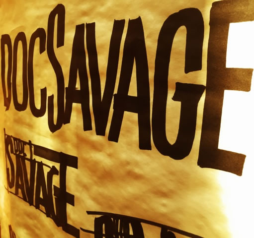
What I did then, and what I’d consider now, in studying logo solutions for “Doc Savage.”
Look into the legacy, and I would be to reach back to foundational material.
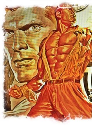
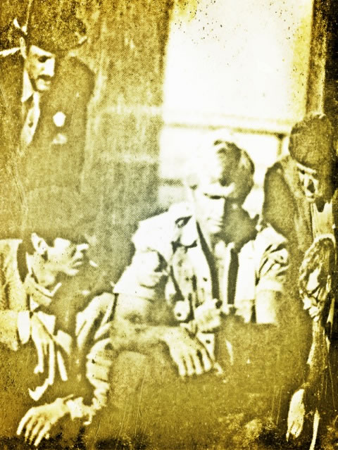
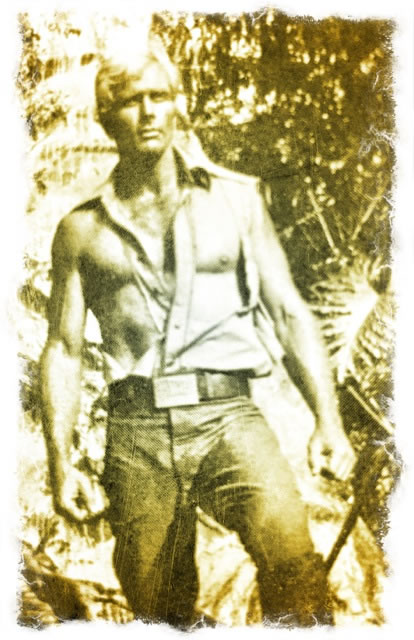
While some kids were into G.I.Joe, I was into, during my elementary, earlier years, I was fascinated by Doc Savage.
I read everything, and amassed a collection of references material, a library of books.
So I started here—the persona of the protagonist, the peculiarly styled character of Doc—here, from a book back panel.
Look back, look deep:
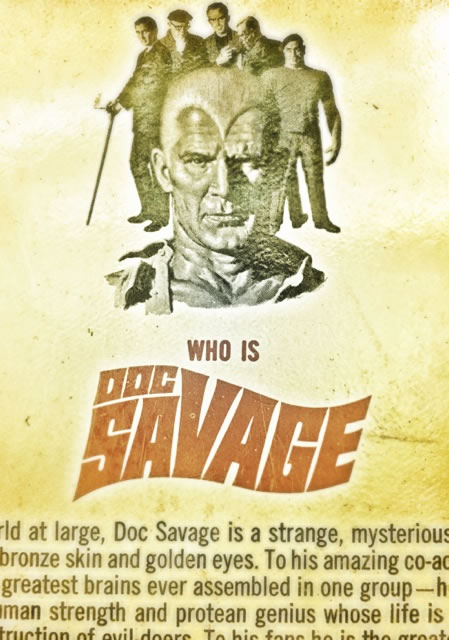
The striking character of the cover series was compelling to me,
in early high school, scanning the shelves, it was “great lettering,”
flowing in a wave of dynamic, action-oriented energy.
Speaking to my art instructor, back then, he taught me
the fundamentals of commercial brush lettering,
sign-painting and depictive arts—how to capture
the idea in a gestural expression.
Doc Savage iconography fit right in.
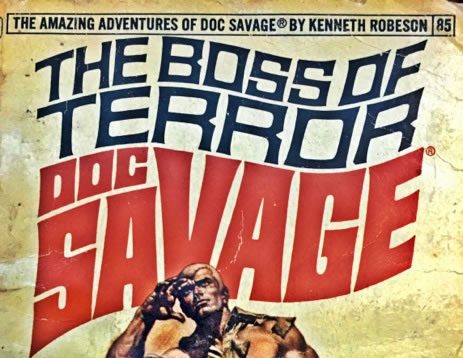
There were earlier cinematic efforts.
To grasp the design strategy, I viewed books, to study their
sequencing and palette interplay, as well as illustrative matter.
I looked, too, at Marvel comic renderings, a shift in lettering style—
also, however, dynamic
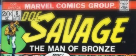
And I examined the illustrative direction from the comics that I had.
It’s been said that, “Doc Savage is the first real superhero,” as noted in Wikipedia’s observations in a historical abstract on DocSavage.
Wikipedia notes “Doc Savage is a fictional character originally published in American pulp magazines during the 1930s and 1940s. He was created by publisher Henry W. Ralston and editor John L. Nanovic at Street & Smith Publications, with additional material contributed by the series’ main writer, Lester Dent.
The illustrations were by Walter Baumhofer, Paul Orban, Emery Clarke, Modest Stein, and Robert G.Harris.
The heroic-adventure character would go on to appear in other media, including radio, film, and comic books, with his adventures reprinted for modern-day audiences in a series of paperback books. Into the 21st century, Doc Savage has remained a nostalgic icon in the U.S., referenced in novels and popular culture.
Stan Lee has credited Doc Savage as being the forerunner to modern superheroes.[1]”
As with anything, I dig into what I know, and what I don’t—and to brand fluency, what I should know—
and organize strategies and the tactics to make them real.
So I look to history.
What I was struck by was the magnetic dynamism of his compositions—studying them in a collective group,
along with the portrayals of the otherworldly character of
Doc Savage, a strange superhero.
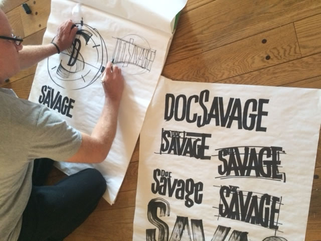
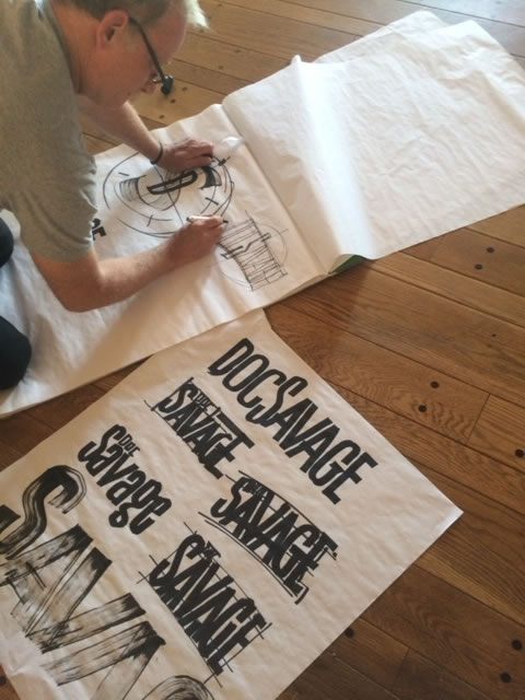
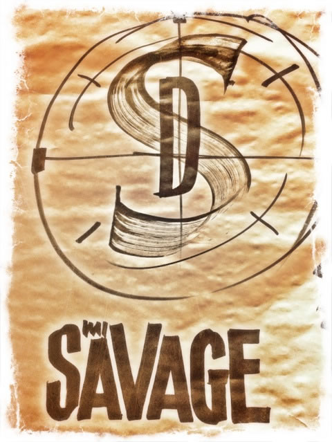
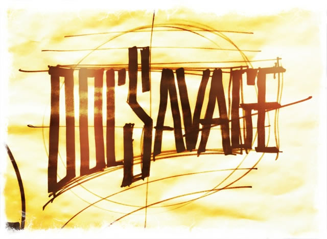
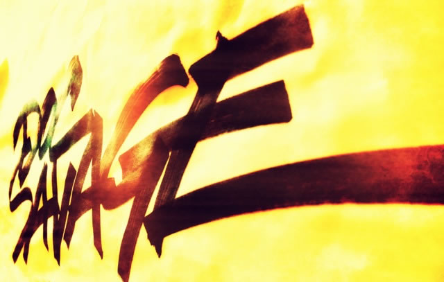
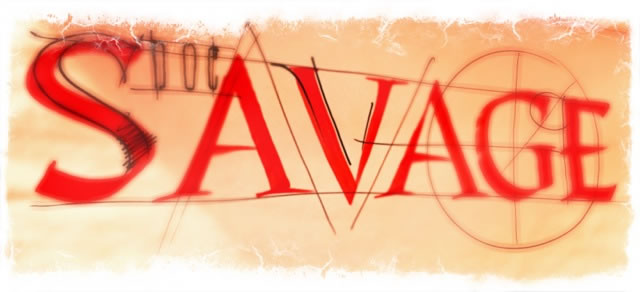
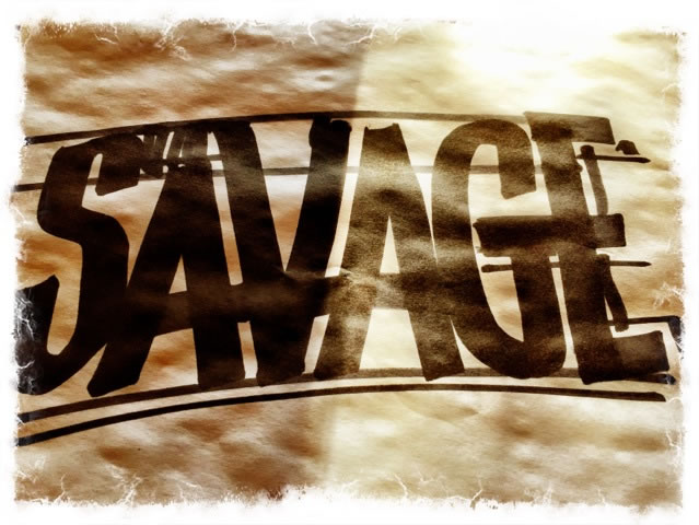
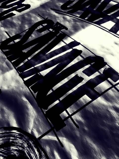
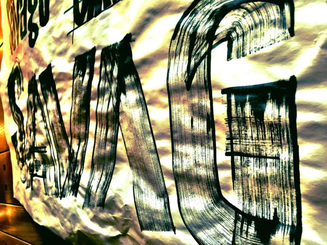
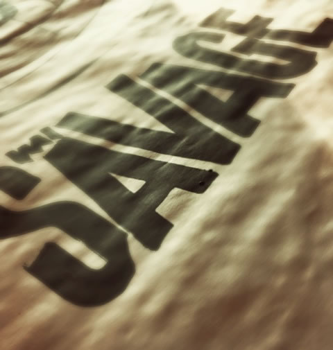
How to go about this exploration—a logo evolution for Doc Savage, I start analog, drawing by hand—visualizations.
And I walk back, looking back into the history of DocSavage art,
I improvised in a set of large scale drawings—done with brushes and large-scale markers,
reaching into the memorial character of DocSavage storytelling from my early years.
I went dynamic, I went big.
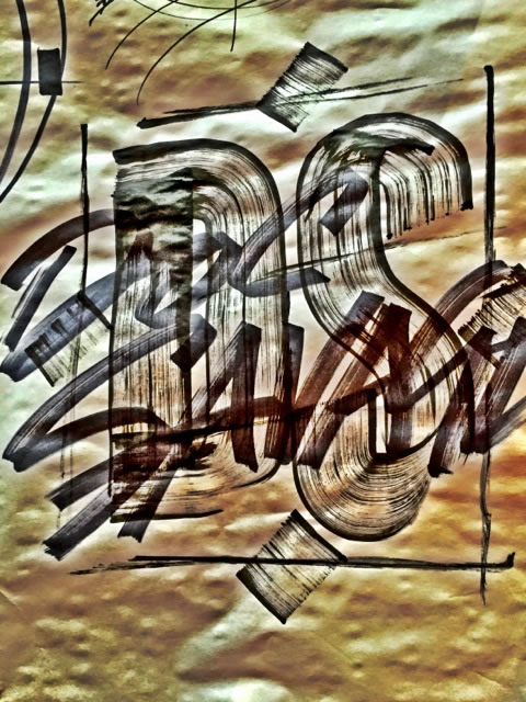
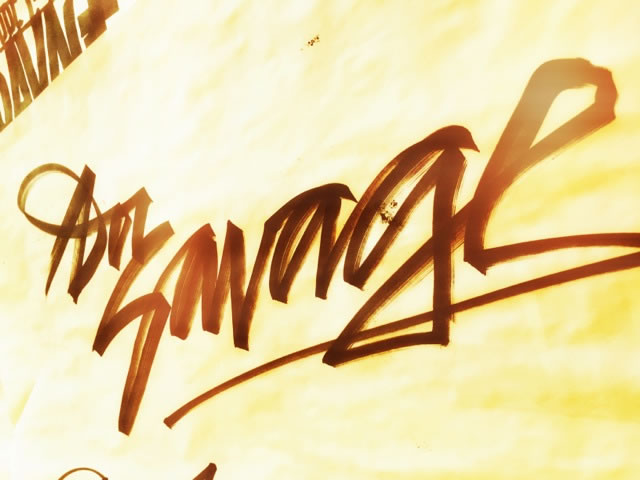
But I kept coming back in my mind to memory—
and the original jackets and illustrative forums and began to walk around
the notions of solutions that linked
to an original design language and ethos to
the brand storytelling and positioning of Doc Savage
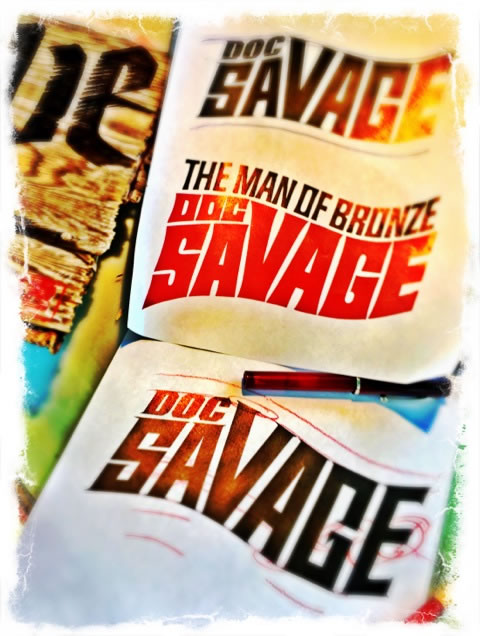
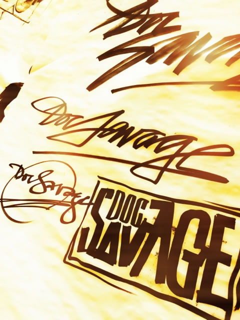
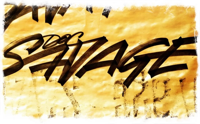
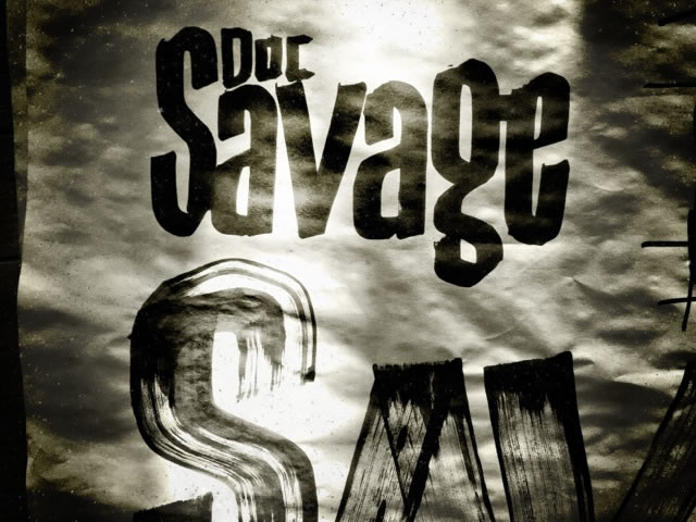
We slimmed and condensed, tailored and tuned to add some other detailed
tracks to the markings of a Doc Savage brand—going back to the 70s,
yet pushing to the now—Doc Savage.
And this, really, is only one approach.
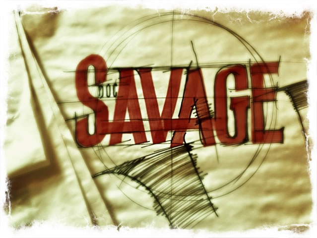
Surely there could be others, but after finding my cache of volumes, I went back;
it’s a start in one positioning.
Where that leads,
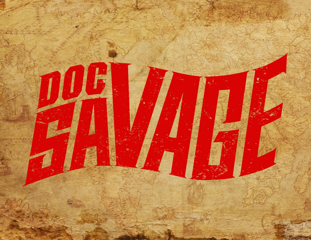
plays here—GIRVIN’s Doc Savage solution—
acknowledging the past, advancing the future:
You might have some thoughts,
as a brand strategist or designer,
about where you’d go.
For us—
grasp the past
to know the future.
Better it.
More on logo design, say—for films—
check-out Stuart Balcomb’s blog gathering on
Girvin movie logos.
Explore as you shall—be your own Doc Savage,
get out and rove the wild.
Tim
Make.
GIRVIN | Strategic Brands
Design for Hollywood | GIRVIN Digital
Surfing | Technology
––––––––––––––––––––––––––––––––––
We build brands.
Follow Us:
Facebook LinkedIn Instagram Behance
Savor
the design
of
adventure
Check out Jim Sterankos Doc art and graphic designs
Love that work — super cool.
I love the Bantam Doc “swoosh” logo, and I appreciate your logo at the end, as it is so similar (why completely re-do the brand?). One suggestion, I understand you’re going for the distressed-t-shirt look, but the white dot on the “c” in “Doc” makes the “c” look like a “g” and it looks like “Dog.” I’d take away that white splotch or move it to somewhere else in the “c.” Just my suggestion. Thanks.
Thanks for your suggestions Mark, always willing to listen.