
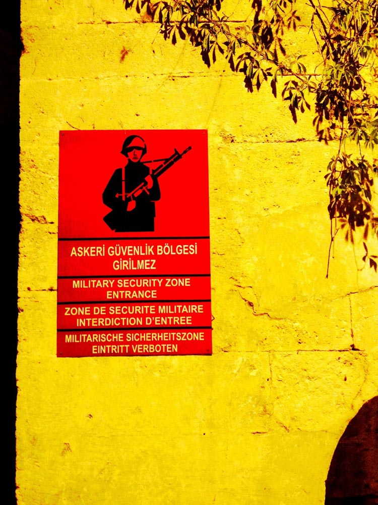
 Istanbul signage
Following on an expanded range from my blog from last week, which you might’ve read—“A Life Of Crime”— and GIRVIN’s history designing logos and design systems for police agencies, entertainment and narratives on international crime-fighting.
This expansion, with an aside in our logo design work for Amazon Studio’s production of the Russo Brother’s Citadel—which we supported with conceptual typographic studies—is, like that series, a global narrative. As well as our collaborations as designers with private investigator Leigh Hearon and her Annie Carson Stables mysteries, I wanted to walk further, and examine more in the realm of crime-related branding.
Given that we, as Americans, are now living in an “ICE age,” so to speak, I was curious about how crime-fighting and protection might find itself rendered internationally—what does it look like? And what messages or descriptive constructs And what, in conclusion, would be the brand strategy and stance of these groups?
FRANCE:
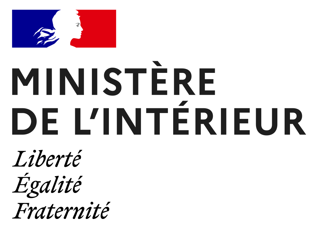
Ministry of the Interior (often called the Ministry of Home Affairs or Internal Affairs) is the core government department responsible for domestic administration and internal security. While the role is global, these ministries generally oversee public safety, law enforcement, civil defense, immigration, and elections.
It’s a simple and elegant expression—the profile is of
Marianne—who is the national personification of the French Republic and a prominent symbol of liberty, reason, and the core French values of
Liberté, Égalité, Fraternité.
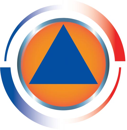
The scale of their jurisdiction, which is global in reach, expands in an
application of a widely known civil defense symbol.
INDIA:
The National Security Guard is the nodal National Counter-Terror Force for the Government of India.
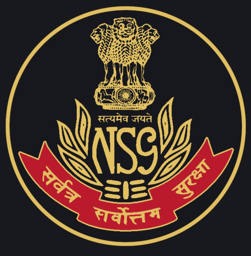
It was founded in 1984 to combat terrorist activities and protect the states of India against internal disturbances.
The formation of the NSG was formalised in the Parliament of India under the National Security Guard Act, 1986. Aspirants who want to join the NSG are recruited from other Central Armed Police Forces and the Indian Army. Its emblem is the three lions of India, symbolizing strength, courage and confidence, with the phrase “Truth alone triumphs,” in Sanskrit, and the wheeled device, the Ashoka Chakra—acknowledging the Dharma, or “the good way,” a righteous duty, the purpose of life—and is a complex and multivalent term which refers to the eternal cosmic law, universal moral order and in Buddhism, the very teaching and path expounded by the Buddha.
This is a complexly overloaded device, more heraldic and crest like—perhaps more of a colonial emblem, a coat of arms.
EGYPT:
The Egyptian Intelligence Agency combines ancient Egyptian symbolism
as the core of its branding.
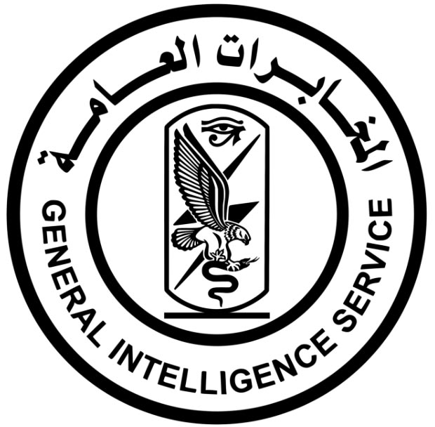
General Intelligence Directorate (GIS)
جهاز المخابرات العامة
The symbolism, another complex hierarchy:
these symbols collectively embody the agency’s core operational philosophy as summarized by Grey Dynamics [Grey Dynamics is a London-based private intelligence firm; specializing in advanced geopolitical analysis, threat intelligence, and security consulting for government, military, and private sector clients.]:
• Bird of Prey: Represents vigilance, speed, and the agency swooping in to neutralize hidden threats.
• Venomous Snake: Represents hidden danger, espionage, or subversion being conquered.
• Lightning Bolt: Symbolizes the speed, decisive power, and rapid execution of intelligence operations
• Eye of Horus: A prominent ancient Egyptian symbol representing protection, royal power, and unwavering oversight. It reflects the agency’s motto—often referenced in Egyptian media—that the “eye of Egyptian intelligence never sleeps.”
UNITED KINGDOM:
MI5 boasts the most modernistic approach to branding—looks more like a high tech firm, which, given its activities would likely hold true to form.
Looking into their website,
the presumptions hold:

IF YOU SUSPECT IT, REPORT IT
Current UK threat level
SEVERE | threat levels
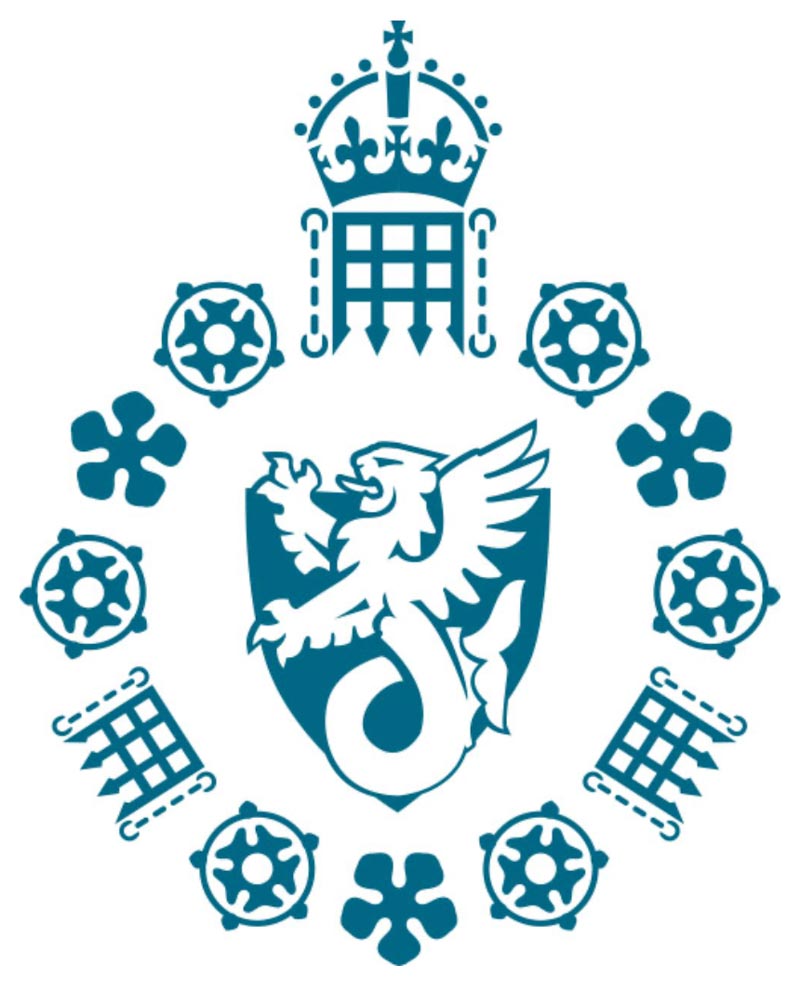
Here’s the new MI-5 logo, with yet another heraldic display.
And a complex tiering of meanings, from the MI-5 website:
MI5’s Badge was adopted in 1981. At the centre of the Badge is a winged sea-lion: a mythical beast, half lion and half fish. The sea-lion (not to be confused with the aquatic mammal) represents our historical association with the UK’s armed forces. The lion’s head represents the British Army, the fish’s body represents the Royal Navy and the wings represent the Royal Air Force.
Surrounding this central emblem are—at the request of His Majesty, the King—added sigils:
• The five-petalled cinquefoil, alluding to the “5” in MI5.
• The portcullis, representing Parliament and reflecting our role in upholding parliamentary democracy.
• The rose, which has historical associations with state intelligence work. Sir Francis Walsingham, Queen Elizabeth I’s spymaster, is widely considered to be the first British intelligence chief and used a rose as the seal on his signet ring.
CANADA:
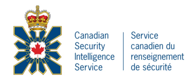
From Grey Dynamics’ analysis:
The Canadian Security Intelligence Service (CSIS)logo uses a structured,
symbolic visual language to communicate its heritage, purpose, and loyalty to the Canadian state.
The core design elements and their meanings include:
• The Red Maple Leaf: Situated in the center, this is the preeminent national emblem of Canada, representing unity, peace, and the land that the agency is mandated to protect.
• The Blue and Gold Palisade: The square outer frame is a palisade (a defensive wall or enclosure), which symbolizes the agency’s protective role in guarding Canada against threats to national security. The blue and gold color scheme is a direct homage to the Royal Canadian Mounted Police (RCMP). Before CSIS was established as a civilian agency in July 1984, the RCMP Security Service held national security intelligence duties.
• The Royal Crown: Placed at the very top of the crest, the Royal Crown represents the Sovereign and emphasizes that CSIS carries out its duties of protecting the peace on behalf of the Crown and the Canadian public.
CHINA:
A mission:
“the security of the state through effective measures against enemy agents, spies, and counter-revolutionary activities designed to sabotage or overthrow China’s socialist system.”
The logo of China’s Ministry of State Security (MSS) features the hammer and sickle of the Chinese Communist Party (CCP) at its center, rather than the national emblem of the PRC. This specific choice of imagery symbolizes the agency’s primary allegiance to the Party, its foundational role in the “covert line” of CCP intelligence, and its duty to protect the state.
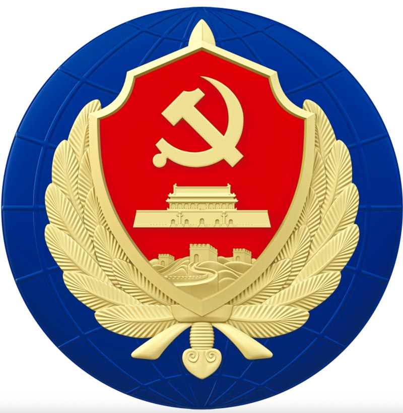
Ministry of State Security
国家安全部
Guójiā Ānquánbù
JAPAN:
The Cabinet Intelligence and Research Office (内閣情報調査室,
Naikaku Jōhō Chōsashitsu), also known as Naichō (内調)
The CIRO is the national civilian intelligence agency under the Japanese Cabinet Secretariat tasked with collecting and analyzing intelligence from around the world.
The symbolism of the device—a traditionally classical Japanese design—with traditional emblemata is again, a historically-founded array of elements?

From Wikipedia Japan:
• The Paulownia Crest: The paulownia design (Kiri-mon) has a history spanning over (1,200) years and is a traditional symbol of the Japanese government and imperial authority.
• Symbolism of the Design: Historically associated with the legendary phoenix, the paulownia emblem signifies highest-level authority, good fortune, and legitimacy.
• Official Use: It serves as a visual indicator that the CIRO is the principal civilian intelligence agency reporting directly to the Prime Minister.
• General Recognition: As a broader representation of the executive branch of the Japanese government, the Five-Seven Paulownia
is also found on Japanese passports and the 500¥ coin.
RUSSIA:
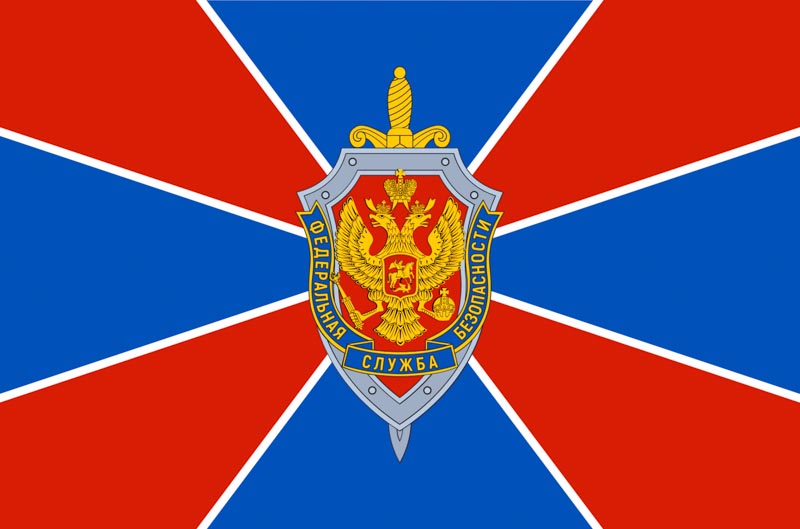
Foreign Security Service of the Russian Federation (FSB) is the principal security agency of Russia and the main successor agency to the Soviet Union’s KGB; its immediate predecessor was the Federal Counterintelligence Service (FSK), which was reorganized into the FSB in 1995.The logo of the Federal Security Service (FSB)—Russia’s principal domestic security agency—uses traditional Russian and imperial heraldry to project authority, vigilance, and state power. Its primary components symbolize the defense of the nation and the unbroken lineage of Russian state.
Федеральная служба безопасности Российской Федерации
Federal’naya Sluzhba Bezopasnosti Rossiyskoy Federatsii
Israel:
Institute for Intelligence and Special Operations
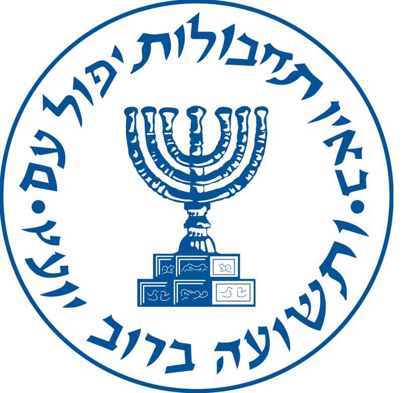
The Institute for Intelligence and Special Operations, universally known as the Mossad, is the national intelligence agency of the State of Israel. Established in December 1949 and headquartered in Tel Aviv, it is primarily responsible for foreign intelligence gathering, covert operations, counterterrorism, and facilitating the immigration of Jews from locations where standard immigration is restricted. Explore more on their missions, here. As to the symbolism of their logo design language, The Mossad logo features the seven-branched Temple Menorah in the center—as it appears on the Arch of Titus in Rome—symbolizing the eternity and light of the Jewish people. Encircling it is the Biblical verse from Proverbs 11:14: “Where there is no wise direction, the people fall, but in the multitude of counselors there is safety.”
The font work has a certain gravity, almost a hand-crafted assertion of the nature of their missions, and—
to handcraft, the menorah mark has a drawn treatment to its articulation.
Key Elements of the Logo:
• The Menorah: An ancient symbol of Judaism and the State of Israel, representing enlightenment, heritage, and the continuity of the Jewish nation.
• Proverbs 11:14: The encircling Hebrew text represents the organization’s foundational philosophy that strategic planning, sound counsel, and wisdom are the ultimate protections for the state.
• The Origin: The modern seal wasn’t adopted until the 1970s. It was designed by former deputy director Shlomo Cohen Abarbanel, who was a field officer with an artistic background.
• Historical Motto: while not part of the graphic design, the agency is often associated with the unofficial proverb “By way of deception thou shalt do war” (derived from Proverbs 24:6). This phrase speaks to the core of clandestine operations: concealment, strategic surprise, and outwitting adversaries.
המוסד למודיעין ולתפקידים מיוחדים
الموساد للاستخبارات والمهام الخاصة
UNITED STATES:
Perhaps the most outdated brand identity program of all entities in terms of its overall image management.
Secret Service agents, professionals, and specialists work in field offices around the world to fight the 21st century’s financial crimes, which are increasingly conducted through cyberspace.
And a complex web of wordy missions.
Logo then.
Logo now.
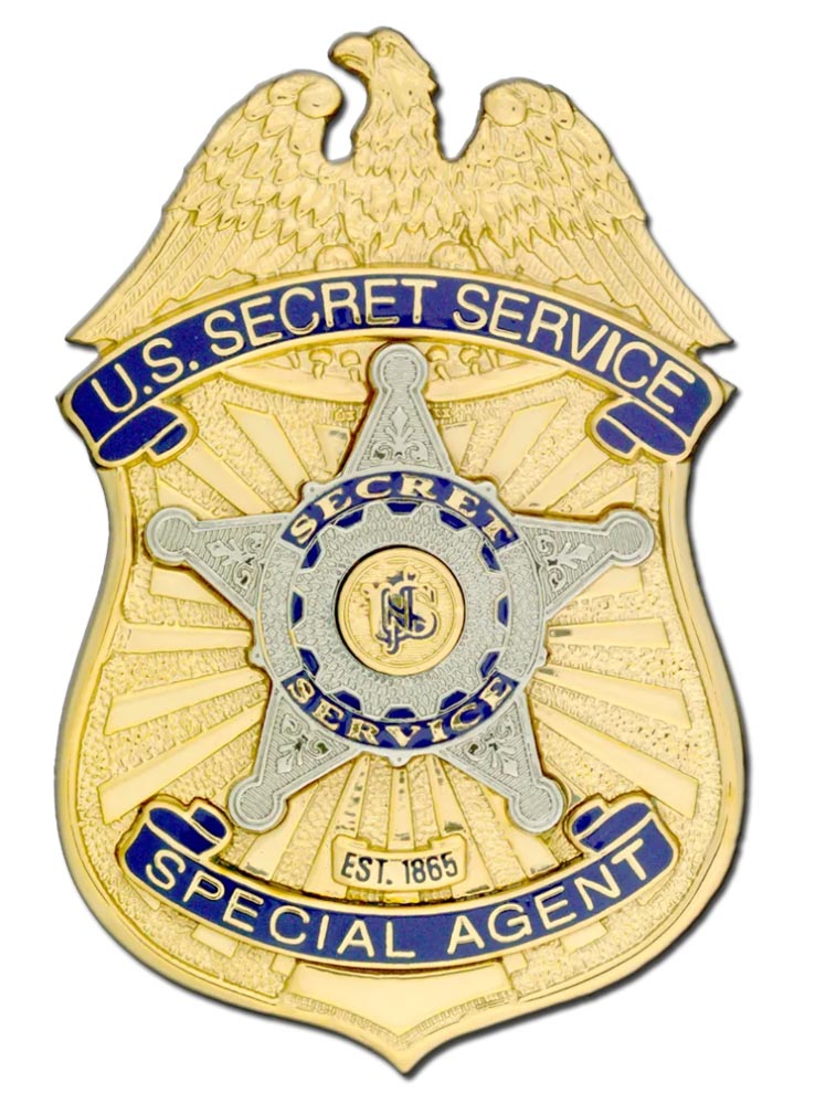
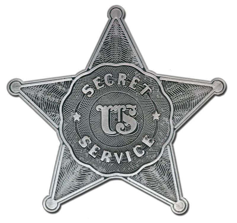
• Unity: Under the “One agency, one badge” initiative, the emblem unifies all armed personnel under one insignia, symbolizing shared mission and teamwork.
• Historical Origins: Features intaglio engravings that honor the agency’s founding mission in 1865 to combat counterfeit currency.
• Vigilance and Defense: The arms of the star feature gold tridents and centurion de fleur motifs, representing defense and watchfulness.
• Law Enforcement Heritage: The blue enameled ring encircling the star and shield honors the traditional law enforcement culture within the agency.
• Golden Accents: The 24-karat gold plating on the badge pays homage to the historical command emblems worn by the former Secret Service Police.
To the logo characteristics, and the review of their legacy—a history of badges—I find the oldest version the most “respectable, “ a complexly detailed piece of engraver’s arts.
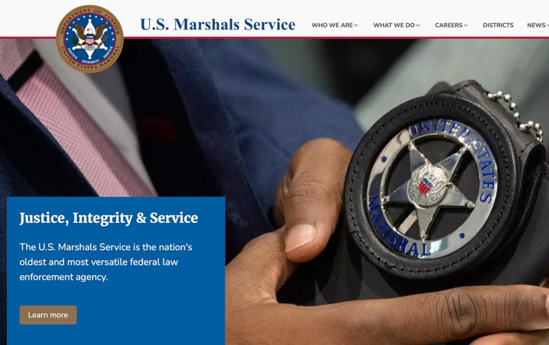
As I mentioned earlier, I was sitting on a jet with a talkative neighbor, a US Marshal, who coincidentally spoke to me on the theories of the layering of police, detection and intelligence—I thought, “never knew, now I’m curious.” Interestingly enough, I had two more encounters with Marshals—one coming to my home to show evidence of theft in a crime against me, and another in a recent City Council-related conversation with a Sheriff, and a Detective.
And then wondered about those words that he used with such repetitive precision.
Why precise?
Because, to his take, there is a clear definition of who does what—which case, where it happened, what is the nature of the crime, and which agency would govern those investigations.
He started with the White House and the U.S.Secret Service and criminal and protective issues related to the President and the defense of the White House.
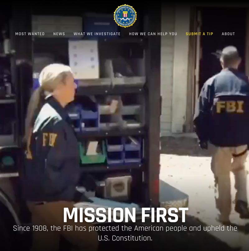
And then worked his way through the FBI,
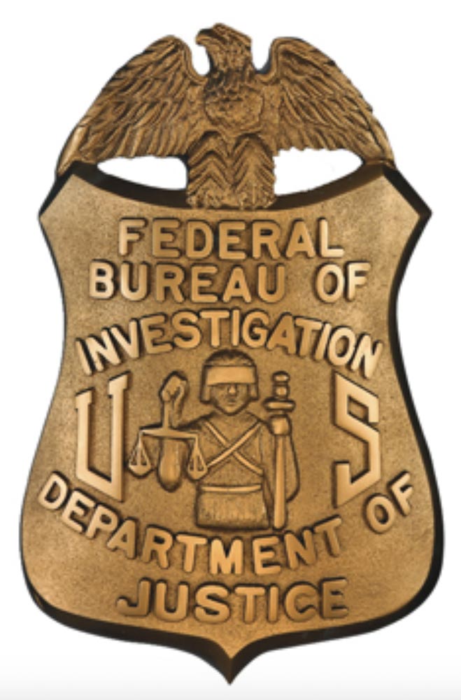
the US Marshal Service, the State Patrol, down to county and city police.
I’d never realized it was so complicated—let alone, coordinated.
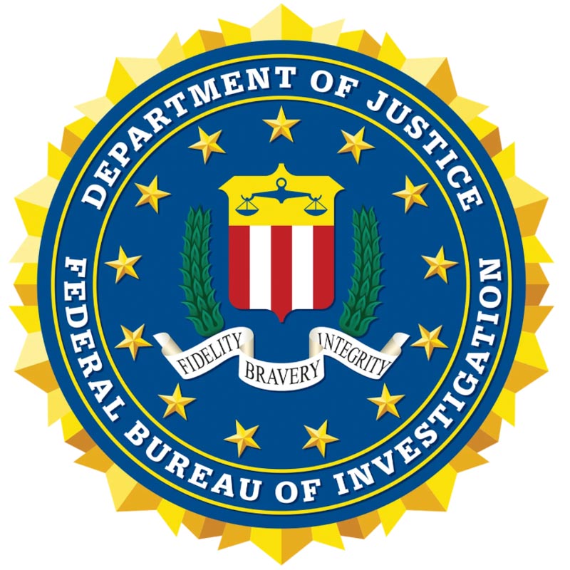
The seal and motto of the FBI
I listened to his role, his work, his storytelling and it made me a brand detective—what do these brands actually look like—here and aboard.
Secret—what’s that actually mean?
Like occult, which is hidden?
Actually, returning to my elementary school Latin studies, it’s tied to “withdrawn, hidden, concealed, private.”
But it’s a bridged amalgam of a word in its original construct—“on one’s own” (see se-) + cernere “separate” (see crisis).
Of all the governmental agencies I was interested in there was one that was the most compelling—that of the gentleman sitting next to me.
According to our etymologist colleague, Phil Harper, the word wizard at Etymonline.com—there’s some intriguing and relevant history: late 14c., “that which is hidden from human understanding;” early 15c., “that which is hidden from general knowledge;” from Latin secretum “secrecy; a mystery; a thing hidden; secret conversation,” also “retirement, solitude,” noun from secretus “set apart, withdrawn; hidden, concealed, private.” This is a past-participle adjective from secernere “to set apart, part, divide; exclude,” from se– “without, apart,” properly “on one’s own” (see se-) + cernere “to separate” (from PIE root *krei– “to sieve,” thus “discriminate, distinguish”).
The meaning “something studiously hidden or concealed; what is not or should not be revealed” in English is from mid-15c. The sense of “key or principle by which some difficulty is solved” is from 1738, perhaps via the notion of “method or process hidden from the uninitiated” (late 15c.).
Probably the most relevant attribute to this entire discussion would be the Mossad premise—crimes function in secrecy, and so must the response to this scenario. Being on the other side of crime, the victimized, you see how it works—a “secret service.” Mossad’s tenets of action spell it out:
The Mossad premise of secrecy is a foundational doctrine rooted in operational survival, where absolute anonymity of agents, methods, and leadership is deemed essential to protect the agency’s personnel and guarantee the security of the State of Israel.
The premise is broken down into a few core elements—each which reaches back to the premise of secrecy:
• Operational Anonymity: Historically, the identities of all field operatives, and even the Director of the Mossad, were strictly classified. The premise dictates that an agent’s true identity must remain obscured to ensure deniability for the State of Israel and to protect operatives from hostile retaliation.
• Clandestine Operations: The agency’s unofficial, but frequently referenced motto, “By way of deception, thou shalt do war” (derived from Proverbs 24:6), underpins the operational philosophy. The premise relies on subterfuge, the use of deep-cover legends, forged documents, and false identities to infiltrate adversaries.
• Shadow of Ambiguity: The Mossad typically maintains a policy of neither confirming nor denying its operations. This allows the agency to accomplish high-risk missions globally while forcing adversaries into a constant state of uncertainty
• The “Nofesh” (No-Choice) Doctrine: Because Israel is surrounded by hostile neighbors and lacks geographic depth, its foundational premise is that it must know what adversaries are planning before those plans are executed. Absolute secrecy in intelligence gathering is the primary tool to neutralize these existential threats.
Running back to the head of this blog, and contemplating brand design in relationship to crime-fighting, security and protection, those elder entities show a legacy approach, that’s distinct to the fact that they’ve been around for a while—they have history, so the notion of a coat of arms approach to brand strategy seems relevant. Not sure why, though. This group of solutions ranges between the classically heraldic to more robustly empowered design systems. The legacy of the medallion—the badge—would be key, given that this is core to identification, literally, a worn emblem—and thence, brand identity.
Probably more “corporate,” in terms of their representations you might check out contractors, like Constellis, a merger string of Triple Canopy, Blackwater / Academi.
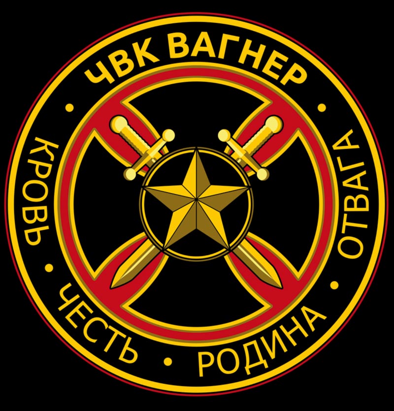
Or Wagner Group, with their logo above, operates as an army for the Russians in African protection services [also regarded as terrorists by some countries] and Frontier Services Group—Chinese security African-based protection.

Our original brand design of Crime Stoppers plays to an amalgamation of context—bold font work with a kind of graffiti-scrawl, a shout-out to Crime—coupled with the fast moving industrial power of “Stoppers.”

Keep your head on a swivel and watch your six.
Tim
––––––––––––––––––––
Girvin | Osean | Tim.Girvin | Wanderer
Follow Us:
Facebook LinkedIn Instagram Behance
Discover more from Girvin | Strategic Branding & Design
Subscribe to get the latest posts sent to your email.