GIRVIN’s Symbolic Patterns for Interiors and Meaningful Graphics in Placemaking
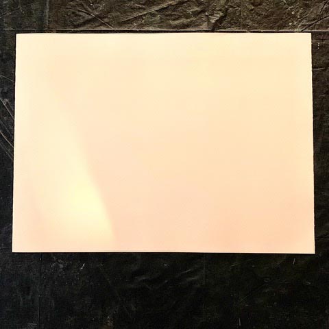
Any designer knows that a simple plane, an empty piece of paper, a coverless book, an empty package or the “undefined” skin of a shopfront is a presence without place—there’s no story, there’s no personality, there’s no…nothing.
It’s plain.
As a student of transformation—the and the designerly shifting of nothingness to fullness, ideas to realized products, brands with presence—I’m particularly intrigued by the history of this idea:
the nature of a single mark that eradicates the nothingness of open and unresolved space into the marked planar characteristics of a graphical signature that re-defines it.
A mark, simple as it might be, articulates dimensionality, directional presence and spatial recognizance—a reconnaissance of design—which etymologically reaches to the Latin derivation, designare and speaks to signare—and the “mark” of the sign, L. It is the portend of the signum. Which means that it “signifies” something—it has meaning.
Obviously, there are broader implications to the notion of a “sign,” L. signe, “the gesture of a hand,” an “omen or portend—the military “ensign,” the signal—and thereby, “significance.”
As designers, our work is inherently about that transformative act, which has a magical implication, making a sign signals a kind of visual alchemy, a transmutation from one plane of consciousness to another tier of perception, newly defined. A mark makes new.
I thought about this as a sequencing, which as a spell-making transmogrification. that has the power to “say something, tell a story, list features, define a place, protect, narrate or attract layers of meaning.” For thousands of years, making marks was imbued with a magical intention, signs as signals of planar and consciousness shifts, to that, historically, books of alphabetic phrasings and symbolic marks were gathered into a “spell book,” known as a “grammar” or to the French rendering, a grimoire.
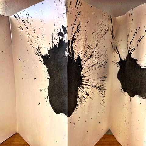
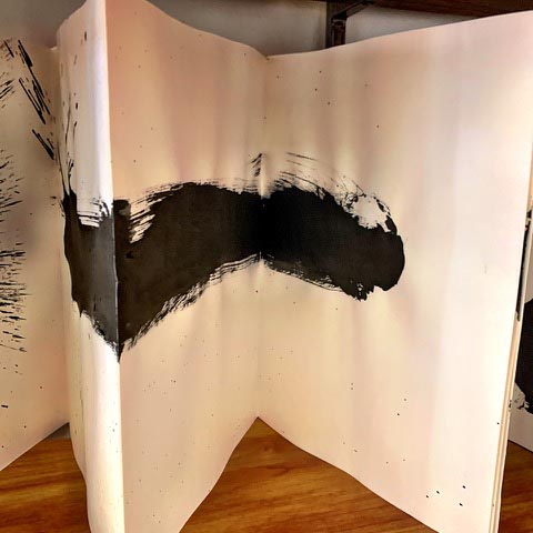
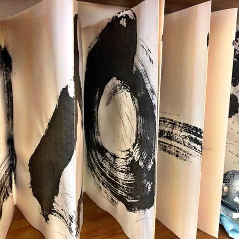
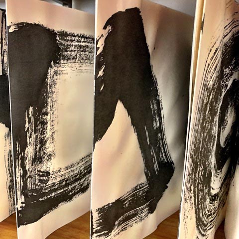
GIRVIN made its own grimoire—a “book of signs,” as in the journey from the nothing to the everything, drafting archetypal symbols as a sequential explication.
This 15’ long, folding book plays to the rhythm of a empty expanse to a progressive revelation of key symbolic gestures, drawn with a large brush in an ori-hon style of folding book, as in the classical book form of Asian, finger-turning as a contactless process of review [no fingers on the artful side of the pages—the pages are turned
underneath as a sliding pagination.]
Here is the book.
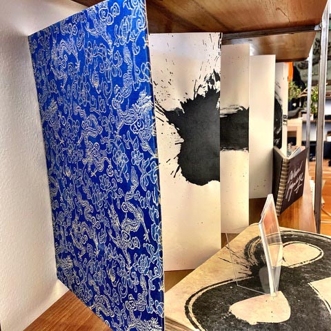
And here are its pages.
The book flows from one symbolic evidence to another,
as a kind of migration of ancient thinking.
The opening page is empty, and the
first revelation would be
the nothing.
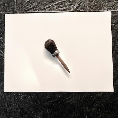
To the tool of somethingness—
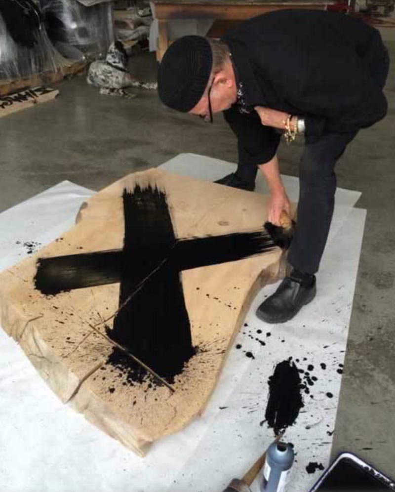
the making of objective place here is the radiator cleaning
brush that I used in this book.
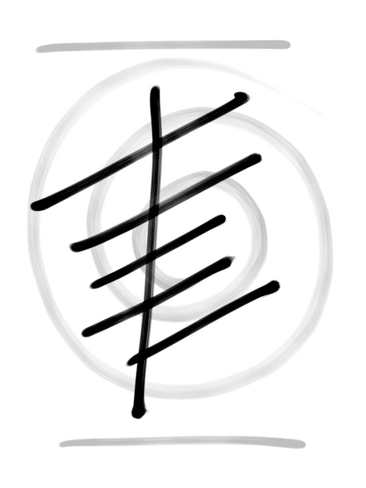
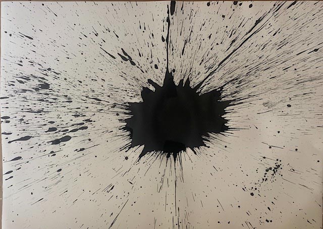
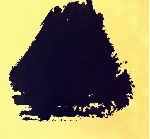
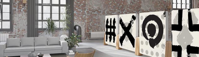
The first stroke of placemaking—the dot,
from which all other marks come.
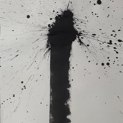
The delineation of place—the second stroke of demarcation.
Interlacement.

The square—the quaternary earth holds four.
Each of the strokes before it.
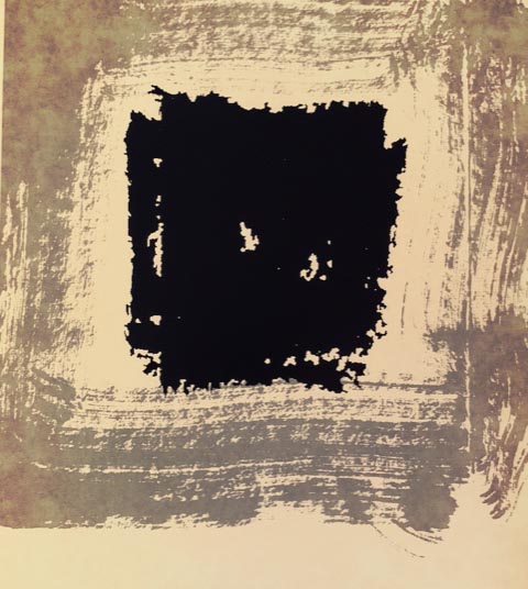
Containment, mapping and progression.
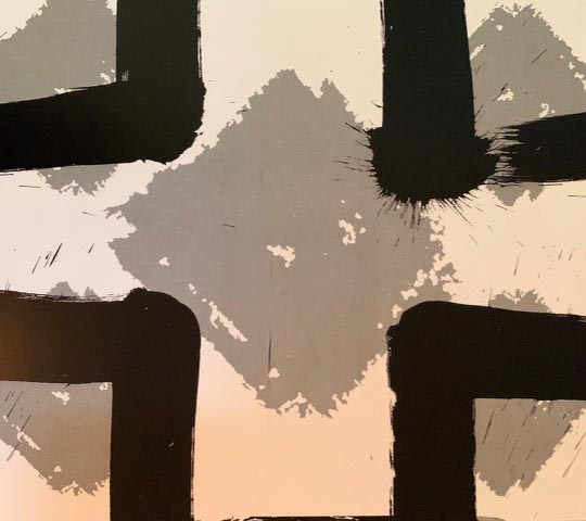
Dimension and direction—
skyward, earthward, the East, the West.
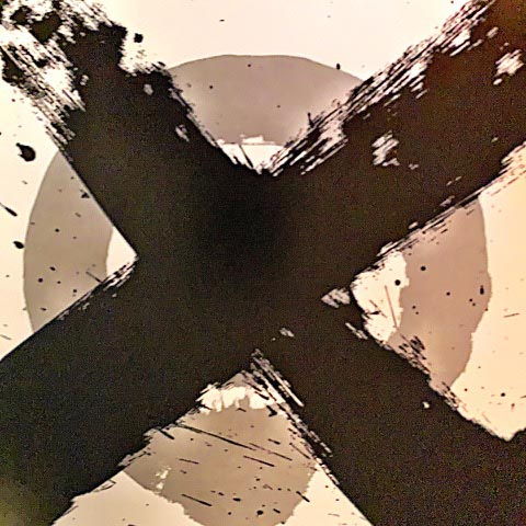
The crossroads.
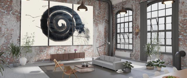
The circle, the arc of the sky—containment.
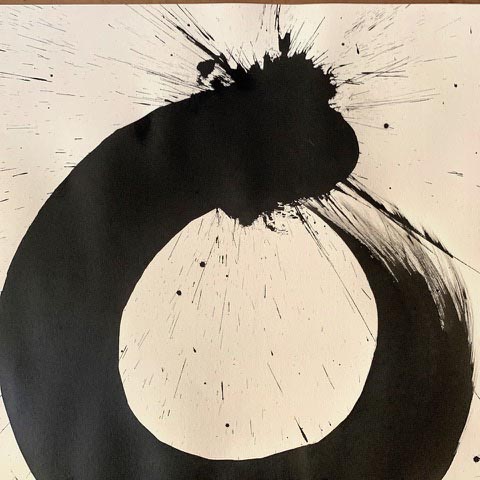
The seed circle in the ring—
the place of presence in containment.

And the interplay of the one in the everything.
That process was built out into a booklet, which you can
review yourself, in a reach to, for a minimal cost and handling fee.
The idea of this expression, horizontally, I’d implemented earlier as a furniture idea, mapping objects with strokes in support of symbolic ideas—space, made place. These are derived from the deeper meanings of signs—their deeper archetypal content. There’s something in this line of thinking,
from Rudolf Koch, or Adrian Frutiger.
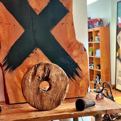
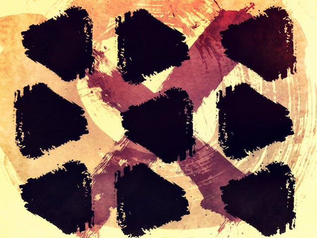
In Talismanika™ I’d drawn these archetypal forms, in the same way, same tools, but on living surfaces—cleaved sections of fallen, urban-harvested timber—for furniture and interiors.
Which applies to other things—arrangements—
in a kind of symbolic power play.
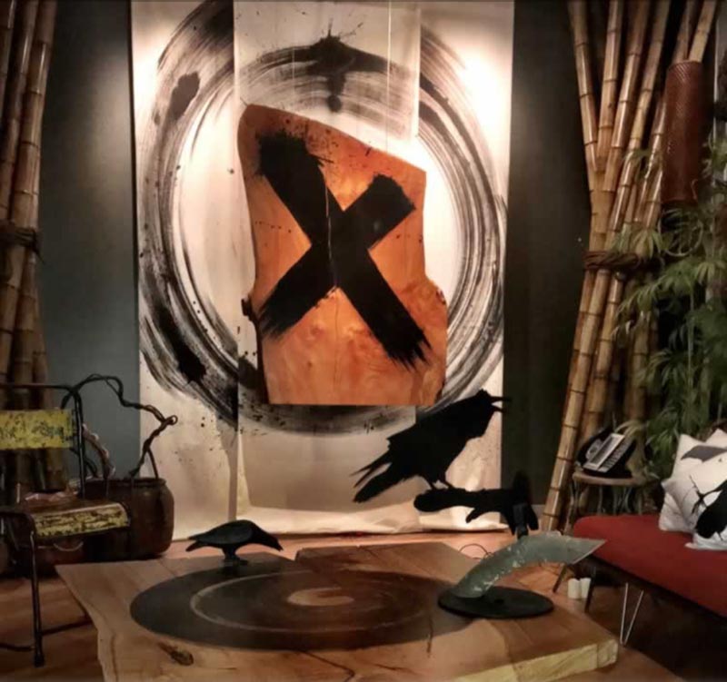
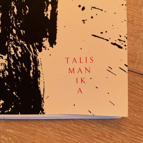
I’ve been calling that Talismanika™—and, in partnering with a manufacturer, CorianderDesigns, along with their brand MeyerWells—the original supplier of the band-sawed, fallen timber—I used in the beginning, we’ve been looking towards a larger scale buildout, marketing and representation as discrete lines inside their brand offerings.
Large patterned installations.
Accoustical tile patterning.
Customized messaging.

Read more on talismanic art in architecture.
Tim Girvin | In Seattle, and at the Washington Coast, OseanStudios
Principal, Founder and Chief Creative Officer,
GIRVIN | Strategic Branding & Design | girvin.com
S I T V I S V O B I S C U M
MCMLXXVI
IBI FUNDATA
Follow Us:
Facebook LinkedIn Instagram Behance
Discover more from Girvin | Strategic Branding & Design
Subscribe to get the latest posts sent to your email.