Exploring the origin, development and renewed applications of the word.
Brand storytelling, animated in humanized beauty — mind, thought, hand, expression.
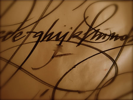
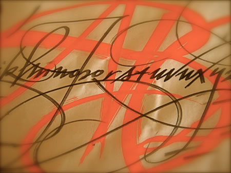
Calligraphy is beauty and writing, combined. And it’s long been seen as a kind of remote and obscure art, either held in the spirit of craft, or in the highest abstraction — in the Asian tradition — as a form of expression that is the exemplar of capturing the very breath of language.
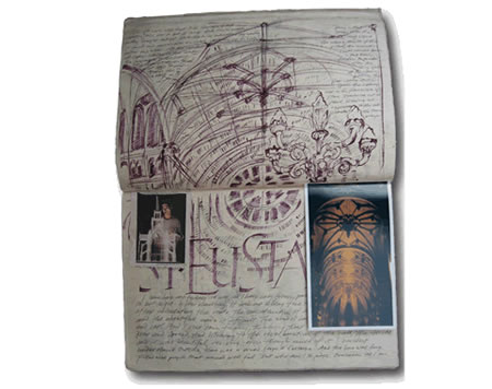
My work in this context begins in the later phases of high school, my senior year, when before heading off to college, to study biology, I came in contact with Lloyd Reynolds, a professor at Reed College, who’d come to Spokane to speak, and to offer a weekend workshop in the beginning strides of calligraphy, initiating me into his world. His approach to the concept of calligraphy was, at once, practical — evincing the notions of the retained memory of muscular movements in the repetition of practice and the kinetics of the hand, with mind — and two, combined with an extraordinarily fluency of art, history, architecture and philosophical theory. Here was a man that evoked a broad range of aesthetic disciplines, from Zen poetry and painting, to Renaissance architecture, classical principles of painting in the Chinese tradition, to the extraordinary lineage of the alphabet — all collated in a kind of breathless monologue, that started at the very beginning of the session, through private discussions with my mother and I at a picnic break at our farm, and finally, in the closing departure notes of “practice, practice, practice.” From there, I moved on to a career in science, or so it seemed.
Once I’d arrived at the New College, in Sarasota, Florida, hoping to begin a series of studies in marine biology — and particularly, marine mammals — I found the deepening approach to science being something more akin to a kind of analytical vivisection, a pathway to learning that approached life as something that was best consumed in killing the very organisms that we set out to comprehend. I wandered. My thinking was that nature, the beauty of living things, was in that place of living, and less to the breaking down of component parts into a sentience of how things lived, by dying. There are surely learnings to be had in breaking down life into the compartments of the frame of breathing entities by literally “breaking” them down. It wasn’t for me. And in speaking to my professor, and others on campus, it was pointed out that my laboratory journals were sufficiently well designed, organized and drawn — more like books — that perhaps I should consider something more to an artistic bent.
I’ve had a long relationship with art that comes from my mother — who, coincidentally, turns 80 in a matter of days. Her washed, watercolor like abstract oil paintings were an inspiration, and the idea of sketching, looking at art books, going to museums and hanging out with artist “types” was a continuing learning exploration — it was simply part of my upbringing, aside from my curiosity about the biological sciences. Still, these sentiments were conjoined. Art and science are intermixed, and even the most profound scientists speak of their relationship — in their work — to artful paradigms in thinking, evaluation and strategy. In fact, the point of science is about shocking, striking, sparked new realizations that oftentimes are akin to the discovery of the art. The concept of artists, and scientists, being nearly one and the same isn’t new. And artists, infused by the mystery of science is yet another balance of exploration. To that end, the balance for me took another turn.
This came in another professor that suggests not only the concept of expanding on the nature of the journal as an exploratory tool, but more so, the history of architecture, the nature of language, design, book creation, palaeography and integration of cultural intention and writing. That is, the politics of script — writing, design, architecture and the allied arts all having something inherently linked to culture, community, geography and the transmission of knowledge. Any one of these avenues for study could easily form a lifetime pursuit. But to my learning, it was more about how to weave them together, as a creative scholarship, a renewed storytelling that could have implications in other practices.
Later, that practice became design. The curious element about this conjunction was the differentiation that became its foundation. That is, if your training as a designer comes from studying history — the heritage of the book, the nature of architecture, art and culture, explored internationally — it provides a wholly unique appraisal of what design means. It is newly rethinking what many might determine as a kind of lost art, the proverbial archaeology of making messages. There are varying parts, even to this — for one, that the alphabet has a far deeper meaning beyond merely conveying textual content. In the days before our time, even centuries back, the alphabet was considered a collection of mysterious symbols that have deep, psychically formed connotations. The psychic component is about the archetypal character of markings imbued with deeper, if opaque meaning. During my college days, I corresponded with Joseph Campbell, Mircea Eliade and Dr. Annemarie Schimmel on examining the nature of the underlying symbolism of the alphabet. The cultural expressions are exceptionally rich — as a hidden code for Christian mystics, a grouping of sorcerer marks, alchemical codes, the Hebrew Kabbalistic universe of magical alphabetic configurations and spiritual markings, to other cultures, like the ancient Semitic tribes of Mesopotamia and their approaches to writing as magic, and finally the Asian experience of writing being invented by the misted-in-time Gods, along Indian expressions of Devanagiri — a writing that is literally “of the Gods”. The traditions are widespread, and really in many instances, still exist to date, in the spirit of Arabic, Hebrew, North African, Himalayan and other Asian expressions of magic, symbolically empowered writing.
Add, to this amalgam, the concept of exploring the various incarnations of the alphabet over time, ranging back thousands of years, millions on millions of people, texts, epigraphic expressions to the present. Even the Greek and Roman systems of writing, the basis for our present alphabet are more than 3,000 years old — but the roots of the alphabet extend far deeper.
A wikipedia overview, reveals below, the range of influences and time frames that intimate the broad international character of what studying the alphabet can be about.
|
Middle Bronze Age 19 c. BCE § Ugaritic 15 c. BCE § Proto-Canaanite 15 c. BCE § Phoenician 12 c. BCE § Paleo-Hebrew 10 c. BCE § Samaritan 6 c. BCE § Aramaic 8 c. BCE § Kharoṣṭhī 6 c. BCE § Hebrew 3 c. BCE § Thaana 4 c. BCE § Pahlavi 3 c. BCE § Avestan 4 c. CE § Devanagari 2 c. BCE § Palmyrene 2 c. BCE § Syriac 2 c. BCE § Greek 6 c. BCE § § Sogdian 2 c. BCE § Orkhon (Old Turkic) 6 c. CE § Old Hungarian ca. 650 § Mongolian 1204 § Nabataean 2 c. BCE § Arabic 4 c. CE § Thai 5 c. BCE § Mandaic 2 c. CE § Greek 8 c. BCE § Etruscan 8 c. BCE § Latin 7 c. BCE § Runic 2 c. CE § Coptic 3 c. CE § Gothic 3 c. CE § Armenian 405 § Georgian (disputed) ca. 430 CE § Glagolitic 862 § Cyrillic ca. 940 § Paleohispanic 7 c. BCE § Epigraphic South Arabian 9 c. BCE § Ge’ez 5–6 c. BCE |
|
|
Meroitic 3 c. BCE |
|
|
Ogham 4 c. CE |
|
|
Hangul 1443 |
|
|
Zhuyin (Bopomofo) 1913 |
|
The point is that learning about design, at least to my experience, was founded on this legacy, rather than the graphic stylings of the last 100 years, which is more the conventional wisdom in learning more about the present state of graphic design education — very little of which will be about the long-ranging history of “design”. Perhaps irrelevant, but more to my background, and how — and why — I think in the manner that I do.
For me, there are two paths in expression — one founded on the concept of the book; and another, based on the history of the alphabetic form, infused with the conceptions of energy, interpretation, illustrative spirit and scholarship. Spend time studying paleography, and the implicated vocabulary of design will be far deeper than most.
The book, and the principles of design of it, are at the heart of the arrangement of ideals. But the real concept of the book is storytelling, visually, the framing of conception. There is a sequence to revelation. There is the sleeve’s opening message, the cover, the endpapers whose patterning speaks to an internal message — even subtly impressed, the small title — a delicate introduction; the main title page, the opening texts, and finally moving into the framing of the book’s content. That is containment, it is continent, it is a sequence of airy space, procession that in many ways exemplifies the concept of moving into the place-making character of a park, a retail experience, or the grounds leading to, and into, a building. Is there air to breathe, or are the spaces confined — what pictures hang on the walls?
Interestingly enough, even in the spirit of this book, which Girvin designed for Scott Oki’s exploration of education, the principles of design and geometric explication are found in Greek, Medieval and Renaissance standards of design — architecturally and otherwise.
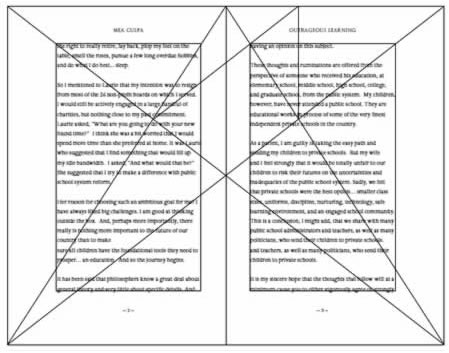
The fonts that we designed and built for the book are derived from similarly classical traditions, based on the epigraphic heritage of the Romans in the 1st century, CE. My sense is to examine how these traditions, paleographic lineages and scholarly observations can be built, as a sequence, in something that is linked to the past but inherently modern. And beautiful.
I was talking with a friend of mine, Ksenia Oustiougova, about the idea of calligraphy in animation — and being involved with the world of creating micro-animation sequences for her clients, based on a fabulous freelance collective of animators, located internationally, there’s pertinence to our exploration.
When I was in college, I explored the idea of the alphabet in animation, working off the old animation tools at the Evergreen State College.
These animations were literally building the designs of alphabets, calligraphic scroll work, moving calligraphic “clouds”, overlaid and moving larger alphabets, as well as “mystical” over strokes of the origin of the alphabet — each done on film, marked with the animation “cel” template punches and mechanically moved and shot, frame by frame.
Today, of course, digital animation is far less “flat” and more dimensionally intriguing.
To the end of making these projects happen, Ksenia and I’ve been exploring ideas — and she’s been pitching the potentials.
This idea, of animation, is something that is, as well, at the heart of illustrating the energy of a word. I’ve written about that idea of capturing the spirit of things in this overview, on the Asian concept o Ch’i.
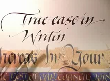
Here are some expressions, finally, that take us from the concepts of the ancient foundations of calligraphic scratching in stone, clay and metal, reed drawn on papyrus, drafted on vellum or outlined on handmade paper.
Some advancements, to the range from the beginning, to the newly inspired sense of the alphabet, the hand, the gesture and motion, in illustration:
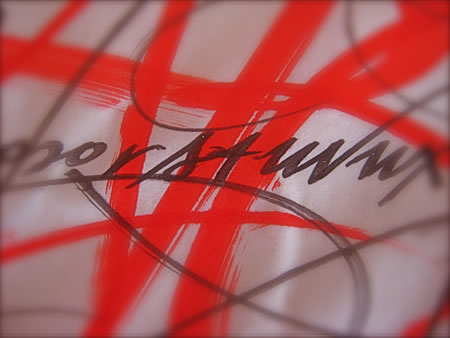
Labuat | The meandering pen:
http://soytuaire.labuat.com/
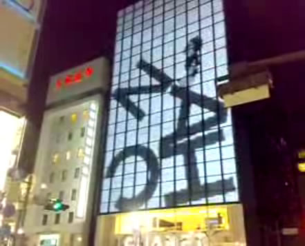
Chanel Ginza building animation:
http://www.youtube.com/watch?v=6CrS-PH1OuY
The evocation of ch’i, in The Way
http://www.youtube.com/watch?v=LKFKxfL7tV4&feature=related
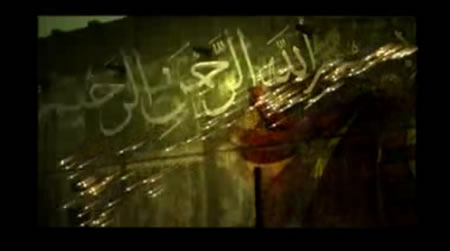
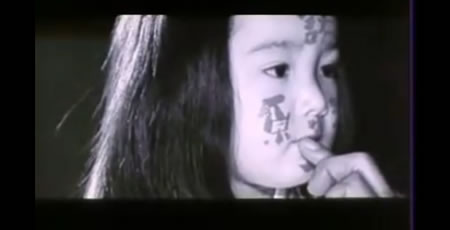
Arabic graffiti
http://www.youtube.com/watch?v=SjJC6LG-rcI&NR=1&feature=fvwp
Uniqlo | Seed
http://www.youtube.com/watch?v=O_4ZdcHVUc0
GIRVIN | Thought to form
(Shot with a Russian Kransogorsk handheld)
http://www.youtube.com/watch?v=GKAIZtb_W-E&feature=channel_page
GIRVIN | Brand reel (Terri Bassett | Digital Kitchen | Larry Butcher)
http://www.youtube.com/watch?v=UVG0188ti_U&feature=related
Se7en | Kyle Cooper
http://www.youtube.com/watch?v=4thzyFFdvVc&feature=related
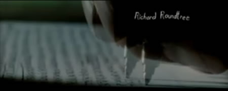
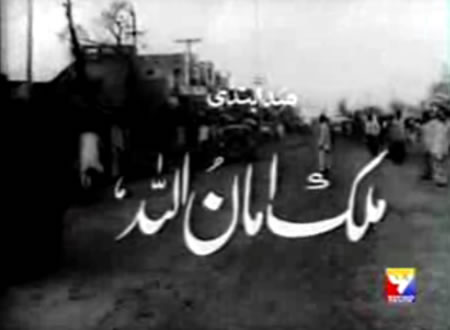
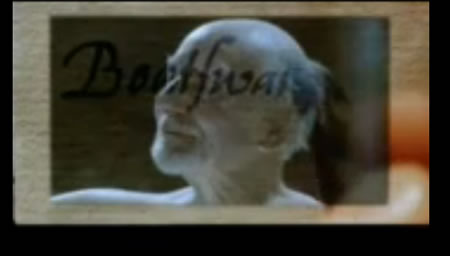
Calligraphic Pakistani Titling (with wild newsreel compositing)
http://www.youtube.com/watch?v=3bQjot2NnaU
Showman’s Reel: Calligraphy
http://www.youtube.com/watch?v=jZ-tGUj0op0&NR=1
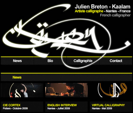
Kaalam | Breton | Light Calligraphy
http://www.behance.net/Kaalam
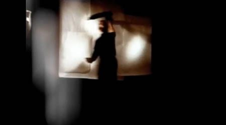
Pillow Book Opening | Peter Greenaway
http://www.youtube.com/watch?v=ZNtZUkfuEzg&feature=PlayList&p=6F10ADE7C73890AE&playnext=1&playnext_from=PL&index=10
Prospero’s Books | Peter Greenaway
http://www.youtube.com/watch?v=ovsxauCwOb0&feature=PlayList&p=6F10ADE7C73890AE&playnext=1&playnext_from=PL&index=19
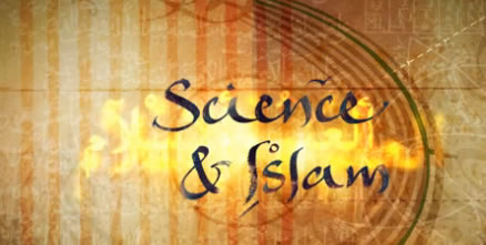
Islamic Overlays | Creative Saints
http://vimeo.com/4508318
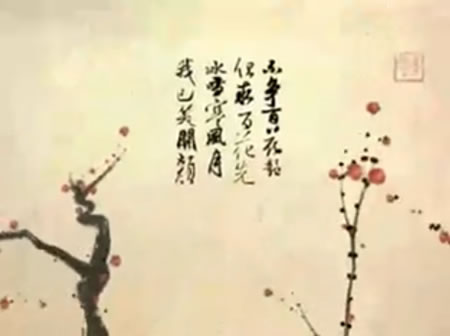
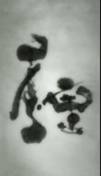
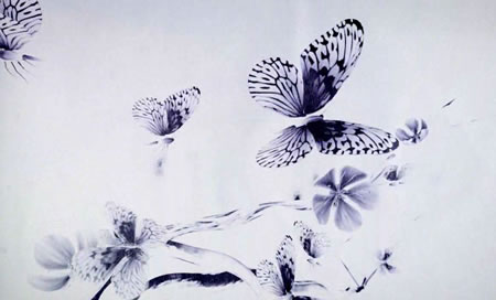
Dimensional Sumi-ye | Haiku | Arakida Moritake (Arjuno Kecil)
http://vimeo.com/2268876
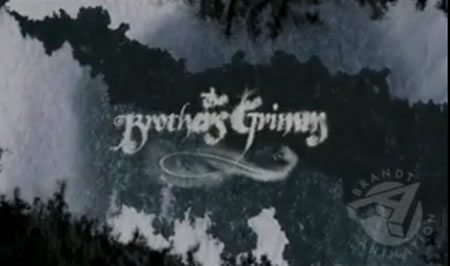
Brother’s Grimm Titling Animation | Terry Gilliam | Brandt
http://www.youtube.com/watch?v=qS6LHdF95D8
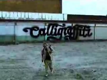
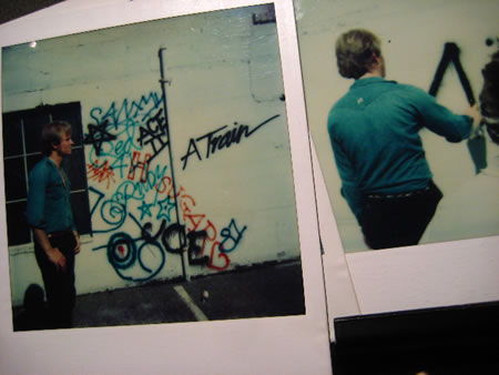
Calligraffiti
http://www.youtube.com/watch?v=-aKyg-8kq-c&feature=PlayList&p=546202B1A073B685&index=0&playnext=1
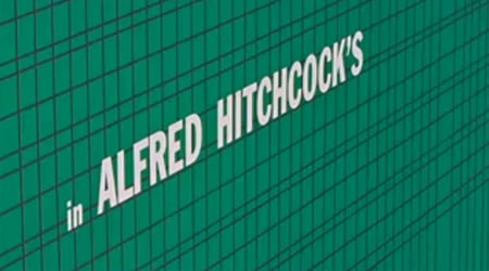
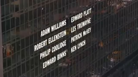
To typographic interpretations: An all time typographic classic | North by Northwest | Alfred Hitchcock & Saul Bass
http://www.youtube.com/watch?v=jIlqatMQSgI&feature=PlayList&p=546202B1A073B685&playnext=1&playnext_from=PL&index=49
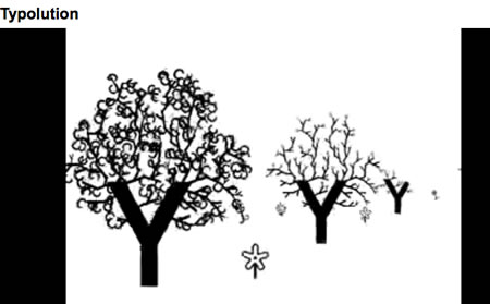
A typographic exploration:
http://www.youtube.com/watch?v=zVPfTlpCKaw
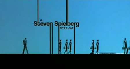
Catch Me If You Can | Steven Spielberg
http://www.youtube.com/watch?v=iVEgK3nCkao&feature=PlayList&p=546202B1A073B685&index=1
Onwards — calligraphic, typographic, graffiti or projected — to more interpretations of message, manner, method:
To any designer, to deepening, it’s about looking at what lies beneath, metaphor or symbol, underlayment of context, myth, legend or mark — there is magic in the translation, of thought to idea, story to shared community, message to miracle.
Keep that spirit on wing.
TSG
Exploring typographic
brandquesting | http://blog.girvin.com/?p=2939
reels: http://www.youtube.com/user/GIRVIN888
blogs:
http://blog.girvin.com/
https://tim.girvin.com/index.php
profiles:
Facebook: http://www.facebook.com/people/Tim-Girvin/644114347
Twitter: http://twitter.com/tgirvin