
Art Wolfe | Wikipedia imagery file
Creative Commons Attribution-Share Alike 3.0 Unported
The brand that is a living, loving being.
Art Wolfe and I go way back — decades; but my personal relationship with him goes back further — into the recesses of my younger years, being in the ramshackle melange otherwise known as REI. Art’s imagery used to be shown in the meandering hallways of that early outdoor cooperative. And in the old daze, Capitol Hill, Seattle, that place was an inexpensively-housed garage of wooden floors, cheap lighting, rough-painted walls, massive wood pillars and a byzantine warren of shopping places. I liked that. East to get lost; and lovely to explore. Fast to get separated from your parents. And I was an explorer, back then, seeking out the forgotten doorways and back entrances of various parts of any store — to see what lay behind the façade. I still do that, actually. But Art’s work was on the walls, back then, and wandering now, in the memory of this kind of place, naturally originated and profoundly evocative of moments of curiosity in discovery; beauty newly known — cherished, and loved.
For Art, it’s about that. Love.
A profound love of the experience, celebration and mysterious unfolding of nature — and generously sharing these uncovering explorations of nature: expressed.
And it’s been an honor to work with, and for, Art and his team. >Chris Eckhoff, his partner in operational support — doing what needs to be done in managing his empire of photography, art, his studios, workshops, travels, TV production, sponsorships and speaking engagements, and his friend and colleague, the photographer James Martin — who has been focused on brand development and strategic implications for Art Wolfe.
So, this is the team — we worked with them all, to see what the heart of the Art Wolfe brand centers upon, and as well, what that evocation might look like. Working with Art was about defining a new sentiment in approach for his brand and visualization; it was less about style and more about capturing — lustrating — his voice. That voice, that spoken sense of personality, lends itself to his work, the curiosity, the roving exploration that is at the very heart of what he’s accomplished.
The heart of his new identity is here. Clean, clear, simple, restrained — yet made by hand in precision:
![]()
This is a crafted font, especially redrawn, classically balanced and letter-spaced — it’s as open as his work. The tactile and dimensional impression of the logo typographic device belies the spirit of touching — the sensate impression — the extraordinary prints that are offered, signed and printed in his studios. And it’s about touch, and warmth, in the experiences that they evoke — whether humankind, animal, nature — scenes that combine the spirit of the three. As well, the deckled edge of the stock that lies beneath his impressed device speaks to handmade, the textured quality of the art full touch. The combination of the spirit of all of these elements infuses the opening of the site modeling; it talks of depth of impression, shifting imagery — and delicately arrayed access to many other portals in the world of Art Wolfe, the paramount of natural explorers and photographers of our age.
Check out these scene | image sorting animations, to the GIRVIN interface for Art Wolfe’s newly organized website and brand evocation:
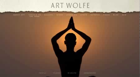
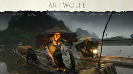
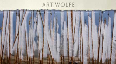
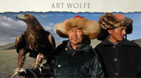
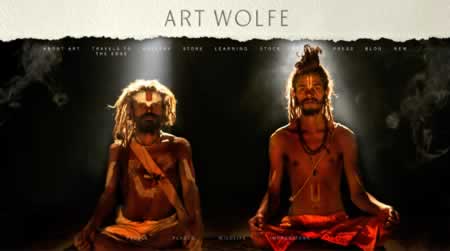
The work that we do is about love — finding the lover of the brand, the person — or persons — that originate the enterprise and bringing it to an audience of lovers — those that embrace the possible captivation, drawn into the web of loving what has been shared. Beyond the numbers, it’s about that — tell a story that shares the (love) passion of creation and invention — and bring that offering forth — in a manner that galvanizes an audience.
Find love, share love — in what you do.
tsg
Discover more from Girvin | Strategic Branding & Design
Subscribe to get the latest posts sent to your email.