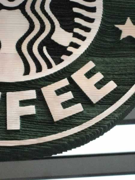
The revelation of Starbucks retail design prototype two.
I have a funny relationship with Starbucks.
I’ve really never worked with them, yet I have these links to the creative leadership that allow for an intriguing consciousness about what lies at the heart of the brand and the explorations that they undertake. Friends in the right places.
While I say I’ve (or we’ve, Girvin) haven’t worked with them, we have — but in an internecine skunkworks fashion, below the radar. And we’ve written about them a great deal. But, like much of our relationship to the industry of communications, we work on the outskirts as a kind of renegade, the ronin. So in my creative work with them, it was secret, it was something about a new retail concept, in exploring, literally, the notion of Joe. Joe as a food and beverage outlet, the concept of a new idea of prototype that goes beyond the current modeling in play. Something really out there and different. Future diner. Modern kaffé. Retro bistro. Went there, designed there, was there. LA actually. Some Starbuckians will recall Joe the journal, but this Joe might’ve been further beneath the surface.
But now, during the effort to build brand for Starbucks in a global effort of repositioning and renewal — I am focusing on an alternative group of tracks — retail, place, story, brand, love. I know, for certain, that a specific friend of mine from Bali will be lobbing authenticity counterpoints over the rails on these missives, but I’m studying this less from the ethos of certain forms of corporate responsibility and more to the strategy of the evocation of brand in place — that is, the spirit of a design direction that links to strategic imperatives.
• Be green(er)
• Seek solutions to justice, contribute to the world
• Tell a new story
• Offer better product
That, in a way, is really the modeling for the new conceptual directions; one, which I’ve already shown (Pike Place & First Avenue, Seattle), and two, the second iteration, now launched in Paris Disneyland, and more conveniently for me, yet far less romantically energizing, University Village.
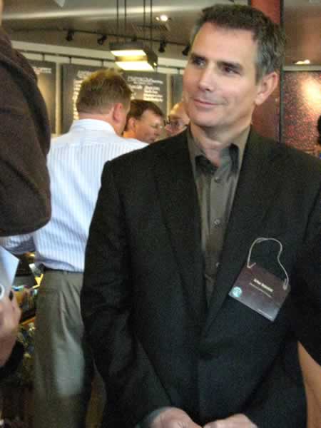
Arthur Rubinfeld
Once again, the real players here (to what I know, and what I’ve been shown and told from my friends there) are Arthur Rubinfeld, who was culled in from his personal consulting arena to readdress the conceptions of how Starbucks could tell its story better, the new gun for global design — story / store development, Liz Muller — and a new design maven, from a long-running history at Ralph Lauren, Tim Pfeiffer. All remarkable people.
Liz Muller
Here are some tellings, to the voicing of new story | new space.
There are a couple of underlying design attributes — and attribution — in building out the character of the place — this one being more urban, and less “heritage”, to the opening store on First & Pike. One, the influences of the grand French champion of raw materiel, in design: Pierre Chareau. I have personal recollections of the first launch of his book, literally decades ago. And the pavilion that he designed in Paris is as easily recallable for me as when I first was exposed to the perforations and raw metal composites in the framing of his places. There’s a legacy that stretches back in time, in the Parisian use of rough materials — Hector Guimard’s Metro scrollery comes to mind, as well as the grand iron and glass armatures, elsewhere in the city. It’s been purported, in speaking with Tom Kundig and Alan Maskin, Partners at OSKA, that the opening inspirations came from them — the Chareau metaphor and the clearing out of the earlier extensive graphical presence of the walls — the Starbuck’s wallpaper. Still, to his take, they implemented only about 50% of their ideas. There are other team members that clearly influenced the interiors – working on conceptual development of both stores. But interestingly — Starbucks cut its staff from nearly 80 rollout retail designers to 8, in the opening innovation sessions that created the store concepts. Team — lean and mean. But to Rubinfeld and Muller’s planning, as well I’d imagine Tim Pfeiffer’s deep retail expertise — small teams are gold, easy to move and great for speedy activation.
You can see more, explored here.

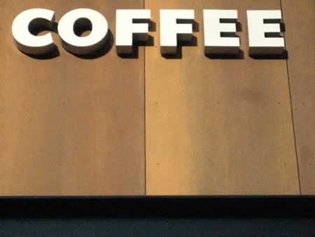
Exterior perforated, dimensionally folded signage
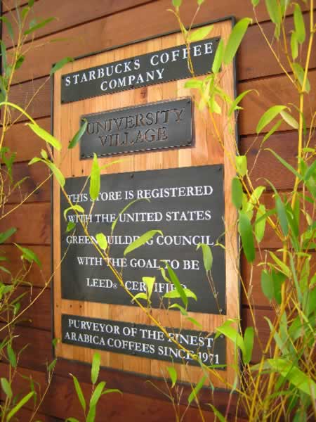
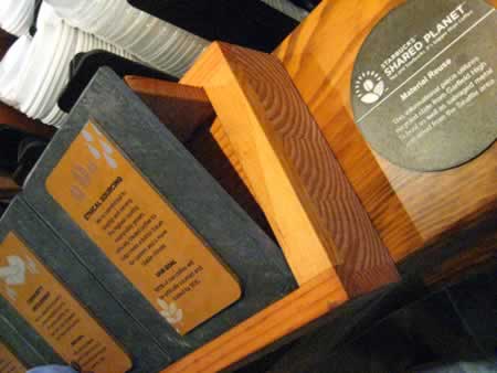
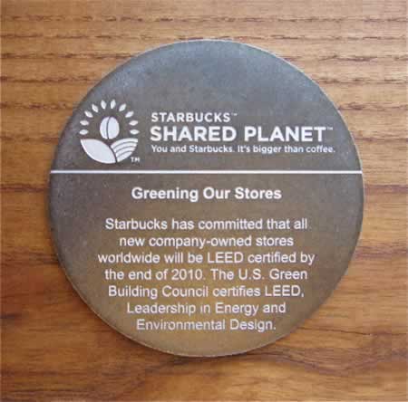
LEED® notifications on the retail front, main entry
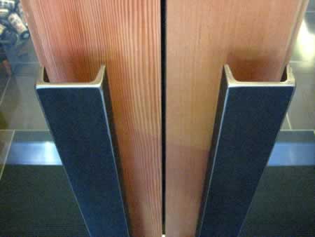
An improvement in door pulls, north entrance
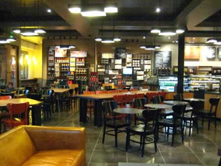
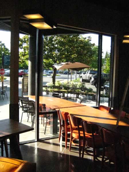
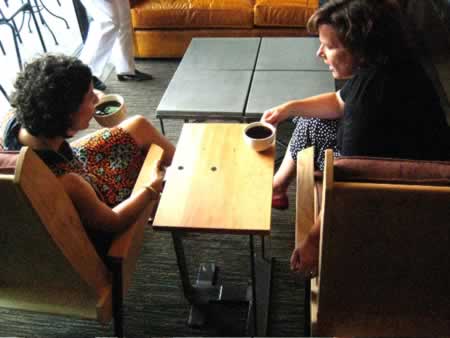
The basic feel of the place, unadorned by humans
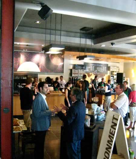
With humans.
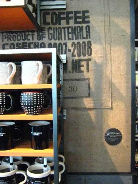
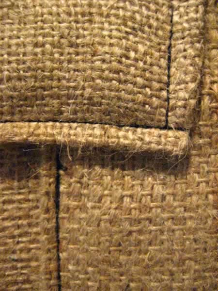
Wallpapered burlap, stitched to the wall:
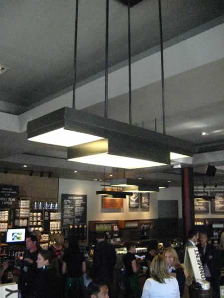
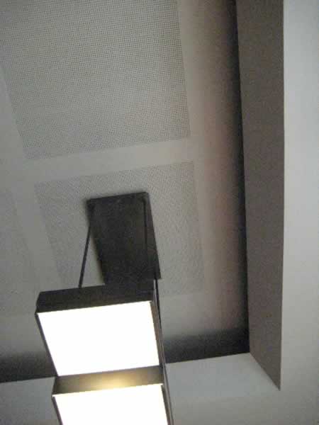
The Chareau-influenced design of light fixtures, cold-rolled steel
The coving treatments recommended by Kundig, with the Dutch recycled accoustical tiling
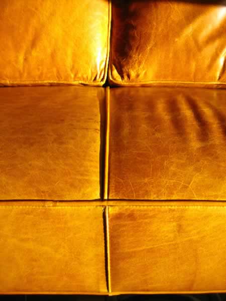
Reused leather.

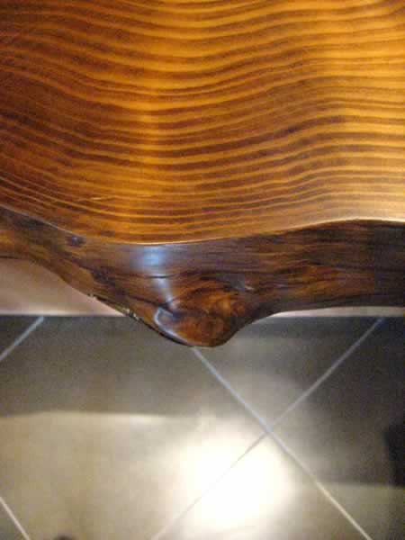
George Nakashima-like, fallen timber: split Ash,
filleted table and butterfly joints by John Wells
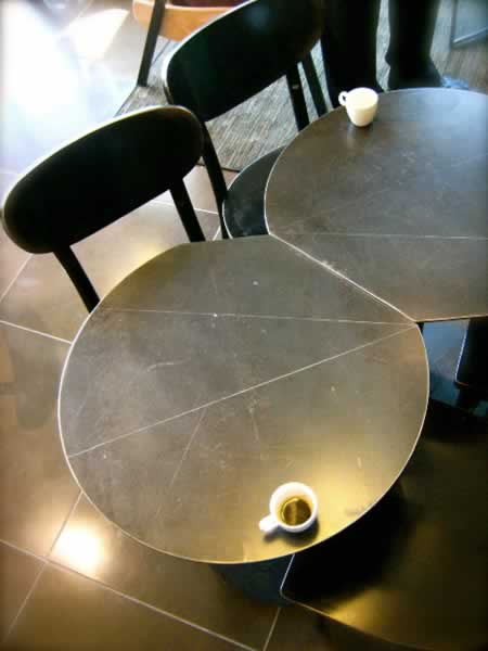
Cold rolled steel table tops
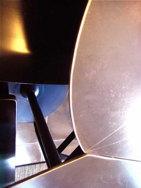
Reconfiguration details
Industrial harvesting of materials in reuse.
Texture and the hand-crafted (locally, by the way)
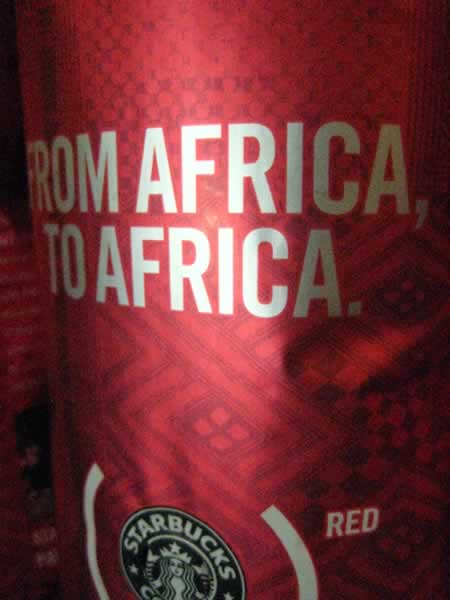
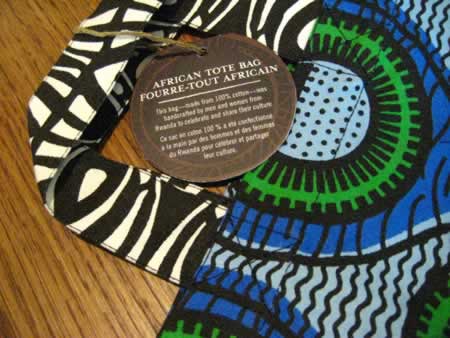
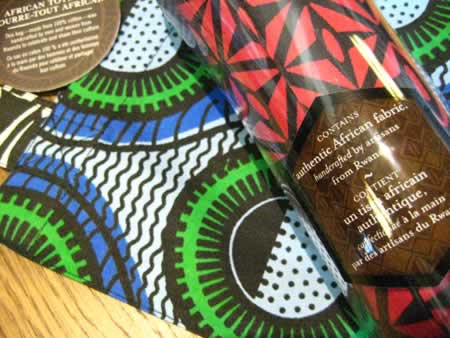
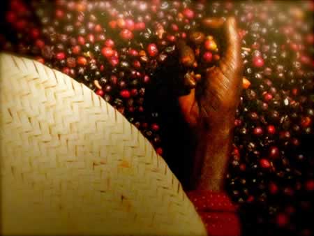
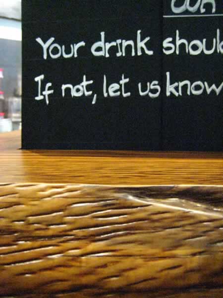
African initiatives — giving back, working with Rwandans, African (RED) coffee beans
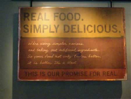
The new food initiative — healthy: making a change to simplicity, honest ingredients and rolled out nationally, last week.
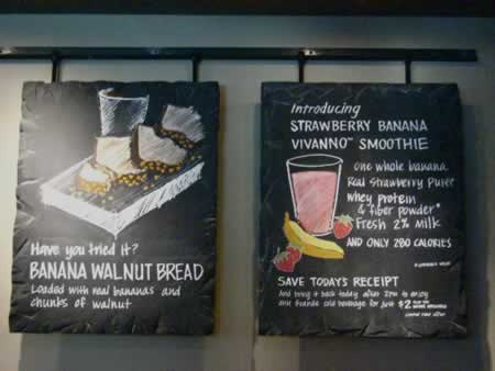
Handmade, cut slate signing, recycled
The hand-scored rules on slate, for handwritten signing treatments
A whole lot of light
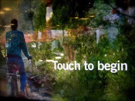
Simple interactive monitors
Burled details, left in play — fallen hardwoods, Seattle
Chareau-styled chairs, side table
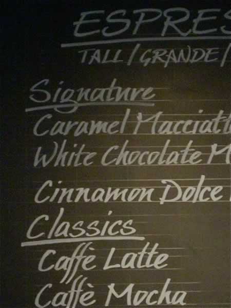
Some notes on signing and merchandising treatments:
Deep-blasted exterior signing
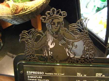
Incised merchandising blade, interior application
Faux steel patinized panels (painted — the landlord objected to possible concrete staining)
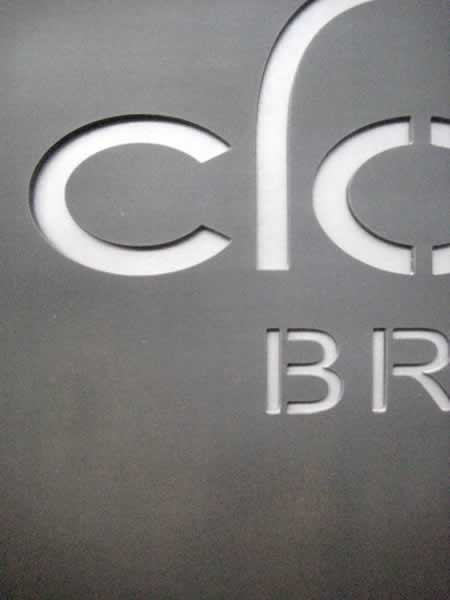
The Clover pronouncement — incised steel external signing application
It’s clear the Starbucks development design team has had fun — but the evolution of these retail conceptions are also thoughtful work, considered in application, and, of course, worked out carefully, to the management of the balance between strategic intentions, dollars per square foot and the sense of story in display. There’s a plan to roll this expansively — internationally — with some pretty spectacular goals.
I hope they make them — beat the targets.
For now, I’d like to see the plastic cups recycled for the yogurt, granola, juices, glass recyled, papers sorted, grounds composted and interred. That would make me feel better about being there.
What’s your take? Been there?
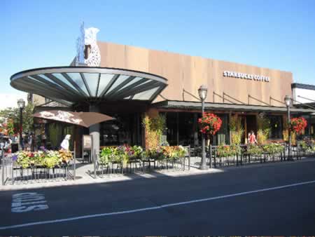
Photo by Dawn Clark
tsg
….
Brandstory: New retail concepts
Frida Giannini
Twitter: http://twitter.com/tgirvin