


Customized type face design, font development and motion picture design
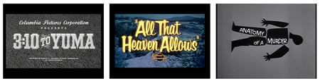
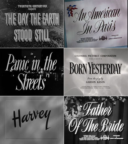
Over the course of the last 3 decades, Girvin has designed literally hundreds of identity design strategies with hand-drawn typefaces for motion picture main titling design, one sheets, posters, billboards and signing and merchandising applications. Big on film and storytelling, visual magic, we are. You can see some of that here, in Girvin’s 888 reel group. And you can see a quick overview of these applications in this study group, animated at Girvin.com. We’ve partnered, in the creation of this great stuff with Girvin talent, like Terri Bassett and Larry Butcher, as well as T.J. Holleran and Jon McVey, as well as aligning our creative with design groups like Digital Kitchen, TinderBox, Flying Spot. Our internal teams, lead by Seattle Creative Director, Chie Masuyama and I, continue to explore the development of customized fonts for identity, building out on what one might call a legacy that goes back decades, to the origin of the show card — completely hand-drawn, brush lettered show cards. From a definitive collection, founded in the Netherlands, check this out. More, on the collection designer, below…
This conception of creating drawn merchandising placards extends back into the 1800s, for signing and retail merchandising display — single, or minimally run posters on show stock, with bright colors, couldn’t be conventionally printed. Signwriters were used. Even master designers like Oz Cooper, with his Chicago design and advertising promotions shop in the mid 1900s, or the brushed mastery and palaeographic theories of Father E. M. Catich was schooled in the skill of using sign-writing drawing techniques to build letterforms for placards, etc. In fact, his theorem that classical roman first century inscriptional letterform character was drawn from brush writing techniques came from his early work as a union shop, showcard sign-writer, as he notes in his study overview, The Origin of the Serif. I, too, started as a signwriter — boats, trucks, cars, shopfronts, glass, metal and wood. Good striking ground, some 40 years back.
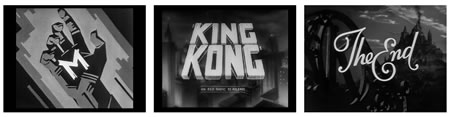
Back then, as now, the idea that a customized — even subtly rendered treatment of — typographic design could imbue the holistic presentation with a hint of humanized detail that can’t be found in simplistic typographic or letter-pressed settings alone. For that line of reasoning, our work has been detailed in this manner for nearly 35 years. There’s a web designer in the Netherlands, actually a seeker, a design examiner, that’s looking for, and has been exploring, more on this front. His name, Christian Annyas, and his site, a marvelous exploration, here. Scroll down for the movie titling stills. Awesome.
But the real point is the hand – the eye – the mind, the turning of the details of the art, the heart.
Explore, learn and find more. The tuning — type design, font creation, face typing; they all align, in the messaging of story, and the compressed visualization of the identity.
What’s your favorite movie identity treatment?
tsg
….
Brands | love | movies | humans:
http://blog.girvin.com/?cat=301
Girvin reel: http://www.youtube.com/user/GIRVIN888
messaging: Twitter: http://twitter.com/tgirvin
Tim Girvin | GIRVIN | girvin@girvin.com
c. 206.890.0621
New York City + Seattle | Tokyo