NY Magazine Article, “Tom Ford After Sex”
—-
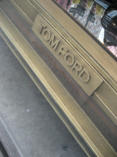
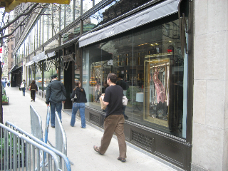
While I didn’t get an appointment, for a tour and fitting…I did have the chance to check out the retail design of Tom Ford’s new story. Store, I mean. The skin of the store is quiet, dignified and restrained. Quiet enough, signed minimally enough, that you might walk by it. I’d expected that. I didn’t miss it. These floorboard signing treatments, below, speak the identity of Tom Ford which, by all references, is essentially without much in the way of character. The font is a san serif skeleton of personality. And unlike the letter spaced balance of Chanel, the Cassandre designed, italicized grace of Yves Saint Laurent, the splay of Louis Vuitton, this is essentially a bulletproof armature that could be the signature of a weapon, not a brand of thinking design, with a slightly sexualized edge. What’s the character, then? Given the care of everything he does, and I’m sure there’s thoughtful certainty in the discipline of this — there is everywhere else — then what does this say? I believe that in designing for Men, Tom designs for himself. And I believe that the studio on Madison is, in a way, his positioning for himself. He could live there. In a manner of speaking, it might be said that the designs of the spaces of Gucci and of Yves Saint Laurent are almost a gesture to the bedroom — a modernist grouping of boudoir. I can’t remember if that was Sharon Frederick, the global director of design for Gucci, or the US Director of retail for YSL, Claudia Cividino. Someone told me that.
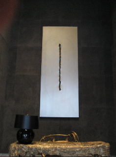
The spaces were designed by the close, long term collaborative to Tom Ford, Bill Sofield. His prototypes lead to literally hundreds of stores — for both YSL and Gucci. And it’s his hand again that created Tom Ford on Madison. Bill’s work is like Tom’s, in a sensibility of discipline and modernist form. With twists. Metals, dark woods, polished and steely. But there’s a sense of texture — but it’s a subtle rendering. Like the metal drapery of this reception table. And then, to texture, there’s the incised single stroke that cuts down center of this almost asian sculpture mounted on the entry wall, burnished dark.
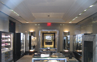
There’s another central character to the work of Sofield, in the defined sense of procession and entry. It’s a ritualized progression. And unfortunately it’s guarded by trolls — so they would seem. Security is tight. What for, one might ask? To offend the curious, disgrace the meek, distract the less moneyed? But there’s security in nearly every luxury store. And to some, this story is about the treasures within; it’s keeping what’s in, in, what’s without, barred. Or channeled, then. But that lends itself to a challenging predicament. If it’s all about opening relationships, then how does the presence of goons support that? If this is, instead, the artfully disposed and liveried guide, then it’s something else all together.
The would be the way. And that is the way. The way in…Help me to come in. Well, come.
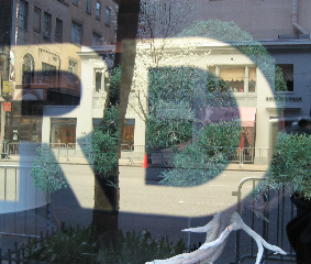
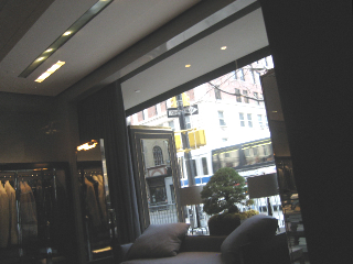
I like the juxtaposition of this image below. The cold type — balanced against the ancient bonsai, reflecting the word, and the world outside. This image in a way symbolizes the stylistic framings of Tom Ford. Cold discipline, a kind of sexual domination in sensual restraint and symmetry.
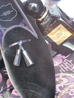
What of the other containments — aside from the store? I’ve admired the packaging of Tom Ford. But I don’t know who’s done it. I’d offer that it’s closely studied by Tom. That he controls it — as I would adjudge that he monitors every device, pediment, flask shape, knotwork and labeling treatment.
Clean, crisp, adjacent to the weathered installation, bonsai.
Symmetries, polishes, reflections.
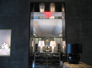
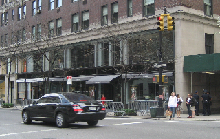
The shopfront, proud to be silent.
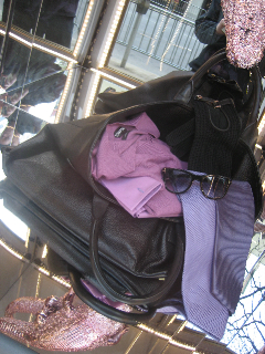
The hood.
Tom the man, Tom the brand, Tom the aesthete. Designed by him. For him.

“Tom Ford 2009 – 1” by Nicogenin is licensed under CC BY-SA 2.0.
Like that. Like him.
Discover more from Girvin | Strategic Branding & Design
Subscribe to get the latest posts sent to your email.