
Examining brand design, storytelling and identity in literature and motion pictures
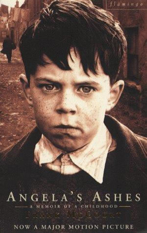
Frank McCourt lived a life that few have journeyed. And he passed that life, last month, on the 19th. He’s best known for his authorship of “Angela’s Ashes” a telling of the travails of his childhood. His brothers, too, wrote autobiographical sketches — Malachy McCourt and Alphie McCourt — and during the 1980s created their staged retelling of their experiences in “A Couple of Blaguards”, a two man exposition.
Frank was born in Brooklyn, the first born of seven children. His parents, unable to find steady work, during the darker hours of the Depression, returned in the early 1930s to Limerick, Ireland, where they sank deeper into poverty, coupled with a continuing absence of income and alcoholism. Frank’s father left the family to find work in the wartime factories of Coventry and sent little money home, forcing Frank’s mother to fend for herself, raising the four remaining children. Frank’s education ended at 13. He held odd jobs and, to bring some sustenance to the table, stole bread and milk in an effort to provide for his mother and three surviving brothers, Malachy, Michael (who now lives in San Francisco), and Alphonsus (“Alphie”) (who lives in Manhattan). Not all the children came through those dark times: the three other siblings died of diseases related to malnutrition and the dense squalor of their surroundings. Frank McCourt himself nearly died of typhoid fever when he was ten.
The world in which he lived was nearly unimaginable in what one might think of a civilized, western industrial nation. In “Angela’s Ashes”, McCourt described an entire block of houses sharing a single outhouse, flooded and muddied by constant rain, and infested with rats and vermin. The Wikipedia reference cites their life as astonishingly painful. “Their mother destitute, as there are few jobs for women at the time, is forced to beg for help from the Church and the Society of Saint Vincent de Paul. Sometimes, Frank and his brothers have to scavenge for lumps of coal or peat turf for fuel, or steal bread, in order to survive. Angela’s mother (a widow) and her sister refuse to offer any help because they disapproved of her husband; mostly because he hails from Northern Ireland — a strange accent — and what Angela’s family calls ‘the odd manner.'”
In the damp, cold climate of Ireland, the children have only one set of ragged clothes each, patched shoes, and no coat or boots. Frank develops typhoid and is hospitalized. Later, he gets a job helping a neighbor who has leg problems, delivering coal, where he develops chronic conjunctivitis. The family is finally evicted after Frank takes a hatchet to the support beams so as to use them to burn for heat. Subsequently, the ceiling collapses in on them. The family is forced to move in with a distant relative who treats them poorly, and eventually forces a sexual relationship on Frank’s mother, Angela. A now teenage Frank starts work at the Post Office as a telegram delivery boy and later delivers newspapers and magazines for Eason’s. He also works for the local money lender, writing threatening letters to people who owe her money as a means to save enough to finally realize his dream of returning to the United States. The story ends with Frank sailing into Poughkeepsie, New York, ready to begin a new life at nineteen.” This was the time of his most profound molding as a writer.
And, to Scott Rudin, our client — the executive director of the film — as well as the design expectations of the marketing department of Paramount Studios Theatrical Advertising group, the nature of our challenge, was to reach into the sense of anguish, as a branding strategy, that set the tenor of the film, the story and the nature of the plight — and pluck — of the children.
Scott Rudin, who frequently takes a defining role in all marketing visualizations of his projects, along with Nancy Goliger, EVP | Theatrical Advertising, was looking for something that looked to the upside — that the story, alone, wasn’t merely about the sheer travail of the experience, but as well, the founding survival spirit that allowed them to continue to live under repetitively harrowing circumstances. While Rudin’s positioning might seem at times (in our working with him, at least) remarkably uncertain — malleable, to the market, to his impressions, to the variation of his visioning. Goliger is a woman of extraordinary art directorial, marketing and strategic skills — her instinct might be called paramount, at Paramount. Still, this conjoining of brand leadership lead to our involvement, and an intellectual exploration of how to capture that soulful rendition — that was tinged with a bleak reference, yet still captured the possibility of salvation.
To that end, these hand drawn, customized typographic potentials were explored, building on historical palaeography — the types of the time, as it was — as well as defining solutions that might have a brighter countenance, mired in the dirt and dire meaning of urban squalor.
Being a draftsman, I reached to the hand, first — a kind of scrawling signature, that aimed for something beautiful, found in the heartless.
A makeshift scribble:
A quick graffiti, along the lines of what an itinerant sign-maker might render, damaged:
A multilayered and dimensional scratching:
A parchment rendering, unclear and gauzy, written painfully:

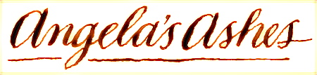
A clumsily rendered Spencerian, hand drawn with steel:
A newly redrawn Victorian font, ligatured, dusted with a vertical tinted shadow:
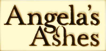
An outlined and distressed Caslon based redrawing:
A customized and distressed version of an more elegant – yet damaged portrayal:
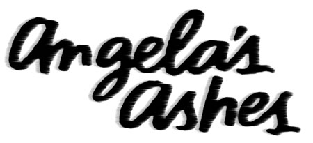
A letterspaced, hand drawn rendering, shadowed backwards:
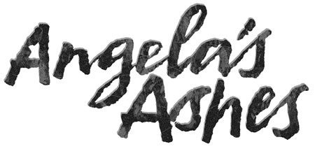
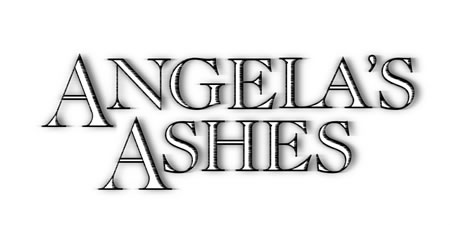
It was the spirit of this last rendering, the idea of something restrained enough to balance the dire expression of the one sheet, that won out in the end — a series of solutions and variations that, in the character of theatrical marketing design, can be the nature of the process of identity development — to the 11th hour. The final Paramount Studio’s treatment:

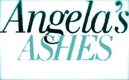
And the final one sheet:
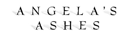
The final rendering, in this poster, intimates a kind of simple desperation, without being overly dramatic — and herein the challenge, to the taste making level of the cinematic portrayal — how far to go, in lustrating the premise, and promise, of the story in brand identity.
Our role, as designers, tends to be focused on the distinction of emotionality in brand content; it’s what we get hired to do — reach into the soul of a brand, the story embedment, and bring that out — as delicately, or as forcibly, as the audience telling and the brand strategy might require.
In the end, these choices are brand instinctual. They are about the capacity of leadership, the center of the brand guidance, to intuitively, reactively, trace the spirit of the brand story and how best to place it. We aim and loft the arrows.
tsg
….
True brands, true stories, true identity:
http://blog.girvin.com/?p=2927
reel: http://www.youtube.com/user/GIRVIN888
blogs:
http://blog.girvin.com/
https://tim.girvin.com/index.php
Twitter: http://twitter.com/tgirvin
It’s a harrowing book. I agree that the final design was the best choice. The hand drawn versions, although interesting, are too informal. Use of a typeface better communicates the breakdown of social convention that is the central focus of the novel (and presumably the movie.)