This is about identity, visualizing and animation — and retail. And something I’d tried to do, but couldn’t. And someone (WOW | Tokyo) that did. My story. Their story.
—-
Last year, I’d worked on this idea of projecting this giant animation of an outgrowth of visual strategy — and finally, the identity — a typography and patterning created for the year end seasonal campaign for Bloomingdale’s | NYC. 2006. And we started that concepting this with Audrey Nizen (Creative Director @ B’s) in 2005, close of year.
The storyboards of my mind worked like this, the pitch — like this.
This was the projection — wall, floor and exterior treatments. Small, spinning — really big — projected. Interactive screen applications. TV. Mobile. Then — shopping bags.
Dimensionally, the prototype models like this:
Floating in digital space, formed, it would be like this — but alive, flowing, crystallizing — appearing and disappearing:
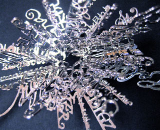
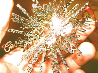
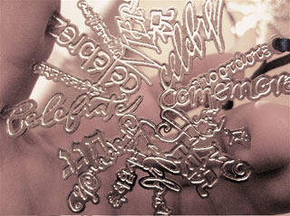
These treatments above are dimensional constellations of this basic language patterning, shown below — it’s a flat-patterned mandala that is spun dimensionally to form a “flowering” sphere.
Here’s the string sequence for the animation:
A spinning movement of the strokes of a star, which was like a snowflake, which becomes a constellation, emerging — and this, dimensionally, is spinning, in space. And slowly there is a kind of “writ on” media, the characters of different languages, different alphabets, that form and crystallize and whirl slowly, each telling that story — Celebrate! Which then flickers out to a patterning of imagery, that is celebration — those people, that land, the populating of culture, beauty, world. And that was the original idea — The world celebrates. And that snowflake, that constellation forms, and you flow through it. 17 languages, floating and dimensionally rotating, moving…projected, with voice and song. Celebrate, sung — spoken — in all these languages. Beautiful, colored, illuminated and crystallized. Interactive, mobile screen, floor animations, wall animations.
We finished the campaign, but we couldn’t fund that application. We tried, of course. The whole team worked on that. There are other things. Catalogs, sites, signing, ribbons packaging, some product development — all that was done. Like this…
It’s here: The cartography of language and meaning
Or here:
https://www.girvin.com/spot/pdfs/bloom2006_pr.pdf
But I was looking at something else, and surely it’s not the same idea, nor is it quite the same thematic intention, but it is an intermixture of live organic form (this time real) combined with growing text.
I’d like to introduce WOW, to you now…Because it’s a visioning; it’s retail; it’s projected:
http://www.dezeen.com/2007/11/05/tenspace-by-wow/
and it’s cool. And, it was kind of like what I was thinking. Only better.
— and what I’m curious about is that idea of something that is animated and alive — but then becomes a shopping bag, or a piece of signing, or a projected imagery. And right now, that idea of celebrate — as a world family of languages and sound, beauty and song, a kind of global snowflaking that is alive. I like that idea. Know of any clients that might support that kind of mission?
There, I’d go.
T | NYC
—-
Tim Girvin
Principal
GIRVIN
https://www.girvin.com
Exploring creative integrations:
https://tim.girvin.com/
Strategy | Story | Name | Message | Identity | Environment | Print | Packaging | Interactive
Discover more from Girvin | Strategic Branding & Design
Subscribe to get the latest posts sent to your email.