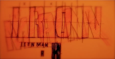
Elemental examinations of material and technology in cinematic design
Earlier in our history as designers of cinematic identity, we were asked by the marketing team at Paramount Studios, lead by EVP Nancy Goliger, to explore the concept of a cinematic treatment of the legacy of Iron Man. Like many of our development programs for theatrical design positioning and visualization, we started nearly two years before the film was released. The unique attribute of our study might be that we had virtually nothing — in the way of reference — of the opening industrial design and production visualization principles of the film.
As in our work for many films, the idea of designing working mostly from working with the studio, historical references, early story-boarding, the script, meeting with executives, writers, directors, producers and stars is relatively commonplace. Positioning a film visually needs a place to start and that — as renegades of motion picture identity design (not being part of the massive promotional engine of film advertising in Los Angeles) — is oftentimes our interloper placement in working on production development.
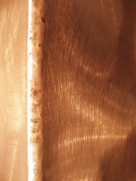
A bronzed application, from medieval armor, tinted in the golden cast of Iron Man cladding.

We reach back into the historical references, pulling materials, visual effects, lighting and composites of imagery to build on the legacy of a new treatment of an established thematic character, or creating something completely new. Our cinematic design books can become, in the opening months of creative efforts on the film, a kind of referential bible of context. Like many programs in motion picture design, the efforts in bringing a film design to light are highly competitive, entirely collaborative (mix and match) and in many instances, perfectly founded on intuition by filmic leadership.
While there are focus testing and audience studies down the line, examining the appropriateness of trailers and visual context, the early work comes from the soul of the story and the heart of the brand. And this is the place that we work, building on the positioning of what we know, what we recommend, what we’ve heard in our onsite, studio reviews and developments and building the widest range of potential offerings that we can muster. Motion picture design development is rarely about a couple of ideas — and just like the opening pitch to the studio for the film itself, the development and evolution of the written telling of the tale in the script, and finally the studies of holistic visual positioning, it’s about a long string of collective thoughts and transitions to build out what might be the final look and feel of the graphic identity for the brand.
Material development, textures and sampling for reference:
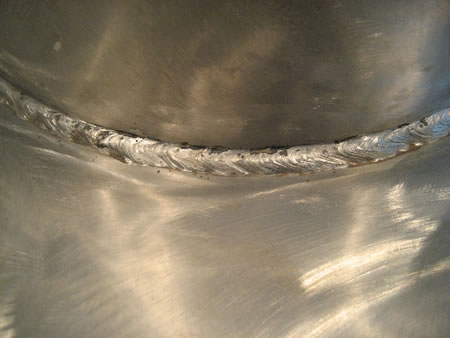
The hand-welded steel of the opening prototype, Iron Man (2008)
Sampling references from shoots in NYC | Armor collection, the Metropolitan Museum of Art, Medieval Galleries.
Cut steel, drilled and patinized — Soho, NYC.
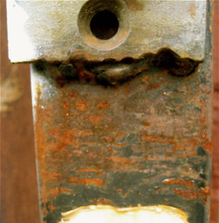
Corroded overcoats and bolting details — Tallinn, Estonia

Golden brushed steel — seams, beveled joints, incisions and light details (MMA.)
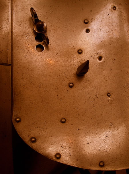
Prototype metals — hand wrought (MMA.)
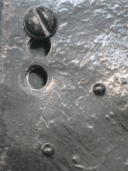
Girvin sees brand as fire — a passionate concretion of idea, creativity, action and enterprise — and this concept of a fiery center-point to the brand likens itself to the very spark of the nature of storytelling. Dig into it, to find the soul — and the material — of the telling.
Working, therefore, on the early concepts of Iron Man, our efforts actually crossed back in time exploring the concept of metal cladding for protection. And as in the opening of the first iteration of the Iron Man character, Stark’s hand-wrought and hammered building of the first protective prototype in the winding caves of Afghanistan, we worked backwards (mostly stealing into the archives of the Metropolitan Museum of Art, exploring and shooting the armory of steel clad warriors in their galleries.
Wrought metals incised and grazed, patinized (Gagosian, NYC)
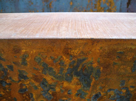
Light tests for glow plate (London, UK.)

Polished steel, acid etched, then re-polished — Chelsea, NYC.
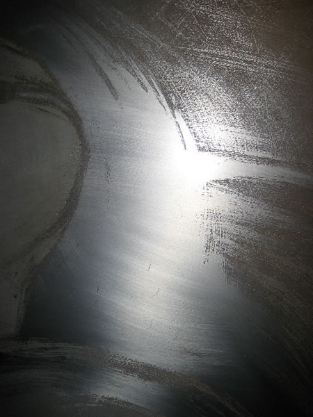
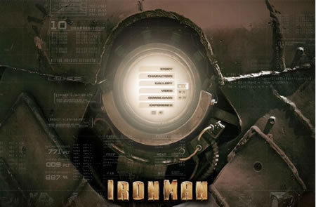
These opening, war-scraped, battle riven armaments formed much of the original idea in how to consider metal as a possible design treatment of the cladding of the atomic powered, heart positioned glow point of his energy. This, too, lent itself to the notion of the glow that might emanate — how that might be linked to the identity treatment and the materials from which it could be fabricated.
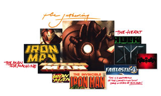
Still, this work is entirely collaborative — one idea forms another, and another, till there might be literally dozens of investigations of solutions. The concept of a simplified slightly condensed versioning of the final, master art was, in the end, hammered out by the leadership of Josh Greenstein, the then newly arrived Creative Director of Theatrical Advertising for Paramount Studios, fresh from NYC’s HBO where he led hybrid marketing for their properties.

Girvin is a ronin, when it comes to motion picture work — we’re not there, in the daily mix of living and breathing the cinematic seizures of marketing exhilaration. But we’ve worked there, every year, since the 70s, starting with Coppola’s Apocalypse Now. That first batch of signature treatments was brush drawn, spontaneously scripted treatments on hand-made Japanese washi, mulberry-frothed, delicate leaves of expertly crafted material that one finds in the translucent luminescence of shoji, the diaphanous, sliding and windowed dividers of Japanese design.
Still, the concept is about finding and capturing spirit — the soul of a story — reaching that messaging out, back to the audience in a manner that can captivate the viewer, reader, sentient, experiencer. In that, a relationship is built; and that’s the nature, surely, of Girvin’s work — building that relational sensibility that attracts and compels holding that vibe — the love — fast to the heart.
Go, Tony Stark, go!
TSG | D E C A T U R I S L A N D
Exploring motion picture and cinematic brand design | https://www.girvin.com/blog/?cat=301
—-
the reels: http://www.youtube.com/user/GIRVIN888
girvin blogs:
http://blog.girvin.com/
https://tim.girvin.com/index.php
girvin profiles and communities:
TED: http://www.ted.com/index.php/profiles/view/id/825
Behance: http://www.behance.net/GIRVIN-Branding
Flickr: http://www.flickr.com/photos/tgirvin/
Google: http://www.google.com/profiles/timgirvin
LinkedIn: http://www.linkedin.com/in/timgirvin
Facebook: http://www.facebook.com/people/Tim-Girvin/644114347
Facebook Page: http://www.facebook.com/pages/Seattle-WA/GIRVIN/91069489624
Twitter: http://twitter.com/tgirvin