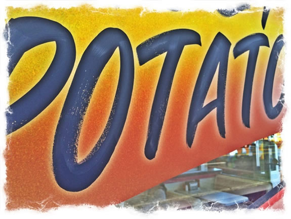
The Script of The Multi-Stroke Brush Lettering
Old-style Grocery Signage Script
When I began my career [1975,] I was a lettering artist, a sign-writer.
I wasn’t a designer, I was more to a kind of tradesman.
I had no idea about what design was, per se — I knew about designers, people that I visited, shared work with, learned from down the line, like Hermann Zapf, Father Edward Catich, the Carters, Milton Glaser, Herb Lubalin — they did nice work, but I didn’t know about design so much — or how it was done, just what I liked. So I went to see them.
Portfolios shown,
study shared,
learning gathered.
Still, I had to survive — so I studied the work of others, and made money as a sign-writer, as well as teaching drawing and calligraphy.
Sign-making is usually an apprentice scenario — you work hands on with a sign writing craftsman. Even back then, I never really found anyone I could relate to.
I had no idea what I was doing, it just seemed like a natural expansion on being a calligrapher. But the styles of calligraphy don’t necessarily lend themselves to signing and writing. Except as large style banners and placards that I did in college using old-style butcher paper pulled out
from a mobile, wheeled roller and
roll of variously-colored papers
and large-brushed industrial felt tips.
I did giant signs.
Big and long — bright paper, big letters, readable from 300 yards. Taking those skills to a micro-hand-drafted set of solutions, with hand-cut, steel-tipped, square-tipped Parker fountain pens [still have them, and use them],
I did micro-customized type for catalogues and brochures.
To that — big signage, I began to explore other methods of “quick-signs” — signage that solved a communication need quickly.
Big, bold, colorful.
From there, I searched out, and I learned about grocery signing, you know — it’s the kind of butcher-paper, swashy-blocky brush lettering [“Fresh Lettuce, 75¢ a head] that is not dissimilar to the styling of used-car lot signage –
“C’mon Over Here, Buy this Baby, only $1,500.00, Runs like a Dream! Hot Rod Heaven! A Steal at $1,000.00!”
What’s interesting about that sign-writing approach is speed — mostly applied to paper. Traveling in Oregon, I went to one of the old foundational sites of Burgerville. Right, I’m vegan, why would I go there?
They have vegan patty “burgers.”
It was there, close-up, that I could see that recollection. This Burgerville is an old one — recognized by many as their
high school eating joint in Beaverton, Oregon.
Decades old — the same as it ever was.
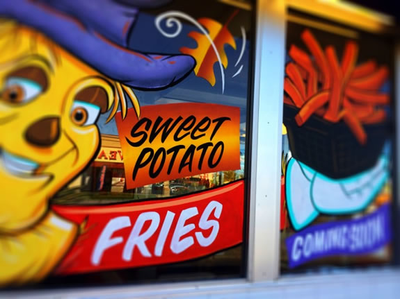
This place is signed using that old brush-drawn style — why it’s defined as multi-stroke is that the lettering is made up of inside and outside stroke
movements —
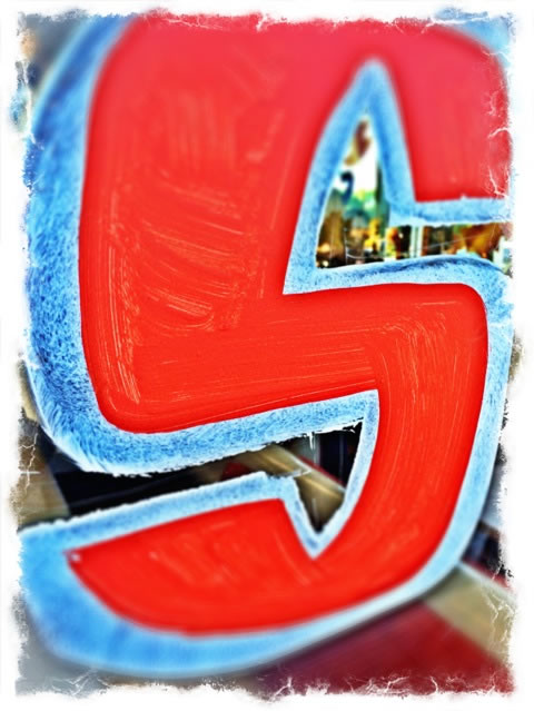
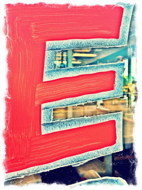
an interior foundation stroke and an outline exterior stroke to fill out the measure of the bold-stroked letterform.
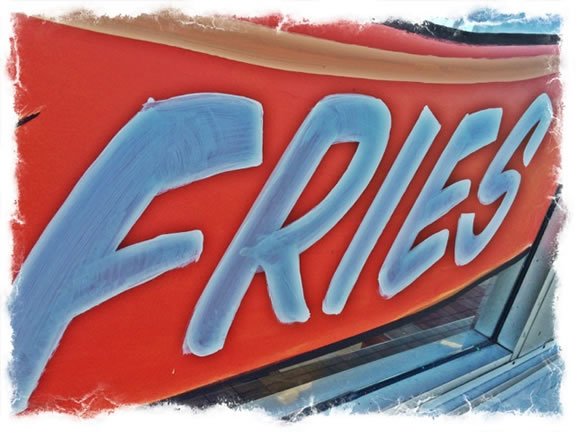
This isn’t an aesthetic move, it’s about a distinct 50s style of hand-lettering.
These are likely done with gouache or a water based pigment. They’re temporary. My work was mostly with OneShot Lettering enamel.
Check it out.
Cool brand,
Burgerville.
Honest,
good people,
committed,
family.
Tim | Beaverton, South Portland, OR.
The Strategy of Holism | Restaurant Experience Design
TouchPoints, Storytelling and Guest Engagement
See the Restaurant Point Conference Keynote:
http://bit.ly/1ndy9bv