DESIGN STUDIES IN BRAND STORYTELLING AND PATTERNING
As a designer for motion pictures, I look backwards to go forwards. And I look forwards to go backwards.
What that means is that much of our work as designers, particularly in motion picture related design and theatrical branding, is that focus on brand storytelling the narrative of the film’s premise—find the time, find the location, define the environment and the tiering of the plot, characters—and how best to visualize that—which can be just that: going back to go forward. Any designer worth his salt knows that research is core to any design, and in working on films, that is a tiering of exploration—what’s the script, who are the stars, who’s directing, what’s the studio doing with the marketing of this property?
I was talking about this to a group of students—discussing design thinking and identity development. One of them mentioned how Aeon Flux
—and back then, Colossal Pictures, influenced her career.
It changed her then, it changed her to now.
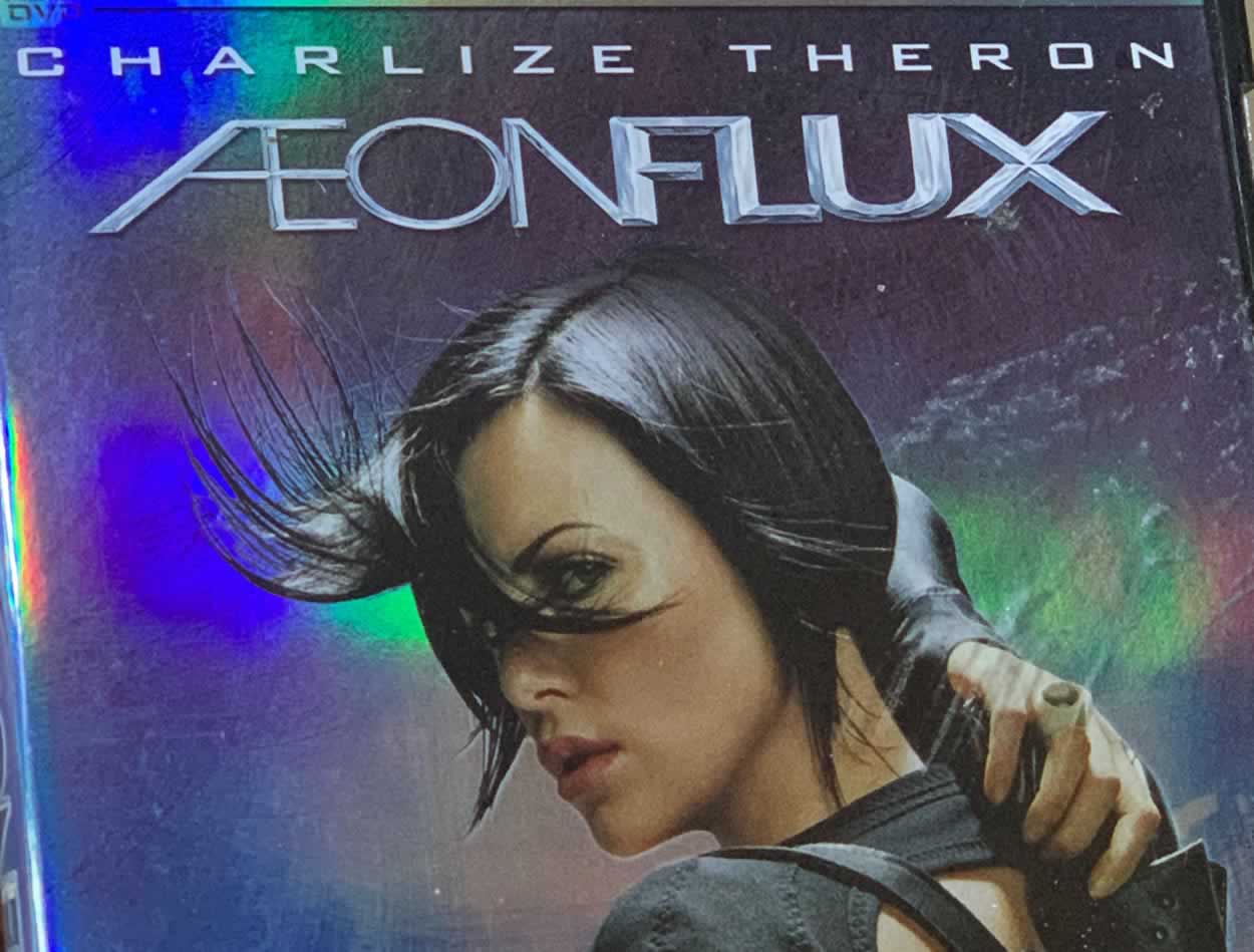
The same day, a notation from Vogue offered another mnemonic—how influential that opening animation was that influenced and empowered the film with Charlize Theron. And, as Liana Satenstein notes, worth reading: “Over the past few months of lockdown, I’ve been watching the adult animated series set in a dystopian world Aeon Flux. At times, it reminds me of what seems to be our own mangled society—with its plotlines about mounting health care bills and border patrols—only more perverse, dangerous, and robotic. It ran on MTV’s experimental Liquid Television from 1991 till 1995. At the time, the show—which was cutting edge, bizarrely sexy, and certainly not for daytime television—played at 10 p.m. with a rerun at midnight.
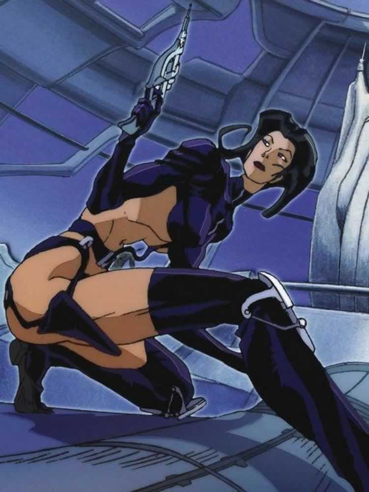
The story followed Aeon, an assassin of the fictional world of Monica, who kills targets and retrieves valuable items and whose main focus is to thwart the plan of Trevor Goodchild, an authoritarian ruler in the neighboring city of Bregna. (He’s also her occasional lover.) Aeon is visually arresting and severely angular, equipped with viscously sharp cheekbones and an impossibly whittled waist. She moves quickly, with each sinewy muscle showing, and is flexible with catlike movements
and otherworldly parkour abilities.
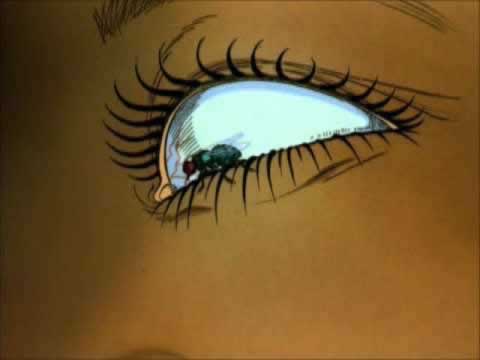
It’s always had a cult following—internet forums were buzzing about it in the ’90s—and now you’ve probably seen splices of the animation pop up on Instagram. The most famous clip is of long tongues interlocking and a fly getting struggling in Aeon’s eyelashes. Most recently Bella Hadid wore a vintage shirt with the image of Aeon on it.
It makes sense that Aeon’s outfit is still popping up on social media and beyond, albeit randomly: While the series is set in a ransacked, dystopian universe, the clothing seems very modern…”
Her meditations, while fashion-driven are that, going back [and going forward] to one series—an earlier animation—might put us in the present, or contemplating the future. Of design.
The question remains, as well, for designers: how do you look towards pushing the edge of a design strategy, out to the edge—something distinct and differentiated?
The answer would be:
Risk! You risk more, push harder, define your ideas and go further. In the movie business, there is a competitive milieu that you’re operating in, dozens of design studios, ad agencies, in-house shops. Many times our core ideas start with a hand-built, customized bespoke font that is later mollified into a solution [mostly by in-house motion picture studio agencies] set that is more manageable—conservative—and entirely non-customized, mostly off the shelf font iterations. Win some, lose some—it’s a collaboration—everyone’s in
the game for the win, surely.
But, at the least,
you were out there further.
Fail harder.
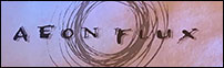
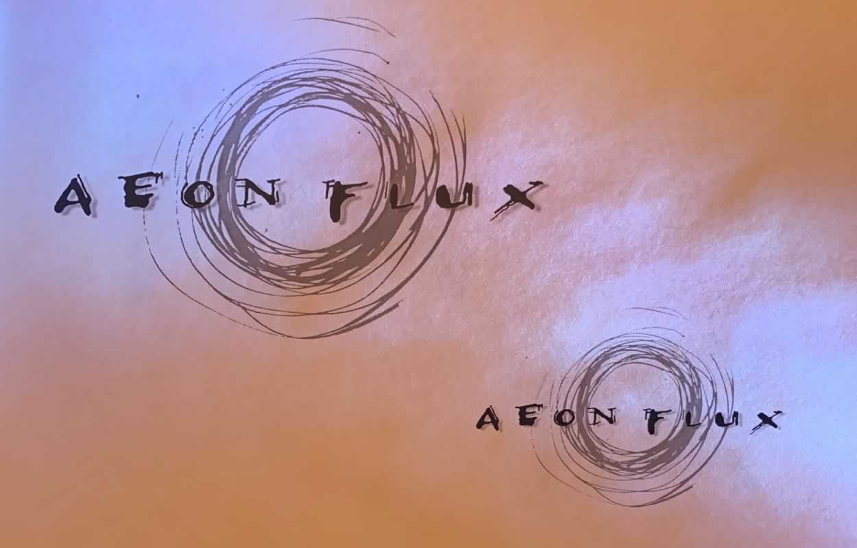
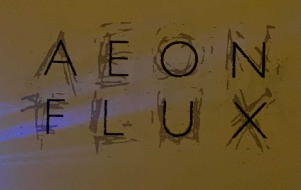
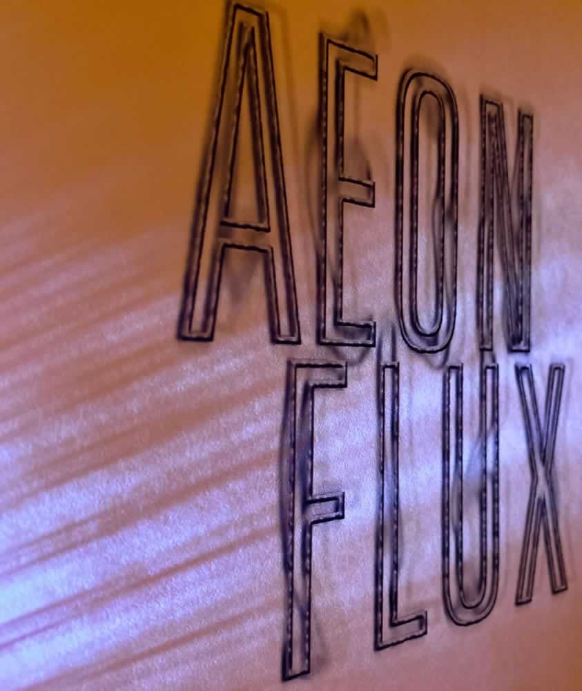
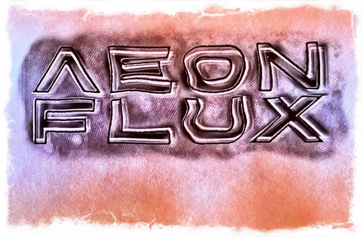
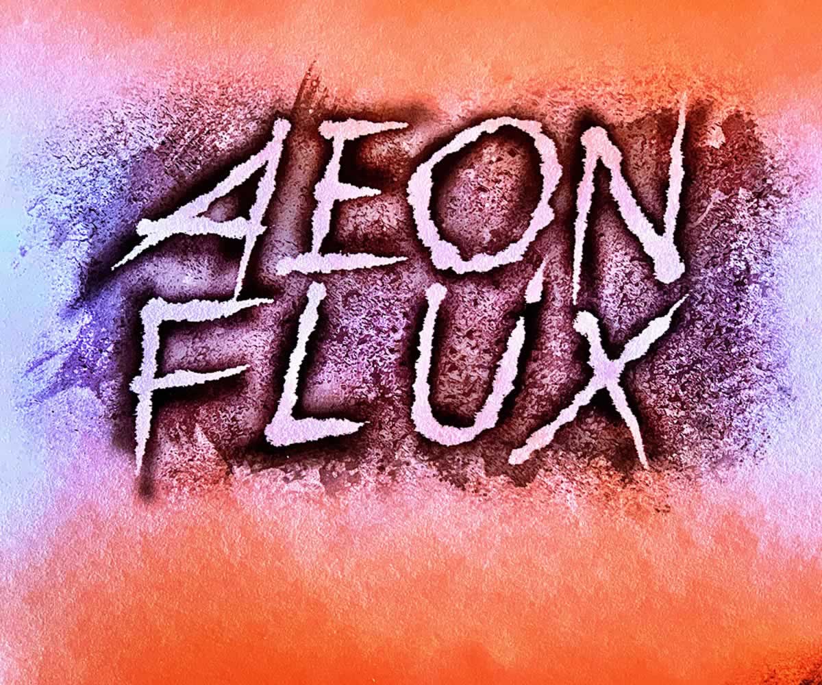
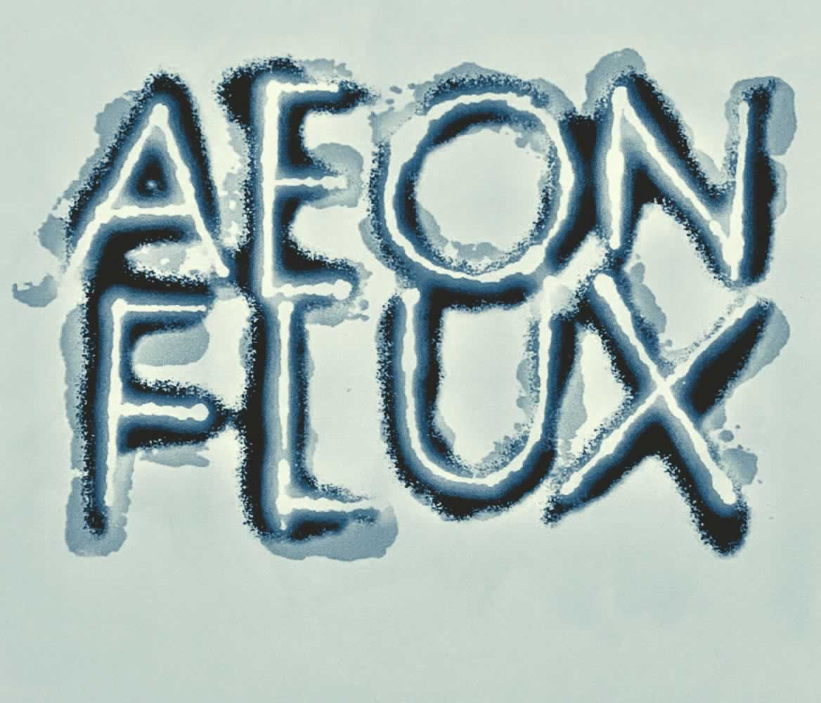
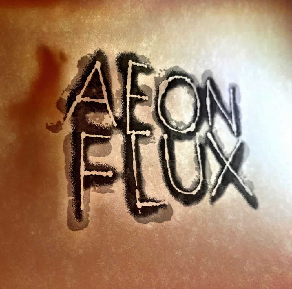
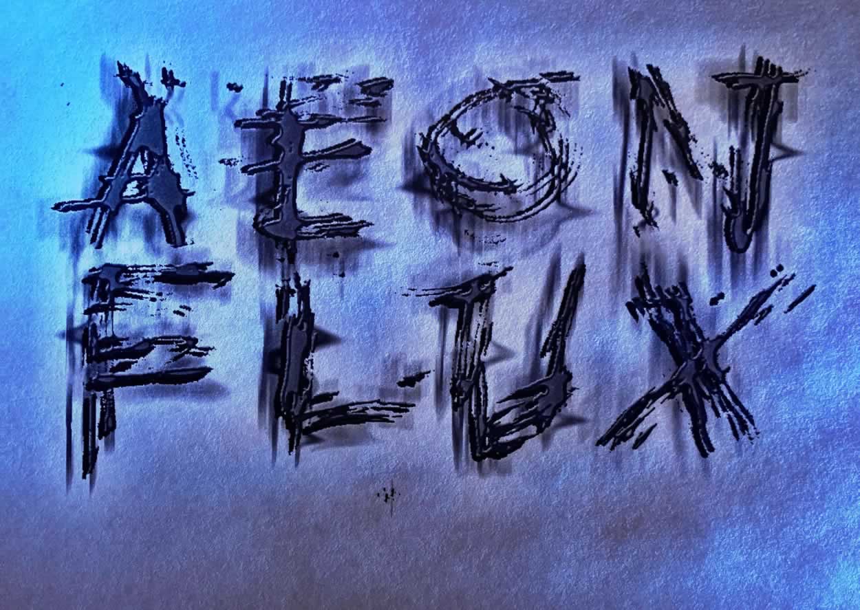
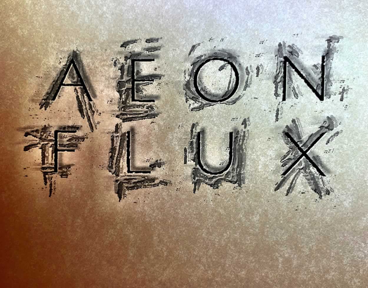
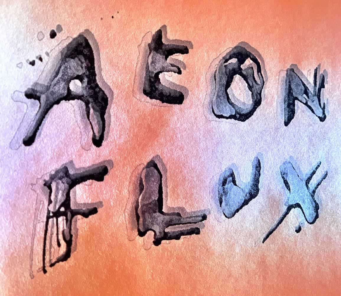
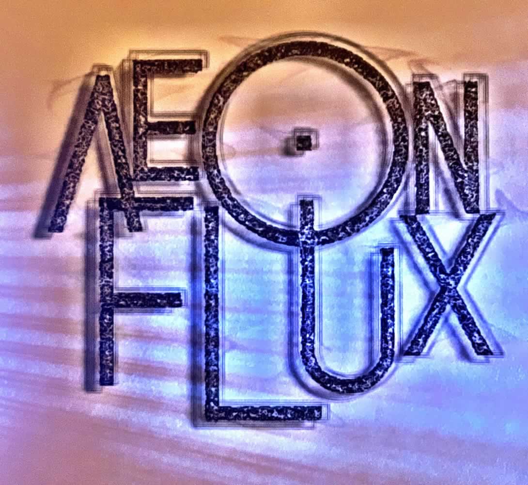
So too Aeon Flux. There’s a look towards the final master identity, which is a chrome-built, futurist dream of fontology, and then there’s our exploration and design builds that are intentionally layered, more driving towards the emotional side of the equation—they’re floating, they’re revolutionary, they’re more complicated.
There’s the final.
And then there are our developmental studies for Paramount Studios. I’m always looking for emotionality, a touchable character, something that is lushly slippery, liquid, visioning a deeper state, that holds, hopefully, a more emotional spin on the story.
There’s that.
And there’s
this.
To get somewhere, you might need to go back. And when you’re doing that—you’re could be going, working, forward.
Tim Girvin | GIRVIN | Osean
MOTION PICTURE DESIGN THINKING