The Letter, the Script, the Legacy: a Cool type & the Human Brand
Some months back, working in various parts of the planet, I partnered with Margaret Swart, Scott Dadich, and the team at Wired to create typographic design solutions for the May issue. Or “ish”, I should say.
The styling of the book comes out like an amalgam of comic book, pulp design treatments that layer the styling of J.J.’s mind, in the spirit of his loves, inspirations and memories.
Like any excellent director (or story collector), J.J. Abram’s mind is like a magnet — it gathers up ideas and visual inventions like a galvanic electrode — and emanations cluster like a battery of charges.
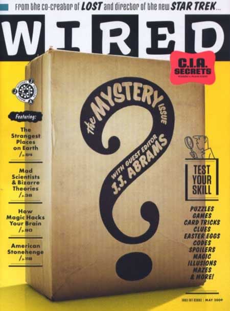
I’d venture, unlike many directors, JJ has a distinctly philosophical bent — there’s a drive to dig beneath the surface to get somewhere — new. Yet old — the classical myth-finding metaphor of the dreamy story-weaver is that there is also the story on the surface; but there are many tellings beneath. What’s in the Mystery Box? Who knows?
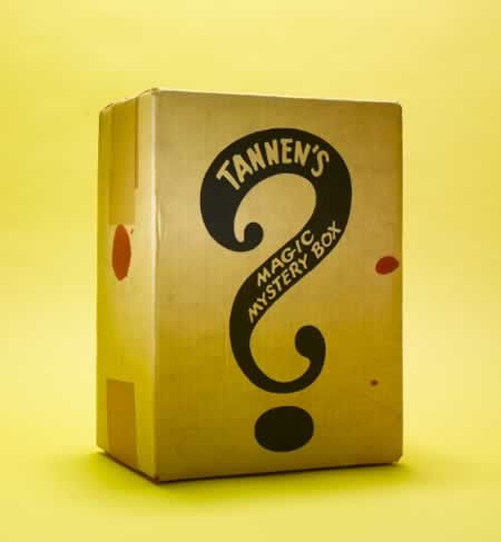
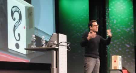
The modeling of the Mystery Box, to my conversations with JJ, is about — and referenced in his talk at TED — the never-ending deepening of the layer of the story; an entanglement, it’s a journey, a labyrinth — but there’s always something that should never be truly found; it’s held out there, the unfurling plot, the flow of the story, yet underneath is is the mystery, the box that will never be opened.
And, of course, more, here.
That reach to JJ — an opening conversation at TED — lead to working on Star Trek. I came in on the production side, working with Scott Chambliss, the production lead; he’s worked on just about everything that JJ’s done. Before that, before I’d met him, I’d worked on Mission: Impossible III. However, the real creative director there was Tom Cruise — his lead created the figuration of the monogram, the balance of the design.
That’s the story. Mystery, the box. A link between type, design, beauty, memory — and that which lies hidden, in the layering of the suspenseful; it’s the scary breath, held for the moment of silence; it’s the monster that is never completely known, it’s the plot that had more spinning coils beneath the surface than the reader, the watcher, might initially comprehend.
That’s the nature of the genre, as well — like the pulp, the comics of the 30s, the 40s, the 50s — suspense lies hidden, venture forth if you dare explore; and buy that cool knick-knack from the end of the catalogue; and who knows what the mail might bring. And the type: cool.
Dig into the magazine — it’s Wired, in a whole new light.
JJ Abrams.
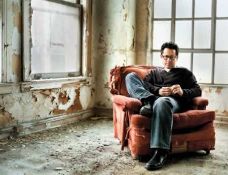
Photo: Mark Seliger / Wired
What’s your take, anyway? What mystery, for you?
tsg
—-
E x p l o r i n g f i r e b r a n d s:
Brand as fire
Tim Girvin | p i k e p l a c e m a r k e t
Notes:
J.J.Abrams filmography
Fringe
JJ Abrams and designing for Star Trek
Girvin and the Star Trek logo
The concept of mystery for Girvin