
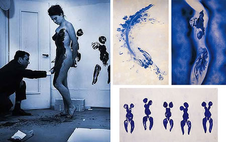
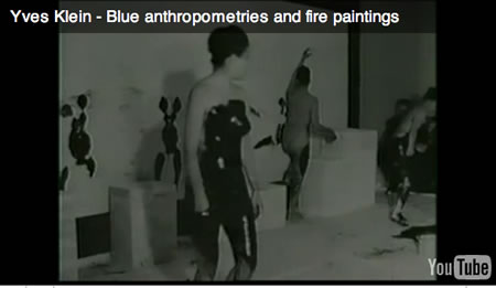
Le Saut dans le Vide (Leap into the Void);
Photomontage by Harry Shunk of a performance by Yves Klein
Rue Gentil-Bernard, Fontenay-aux-Roses, October 1960.
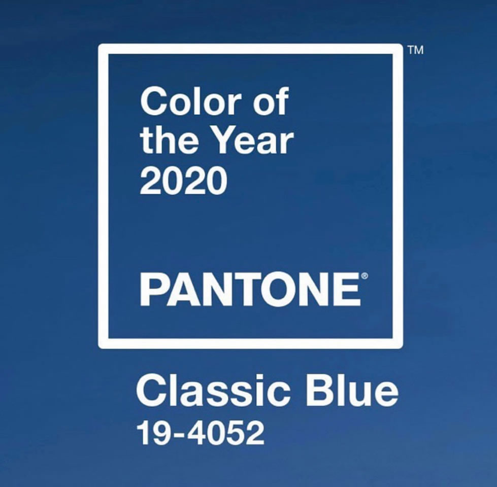
THE SENSING OF COLOR. PANTONE’S BLUE 2020.
“May all that emerges from me be beautiful.”
Y V E S K L E I N
I picked up a note from a friend, Pantone color strategist Leatrice Eiseman and it reminded me of another contemplation of the sensation, and the embracement of color.
Do You Know Why Almost All Disney’s Princesses Wear Blue?
Leatrice Eiseman of the Pantone Color Institute told Allure the concept of blue is for boys came from positive connotations with the color like dependability, constancy and loyalty which matched with creating a strong decent man. But putting these princesses in blue is a subtle way of …
But now, I’m thinking about the nature of brand, experience, connections and sensation—and Pantone’s new blue 2020.

It recalled the idea of qualia as a component of that experience.
The quale, what is it? The relation to branding might be in the context of experience — it relates to the distinction of outcome of sensation: what is the subjective reaction? It might simply be linked to the notion of the way things “seem.” In experiencing an extraordinary sunrise, cutting your finger, scenting a particular fragrance, all of these have reactions — and these can be defined as quale. Daniel Dennett writes that qualia is “an unfamiliar term for something that could not be more familiar to each of us: the ways things seem to us.”
A wiki offers this string, for the expansion on positioning.
For example, Clarence Irving Lewis, author of “Mind and the World Order” (1929), could be considered the first to employ the term “qualia” in its
generally agreed upon modern sense of usage.
“There are recognizable qualitative characters of the given, which may be repeated in different experiences, and are thus a sort of universals; I call these “qualia.” But although such qualia are universals, in the sense of being recognized from one to another experience, they must be distinguished from the properties of objects. Confusion of these two is characteristic of many historical conceptions, as well as of current essence-theories. The quale is directly intuited, given, and is not the subject of any possible error because it is purely subjective.”
Frank Jackson (1982) created the definition of qualia as “…certain features of the bodily sensations especially, but also of certain perceptual experiences, which no amount of purely physical information includes.”
Daniel Dennett has organized four properties that are commonly ascribed to qualia. According to this positioning, qualia are:
1. ineffable; that is, they cannot be communicated, or apprehended by any other means than direct experience.
2. intrinsic; that is, they are non-relational properties, which do not change depending on the experience’s relation to other things.
3. private; that is, all interpersonal comparisons of qualia are systematically impossible.
4. directly or immediately apprehensible in consciousness; that is, to experience a quale is to know one experiences a quale, and to know all there is to know about that quale.
But for GIRVIN, in working in the brand placement of action steps, it’s more about the sense of reaction. In experiencing this brand, or sensing the identity of an enterprise holistically, it might be harder for a person to define how it is grasped.
Red. Skunk. Sandpaper. Salt. Boom. What does it feel like? These might be defined as “raw feels”—they might be indescribable. Surely, however, the idea of quale is something that has far deeper intentions—and reaches into the depths of cognitive psychology and philosophical considerations.
To reference, a person that is normally capable of seeing—that sees red—would be incapable of defining that experience to someone that has never experienced color. They might never know it—partially, or—completely. It is possible to make an analogy, such as “red feels like heat.” Potentially, it might be possible to provide a description of the conditions under which the experience occurs, such as “it’s the color you see when light of 700-nm wavelength is directed at you.” But even the scientific perspective of experience would suggest that supporters of this kind of qualia shall contend that such a description is incapable of providing a complete description of the experience. The exploration of the concept of qualia, debated for decades, even questioning its existence is a long-running examination, there is a great deal to study, if you’re interested in engaging further in this philosophical explication. Stanford. Music. Quining Qualia.
To the notion of brand experience, and color, we’ve been exploring that—not only with clients, and their products, but as well in the construct of designing experiences. When you’re exposed to a brand that centers on yellow (Michelle Obama, for example), for example, what does it feel like?
Working with Fluke Instruments, in supporting the branding of their global industrial design platform for product development, Fluke yellow, PMS 123, is a registered chroma palette.

It suggests warning, protection, utility and is perceivable in potentially dangerous situations. Fluke, for the experiencer of their products is all about yellow. Testing this idea—color and persona, psychologically and operationally, confirms this proposition globally.
How to expand on that, framing the equation for other ranges of colors? I was struck by green, recently — with all the green consciousness, what does that hold? Fashion for one: army, cargo, drab, olive, green.
And blue mind.
What of blue?
Blue has different emotional strains. Designers like it.

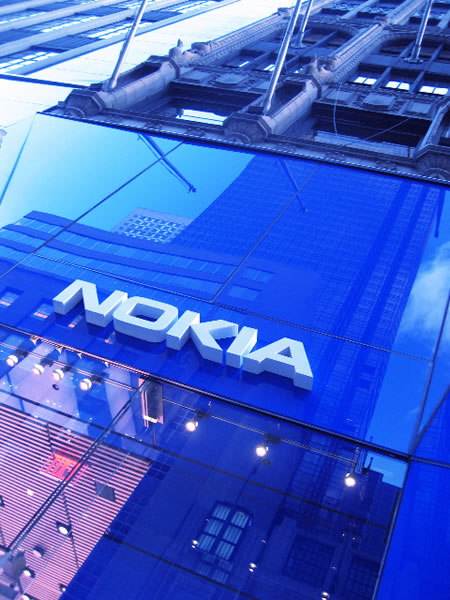
Working for Yves Saint Laurent in NYC and Paris, I was struck by the contrast of their store concept adjacent to Nokia (Girvin blog).
One, black and polished silver, the other: blue.
Blue is a palette that has some psychological considerations as well. There are layers, of course — these being simplistic (for more insights on color strategy, study Lee Eiseman, a recent Girvin relationship, or our friend down south, Laura Guido Clark—both amazing color strategists.)
Blue, in one context, according
to Kendra Cherry, is masculine.
She outlines:
The Color Psychology of Blue
• Blue is described as a favorite color by many people and is the color most preferred by men.
• Blue calls to mind feelings of calmness or serenity. It is often described as peaceful, tranquil, secure, and orderly.
• Blue can also create feelings of sadness or aloofness.
• Blue is often used to decorate offices because research has shown that people are more productive in blue rooms.
• Blue is one of the most popular colors, but it is one of the least appetizing. Some weight loss plans even recommend eating your food off of a blue plate. Blue rarely occurs naturally in food aside from blueberries and some plums. Also, humans are geared to avoid foods that are poisonous and blue coloring in food is often a sign of spoilage or poison.
• Blue can also lower the pulse rate and body temperature.
• Consider how blue is used in language: blue moon, blue Monday, blue blood, the blues, and blue ribbon.
Bigger still, there’s perhaps not one color word that has more applications than the meaning of blue. See here, a sampling, to list the expansive vocabulary that emerges from blue.
According to John S. Farmer, “Few words enter more largely into the composition of slang, and colloquialisms bordering on slang, than does the word BLUE. Expressive alike of the utmost contempt, as of all that men hold dearest and love best, its manifold combinations, in ever varying shades of meaning, greet the philologist at every turn.
It’s not just about the color “blue,” but the variations on it — meaning emerges.
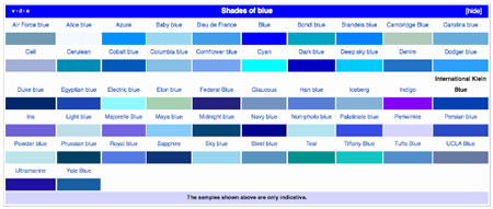
Shades of blue reference link.
Human brands and the color blue.
To that end, exploring legacies of blue, I recollect and contemplate two powerful experiential expressions that are both linked to human brands. One being the use of blue in the gardens of Yves Saint Laurent, in Marrakech, Morocco, that we’ve written about earlier.
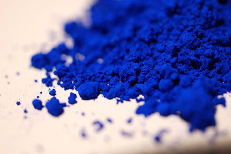
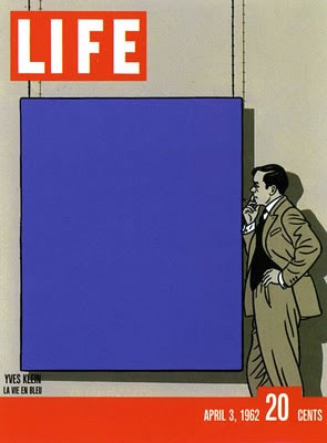
But, as well — more recently circulating — the human brand of Yves Klein, and his definition of his own color, International Yves Klein Blue. In our work on human brands, looking for palettes that link to a story that’s attached to persona are part of any brand development story.
The key distinction to Monsieur Klein’s legacy is the rather sensationalistic concept of an artist creating his own brand color. As an artist, such a proposition might seem challenging — “buy Klein, it’s blue, it fits in with your interiors.” But perhaps the real legacy is that this is exactly the case — some people do buy art to match their interior regimen.
The notion of exploring distinctive palettes that wrap around a human legacy aren’t all together unique, but there are few that would say that they “own this color.”
YKIB is one of them.
More on the story here:
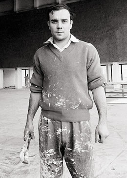
Yves Klein
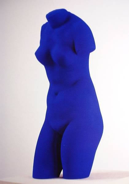
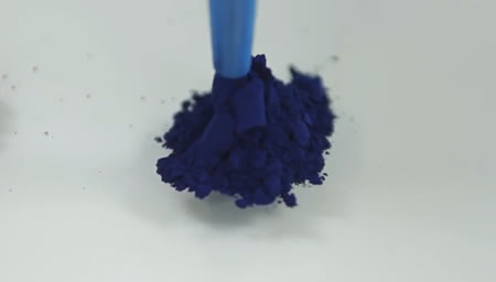
• International Klein Blue (or IKB as it is known in art circles) was developed by French artist Yves Klein as part of his search for colors which best represented the concepts he wished to convey as an artist.
• Although Klein had worked with blue extensively in his earlier career, it was not until 1958 that he used it as the central component of a piece (the color effectively becoming the art). Klein embarked on a series of monochromatic works using IKB as the central theme. These included performance art where Klein painted models’ naked bodies and had them walk, roll and sprawl upon blank canvases as well as more conventional single-color canvases.
• IKB’s visual impact comes from its heavy reliance on Ultramarine, as well as Klein’s often thick and textured application of paint to canvas.
• IKB was developed by Klein and chemists to have the same color brightness and intensity as dry pigments, which it achieves by suspending dry pigment in polyvinyl acetate, a synthetic resin marketed in France as Rhodopas M or M60A by the firm Rhône Poulenc.
While it is often said that the method for creating International Klein Blue was patented by the artist, this is not entirely true. Klein’s patent had little to do with the chemical composition of the color, instead describing a method by which Klein was able to distance himself from the physical creation of his paintings by remotely directing models covered in the color.
The strategy of the blue brand, YKIB | Yves Klein International Blue.
Yves Klein
I’d offer that people brand themselves, whether they want to or not. They set up the brandcode® that represents who they are — carefully crafted or settled in the limits of thoughtless “brand management.”
Yves had a strategy, interestingly enough, as noted in this overview.
Monsieur Klein began with single palette paintings, he painted monochromes as early as 1949, with the first private exhibition of this work in 1950. In his first public showing was the publication of the Artist’s book Yves: Peintures in November 1954. The book was a parody of a traditional catalogue, featuring a series of intense monochromes linked to various cities he had lived in during the previous years. Yves: Peintures anticipated his first two shows of oil paintings, at the Club des Solitaires, Paris, October 1955 and Yves: Proposition monochromes at Gallery Colette Allendy, February 1956. These works were largely misunderstood by the art audiences that attended his showings. Public responses to these exhibitions, which arrayed orange, yellow, red, pink and blue monochromes, left Klein deeply disappointed, “as people went from painting to painting, linking them together as a sort of mosaic.”
He shifted his strategy to a new tactic. From the reactions of the audience, he comprehended that his audience considered “his various, uniformly colored canvases amounted to a new kind of bright, abstract interior decoration.” He was astonished at this understanding, and he “knew a further and decisive step in the direction of monochrome art would have to be taken.” From that time forwards there would be only one coloration for his work—he would concentrate on blue.
His followup, the next exhibition, ‘Proposte Monochrome, Epoca Blu’ (Proposition Monochrome; Blue Epoch) at the Gallery Apollinaire, Milan, (January 1957), featured 11 identical blue canvases, using ultramarine pigment suspended in a synthetic resin ‘Rhodopas’. Klein was newly discovered by Edouard Adam, a Parisian paint dealer, the paintings catalyzing the optical effect of the chroma, retaining “the brilliance of the pigment which, when suspended in linseed oil, tended to become dull.” Klein “patented” this formula to manage the “authenticity of the pure idea.” This colour, reminiscent of the brilliant purity of the lapis lazuli used to paint heavenly features, the sky and Madonna’s robes in medieval paintings, was to become famous as ‘International Klein Blue’ (IKB). The installations supported the strategy — these paintings were arranged on poles placed “20 cm away from the walls to increase their spatial ambiguities.”
The strategy worked, and the show was critically and commercially successful. It expanded the YKIB innovation traveling to Paris, Düsseldorf and London. “Happenings” expanded the brand power — at the Parisian exhibition, at the Iris Clert Gallery in May 1957, marking the opening with 1001 blue balloons that were released, with blue postcards that were sent out using YKIB stamps. Klein had bribed the postal service to accept these as legitimate postal shipment stamps. During the same time, an exhibition of tubs of blue pigment and fire paintings was held at Gallery Collette Allendy.
Other art events “happened.” Blue, evolved. Fire, emerged.


To this take, the idea is color — if there’s a color that relates to a brand story — what, precisely, might that be? How to define the psychological bridge between the human brand — or the enterprise — and the link of color to emotional equations?
Tough to do, but increasingly, the idea of decisions being made based on cold hard facts is dissipating — people are reacting to, and making choices founded on instinctual connection and emotional relevance. It’s less about the marketing sell through and more about the notion of brand resonance in emotionality.
The concept of decision making is increasingly framed in the context of “I’ve thought that through — this personal decision — and I’m convinced I’m making the right choice: it feels right.” References are numerous.
That idea of finding the right choice, as well, relates to the opening exploration to this blog — the sensation of experience in framing an understanding how people experience things — individually and subjectively — and, at the very least, it will be about how to comprehend that some experiences will need to be shared to build community. The more the brand — human or otherwise — understands the nature of the quale, the better potentials in terms of telling human, branded stories and visualizations that are memorable and can be shared.
What of the making of your own color? What color are you? And what does it feel like, as you describe your experiences to someone else?
….
T I M | redrafted | OseanStudios
–––––
Here’s to Blue | 2020
H U M A N B R A N D | S t r a t e g i e s
https://www.girvin.com/subsites/humanbrands/
Added references:
• http://radicalart.info/nothing/space/klein/blue.html
• http://v3.espacenet.com/publicationDetails/biblio?CC=FR&NR=1258418&KC=&FT=E
• Lowe, E.J. (2008), “Illusions and hallucinations as evidence for sense-data”, in The Case for Qualia, Edmond Wright (ed.), Cambridge MA: MIT Press, pp. 59–72.
• Lewis, David (2004), What experience teaches, in There’s Something about Mary, Peter Ludlow, Yujin Nagasawa and Daniel Stoljar (eds.). Cambridge MA: MIT Press
• Tye, Michael (2000), Consciousness, Color and Content. Cambridge MA: MIT Press
• Schrödinger, Erwin “The Mystery of Sensual Qualities” Chpt 6 of Mind and Matter (1958), in What is Life? with Mind and Matter and Autobiographical Sketches Cambridge University Press, Canto Edition (1992) ISBN 0521427088
• John S. Farmer, “Slang and Its Analogues Past and Present,” 1890
• Hannah Weitemeier, Yves Klein, 1928-1962: International Klein Blue, Original-Ausgabe (Cologne: Taschen, 1994), 15. ISBN 3822889504
• Making color: http://www.youtube.com/watch?v=Fypi6dAJB8E&feature=player_embedded