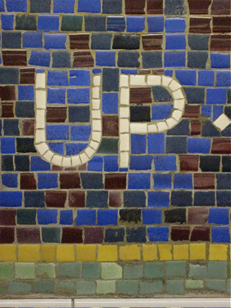
The right type — communicating simple, elegant pathways in environmental graphic design.
I was standing in the subway, NY Transit Authority (MTA) — the proverbial NYC subway system and thinking about the complexity of the way-finding system there. Frankly, it doesn’t always work. More than once (probably more than a dozen times, actually) I’ve headed down one corridor, and ended uptown express when really I was looking for a downtown local. Who hasn’t?
But the real consideration relates to the complex science of moving people around. Way-finding. The idea to the character of finding a way is to first comprehend how people get lost. That idea of lost is an intriguing condition. Personally, I like being lost. And in the nature of finding a way, mapping urban cartography, I’ve been lost in most of the big cities in the world. Heading out, every place I explore, the idea of wandering is in the blood of journey, and you can just as easily clearly know your way to the contrary condition of being completely lost. Adventure lies there.
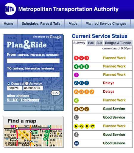
But the idea of seeking out place, and finding a way through to where you want to be is an allegorical puzzlement. For us, and others in the place-making and way-finding exploration, it’s a way of thinking. To that end, simple is best. And standing in the Metro (NYC, Tokyo, Paris, London) getting thousands of people in and out of underground places is a professional liability. It’s got to be simple, elegantly spare, quickly comprehensible.
Connecting with master signing experts, like Massimo Vignelli, I was exposed early on in my career in NYC complex signing challenges. And it was in this nexus that I observe the living passage of Bob Noorda, Massimo’s design partner on the signing system for NYC subway system. All of Noorda and Vignelli’s work is classically — internationally — disciplined. And it all works.
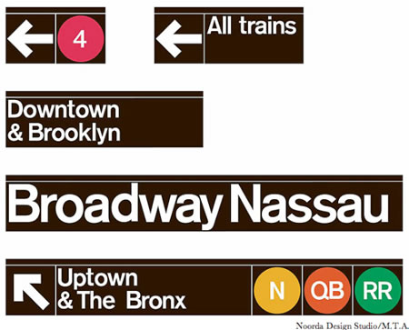
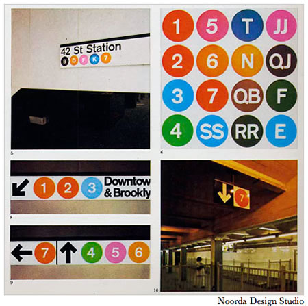
Simple modernism is a beautiful thing. It’s not necessarily Girvin’s design strategic styling to consider the use of Helvetica as a signing proposition, but given the Milanese, modernist spirit of their practice, it’s a sensible solution.
I will proffer, however, that I do like signing eccentricities, like these. Perhaps not so perfected, in terms of the needs of wayfinding. But human.
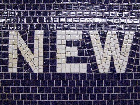
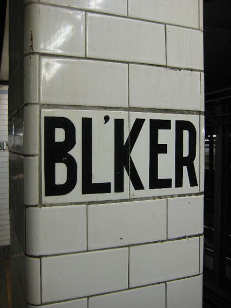
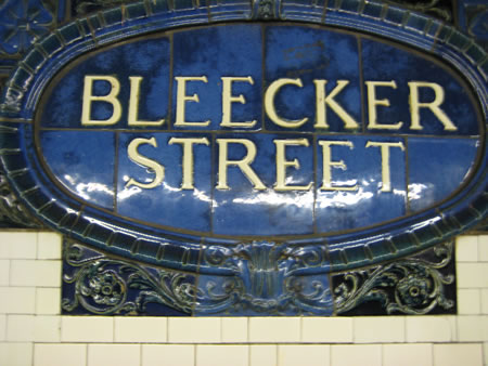
warmest | all ways. my motto.
tsg
….
Brandstory: ENVIRONMENTS
https://www.girvin.com/client-list
Tim Girvin | GIRVIN
c. 206.890.0621
New York City + Seattle | Tokyo
the reels: http://www.youtube.com/user/GIRVIN888
girvin blogs:
https://www.girvin.com/blog
https://tim.girvin.com/index.php
girvin profiles and communities:
TED: http://www.ted.com/index.php/profiles/view/id/825
Behance: http://www.behance.net/GIRVIN-Branding
Flickr: http://www.flickr.com/photos/tgirvin/
Google: http://www.google.com/profiles/timgirvin
LinkedIn: http://www.linkedin.com/in/timgirvin
Facebook: http://www.facebook.com/people/Tim-Girvin/644114347
Twitter: http://twitter.com/tgirvin