Old Coolness | Logo history
Image credit: StockLogos
In the past, countless logos show the character of the original brand personality.
Does modernization take away the soul of their launching propositions?
In some instances, we think — “yes!”
How many times have you been asked to work on a “brand evolution” where you thought — “I really like the old logo…” At Girvin, we’ve worked on and written about brand projects with brands that are hundreds of years old and more recently, brands that are a century old. Sometimes, strategy suggests that doing an evolutionary tweak that supports the intentionality of the original brand mark is a good foundational approach — cleaning up the attributes of an old application that is simply improved in the character of typographic design — this treatment, for example, came from old dance shoe art and tap dance plates that we found, searching the archives of Capezio. We strove to hold to the principles of the original, then to use and apply it in more imaginative approaches, layering the imagery of the brand story.

Studying stock, and leads from friends, both logo lovers, I found these relics and their refurbishments: Nintendo, the original, the revised. The old, while dated, is kind of cool — actually, the current Nintendo logo is also kind of dated, as well:
Image credit: StockLogos
The Kwannon goddess imagery is an unexpected solution, but, to the notion of all-seeing, perhaps it makes sense. Still, the notion of a goddess rendering speaks to Lucent’s brush-drawn circle stroke, which is what might be called a master stroke of a Zen master who has achieved satori.
Image credit: StockLogos
I might suggest that the current logo doesn’t necessarily really suggest how Lego works, or the spirit of Lego engagement. I old treatment reminds me of old German electrical logos — and Germanic strategies of typographic styling and identity = [in this instance] bold, oily and inlined.
Image credit: StockLogos
What’s better, the original eccentric and somewhat classical, or the big extruded french fries?
Image credit: StockLogos
It’s interesting that the original treatments of the shell illustration were, in fact, of a shell — scalloped with a patterning that suggests the path of the highway. Nice — funky, rough hewn, but nice. Slick, hardcore Shell, in the other more modernist treatment must be seen by many as a garish warning sign.
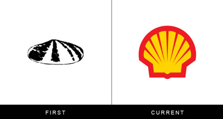
Image credit: StockLogos
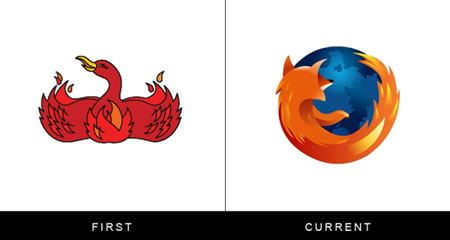
Image credit: StockLogos
I remember seeing the original rendering of Firefox, the icon and wondering — “what the heck is that?” According to Flavorwire’s overview — it’s a good question, and one which was even corporately contemplated — “what the heck are we?” They note:
“Firefox’s original 2002 logo didn’t feature a fox at all — rather, it was a phoenix — but that’s because Firefox was originally called Phoenix. Then, thanks to trademark issues, the named was changed to Firebird. When they finally settled on Firefox, Jon Hicks designed a new visual identity for the brand that launched and stuck.“
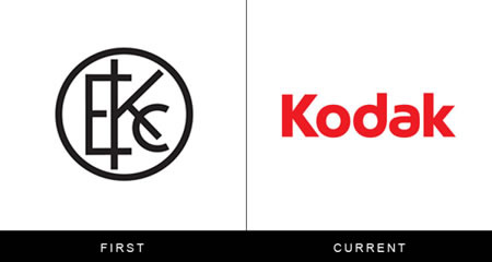
Image credit: StockLogos
The classical balance of this monogram treatment, which I’d hardly call corporate symbology, feels more like a personal stamp or seal that one might find associated with a rare book binding, printer of the water-marked seal of a paper maker. According to Kodak, it was “the first company to integrate its name and look into a symbol.”
The notion of a X — to the symbolism of the X, and copying, marking marks and signing is an interesting, albeit profoundly obvious creative solution. Still, old finds new — the thread newly interpreted.
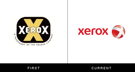
Image credit: StockLogos
In exploring brand evolutions, more than once, we’ve heard the “clean it up” positioning — but rarely — take us back to the spirit of where we started.
Considering the character, even the humanity of a brand, can buoy personality impressions and enhance, potentially, the relationship between people and the stories they tell about brands — how they share their experiences. Person to personality, if there’s a connection — human, human brand, to humanized brand experience — the possibility is more telling, embraceable, cohesively linked and connected, as opposed other less human stylings.
Jay Walter Thompson.
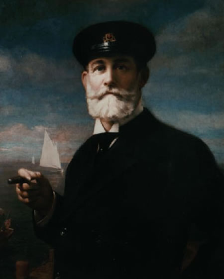
Working on an identity program, sometime back, in Chicago and San Francisco [as well as Tokyo] with former [and now retired] JWT leader Steve Darland, we walked the line to humanity, creativity and the touch of the hand.
The man:
One path:

Another, below, to the founding truth of the matter:

You can guess where we went.
But, to old and new – for you — what is a great brand that’s old logo is actually cooler than the new one?
I suggest the above [JWT] and this one, P&G. The old identity, which is laden with a kind of mysterious persona, was supplanted with a new monogram, soul-less in its styling [for a company that touts the character of its humanity, human insights and global communities
When you think about it, what’s a humanized brand that you:
admire?
Embrace?
Share?
Human touch, to brand, story, evince + evoke, embracement, engagement, enchantment.
That, perhaps, and simplification — once, an artful complexity — then, in the move from our current visually overburdened complexity,
onwards to the simplified and soulless sameness.
We need design + brands with soul. Not blots of core-coded recognition.
Protect us, from:
SBUX series of logos – a cup, shopfront — a solid green dot…just ahead color + shape — core recognizability.
Design strategies that are good for insects.


Sometimes design strategists might go back to the heart, to find again, where they, or their clients, first dreamed.

Human touch, to branding.
Soul, voiced.
Passion, ignited.
It’s where it is, and where it happens.
T. | GIRVIN | NYC
G I R V I N | THE MESSAGE IS THE VOICE
DESIGNED TEXTUAL CONTENT: THE BREATH OF SOULBRAND
http://bit.ly/sJ4IjO