The Art of the Shopping Bag
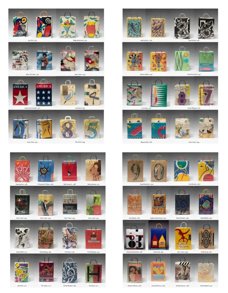
It was a reminder from friend Steve Heller, the Design Editor in Chief at Print Magazine, that recalled the legacy of former Bloomingdale’s Chief Creative Officer, John Jay— in the following notation from the Magazine:
“Jay’s bags also lacked the store name or logo. Unlike the recognizable consistency of Big Brown Bag, Jay commissioned unique artists’ bags three to four times a year, depending on what seasonal marketing events demanded. Holidays were frequent themes, a New Year’s bag, a summer bag, fall “concept” bags and other cultural treats.”
As John notes,“I used the bags as a demonstration of Bloomingdale’s’ connection to the global creative zeitgeist.” As he recalls,“being a true, full line department store and not just fashion gave me the opportunity to speak to movements such as Postmodernism in architecture or Memphis design.”
As a design agency consulting to John Jay and CEO Marvin Traub, working with Bloomingdale’s, continued a legacy from my earlier campaign development for Nordstrom. In fact, this is how I’d met up with John, after he’d seen the Nordstrom work.
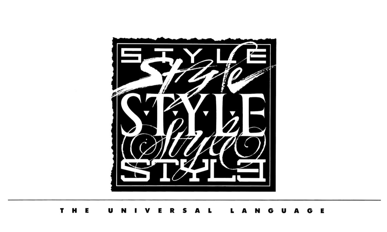
But there is a backgrounder narrative. Earlier, I’d pitched a vision to the Nordstrom family, Creative Directors Dan Holland and Claudia Milne, and later Linda Finn and Cheryl Fuji-Zahniser, on the idea of an integrated design program for thematically-aligned promotion development—a name, a design theme and campaign brand that spread from shopfronts and windows to comprehensive interiors and merchandising, sales collateral, signage and shopping bag integration. The various grouping of some of the ideas could be exemplified in this stylistic overview—literally, the “Style” campaign. This single mark led to custom fonts, signage, pillar and beam decorations, packaging and shopping bags, integrated messages all built around this one grouping of “stylistic clusters.”
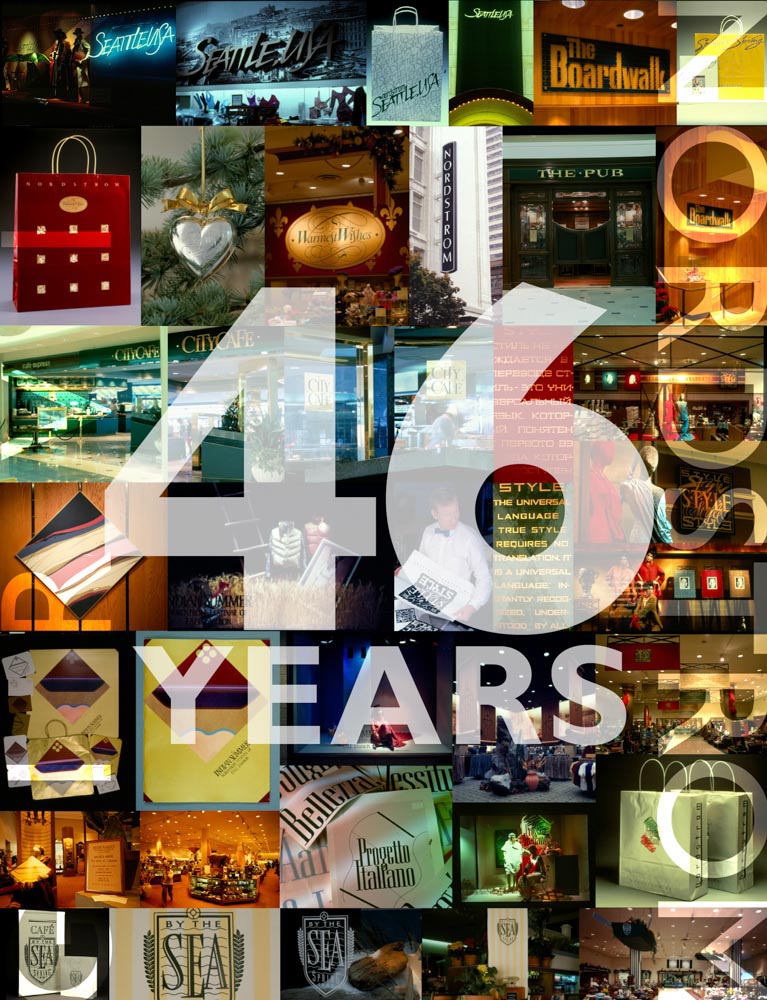
The scale of these integrations can be expressed in this multiple-decades-of-collaboration, anniversary poster for Pete Nordstrom. And in that, you can find various brand solutions, for campaigns, extended across media channels including built environments.
And fonts—noting above, the Progetto Italiano logo, we built a font around that for signage and advertising spreads, shopping bags and window messaging in merchandising. Here’s Progetto—the GIRVIN font.
Like Corvinus, only better, drawn with a pen as comprehensives,
then rebuilt as razor-cut photostats.
There was a bag, a font, and signage.
It comes from an inspiration, logo typography,
signage and an integrated scheme.
Like Metropolis, a Nordstrom campaign.
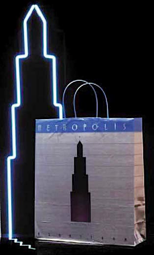
An inspiration
in the oversized drawings of modernist architectural draftsman, Hugh Ferriss.
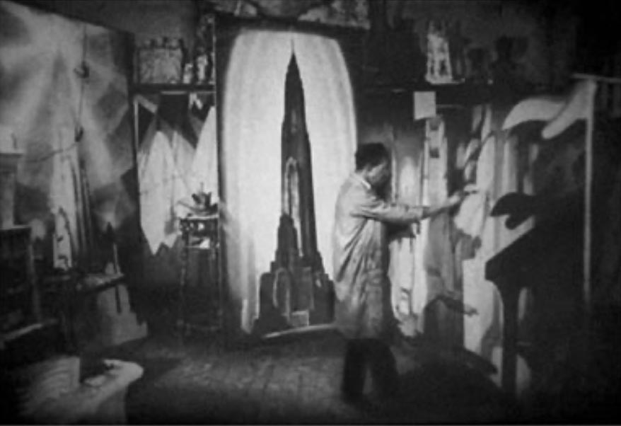
And the campaign installations in merchandising signage.
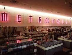
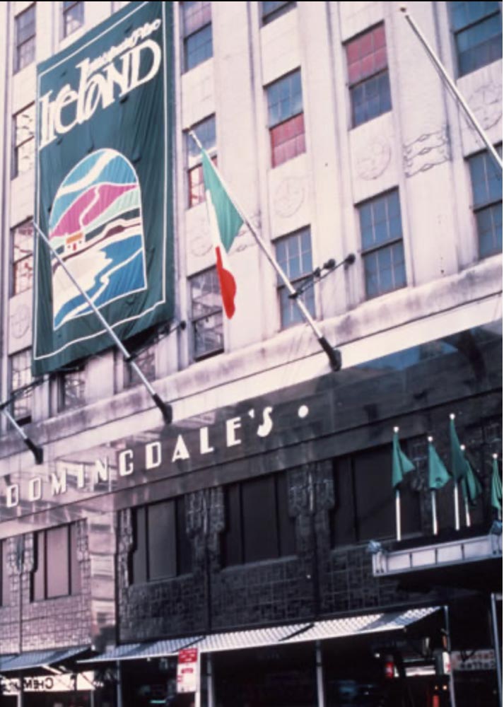
That idea spread from Seattle to NYC.
Working with John Jay and his creative colleagues, Robert Valentine, Richard Hsu and David Au, I’d designed dozens of campaign “identities” spread through customized, hand-tailored newspaper treatments and campaign formats, as well as catalogues and other print collateral.
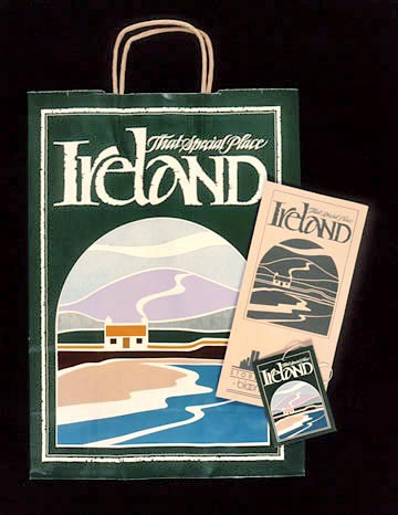
The first design rendering—
a campaign identity and packaging:
I R E L A N D,
Bloomingdale’s.
It was then, working through a decade of collaboration with John Jay, I was introduced to Marvin Traub and his visioning of the Bloomingdale’s Fortnight events, Traub’s strategies of a month-long country campaign—which was headed by a core country-focused, vendor outreach identity, which I had the pleasure of working on with Jay and his teams on building a number of design solutions for many of these. These were supportive of TV and video implementation, as well as packaging, signage and extensively integrated graphics—and, in nearly every instance, customized fonts that we built in support of graphical expansion of the campaign premise.
A campaign:
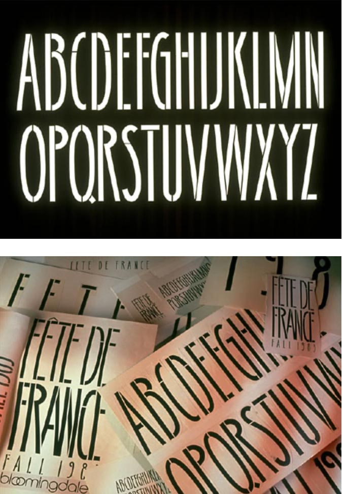
FÊTE DE FRANCE
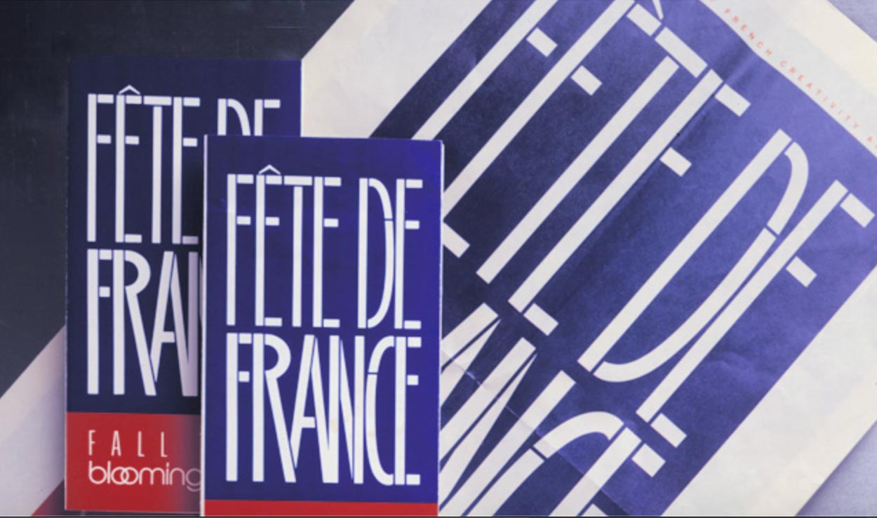
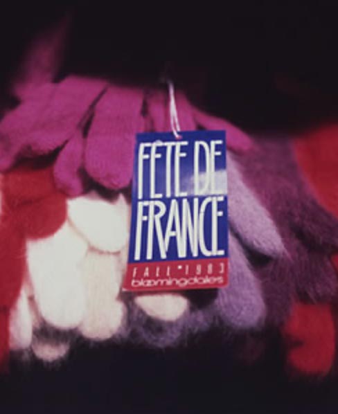
The Fête de France Font
The notion of the Traub country-inspired fortnight campaign was worldwide in scope,
exploring countries, with culturally-attached holistic exemplars, merchandising and built applications.
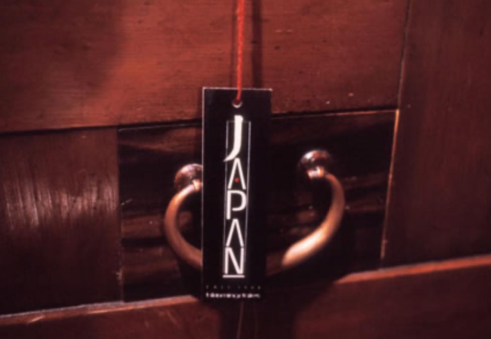
A Campaign For
J A P A N
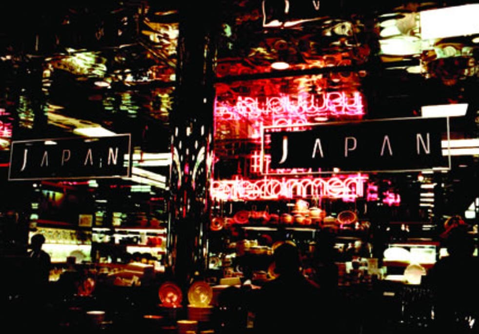
Signage
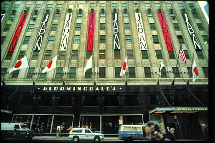
Merchandising
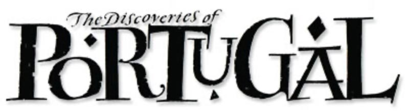
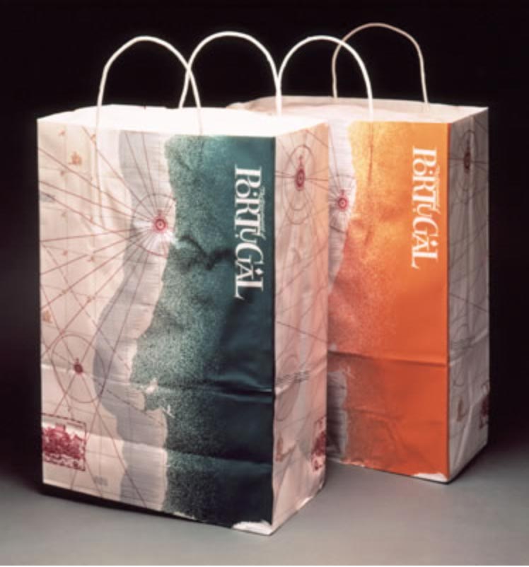
A Campaign for
P O R T U G A L
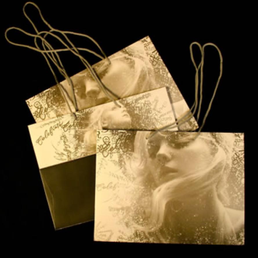
And a two-sided, flipped panel shopping bag.
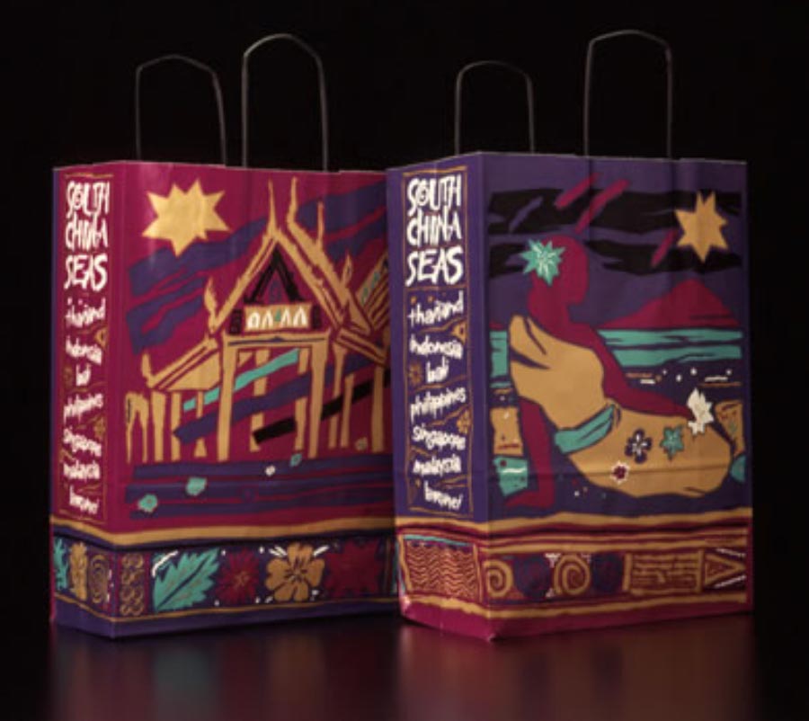
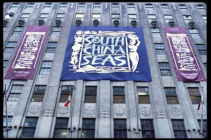
S O U T H C H I N A S E A S
campaign identity art
and shopping bag.
It’s a patterning in the arc of my career as a designer—still to this day, I’m fascinated by the idea design treatments that extend from a core idea—a semblance of code, a brandcode®, an integrated design-linguistics, a sensorial system that extends horizontally through experiential tiers of audience engagement. In my experience, it is these touchpoints that brand journeyers never forget. Talking to consumers in anthropological investigations, it invariably comes back to
“I remember the small things—there was a patterning on the floor, and the rug in the entry area, and it matches the journal paper in my room. When I look back, it’s the small details that come to mind, and how they fit together.”
What goes around, comes around.
What was, is.
Tim | GIRVIN | Strategic Brands
digital | built environments by Osean | theatrical branding
waves | art | talismanika™
Projects in strategy | story | naming | messaging | print
identity | built environments | packaging
social media | websites | interactive