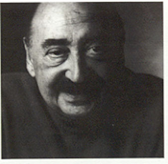
Saul Bass
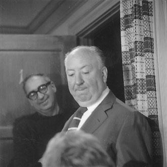
Saul Bass with Alfred Hitchcock on the set of “Psycho”.
I gave a talk for the Arizona Advertising and Marketing Association some time back, and during that presentation — it was actually a conference — Saul Bass was one of the co-presenters in the forum. We connected.
We talked for a bit. And I’m glad that I’d linked up before he’d passed. What we talked about is the hand.
I’m curious about that, as an element of working. The hand. These days, I look for designers that can actually draw. More often than not, designers can’t draw. So, I’m blessed, in a way, that most of the people that work at Girvin can draw. Drawing is a good way of beginning any type of thinking. Being a draughtsman myself, I suppose that I look for that, in others.
Saul’s sense of drawing infused a lot of his work — even the reach to theatrical advertising — and corporate — identity.
Some expressions:
And in speaking with Saul — we talked about that connection between hand and mind. The idea of using the hand as the starting point for the leap of the imagining. Beauty found, ideas uncovered, in the gesture of the hand. Everyone has a distinctive take on doing that. Their hands, and minds in rendering, speak. What I mean, as well, is that I can tell who’s done the drawing of just about anyone in the office — here or there. Anyone on the team, I can recognize the wrist, the fingers.
Drawing as signature.
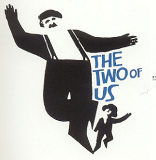
And, in a way, you can see that here, as well. That’s what I sense. The hand, the making, the connection — between wrist and mind. The imagination strides out on the tips of your fingers, a pencilled stroke to the heart.
Another of Saul’s more distinctive hand-wrought expressions.
Kidding.
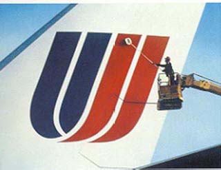
But in a way, the idea of the profound simplicity of this modeling hearkens to the hand cut papered stencil character of Saul’s work. Girvin actually worked on an identity program for United, taking Saul’s basic U mark, and detailing new typography (Bodoni).
Saul took his sense of the hand, and the link to visualizations, and the styling of his theatrical advertising design treatments to motion design — and titling; here are some references to explore:
http://www.youtube.com/watch?v=j3QcS2iovss
http://www.youtube.com/watch?v=Ignl1WwvyiU
…..
A biographic overview
This article was published in the international magazine
Patek Philippe
Number 9, Spring / Summer 2000
Saul Bass was born in New York on May 8th 1920 and studied Graphic Art at Brooklyn College, NY before moving to Los Angeles in 1946. Bass was a pioneer of the pared down graphic, favouring minimalist symbolic images, which has been in vogue since he began designing for the film industry in the early 1950s.
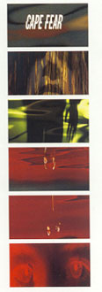
This titling sequence for Cape Fear exemplifies the visualization of filmic movement and the hand. (TG)
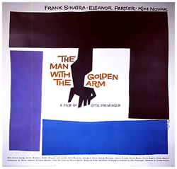
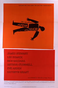
In 1954, Otto Preminger commissioned Bass to create a visual identity for his film ‘Carmen Jones’. Bass came up with a strikingly simple flaming black and red rose. The following year, Preminger again called on Bass to work on ‘The Man With The Golden Arm’, for which Bass created the famous jagged arm design, suggesting the jarring and disjointed existence of a drug addict. With this design, Bass exploited what he termed the significance of content in design. Bass, along with a small number of other 1950s designers such as Paul Rand and Erik Nitsche, operated against cluttered imagery and towards geometric designs using angular shapes and primary colour schemes. While working on the design for ‘The Man with the Golden Arm’ Bass asked ‘Why not make it move?’ Through animation, he created a new style of title sequences, which has since become classic. The thin white lines of the title sequence for ‘The Man with the Golden Arm’ gradually invade the screen and set the tone for Preminger’s tale of a hardened drug addict.
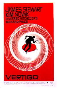
For opening sequence of ‘Vertigo’, Bass used the motif of the revolving Spirograph to evoke the dizzying sensations of the film. He always aimed to create the right climate for the film in question when designing opening sequences, offering audiences a visual feast from the very first frame, and plunging them into the atmosphere of the story that was about to unfold. Thanks to Bass, they no longer had to sit through the tedious credits which had until then been part of the cinematic experience, and which were, in Bass’ own words, mere ‘popcorn time’.
Bass directed the short dream sequence in ‘Vertigo’ as well as working on the poster campaign for the film. This film marked his most complete collaboration with Hitchcock. Paramount Studios did not censor Bass’ work for ‘Vertigo’ in any way, gave him full credit for his work on the film. It was not customary, until Bass’ era for American poster designers to be credited for their work. Once again, Bass spearheaded changes in this area. By signing all his work, he made it possible for the designers to lay rightful claim to their work, and redressed the balance in favour of the artists.
Today, collectors are showing interest in all Bass’ poster designs.
Alongside masterpieces including ‘Exodus’ and ‘Spartacus’, Bass also designed posters for less commercially successful films. Posters from the American campaign for Preminger’s 1958 film ‘Bonjour Tristesse’ sell because Saul Bass designed them, and for no other reason.
In the 1960s, Bass’ genius extended to building corporate identities for some of the biggest companies in the USA. He designed the logos for AT&T, Quaker Oats, and Warner Communications, and successfully conveyed the ethos of each of these corporations to the American public. As always, his concern was to replace predictable images with simple, meaningful symbols. His perfectionist drive and his aspiration to always be at the vanguard of all forms of design have bequeathed a legacy of some of the most potent symbols of the 20th Century. I am consistently aware of the influence Bass has had on contemporary film poster designers and on the design world at large. Unashamed references to original Bass designs abound. The poster campaign for Spike Lee’s 1995 film ‘Crooklyn’ offers a humorous and clever reworking of Bass’ graphics for ‘Anatomy of A Murder’. Today Bass’ visual style is echoed everywhere from all forms of advertising to the most prestigious of web site designs.
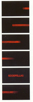
Girvin worked on creating the identity for this film: Good Fellas. Saul did the titling.
As for film poster collectors, I have noticed a shift away from a strict
policy of collecting posters of one genre, director or star, towards an
approach more appreciative of the image and design of the poster. Bass’ ability to transcend a film’s ‘look’ and create meaningful symbols has made him the single most requested film poster designer.
Saul Bass died in 1996, in Los Angeles, leaving behind a flourishing
design empire with Bass Yager Associates, and a heritage which will continues to inspire creative designers and film-makers.
Tony Nourmand (author of the above)