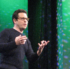
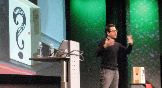
Several years ago I got a call from Paramount Studios to work on a project for JJ Abrams. I’d never heard of him, embarrassingly enough. Nancy Goliger, EVP of Advertising, told me to check out his TV shows, “Lost” and “Alias“. I watched all of them. And I became fascinated by him. I watched everything.
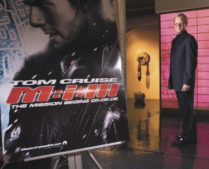
Photo by Matt Hagen
The project was “Mission: Impossible III“. Actually, I’d worked on all three Mission:Impossible treatments for Nancy and her team [read the case study https://www.girvin.com/clients/paramount_mi3].
I had a goal to connect with JJ Abrams. To learn more about him. And I did. At TED [https://tim.girvin.com/?p=246]. I’ve written about it. But inherently there’s something to the creative drive and commitment of his visioning that is captivating — and I stuck with the connection. What I was interested in was getting closer, getting connected with that energy.
At TED, he spoke about seeking mystery and imagination — looking for the mystery, the magic, that lies in the unknown. And even, to a degree, in storytelling, understanding that the concept of the unknown is something that is held — remote, concealed — and savored in that quality. It’s just there — beyond. It’s the mystery box.
Following that opening lead, I’d reached to him and his team about linking in with production design for Star Trek. And while I didn’t have the chance to connect directly with JJ, I did connect on the front of set and production design [http://memory-alpha.org/en/wiki/Scott_Chambliss]. While I’ve connected in the past on treatments for other films, working on production design related imagery, this is the first time that I was actually working with the production design team. I met at the lot, which is part of the Paramount Studios compound. And, as has been the case with everything attached to Star Trek — and working on virtually all the Star Trek identity design programs, there’s enormous secrecy attached. Most of the time, in working on this property, I’ve had to read the script on the lot. That is not an infrequent proposition.
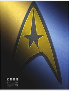
My role, the Girvin team responsibility, in exploring the identity of Star Trek was focused on reaching to the roots — getting back to the heart of the design treatments for Star Trek. The core identity.
There’s significant history there — from the early brandmarks to the evolution of the later television grouping and a long string of Paramount theatrical releases. Our focus was examining evolutions of the early brand type created by the design team that served the master Star Trek innovator, Gene Roddenberry http://en.wikipedia.org/wiki/Gene_Roddenberry. JJ Abram’s prequel design reference was styled as a foundational direction — nearly retro. So the bulk of our exploration was about beginning with the alphabet, redefining and tuning the brandmark, and building variations.

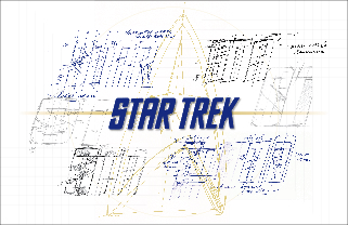
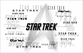
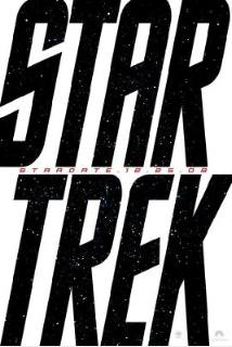
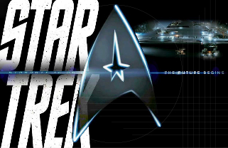
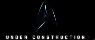
The final treatment implemented by the JJ Abrams team, following his creative leadership — and now released — was coordinated by art director and production set designer Scott Chambliss; is a composite of the alphabet evolution and the Federation star shield — now dimensionalized.
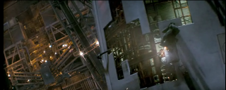
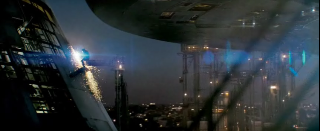
The site visualizations intimate that prequel — building:
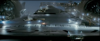
And the building of the Enterprise:
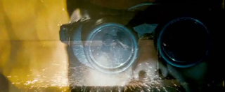

The opening teasers represent a further advance on the stylistic retro feel, exemplified by photographic modeling that not only references a dramatically unique, if not retro palette, linked to the brand language created under Abram’s direction:

There are thematic drifts here. But the themes are more dramatic threads for me:
• Return to the heart of the telling
• Find the original roots of the making
• Locate the structuring of the visual threads
• Redraw the lines of the original
• Celebrate what you have found
tsg | los angeles
—-All images property of Paramount Studios ©2008