Classic British design, calmly repackaged in the face of fear.
I’m sure you’ve seen this.
(image: Graham Turner | WWII propaganda poster, Woodbridge, UK)
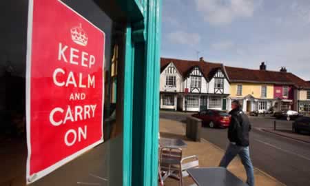
If you’ve been in London, you would’ve seen it there — festooned, on the walls, an occasional tube posting. Actually, it’s everywhere. And now it’s here in the States, as well. It’s a revival of the calming influences of message, placidly orchestrated. I’ve referenced that earlier, another story, and the WPA.

And I’m really not sure where it’s from, whether it’s a classic monarchic sign of the times (yes), from the present UK (yes), or whether it’s older, like a WWII signing (yes). There’s some unearthed history here, noted below. First off, it’s a reappearance: Jon Henley notes —
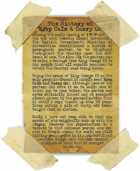
“Back in the spring of 1939, it was an anonymous civil servant who was entrusted with finding the slogan for a propaganda poster intended to comfort and inspire the populace should, heaven forbid, the massed armies of Nazi Germany ever cross the Channel.
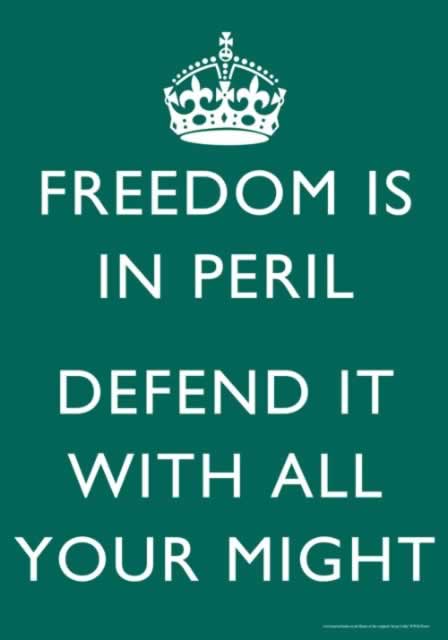
This was the third in a series. The first, designed to stiffen public resolve ahead of likely gas attacks and bombing raids, was printed in a run of more than a million and read: Your Courage, Your Cheerfulness, Your Resolution Will Bring Us Victory. The second, identically styled, stated: Freedom Is In Peril.
From August 1939, both posters began appearing all over the country, on billboards, in shops, on railway platforms. The third, though, was held back. This one was for the real crisis: invasion. A few may have made their way on to select officials’ walls, but the vast majority of the British public never got to see it. This poster enjoined: Keep Calm And Carry On.
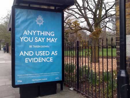
And suddenly these days, it’s everywhere, from homes to pubs to government offices. The Lord Chamberlain’s Office at Buckingham Palace, the prime minister’s strategy unit at No 10, the Serious Fraud Office, the US embassy in Belgium, the vice chancellor of Cambridge University, the Emergency Planning Office at Nottingham council and the officers’ mess in Basra have all ordered posters. Even David Beckham has the T-shirt, we are told.
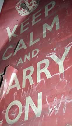
For 60 years, the poster had been forgotten. Then, one day in 2000, Stuart Manley, co-owner with his wife Mary of Barter Books in Alnwick, Northumberland, was sifting through a box of hardbacks he had bought at auction when he saw “A big piece of paper folded up at the bottom. I opened it out, and I thought, wow. That’s quite something. I showed it to Mary, and she agreed. So we framed it and put it up on the bookshop wall. And that’s where it all started.”
And here’s another word, to explanation, whether it can be trusted or not — and I’m not even sure of the provenance of this taped missive:
(Barter Books perhaps?)
What I like about the character of some aspects of what I’d call, “British Utilitarian Design”, is there’s a kind of classical simplicity that I find refreshing — that modernist, nearly socialist quality, is authentic, simple, modest and right to the point. It could be exemplified in a design treatment like this, for the subways (otherwise known as the Tube.)
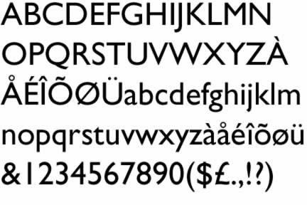
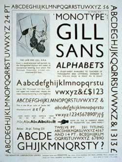
One of the typographic qualities, to this modernized — yet somehow happily homespun feeling is the very character of the font itself, at once, designed by a calligrapher, then later created as a font by a stonecutter and sculptor, supervised by a master theorist of newspaper and publishing design.
The font is Gill Sans. It was created by, as essayed by Mark Boulton, Eric Gill in the 1920’s and issued by Monotype in 1928 to 1930. Eric Gill studied under the calligrapher and stonemason, Edward Johnston, at the Central School in London so therefore “it comes as no surprise that Gill Sans is based on his teachers typeface for London Underground, Johnston Underground.
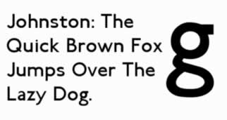
Due to it’s legibility and its ‘Britishness’, Gill Sans has been adopted by many companies and organisations as their corporate typeface. Notable mentions are:
* BBC
* Royal Society of Arts
* The Church of England
* Network Rail
Not to mention the number of companies who have had typefaces designed which have been heavily influenced by Gill Sans. Gill Sans is a beautifully designed typeface which, unfortunately, has suffered at the hands of software, and to a certain extent, its own popularity. But the real quality is the simplistic humaneness, that brings a special quality to the evocation of even official proclamations, extended broadly, by the Mayor of London, over time:
Or this other propagandist reference:
Or this hope for something better.
Back to calmness, there are divergences. Because, as it would appear, this discovery emerged in the British scene a couple of years back, and, with the emerging new crises, it’s taken on an added spin of relevance.
Humor abiding, I’ve seen variations.
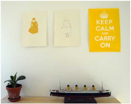
First, color in numerous variations — and set in attractive “interiors” schemes:
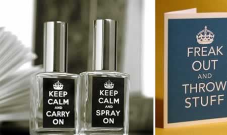
Then, newly compelling spins on product development:
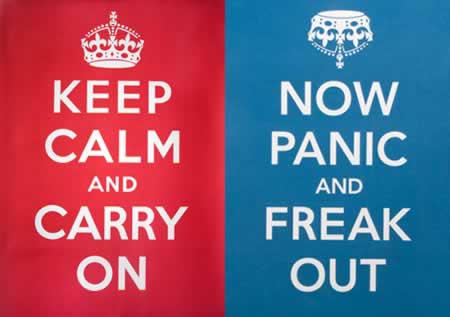
Then spins on interpretation:
One way, or the other:
Design evolutions and cycling diversifications:
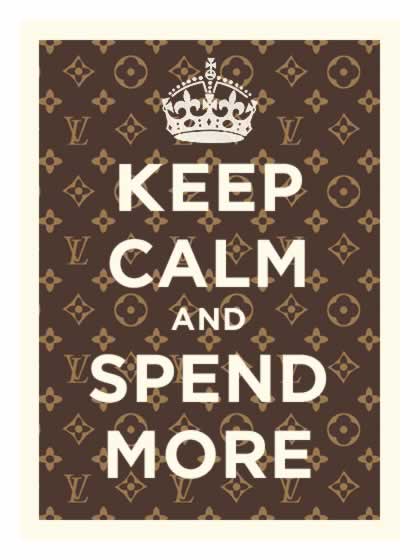
Another solution, shopping:
Or the anarchist path:
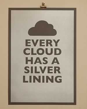
Other forms of optimism:

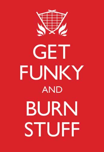
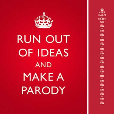
Or, finally, in parody — keep at it, on and on and, well…
On!
How about you? Are you keeping calm, carrying on?
Everyone’s got to make a buck, or a pound sterling, but it’s interesting the idea of a phrase that reaches back to the past — another psychic era, when banding together was crucial for survival — and messages, visualized, catalyze community.
As a designer, reaching to the past, and stretching to the future, I can exclaim in unison.
….
concepts of propagandist design
Tim Girvin | GIRVIN
New York City + Seattle | Tokyo