 The twists and turns of meaning —
drawn knowledge.
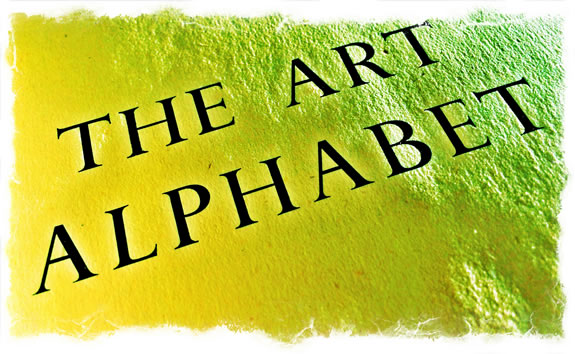
In teaching workshops on the alphabet, and especially finding your own place in the quintessential expression of the YOU,
in alphabetic form —
the flow of your presence.
What I believe is that
each person has traits that show through
in how they epitomize the 26 characters —
each takes a word
and treats it differently.
And while one person left early, since they’d expected a digital course on type design — key-strokable fonts — all the others stayed from the opening overview lecture, to the hands-on workshop and experimentation
in their artful outcomes.
The results were fascinating.
People simply got into it.
While some of the students were professionals, others were from the sponsoring college and came at their own choice, after viewing the show of the work. Most saw the opening interpretation —
the Girvin “liveshow”
of
“aliveness.”
And that’s what it all comes back to — the vitality of the person and the journey of how they get to a point of spirited expression. Aliveness and spirit are surely aligned — spiritus is breath, breathing — and in the potency of the ancient way of thinking of breath — it comes as a life-giving breeze, indeed — the Breath of God, what the Hebrew language speakers call ruach elohim, רוח אלוהים, is the opening breeze of God, the first breath of being — the foundational energy, spreading out — what the Romans called spiritus, and the Sanskrit — prana. Chinese: Ch’i.
The point is flow.
We’ve written a lot about this,
and you can find
one added reference here.
And while many might suggest
that the best way
to make beautiful letters
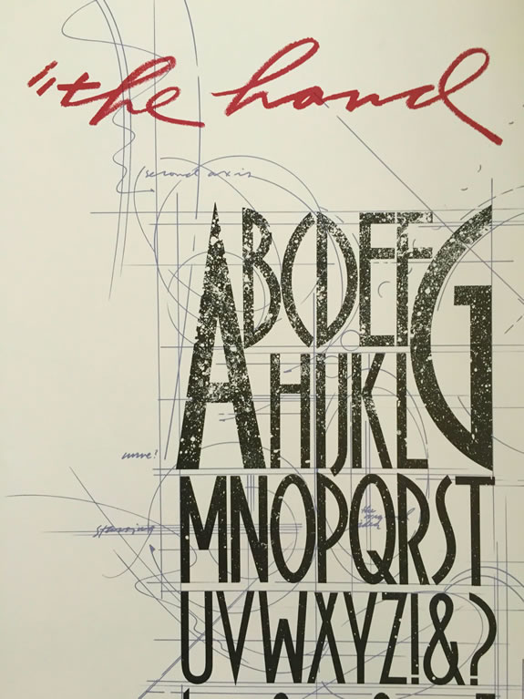
is to draw them with compasses and geometrical tool markings, the best and most soulful interpretations of powerful meaning in words comes from
the hand and the heart,
or, as we discussed in class:
“the hand compels the type.”
I used to experiment, and parody the Renaissance interpretation of Imperial Roman letters [mostly their epigraphical work] with mostly humored whorls and swings at letterforms, that didn’t really interlace the meaningful outline of their characters, but rather crackled the energy about their form.
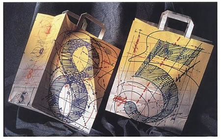
Like this two-sided bag for Bloomingdale’s — with flipped colors and numbers:
handmade.
I realized that my best work came from the hand
and the heart.
What’s alive, what moves you,
holds you.
And that holding
is what you don’t forget.
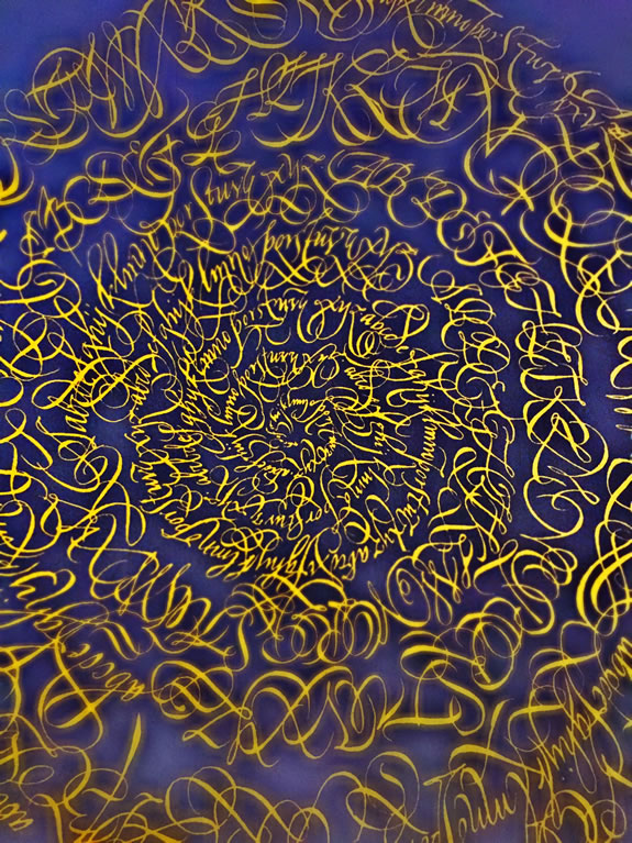
I used to develop these whirling alphabet mandalas, an object of meditation unto themselves. You start in your center,
and you whorl outwardly,
further from the center,
in that journey of drawing.
You draw in,
and you draw out.
And what draws you
is what you draw.
And the poster itself.
A show of GIRVIN work at the Richard Harrison Collection at
the San Francisco Public Library.
Alchemy — the journey of taking the one, moved through a portal to another layer of seeing.
And being.
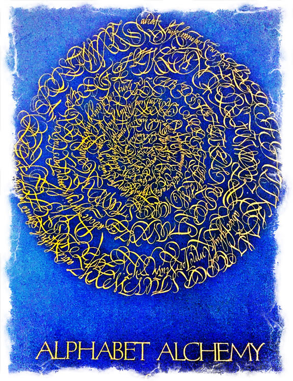
The journeyer makes the journey.
YOU
MAKE
YOUR
WAY.
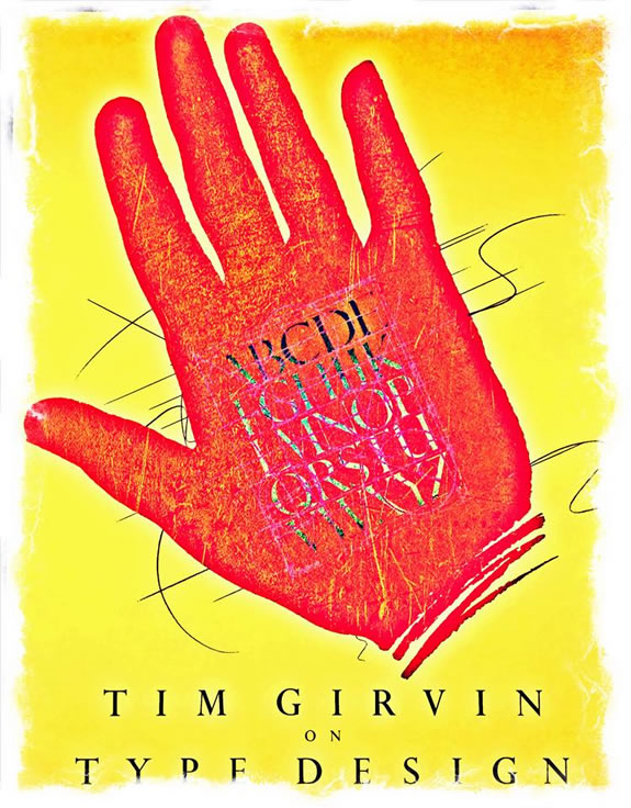
Tim | Old Queen Anne
GIRVIN STUDIOS.
STRATEGIC MAGIC
––––
Rethinking Beauty:
Brand Strategy & Visualization
Girvin BrandJourneys®
http://bit.ly/1sSgbOB