THE MYSTICAL ARCHITECTURE
OF THE ALPHABET
To know the past is to know the future.
So in grasping the past, I look into the words to build design strategies —
and what it means in the craft of the work, as well as
the solution-finding of design [un]thinking.
That is, when you contemplate solutions, you’ll need to ponder
what it all means — what does it mean for you?
What does it mean for who you’re ultimately designing for?
And what does it mean for the client?
The point lies in the quest for meaning — looking into the construct of content.
It’s not just content, there is meaning that lies within,
and what lies beneath.
Look at words as you explore intention and direction.
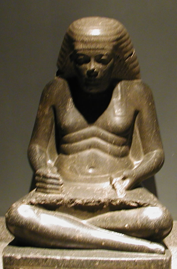
Ancient Egyptian Scribe [and architect, priest and public official]— Amenhotep, Son of Hapu — 2620-2500BC.
The word scribe which is as a maker of script — the noun;
and as a verb, is
a “scratching, a scribble, a marking.”
And another word enters into parlance, simple enough: describe comes to mind, for in that scratching, definition and articulation of idea becomes manifest. It comes right back to the very nature of design as a signing, a drifted draft of personal character that relates to the heritage of making marks. And isn’t it so that really, in the layering of information, design is about making marks.
The magic of the mark is transport — make a marking and the viewer is carried somewhere else — a dream, a portal, a poem, an evocation, a prayer. It is, literally, a “passage” — someplace else.
Definitively — not a new idea.
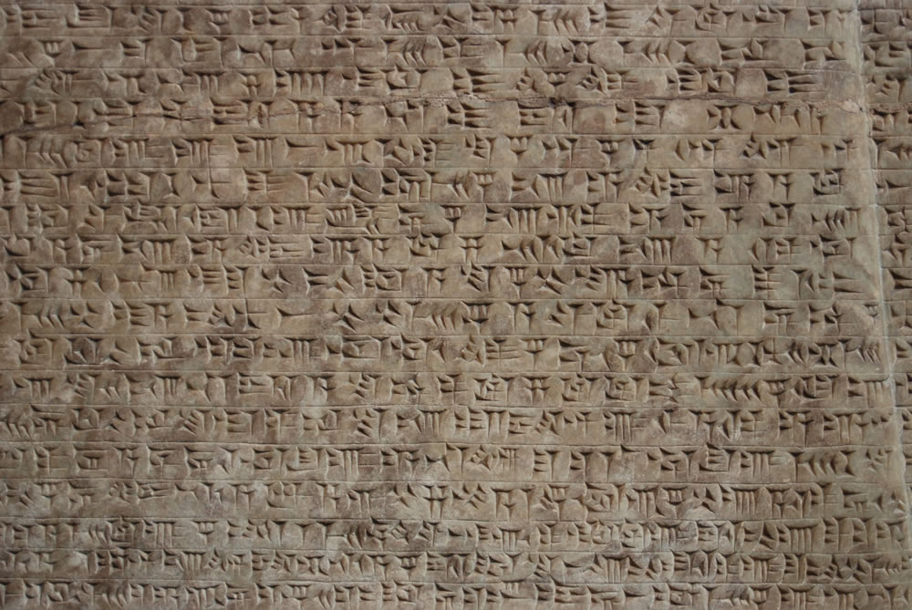
But as ancient as the scribes of Egypt and 2,000 years before them,
the ancient geometric incisions of the proto-sinaiatic, semitic scripts, just after Chaldean cuneiform — there, between the Tigris and Euphrates, some 5,500 years ago.
Making a mark
will suggest a link to
mind, memory and thought —
expressed.
Could it be possible that
scribing,
that marking
is the arcing stroke of
a hidden geometry —
that behind and beneath
the de-signed thinking is
a geometry, a perfected,
“de-scribed”
wonderment?
In the “thinking of design,” could it be that scribing would best be done by hand?
Or better in the administration navigational implements — the curve of the draft of the ship’s lines, the ruler of measured steps in the cadence of a ruler — mapping journey: a ruling device — the pen, and the master of the curves: the compass.
In finding the perfected letters — drawing them —
would that be straight off the fist, with mechanical aids?
For me, the notion of a geometrical letterform came from
a Saul Steinbergian study
which played to the pompous notations of a scribal definition of a drawing, notes of gibberish. I played on that — drawing letters by hand, defining them as geometrically built, then making illegible notations, like they meant something.
To my take, you draw it real.
Or not.
Paul Standard, an early typophilic friend of mine, in the 70s, the beginnings of my career,
is quoted with the reference:
“Geometry can produce legible letters, but art alone makes them beautiful…”
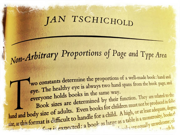
I used to go and visit Paul and Stella, [the celebrated cook book authoress] and talk about type, food and cooking at their book-cluttered apartment, in NYC. Lovely and cultured people. And in that, Paul was a scholar [and member of the Typophiles] – letter history, type design legacies and a key member of that society. From that bridging, I’d encountered Jan Tschichold, another scholar of typography and design, about the right layout of the book.
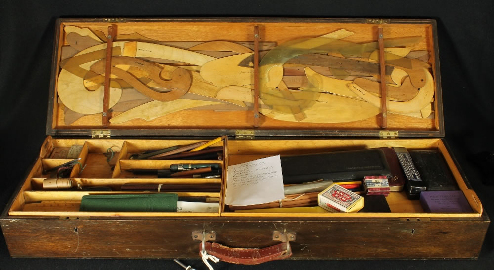
I began my career as a sign-writer, letterer, calligrapher and hand-made book builder — and later a book designer — back then ruling up the pages on a layout on a tracing stock, drawing out the height, kerning and leading of the fonts, to page, in the theories of Adrian Wilson, a book designer from San Francisco.
Before that time, that first project, I had no clue about how to even design a book. I had a theory about how books should look — what the meaning would be, the cadence and movement of the pages, the sequences of design and revelation.
I collect them, should I not know how to do that —
put that together?
But my principle, in making books by hand was that there was a sequencing — a threading from page to page — a girding of grid, from layout to layout, long before I even knew what “the Swiss grid” was about, so advocated in many design schools, including the University of Washington. One designed note, on one page, would find a telling on another.
The thread goes through,
page to page.
And I studied more into the history of the book — how that has worked for the last couple of thousand years.
What then, what now?
Still threading, after all these years.
What I knew from my art history and architectural studies was that the nature of design could be supposed on a practice of a geometry of arrangement — almost thinking dimensionally, like there are moving lines in the design that move from horizontal planes to vertical planes — that flows through: everything.
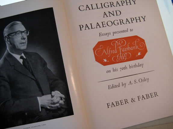
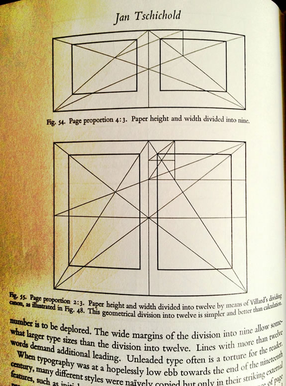
Jan Tschichold identified that principle of a layering of an invisibly inked grid line, a harmonious whispering of proportion that drives the beauty of the page; its air and openness. And later, with Lloyd Reynolds, in the famous Festschrift for Alfred Fairbanks, “Calligraphy and Paleography.”
His “Non-arbitrary proportions” essay was a learning that shocked me, mostly because it seemed so familiar, yet still, I’d never seen it evidenced as a concrete theory. The core to the principle was designing a layout for books that — unlike our hurried sense of time — could be used for hundreds of years, handled and studied by thousands of people, potentially, over time. Whether this notion of design could be attached to the higher metaphysics of “divina proportione,” the notion of the rhythm of design being a kind of perfected patterning, found in natural phenomena and rhythmic positioning of proportion, airiness and the balance between something “defined” and something “undefined.”
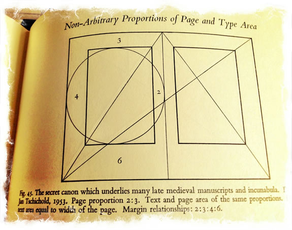
Jan Tschichold’s Essay from the Fairbanks festschrift
You can find it here, as well, as a separately published document.
In any manner, it might be considered that it “feels right” in the context of “elegance, spareness and balance.”
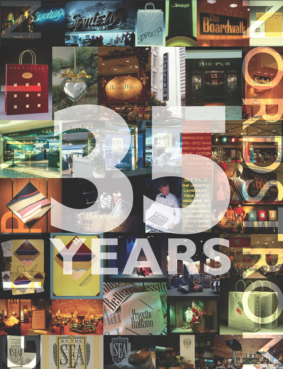
Still, there are present applications — a design can be built, today, on this positioning: in a project overviewing our Nordstrom work, we used the principle of classically-defined, geometrically-principled design
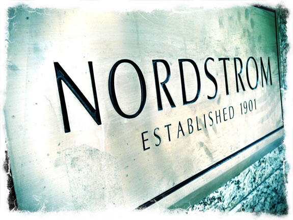
in a customized letterform — tall, airy, balanced.
The key comes not only to scale, but more so the arrangement of content within.
That goes back, a couple of thousands years, and goes forward to the now.
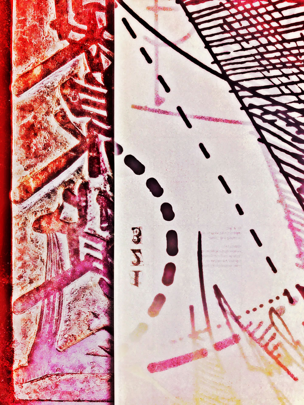
Lettering remnants
from the Italian Renaissance:
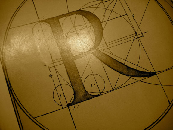
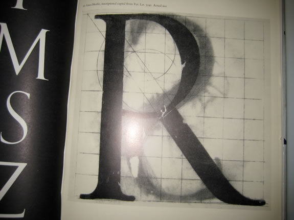
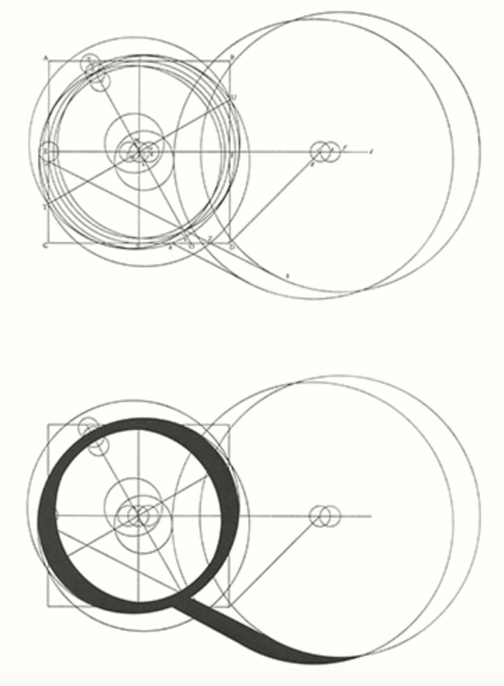
Geometry applied to the drafted letterform [shown above] was part of the Italian humanistic analyses
in a “scientifically-artistic quest” of how to create the perfected letterform, during the Renaissance.
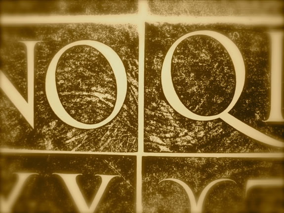
Designers from the period offered manuscripts and printed books that espoused these tools—the compass, rule and curve to build supremely cool letterforms defined Roman Imperialist letterforms — found in epigraphy from around 100 CE and earlier Greek epigraphy.
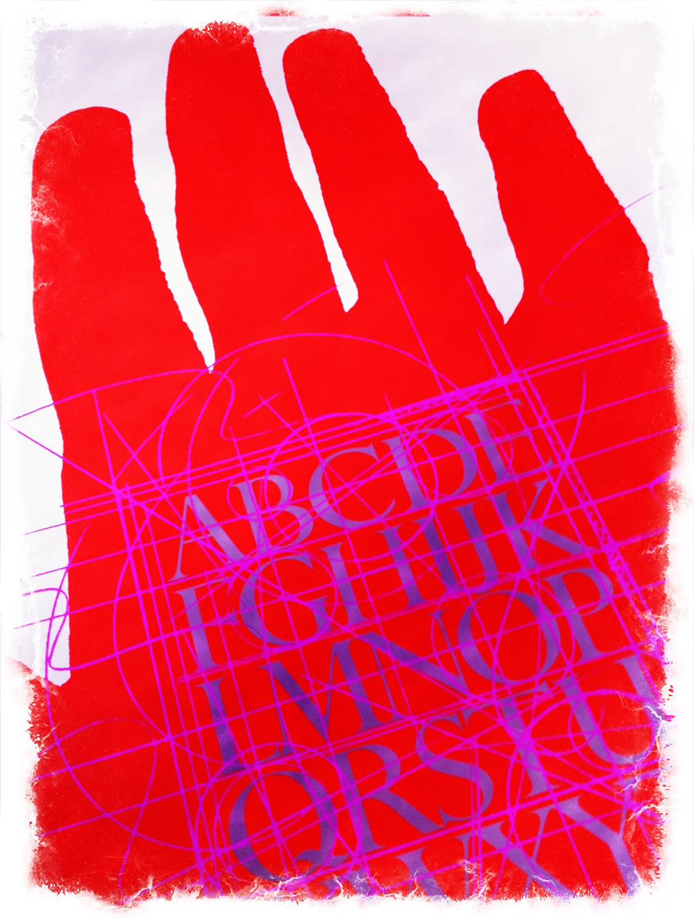
Our explorations are more whimsical — the imagery below, a Girvin font,
“Dominic’s” for a restaurant design and signing program.
“The hand compels the type” relates to a reference, to our history, that ties the structure of the letterform to muscular movements, evolutions in speed, letterform simplification in structure and learnings — the gestures that compel the quality of how the letterform is drawn.
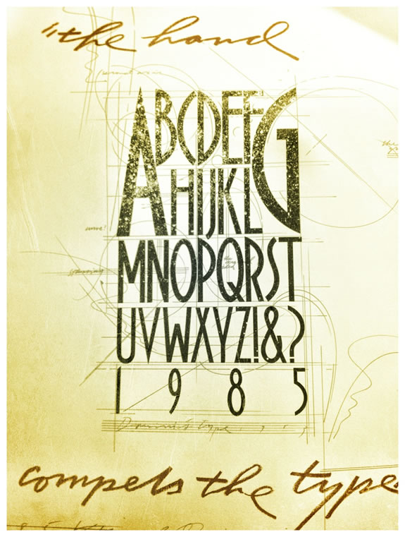
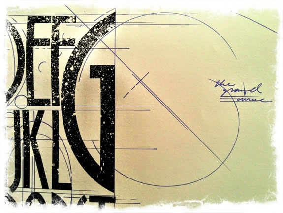
The geometric principles here are invented.
I drew the font, then added the curvilinear articulations as lines of energy in the drawing —
the notes are personal.
Can that idea be applied to the scripting of the letter? Really?
I don’t know, I’ve never done that — formally.
More, for me, was the art of splaying curves and descriptive cartography to the mapping of letterforms,
albeit not ever really needing to use geometry to find “rightness” in proportion.
The mind first, eye is next.
For me, it was more about the energy of the drawing
on static structures, the architecture of
the letters themselves.
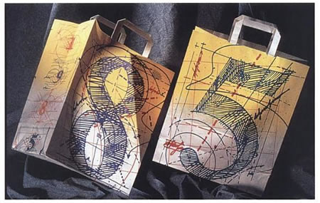
As in most things, I really never knew what I was doing, merely experimenting and exploring. Even this two-sided 1985 Bloomingdale’s bag was completely made by hand with no real principle of a higher positioning than doing something full of color, magic and energy.
And the year, a kind of honor bestowed on an artist, to do the bag for the year, Bloomingdale’s.
Magical design
plays both sides,
to the hidden geometry of drawings —
sigils and angelic and demonic seals and charts —
worldwide, for 5000 years —
have played to a geometric interpretation;
these incantations are
maps, magic words, symbols and channels
from one domain to another —
inter-planar messaging and calls,
voicing hidden codes and portal openings.
And in studying the history of markings, as well as the drawing of
these mysterious coded geometric overlays
on the magic of the letterforms themselves,
I delve there.
Still.
Tim Girvin | GIRVIN | OseanStudios
…..
Girvin Cloudmind® | goo.gl/33c5P8
TEAM-BUILT STRATEGIC INNOVATION WORKSHOPS