Working in Vegas, over the course of four days, we all studied people.
Our team was Cathy Mack, Girvin’s San Francisco-based Director of Strategic Marketing, and Gabrielle Girvin [my daughter], Girvin’s Seattle [and firm wide] Social Media Implementor and Participant in Tim Girvin Special Projects [events, speaking engagements, teaching programs, books and marketing, supporting research and production for Girvin marketing].
And, anyone involved with marketing, the craft of strategically “selling” must and will [we all did] watch people.
To sell anything to a person, you have to be studying them.
What are they thinking, are they listening, what stories does their body tell, to their degree of engagement, interest, contemplation or dreaming — “the future state of the have?”
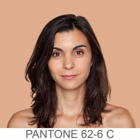
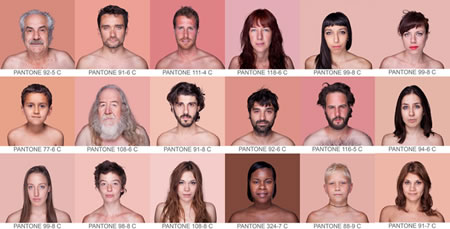
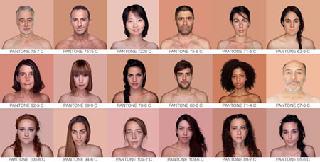
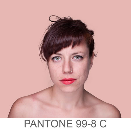
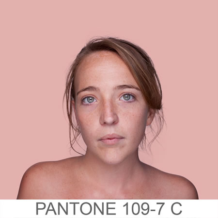
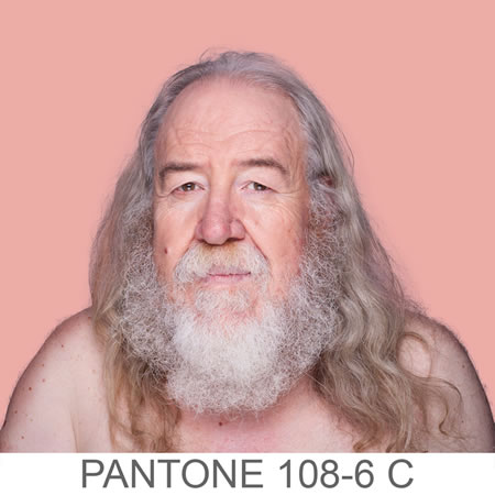
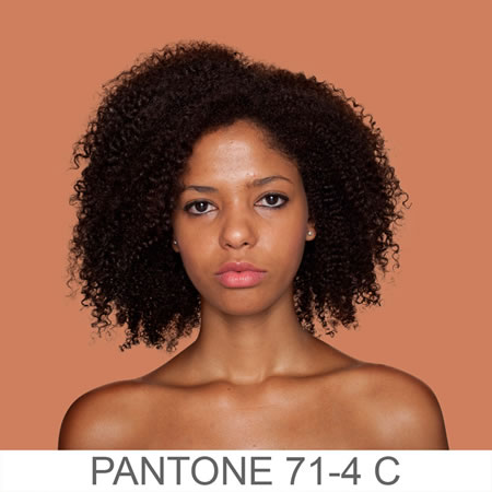
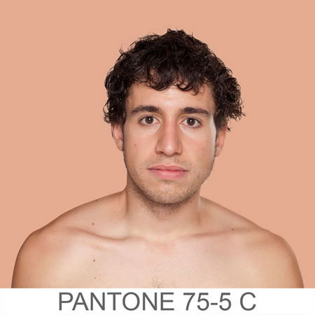
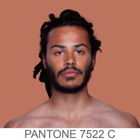
Pantone’s People Color Matching System: Humanae + Angelica Dass and her alignments.
And it got me to further contemplate the idea of the color of them — the people — and the colorations of the environments they were in. People, of course, have richly varied and wonderful colors to them. And, to this blog — Pantone has considered this idea in a new humanized sequence of human palette reflections — People PMS [Pantone Matching System] — our descriptive “name,” not theirs.
“Pantone swatches are typically used by designers and photo retouchers, oftentimes to find equal or complementing colors for their subjects. In an ambitious ongoing photo series by Spanish artist Angelica Dass, the photographer seems to be looking for subjects whose skin tone reflects specific Pantone colors. The project, titled Humanae, takes an 11×11 pixel sample from the subject’s face and fills the background with that color and accompanies the image with the Pantone alphanumerical code below it, just like a Pantone swatch!”
People, color, and Las Vegas
Vegas is a wild city to explore, to color studies. Every lobby is overloaded with heavily illuminated and noise-producing hardware, the “slots” to the trade — slot machines. They each have their story [and color-lit-illumination strategy, like a circus palette, loud and boorish, carny-like hooting color treatments [and nothing subtle or understated] — and luck isn’t obvious — frankly, it’s hard to say if it’s a randomized patterning – or planned. Cartoonish might be a quick study in the general aesthetic.
There are sequences of access — the entry, which oftentimes has “better” machines, elevated luck as an enticement — “come in, welcome, the luck is better here — more to your fortune.
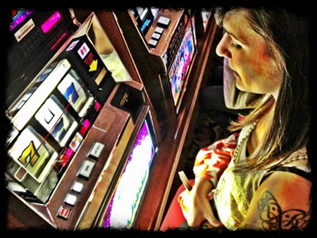
People sit in font of them, then they are colored — in their color — by the machine.

The Cosmopolitan | entry sequence, off The Strip
One can design environments where the color of light, the bouncing cadence of light and molecular-colored reflection will either happily affect people or — dis-affect them with a negative response. Generally, it might be said that some people colorations simply don’t look good in avocado. Brilliant orange isn’t so good, either. Black as a palette will impart its funerary presence, on the experiencer.
Anyone tied to retail design knows the nature of the “procession” or the “customer journey” as an idea. Earlier, Girvin worked with Nabisco [and Haggen Stores] on just this idea — but more to the notion of the “shelf set.” When one approaches a counter display area — walking the aisles, what is the sequence of revelation? Where are the ChipsAhoy? Savory crackers are aligned, and arrayed — just how? We called it “the bullseye strategy.” Centering in on the moneyed product set. These principles synchronize with movements into the gaming world, as well as the charmed life — notes are here.
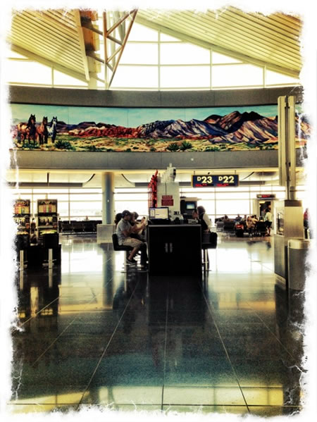
Color affects people — and the effectuation of color thinking — light casting out on people, as they sit slumped in their swivel gaming chairs, smoking and drinking is a saddening state of affairs.
Even brightening colors don’t support a lively or happy disposition. Even Gabrielle Girvin isn’t happily “enlightened” by the color of her one and only time at a slot machine [as far as I know].
For Pantone and their yearly inventions of new strategies and products — and ways of thinking about them, how they affect people — the effects of smart colorific tactics — I applaud them.
I’ve learned more from friend Leatrice Eisenman, San Francisco color-matrix Laura Guido-Clark, friend, co-founder, creative director — butter London colorista — Nonie Creme.
Color lives large in our lives — yet, we too, are color.
Such is the richness of our personal palettes, and potentially — how we contemplate the colour of us [and how Pantone organizes these reflections].
My question to you would be —
if you’ve gotten this far — what about you, your color and the color that works with, on and around you?
Tim | The Old Queen Anne Hill Studios | Girvin Seattle
GIRVIN notes and writings on colour:
https://www.girvin.com/blog/?s=coloration