Branding Buildings | Building Brands —
Aligning Typefaces With Architecture
In my earlier years I lived in a neighborhood laden with architects —
like when I was 12 years old,
in Spokane, Washington.
I lived in a MidCenturyModern house [the one at 42nd & Perry] and the entire block was festooned with architects. I’d go up and down the block, to their smoke-filled living rooms and look at the models, drawings, and pinned-up tracings and plenty of books on architecture. More too, the entire neighborhood and my parents’ circle of friends was a webbing of designers, interior decorators, architects, painters and poets. That learning, as well as early drawings helped me look at drawing buildings, then drawing signs and type for those imaginary places.
To the idea of aligning a building with a typographical system, that’s an ancient legacy. The Romans, in the early evolutions of Graeco>Roman[ized] architecture, derived from the spacious majesty of loftier Greek principles of design strategy, let alone the built marvels of Northern Egypt and the edifices of Mesopotamia — people knew how to build big,
to take supreme advantage of scale, location and siting strategies —
spectacular seen from a distance,
dramatic in their sited views out
to the surrounding landscapes.
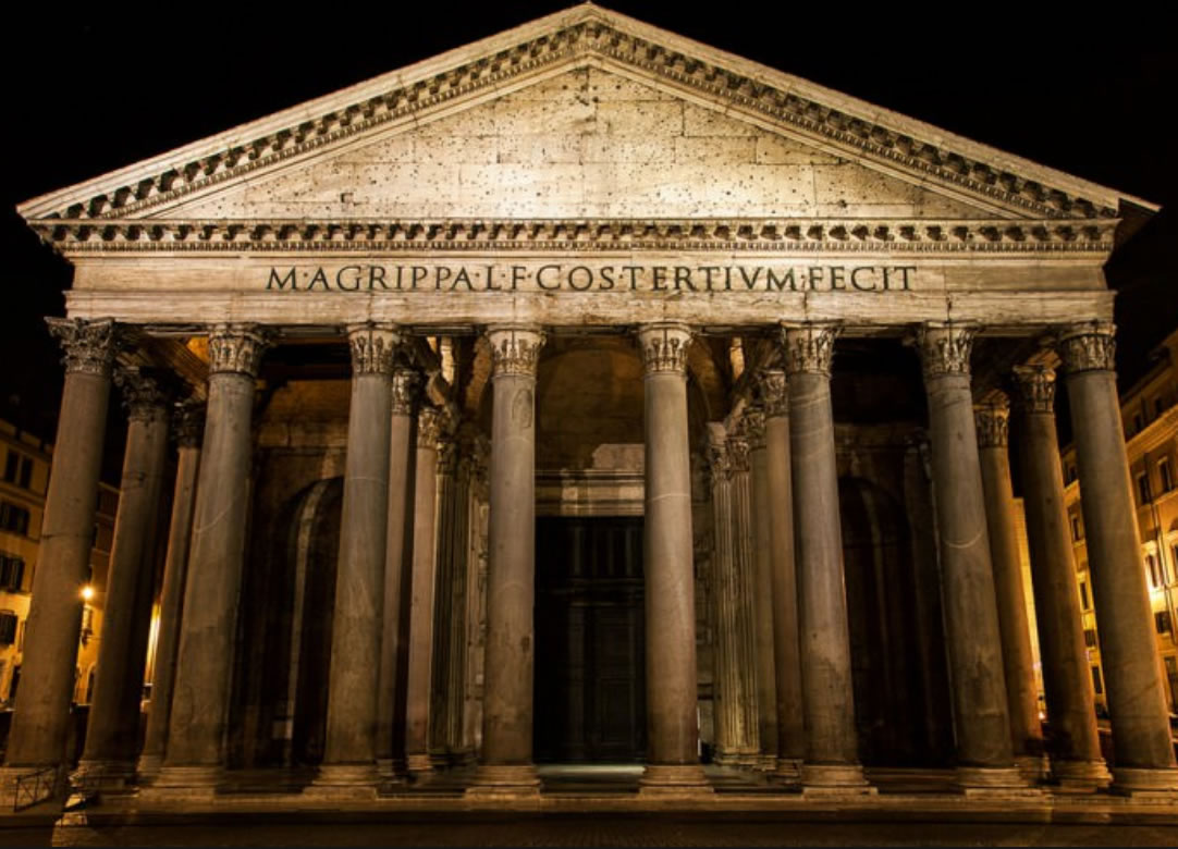
In these strategies, the point was to align the messaging of place with the drama of the building. So the thinking that epigraphic renderings should state a message that synchronized to the drawing of scale. Roughly 100 years after the crucification of Christ, Marcus Agrippa offered this testimony to a third-time rebuilding of the Pantheon —
M. AGRIPPA L.F. COS TERTIUM FECIT
(Marcus Agrippa, son of Lucius, three-time consul, made this).
But in the perfected complexity and mystery of how that building was built, and why it’s still standing after 18 centuries is a marvel to architects and engineers — even more so — the how of its construction — the question of a perfect type for the building.
How does it work? The wide curves and graceful spaciousness of the Capitalis Monumentalis — the classical capitals of the Romans — fits the bill.
For another edifice, we chose a similar strategy of classical, customized lettering that was designed to respond to a modernist rendering of a tower in Seattle,
designed by Kohn Pedersen Fox.
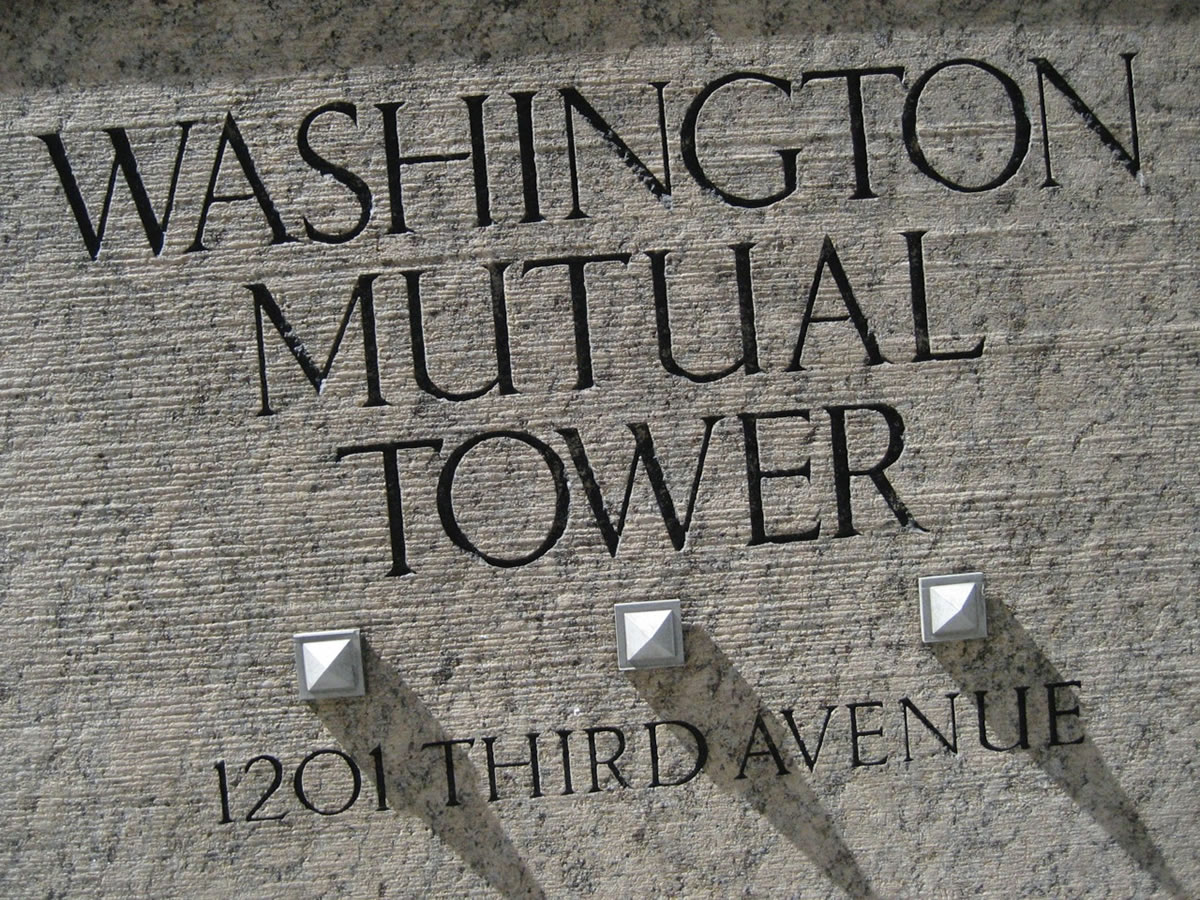
In this manner, we drew and created a font for the building.
And the proposition is simple.
Design an alphabet that aligns to the style of the place.
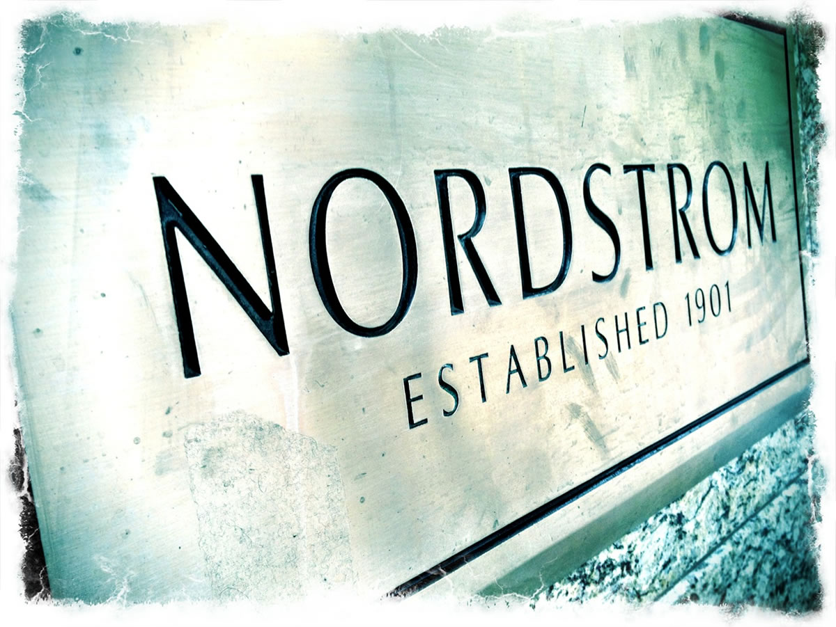
Taking that thinking of specialized alignment,
cultivation and brand implementation,
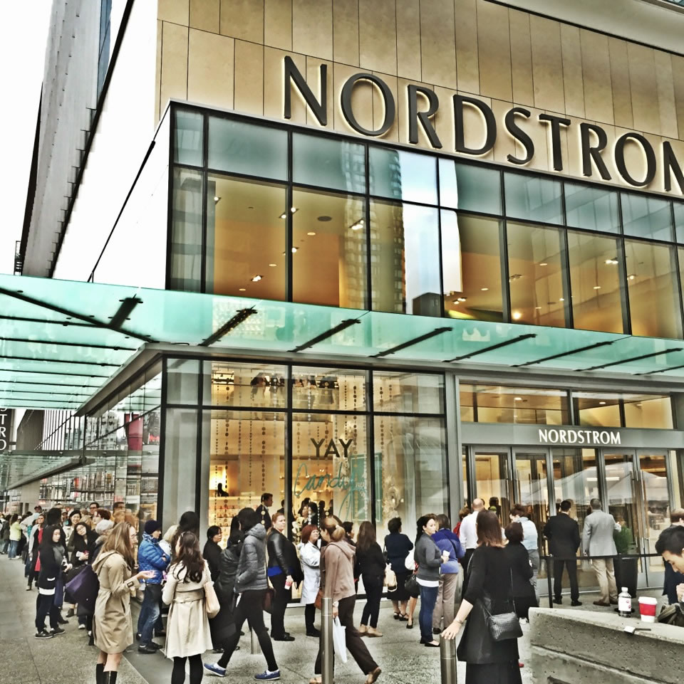
we designed a customized alphabet for the Nordstrom brand,
which ultimately included internal
and external signing systems.
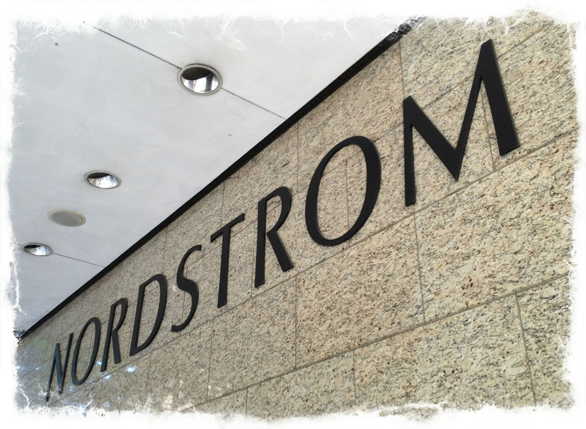
Designing a font — building aligned — is about this journey, storytelling the structuring of the letter, and how that is built — the stand, the stem to pillar, the serif to pedestal, the vault — the curve of the spin of the interior counter, the spandrel — a string of letterforms in rhythm, the arcades: the m’s, the n’s the bounce of the vaulted ceiling strokes. Interestingly, that theory isn’t new, but well known
as an allegorical rendering —
like these:
The better people communicate, the greater will be the need for better typography—expressive typography.
Herb Lubalin
“Printing is a composition just as an architectural structure,
a painting, or a piece of music.
It cannot be wholly reduced to a formula.”
John C. Tarr, Oxford —
Preface to “How to Plan Print,”
London, 1938, p.vii.
Type design is a job where there is no room for easy solutions. Letters can perhaps be designed quickly using a compass and ruler, but these are unsuitable for a typeface, as they fail to satisfy the subtle optical laws that make reading enjoyable.
Georg Salden
“A typeface is an alphabet in a straightjacket.”
Alan Fletcher,
London,
Co-founder
Pentagram
“Geometry can produce legible letters,
but art alone makes them beautiful.
Art begins where geometry ends, and
imparts to letters a character
transcending mere measurement.”
Paul Standard, NYC —
Manuale Typographicum,
Frankfurt am Main, 1954, p.63.
Typography is two-dimensional architecture,
based on experience and imagination,
and guided by rules and readability.
And this is the purpose of typography:
The arrangement of design elements within
a given structure should allow the reader to easily focus
on the message, without slowing down the speed of his reading.
Hermann Zapf,
Darmstadt
“Of all arts, architecture is nearest akin to typography.
Both are equally related to their function. In both, that which wholly fulfills its purpose is beautiful.As the facade of a building holds the promise of a room behind it, so the page may be said to disclose the spiritual room behind it. Utmost clarity and perspicuity mean greatest beauty.”
Helmut Presser, Berlin —
Formgesetze im Illustrierten Buch
des 15 Jahrhunderts in Gutenberg
Jahrbuch,
1951,
Mainz, p.75.
As I never saw my father or my mother, and never saw any likeness of either of them (for their days were long before the days of photographs), my first fancies regarding what they were like, were unreasonably derived from their tombstones. The shape of the letters on my father’s, gave me an odd idea that he was a square, stout, dark man, with curly black hair. From the character and turn of the inscription, “Also Georgiana Wife of the Above”, I drew a childish conclusion that my mother was freckled and sickly.
Charles Dickens
“Architecture began like all scripts.
First, there was the alphabet. A stone was laid, and that was a letter, and each letter was a hieroglyph, and on each hieroglyph there rested a group of ideas, like the capital on a column. Thus, until Gutenberg — architecture is the chief and universal writing.”
Victor Hugo, Paris,
Notre Dame de Paris,
5th book,
Ceci Tuera Cela in Oeuvres Completes de Victor Hugo, Paris, 1864. ps. 277-288.
Lettering is a precise art and strictly subject to tradition. The ‘New Art ’ notion that you can make letters whatever shapes you like,is as foolish as the notion, if anyone has such a notion, that you can make houses any shapes you like. You can’t, unless you live all by yourself on a desert island.
Stanley Morison
Type design is a job where there is no room for easy solutions. Letters can perhaps be designed quickly using a compass and ruler, but these are unsuitable for a typeface, as they fail to satisfy the subtle optical laws that make reading enjoyable.
Georg Salden
“No art is closer to architecture than typography. Like architecture, its first principle is the discriminative and proper adaption of materials. Like architecture, it rests upon a system of definitive conclusions. Its economies are fixed, it repudiates contorted eccentricities. As the designer of a palace cunningly distributes shadow and light on its façade and, in the plans of interiors, adjusts light and shade to living needs, so the designer of a book employs two contrasting qualities, the white of the paper and the black of the ink, assigns to each its part and attains a harmonious whole. There are in architecture great calm planes that are comparable to the margins of a page. There are, in a book, symmetries and modulations like those of a building. Indeed, is it not true, that these two great works of man — a book and a house —
should aim at the same fundamental virtue: style?”
Henri Focillon, Paris —
Preface to Le Livre,
Son Architecture,
sa Technique by
Marius Audine,
Pgs. vii-viii.
Of all the achievements of the human mind, the birth of the alphabet is the most momentous.
Frederic Goudy
Drawing an architecture of a letter —
I stroke the rules of the foundation, floor plan,
the plinths of the serifs —
the soaring rise of the
it’s a Renaissance rendering of scribing the graceful cartography and building-aligned structuring.
Wide open. Elegant.
Aligned.
I took that principle and
drew that to other forms
of language illustration,
and the geometry of alphabets.
Paul Standard, an early typophilic friend of mine, in the 70s, the beginnings of my career is quoted with the reference: “Geometry can produce legible letters, but art alone makes them beautiful…” I used to go and visit Paul and Stella, [the celebrated cook book authoress] and talk about type, food and cooking at their book-cluttered apartment, in NYC. Lovely and cultured people. And in that, Paul was a scholar. From that bridging, I’d encountered Jan Tschichold, another scholar of typography and design, about the right layout of the book.
I began my career as a book designer — back then ruling up the pages on a layout on a tracing stock, drawing out the height, kerning and leading of the fonts, to page, in the theories of Adrian Wilson, a book designer from San Francisco. Before that time, that first project, I had no clue about how to even design a book. But my principle, in making books by hand was that there was a sequencing — a threading from page to page — a girding of grid, from layout to layout, long before I even knew what “the Swiss grid” was about, so advocated in many design schools, including the University of Washington. One designed note, on one page, would find a telling on another.
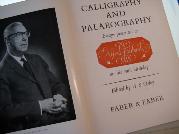
What I knew from my art history and architectural studies was that the nature of design could be supposed on a practice of a geometry of arrangement. Jan Tschichold identified that — and later, with Lloyd Reynolds, in the famous Festschrift for Alfred Fairbanks, “Calligraphy and Paleography.” His “Non-arbitrary proportions” essay was a telling that shocked me, mostly because it seemed so familiar, yet still, I’d never seen it evidenced as a concrete theory. The core to the principle was designing a layout for books that — unlike our hurried sense of time — could be used for hundreds of years, handled and studied by thousands of people, potentially, over time. Whether this notion of design could be attached to the higher metaphysics of “divina proportione,” the notion of the rhythm of design being a kind of perfected patterning, found in natural phenomena and rhythmic positioning of proportion, airiness and the balance between something “defined” and something “undefined.”
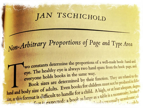
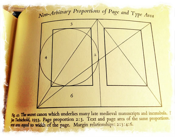
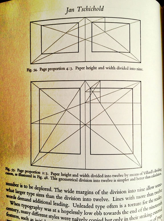
Jan Tschichold’s Essay from the Fairbanks festschrift
In any manner, it might be considered that it “feels right” in the context of “elegance, spareness and balance.” Still, there are present applications — a design can be built, today, on this positioning: in a recent project overviewing our Nordstrom work, we used the principle of classical geometric design in a book form — tall, airy, balanced. The key comes not only to scale, but more so the arrangement of content within.
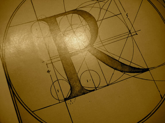
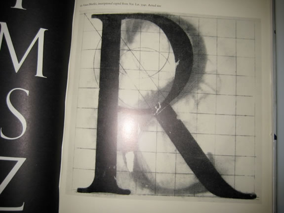
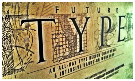
Geometry applied to the drafted letterform [shown above] was part of the Italian humanistic analyses in a “scientifically-artistic quest” of how to create the perfected letterform, during the Renaissance, manuscripts and printed books espoused these tools to build supremely cool-defined Roman Imperialist letterforms — found in epigraphy from around 100 BCE and earlier.
Our explorations are more whimsical — the imagery below, a Girvin font, “Dominic’s” for a restaurant design and signing program.
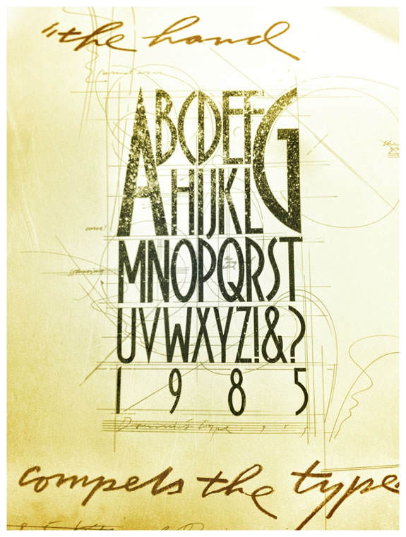
“The hand compels the type” relates to a reference, to our history, that ties the structure of the letterform to muscular movements, evolutions in speed, letterform simplification in structure and learnings — the gestures that compel the quality of how the letterform is drawn.
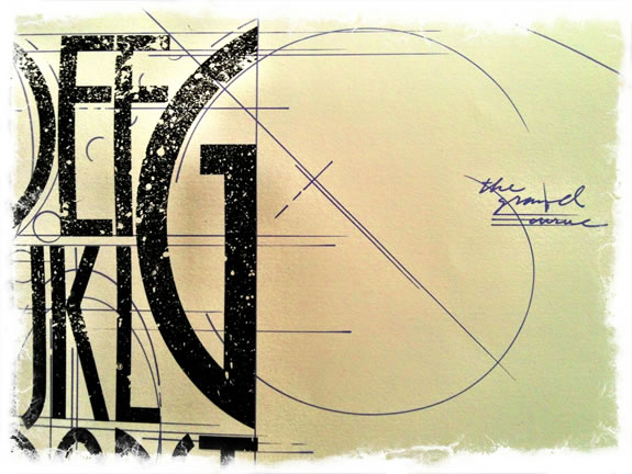
Can that idea be applied to the scripting of the letter? I don’t know, I’ve never done that — formally. More, for me, was the art of splaying curves and descriptive cartography to the mapping of letterforms, albeit not ever really needing to use geometry to find “rightness” in proportion. For me, it was more about the energy of the drawing on static structures, the architecture of the letters themselves.
As in most things, I really never knew what I was doing, merely experimenting and exploring. Even this two-sided 1985 Bloomingdale’s bag was completely made by hand with no real principle of a higher positioning than doing something full of color, magic and energy.
And the year, a kind of honor bestowed on an artist, to do the bag for the year, Bloomingdale’s.
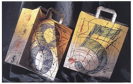
Magical design
plays both sides,
to the hidden geometry of drawings —
sigils and angelic and demonic seals and charts —
worldwide, for 5000 years —
have played to a geometric interpretation;
these incantations are
maps, magic words, symbols and channels
from one domain to another —
inter-planar messaging and calls,
voicing hidden codes and portal openings.
And in drawing these mysterious coded geometric overlays on
the magic of the letterforms themselves,
I delve there.
Still.
Tim Girvin
GIRVIN | Decatur Island Studio
THE MESSAGE IS THE VOICE
work: https://www.girvin.com
DESIGNED TEXTUAL CONTENT: THE BREATH OF SOULBRAND
Tim Girvin | founder + principal
mobile direct. 206.890.0621
teams: New York City + San Francisco & Bay Area + Seattle | Tokyo
truth: https://tim.girvin.com/