
I will not be pushed, filed, stamped, indexed, briefed, debriefed or numbered.
My life is my own. I resign.
—NUMBER 6
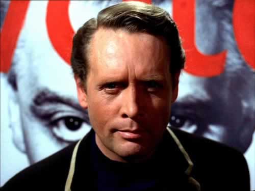
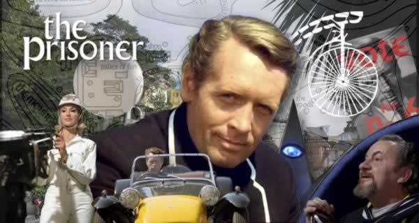
I introduced a friend of mine to Patrick McGoohan’s “The Prisoner,” a series that he conceived, starred in and produced for a limited run in the 60s.
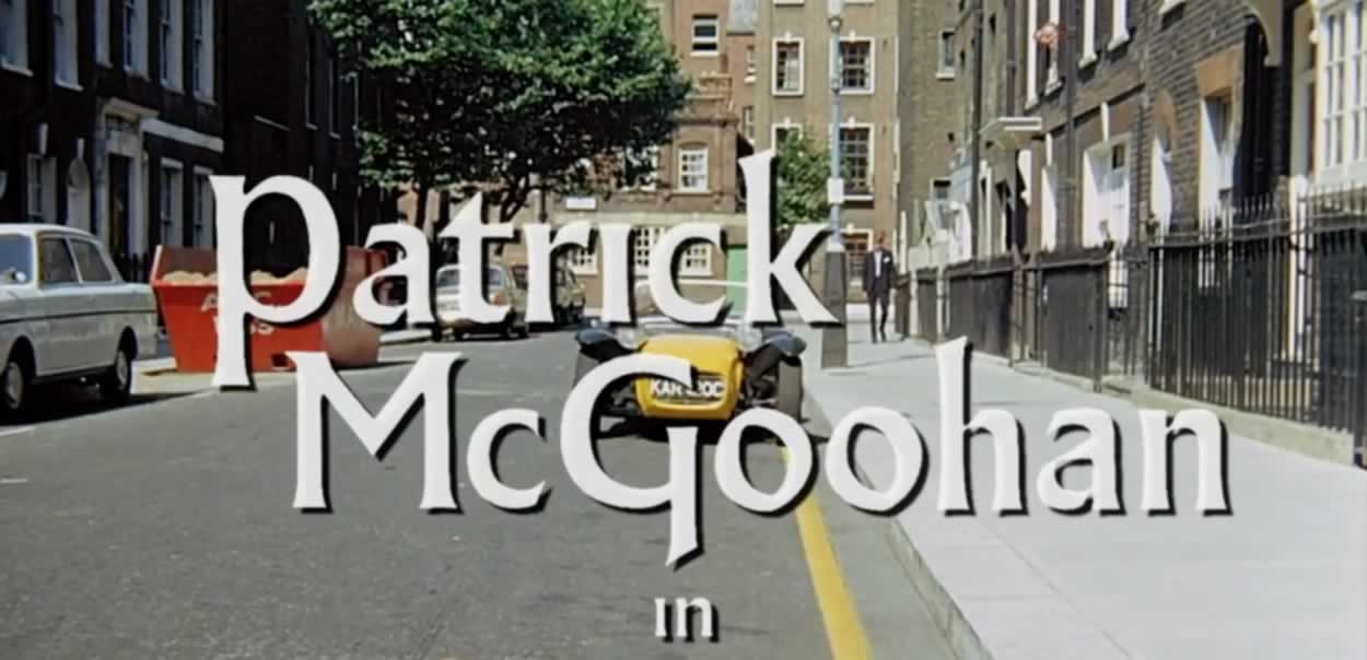
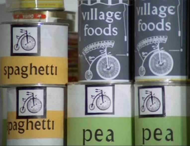
It was a short-lived, but inspired piece of work, that likely few people reading this blog would know anything about. But it struck me, somehow, and stayed with me—it was the detailing of the production that was memorable—it had a distinguishable style that I could see in everything from the titling, to the signage and packaging of the life at “The Village.”
Everything was cast in the peculiar
design vocabulary of “The Village.”
And much of that design thinking was manifest around
the notion of the repetitive use of a font.
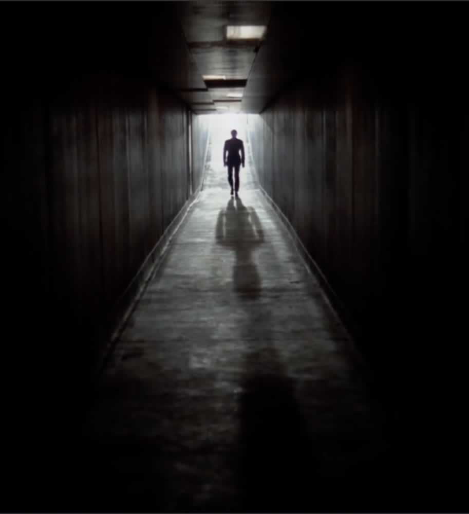
In the lead role, McGoohan played a “retired” secret agent for British Intelligence—in the opening credits, he feverishly types, and casts his resignation upon the desk of some agency executive and returns to his flat to begin what we imagine: he would be presuming a life on his own, but his suite is “gassed,” and he’s knocked unconscious and ferried to a bizarre little enclave known as “The Village;” he’s now been literally—retired by the agency.
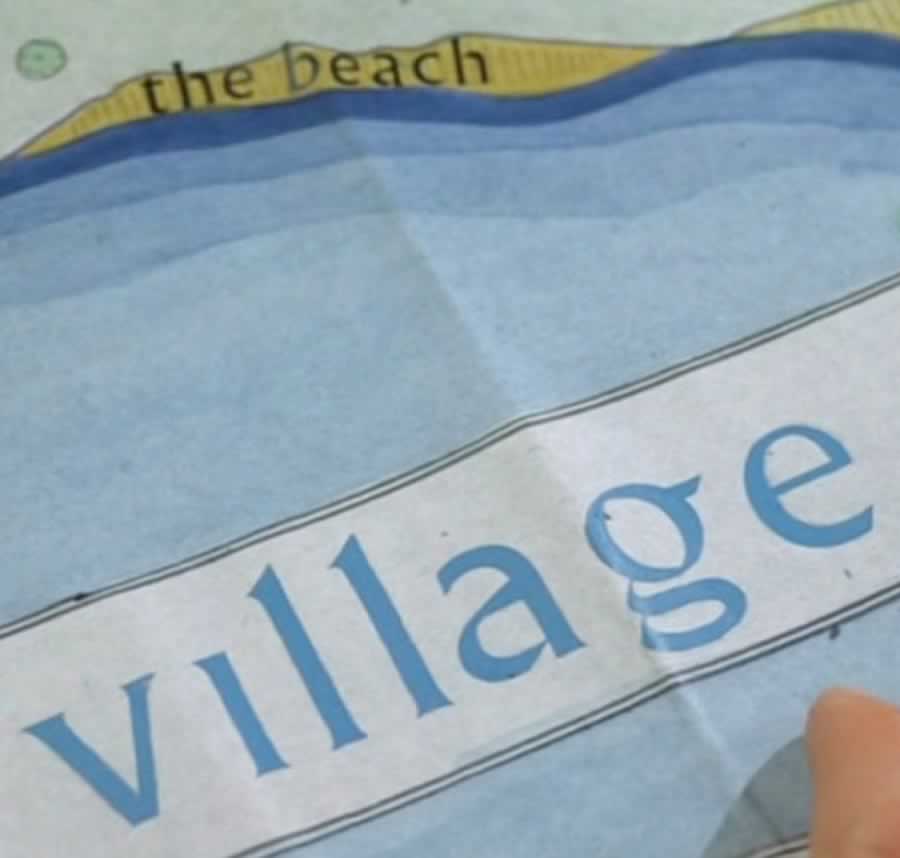
Here—at the Village—shot in an existing Welsh township known as Portmeirion, they, the promoters of the site, note: “It was probably one of the most influential pieces of television of the 1960’s not only in the UK and USA, but also in France, Australia, and many other countries. Even The Beatles were fans! Its cult status was confirmed with the establishment in the 1970’s of the official Prisoner Appreciation Society, Six of One.”
Culturally, it is bereft of accepted norms of transaction: there is no money—only “credits,” no crime, of course, no speaking out of turn; there’s not much of anything other than a group of elders who have been, we surmise, similarly “retired” or pulled from public life as a risk of too much secret agency. Sheepish would be an understatement. But it’s a little too perfect: without names,
everyone is a number.
Still, McGoohan rebels in his retired condition—clearly, this wasn’t the way he planned on stepping-out of the Crown’s spy-club legacy.
“I am not a number. I am a free man.”
Or so he thinks.
Not being one to be put down to a easy peg in a community of calmness and Stepford robotism, he immediately lashes out
and tries to leave the community.
Repeatedly.

But there is an symbolic orb, a floating globular guardian that chases down unwitting escapees. The idea of an “idyllic” village, that’s seemingly nestled on some obscure coastline, forested hillocks behind, it’s questionable that it would make anything less than an easy out—but no.
No one leaves alive.
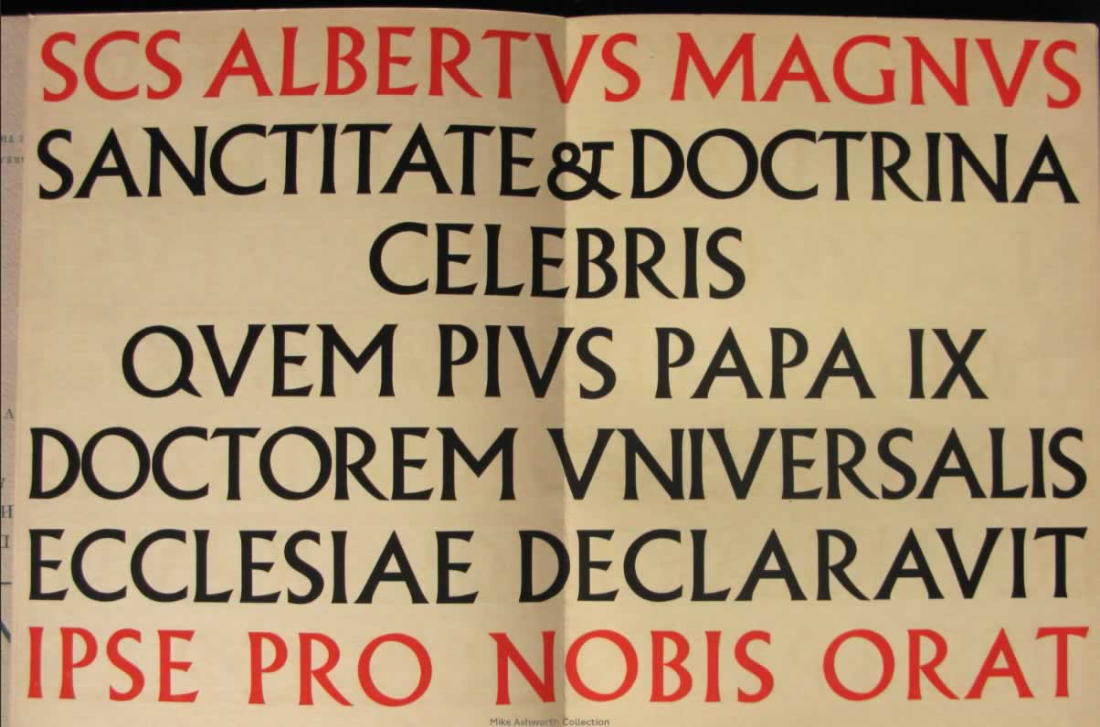
When I was studying in London—1976, I met the designer of this font, Albertus, created by Berthold Wolpe. I was astonished by the collection of Roman inscriptions in his home—how did he collect so many?
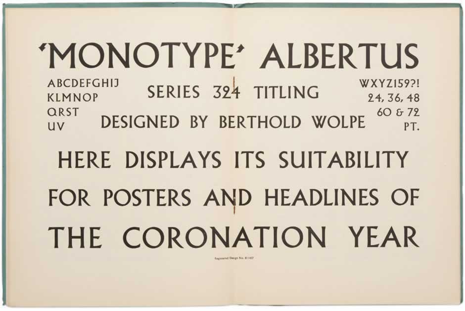
And one might estimate that his font, Albertus, was inspired by this epigraphic proximity; meeting up—we talked of lettering, the rhythm of the alphabet, the repeating nature of the forms—it was a good discussion. I drew some letters and my own influences in classical letters of the Roman Imperial legacy.
We talked.
Wolpe had that fascination as well—and it shows.
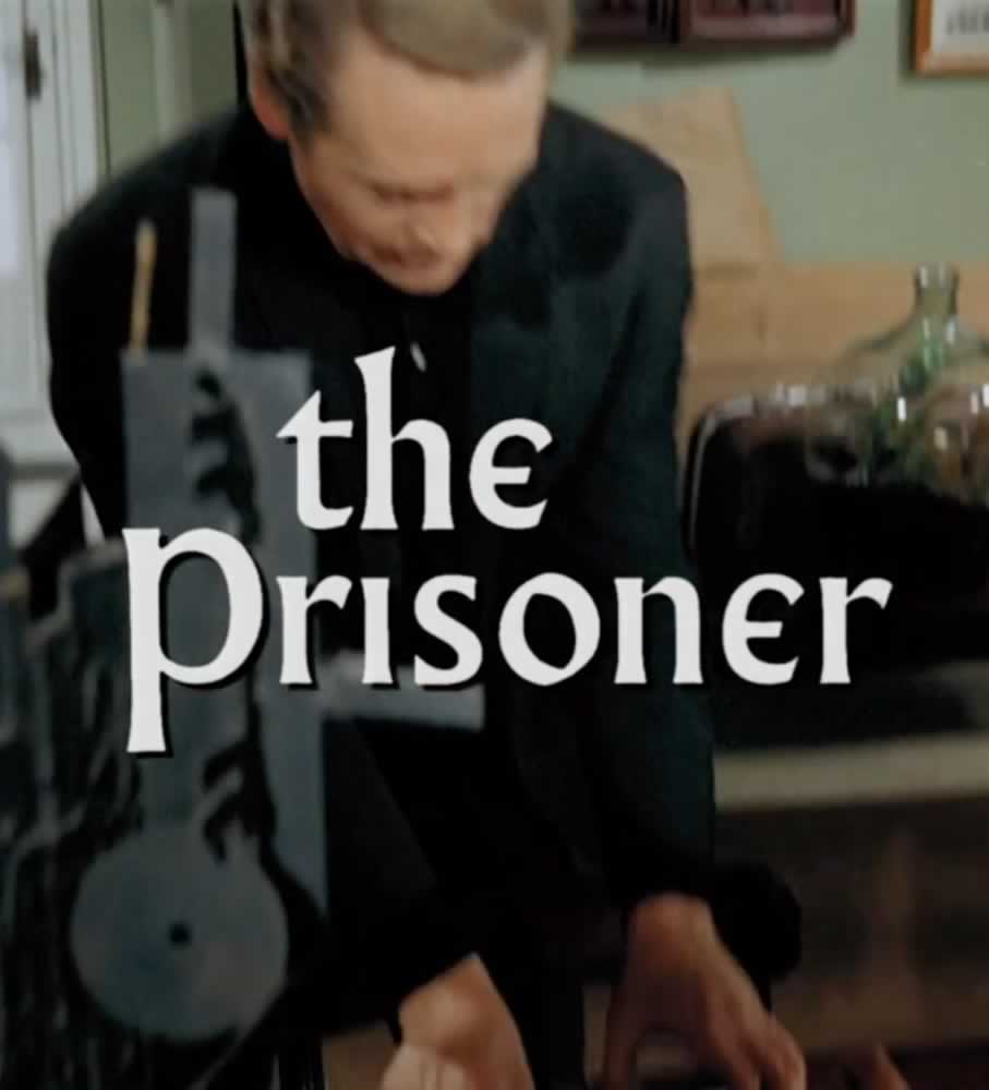
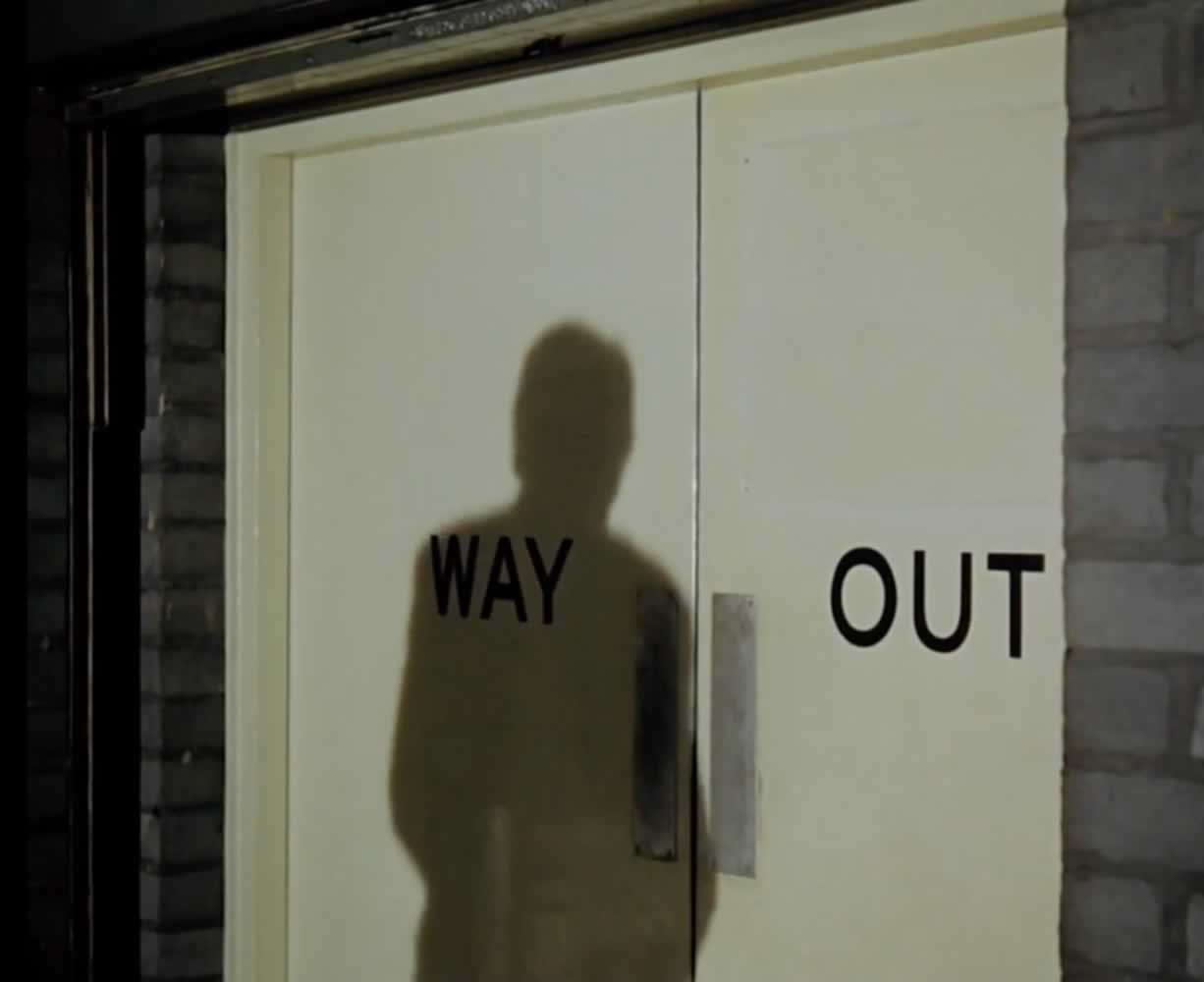
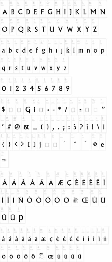
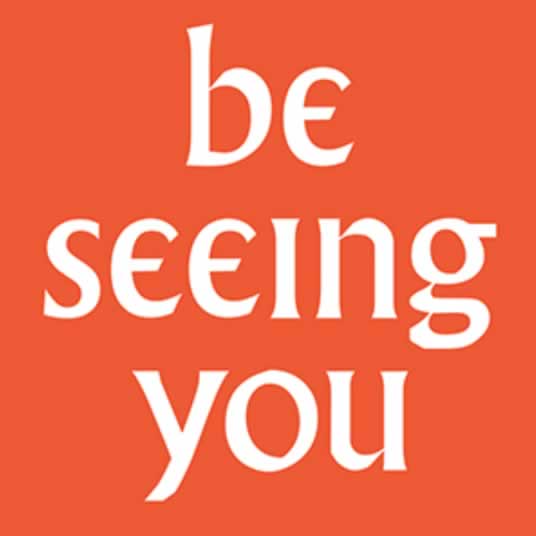
That font became the key messaging for the TV series and its visible identity: its titling treatments, its signage and collateral—but it was a special rendering—note the “e,” likely influenced by McGoohan’s direction. This font system was later built, in homage, by designer, Mark F. Heiman.
The key is an integrative element in the use of the font
as a core design linguistic of the
holistic conception of the program.
Of course, that’s a simplistic framing for the larger mysticism of the storytelling, allegorical as it was—and is—given a recent documentary in which McGoohan states the underlying allegories for his development: “The general theme has been with me for years, since I was a little boy, brought up in a very strict religious household, going to school with strict schoolmasters. The individual little boy – any little boy – up against this sort of pressure and the slight isolation in it… That’s what the theme of The Prisoner is, the individual in revolt against bureaucracy. That sort of rebellion is in everyone, isn’t it, in one way or another?”
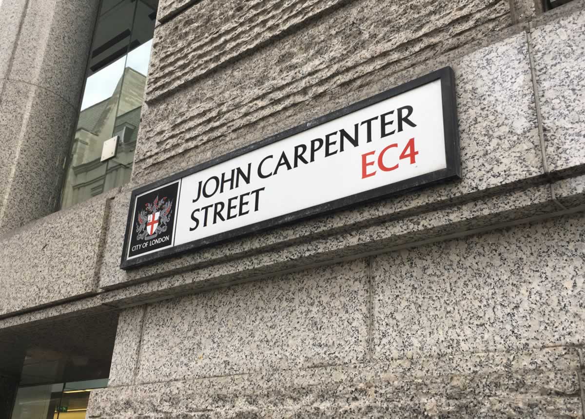
Other villages have embraced that principle—Albertus, for signage. As well as other filmmakers, London uses Albertus as a way-finding font.
And John Carpenter uses it in his films.
And in the journey forward, there’s always a step back, a step away—
and the departing phrasing would be?
The classic goodbye, for anyone in the Village.
Explore as you will.
And if you’ve ever seen “The Prisoner,”
let me know your thoughts.
Tim Girvin | OseanStudios | www.girvin.com
Designing entertainment and film identity | movie brands.