
IN A LEGACY OF DECADES OF COLLABORATION, THERE ARE ELEMENTS THAT SPEAK LOUDER THAN OTHERS, LIKE THE WORDS THAT MESSAGE FIRST-OFF, TO A READING BRAND EXPERIENCER.
THE HOLLYWOOD
MOTION PICTURE
PRESENTATIONS.
In the brand journey of forty five years of exploration of design, websites, packaging, signage and built environments, there’s an answer: it comes back to me that the core of that layering of all the work comes down to the message: “what’s the story, who’s telling it, what’s it look like and: how does it feel?”
Also, most relevant
to this cycling:
“how
does
it
read?”
And, if the experiencer is reading it,
what does it say?
In studying any layering of brand experience,
what could those messages tell?
When we think about a grouping of ideas, an exploration, invariably we gather them in some way that acts as a mnemonic on the meditation, as well as clustering of sequential imaginings. As well, grouping studies in a conglomerate manner allows for a tiering of storytelling—it’s like: “seeing this, you get to this; seeing this, you get to that—seeing all of this, we drive you to think about this—it’s a grouping of imagery that pushes towards a story in design thinking—it’s the culmination of ideas—it’s cloud mind, we call it. Journal work is a way of gathering up a cumulus of thinking, clouds gather and form a hypothesis of solution pathways.
Journals allow for sidebars of contemplation, meditations on passage of explorations—the journal is the jour—the French for daily—it’s a transaction of thinking, that takes the experiencer into the layering of thought paths.
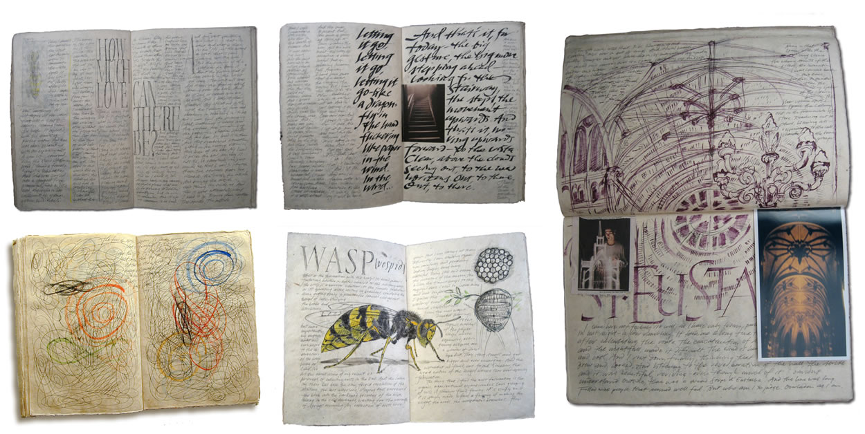
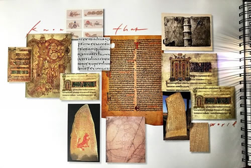
We use journal dailies to walk-around groupings of ideas—which lead to solution pathways. There’s a backgrounder, a re-search into temporal references—previous work, study models, art, architecture
and palæographical considerations.
So in working for the motion picture industry—as brand designers, invariably, we build our studies to express sequentia—sequences of ideas, tiering storytelling, previous references, utilizations of earlier thematics—since many of the stories that we retell are archetypal or thematically founded in historical content.
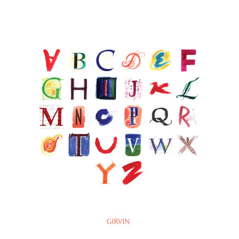
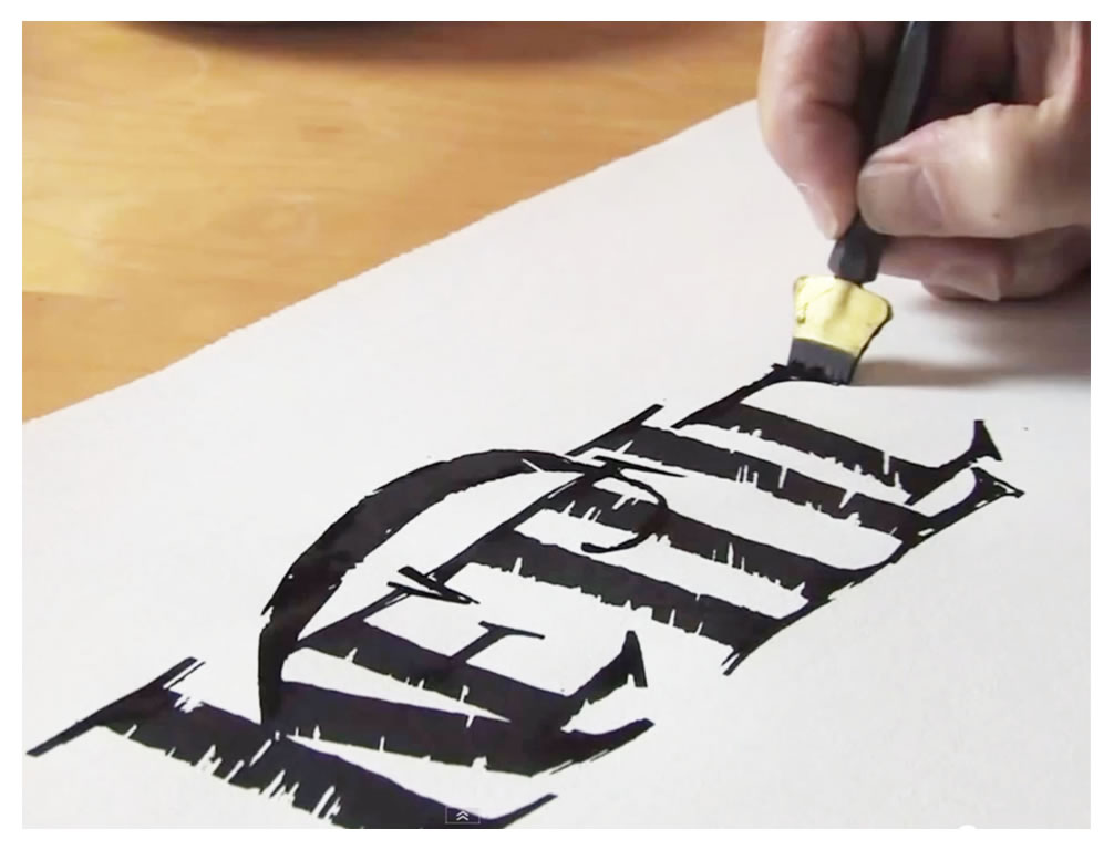
Rather than repeating earlier works, we need to know where a story might’ve gone, where it’s been—and a key part of that telling would be the alphabet. Looking at work that could be hundreds of years old, the high craft of font design—hand-drawn, customized to the momentum of illustrative solution-making.
The use of the alphabet in this context is thinking of alphabetic illustration—the letters themselves tell the story, they draw the experiencer in—
by reading into the narrative.
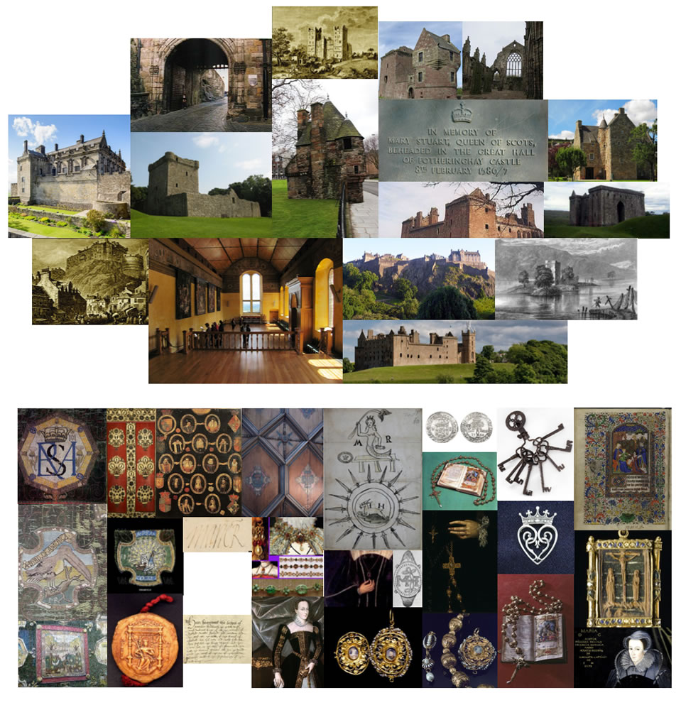
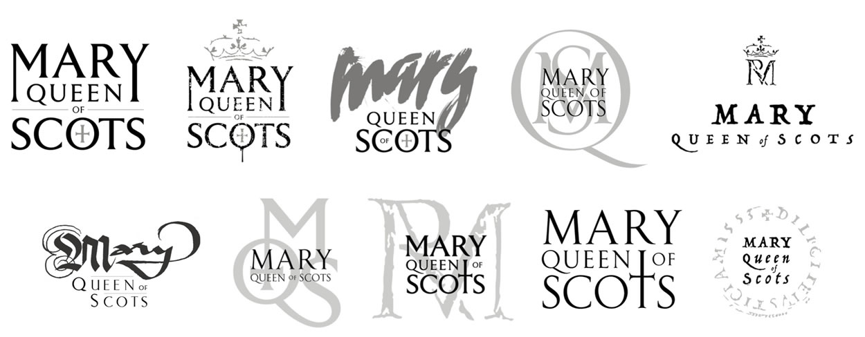
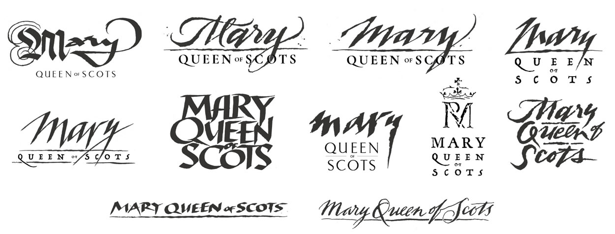
So in a story of work on Mary, Queen of Scots, we look at the history of representation, and we looked at her, her time period,
the writing and character of the palæography of her momentum.
And what of architecture—breathing the air of that time period, what happened? Breathe time, we call it.
What of other, even decorative, uses of lettered form?
In any strategy of designed narrative and brand-working logo treatments for film, it’s more about a channeling of pathways—solution-sets that are distinct and strategically-defined—not shot-gunning design renderings.
Stay in-track, on target: to strategy,
with aligned tactics—that’s our thinking.
So, as in the journey—and the journal—it’s a matter of gathering thoughtfully-aligned alphabetic solutions, that are conceptually targeted—but the lensing is varied.
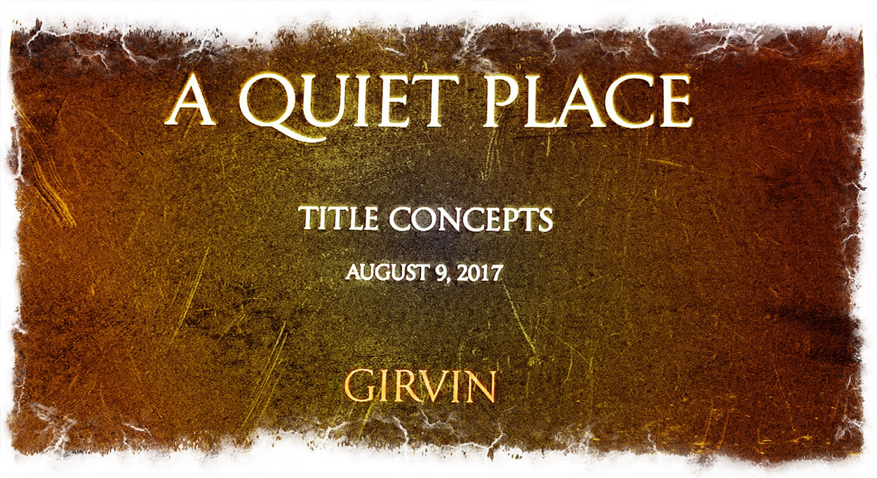
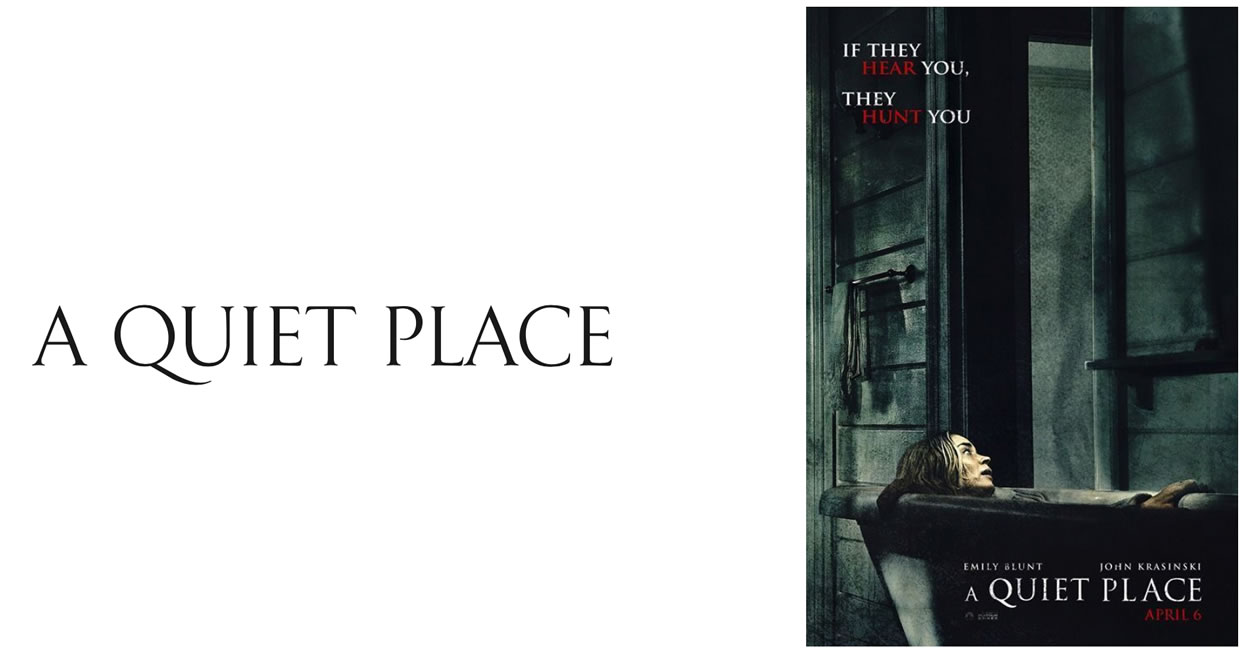
In “A Quiet Place,” I was operating on a single day review of a script, onsite in a locked room at Paramount Studios. That’s all I had, was the story—some questions on production design, some answers to pace and tension, lensing character, the notion of silence—a pervasive quality, some production discussions with executives—so we walked around the working premise.
From silently illustrative, to pushing the perimeters of storytelling:
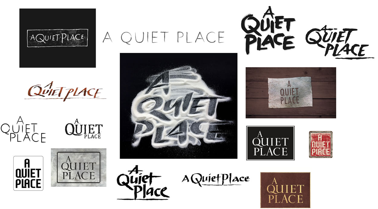
In the end, a GIRVIN customized font—
which was, in fact, the header to our journal of studies.
Walking back, the studies of other journal-built collective groupings of customized font solutions—it all comes down to the very character of the story—and, in this instance, the history of the telling—where it began, where it went to, and later interpretations—as in the
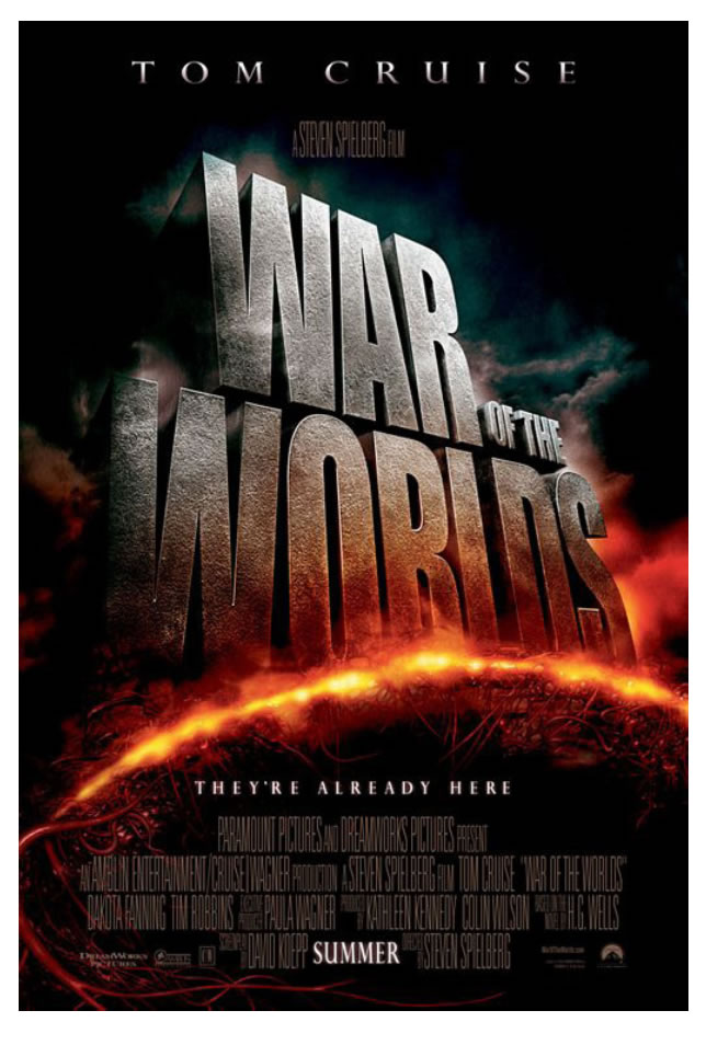
lensing of Steven Spielberg’s explications.
We start with drawings and clustering solutions, ideations and hand-built font treatments, that are tailored to the narrative, its history, that then could be built into realized, even dimensionalized renderings.
But as in everything, we go back to go forward—where things where, how they were done, and how do we advance them to the now?
Part of those studies, from a journal-gather, could be simply configurational—studies in weighting and structure.
As before—what now?
What was then,
what is now?
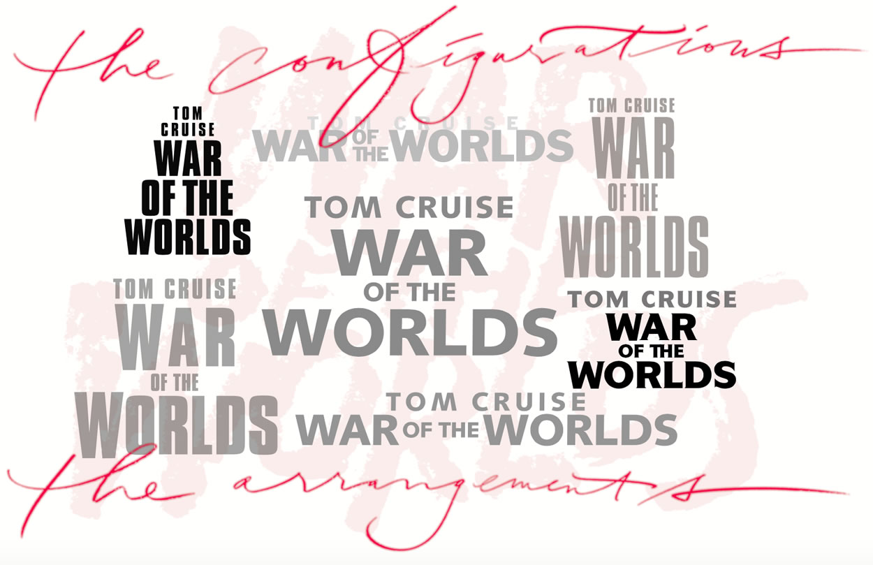
Then if this art is realized as two-dimensional arrangements, what further font suggestions would be built as three-dimensional —
deepening the layering of context.
This is the read, this is
the opening
narrative expression.
This is what people see.
First.
They read the
message.
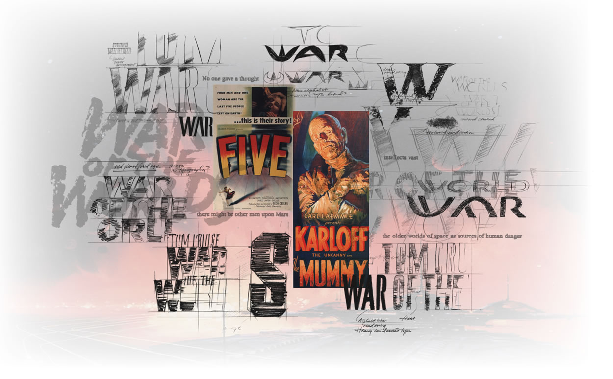
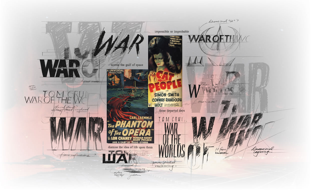
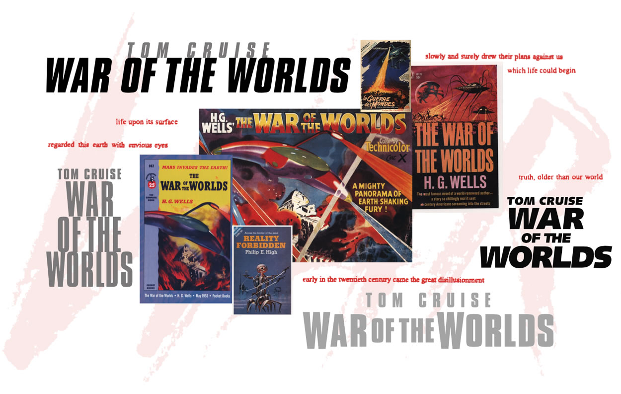
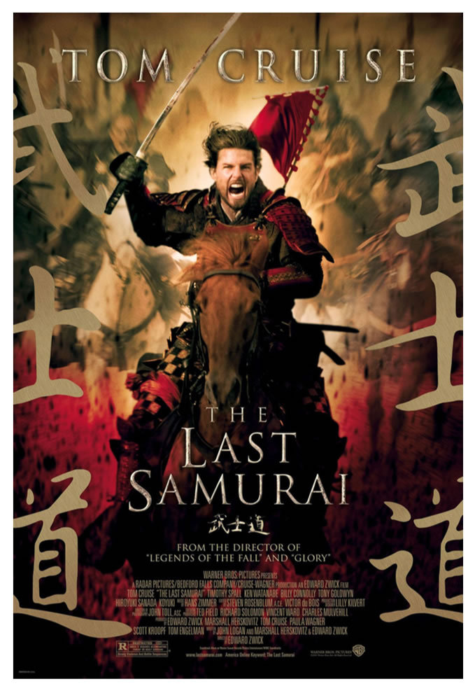
In another Cruise study, which really might be a sequencing of titles
that we explored in partnership with Tom’s acting. This solution set was built in a collaboration with Massey Rafani’s team at Warner Brothers.
This is a 19th century telling—and based in a late Victorian construct, the 1870s, looking for type references in the time frame—breathing time, as well as coupling this rendering with Japanese principles of ideographic messaging and details. From that time, we pulled fonts, signage,
temple symbology, icons
from another age.
And we combined them
into logo typographical configurations—that, until themselves—
encapsulate the telling.
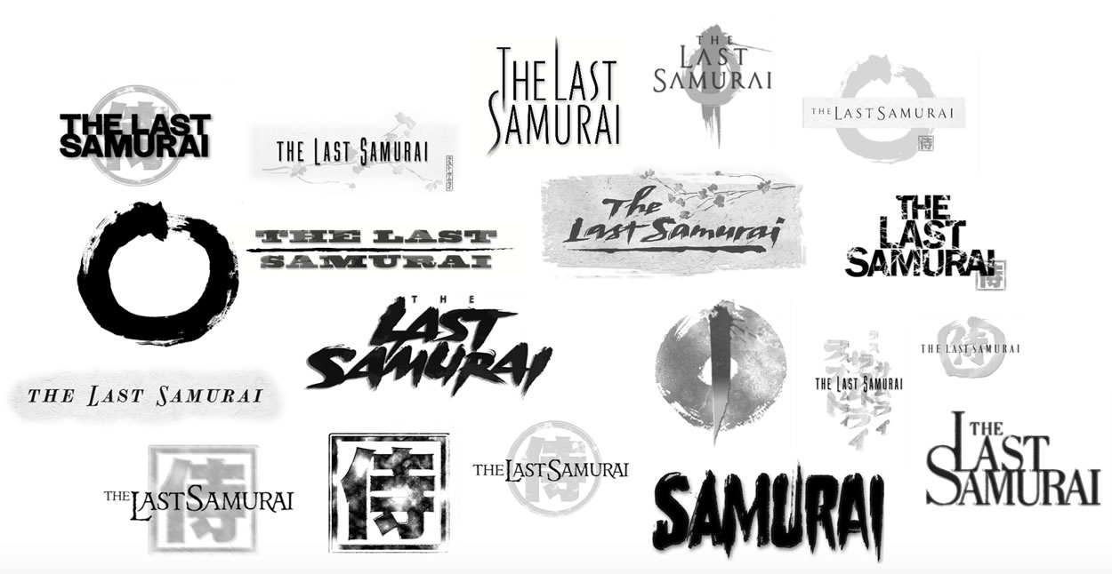
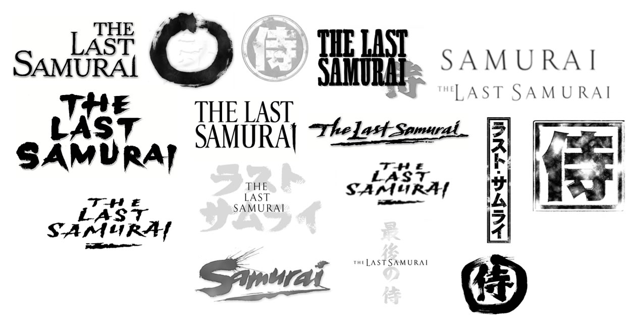
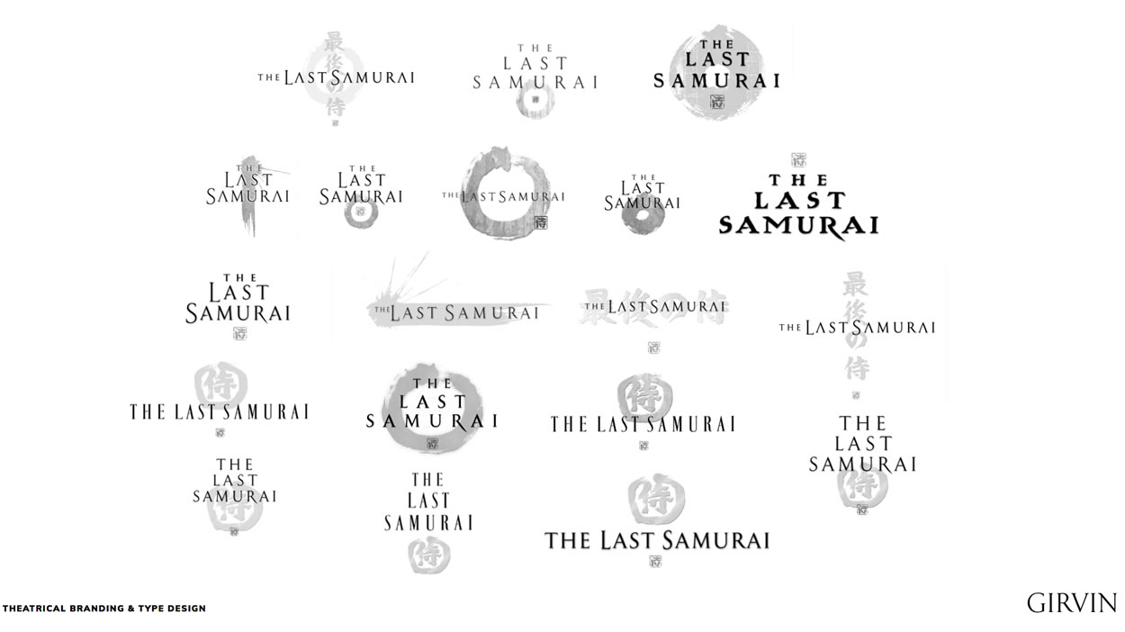
In the end, a balance between classical
accessibility, speed of read.
Interestingly, the font is founded
on a 1st century epigraphic rendering.
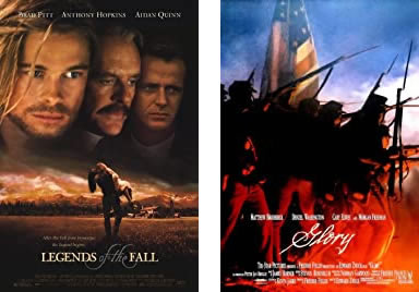
With Edward Zwick, we worked out two other entirely tailored renderings.
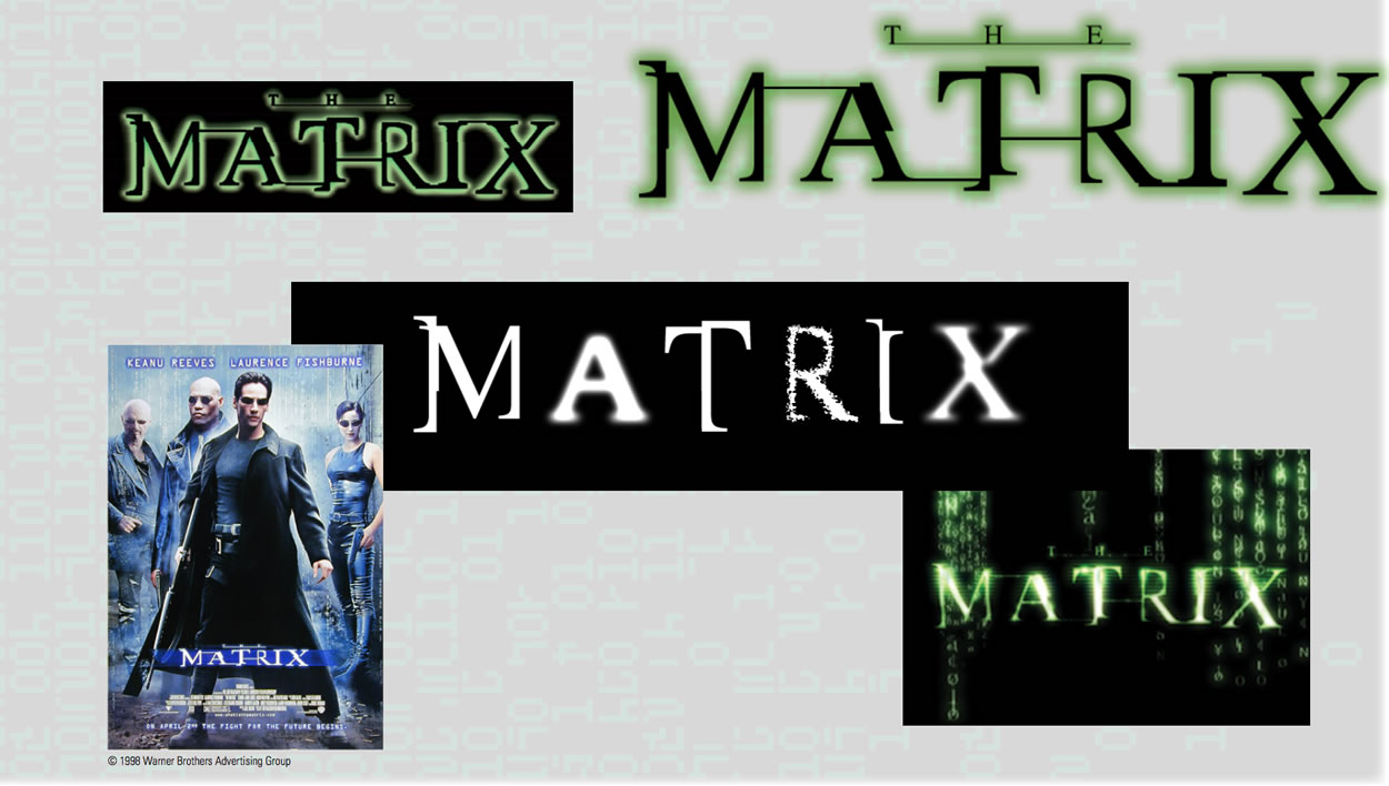
Legends and Glory
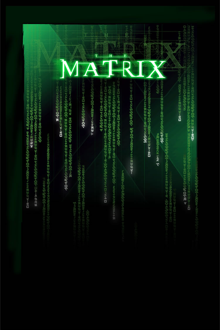
As has been recounted in varying forms from the past, our reach into The Matrix began with a pivotal call from Joel Silver—“to come to his office the following morning,” to meet with the Wachowski siblings to talk about a movie. With Larry and Andy, at Joel’s office on the Lot at Warner Brothers,
we walked through the entire story, completely storyboarded, as well as the rotational shooting techniques planned—as he exultantly described them.
Still, a journal was built, which Larry described as “whoa, cool.” And then invited a run to Sydney, Australia to see all the cool stuff they were doing down there.
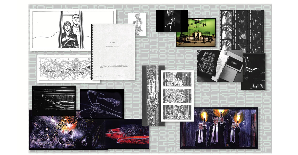
In accordance with the Wachowski’s
opening conversations, we built custom fonts
for monograms—for production crew gear.
To build monograms, we had to think through tailored fonts as well
—to make a single letter, there has to be a foundation.
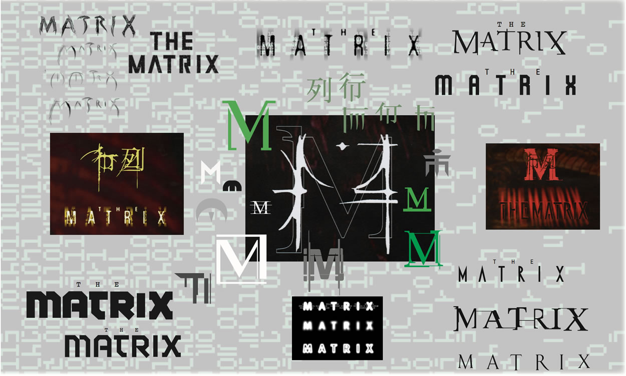
Monograms revolved around fonts,
fonts revolved around
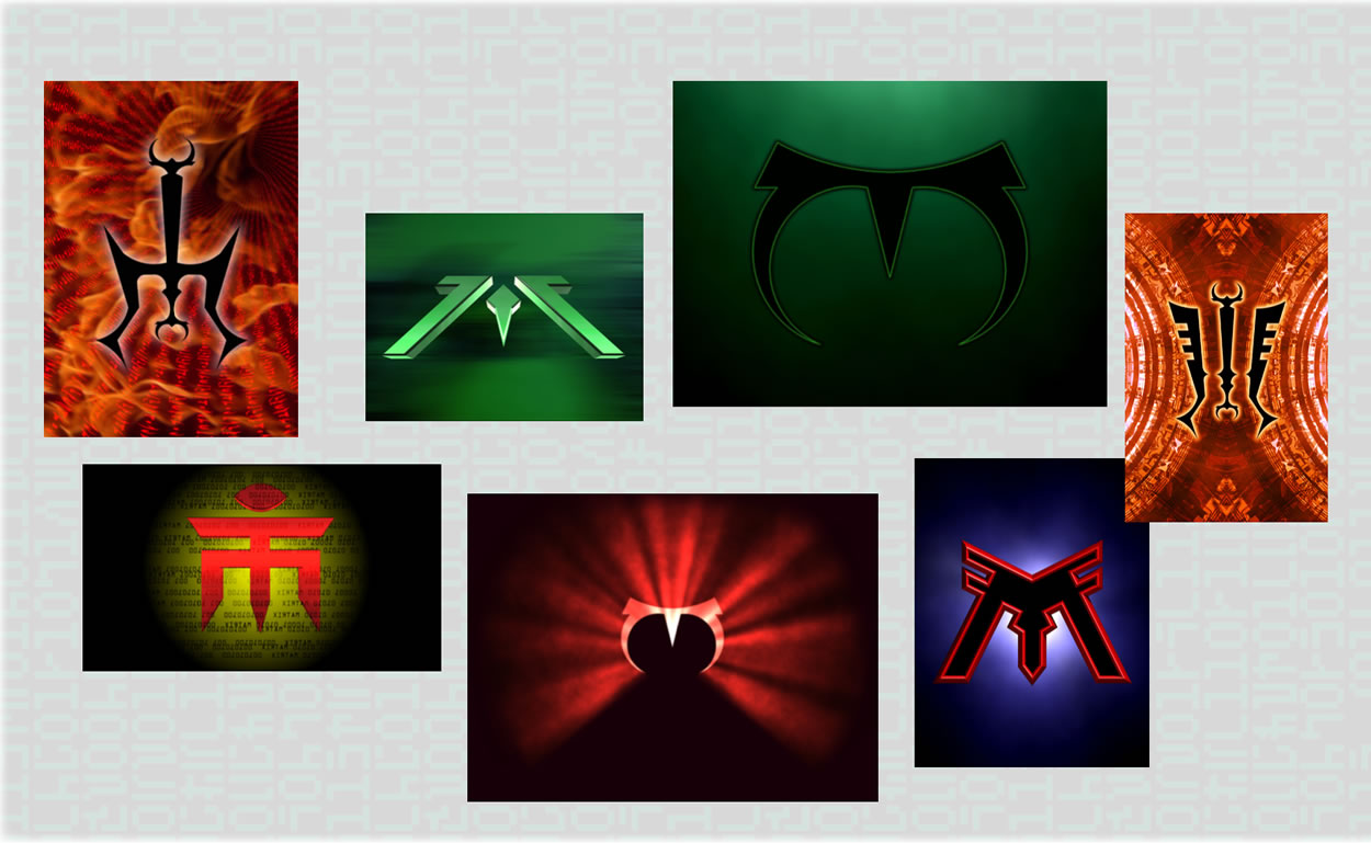
monogrammatic treatments, icons that lead to
the sino-anglo iconic devices.
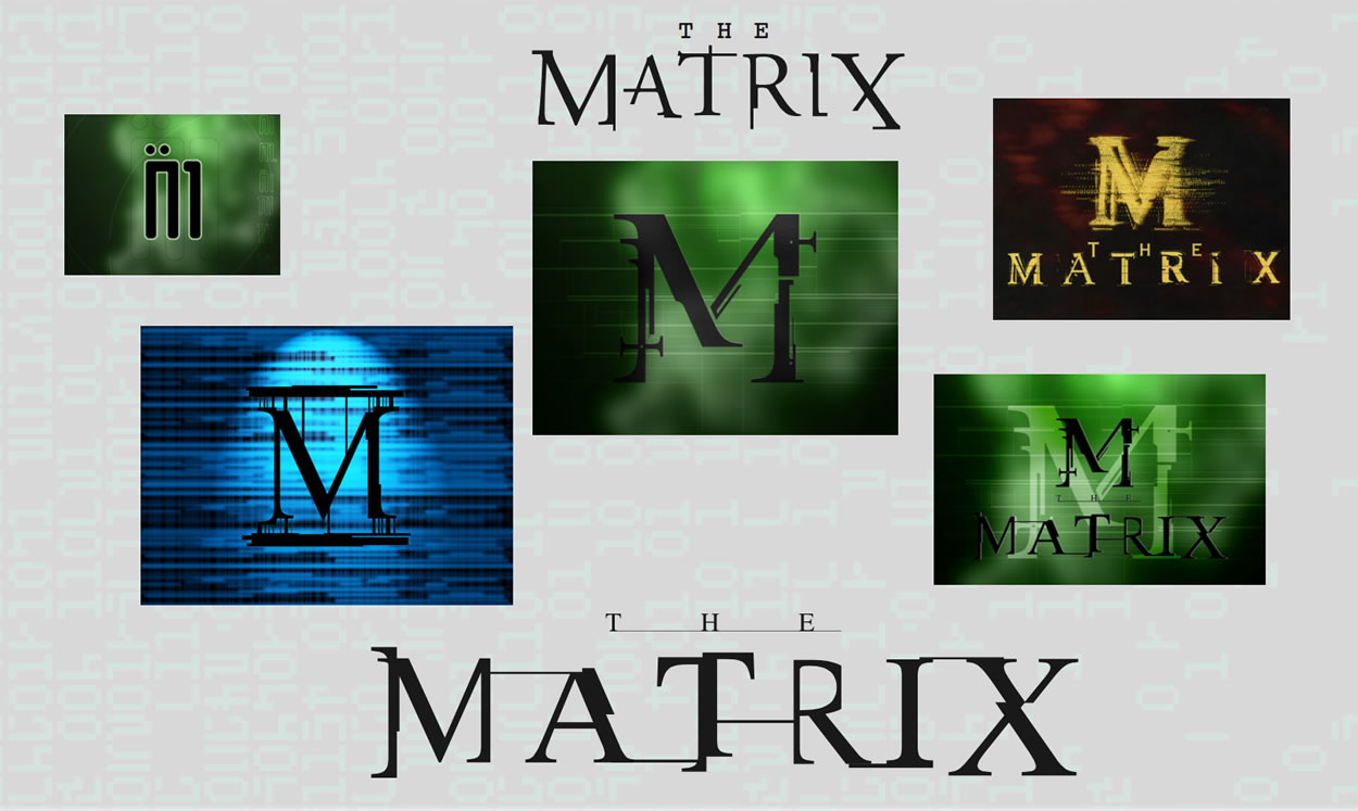
Every design booklet, collective journal, is a journey of discoveries, notations, improvements and evolutions, till the tiered studies of a master identity for the film and subsequent campaigns.
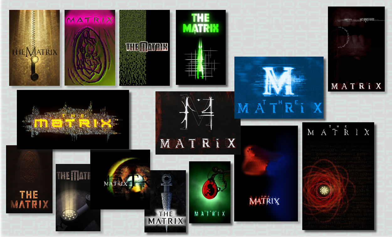
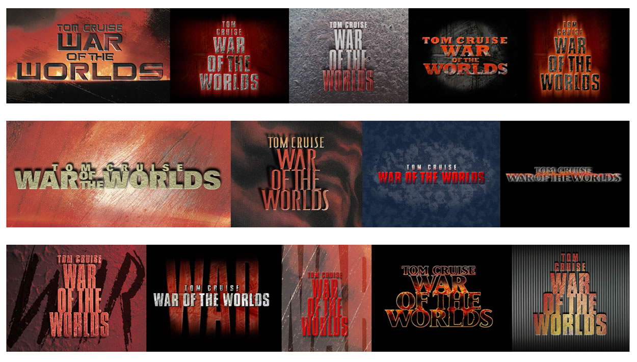
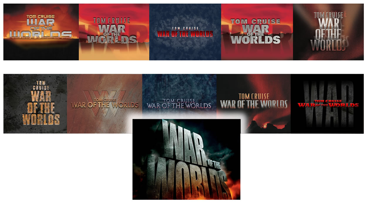
All of the imagery here—above and below—is part of a presentation to motion picture agencies and Film Production groups—marketing teams in the major Studios—on the creation of bespoke alphabets in support of integrated branding and campaign uses.
As I’d mentioned in the beginning of this overview, a brand must first be “read,” that’s where the “name” lies—it’s a key point of recognition. And the logotype speaks that language as a kind of portal—
it’s a lead-in to the narrative.
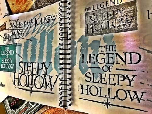
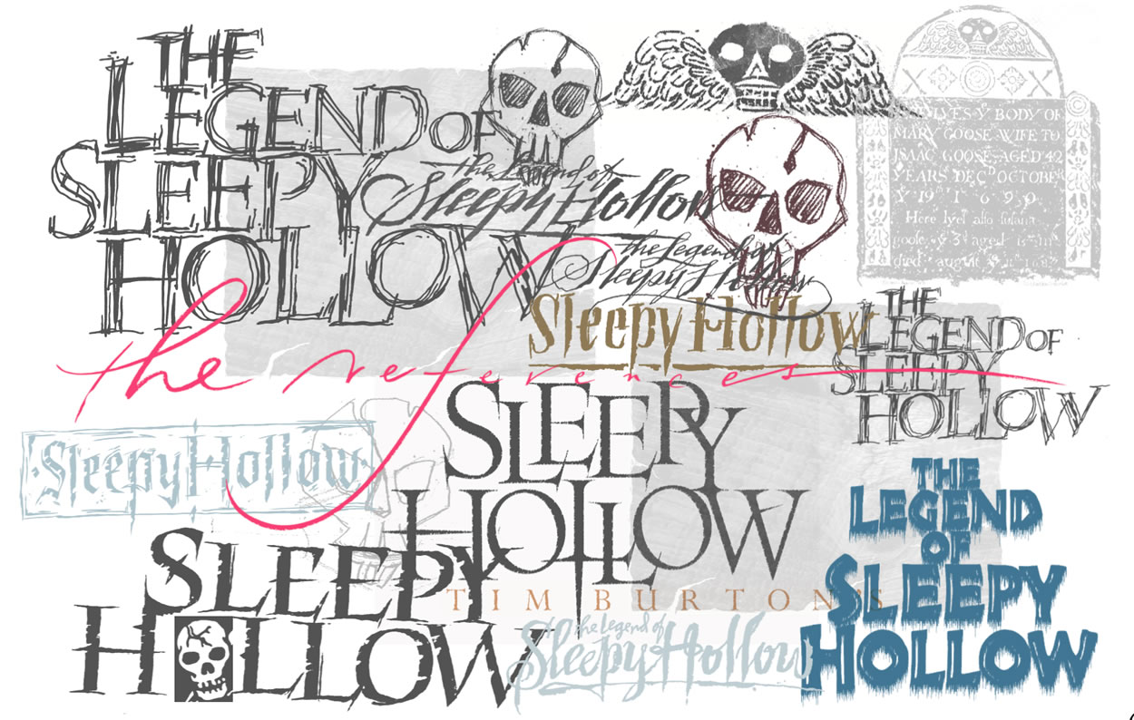
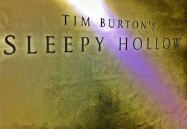
This is another journal grouping, built for Tim Burton—again, it’s a layering of storytelling, around the legend and imagery that I received from Mr. Burton’s production design sketches
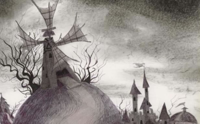
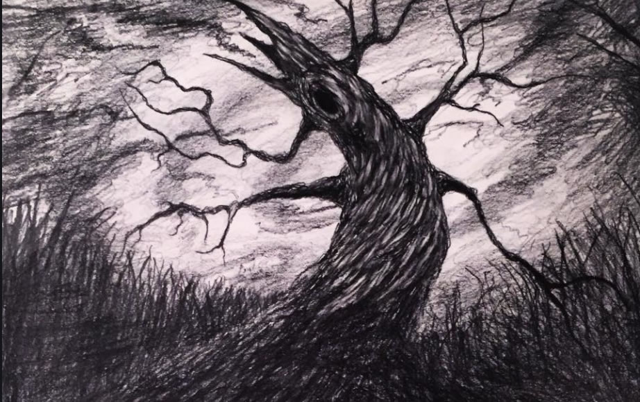
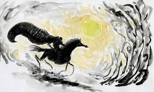
—we tried to create some evidences
of these renderings inside the identity font and logoworks.
Paramount Studios shared these drawings
when we asked for closer-in
production design and
lensing insights.
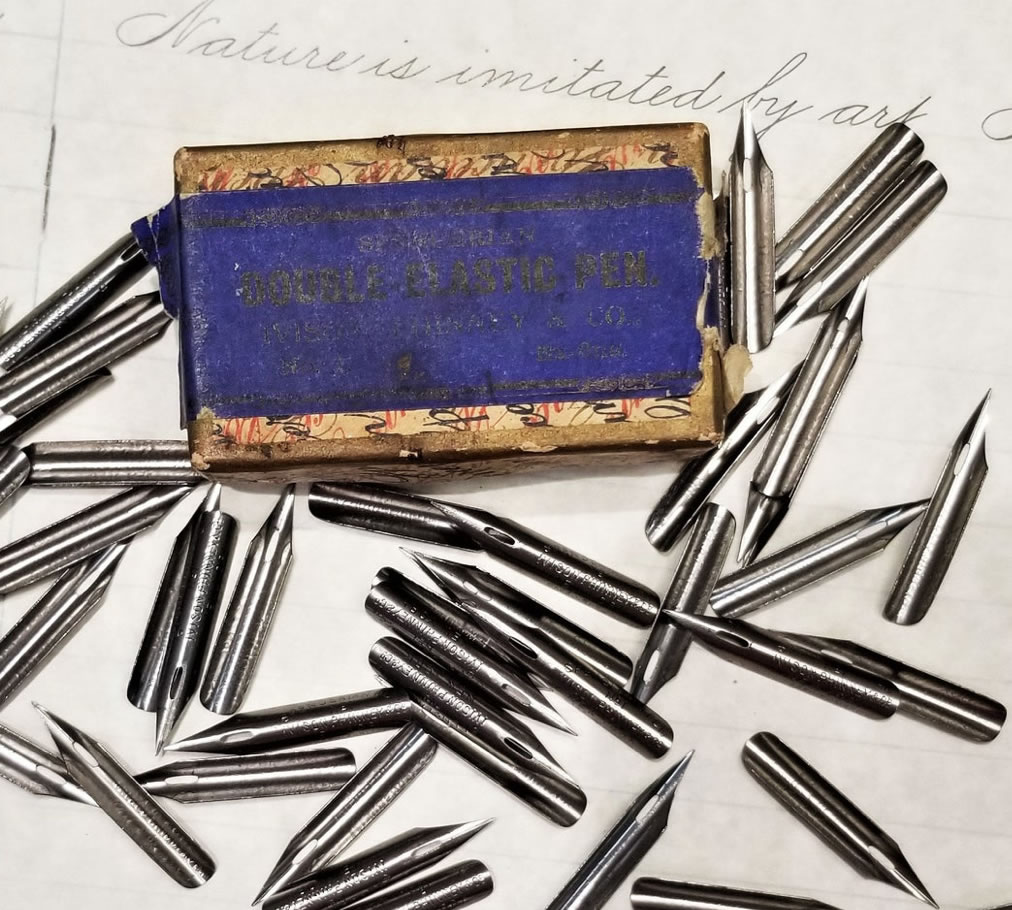
This is a story from the 1700s, so we booked pre-Industrial Age letterstyles—types from the period, as well as studying gravestones and funerary iconography. We worked-out font renderings and solutions—but, too, split-tipped, cursive Spencerian metal pens from the scrivener of the 18th century, a time of Copperplate scrollisms
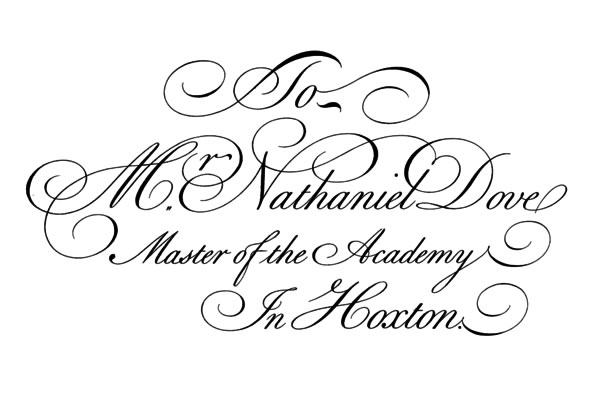
and florid penmanship
[the above: Spencerian from 1740,
“The Universal Penman.”]
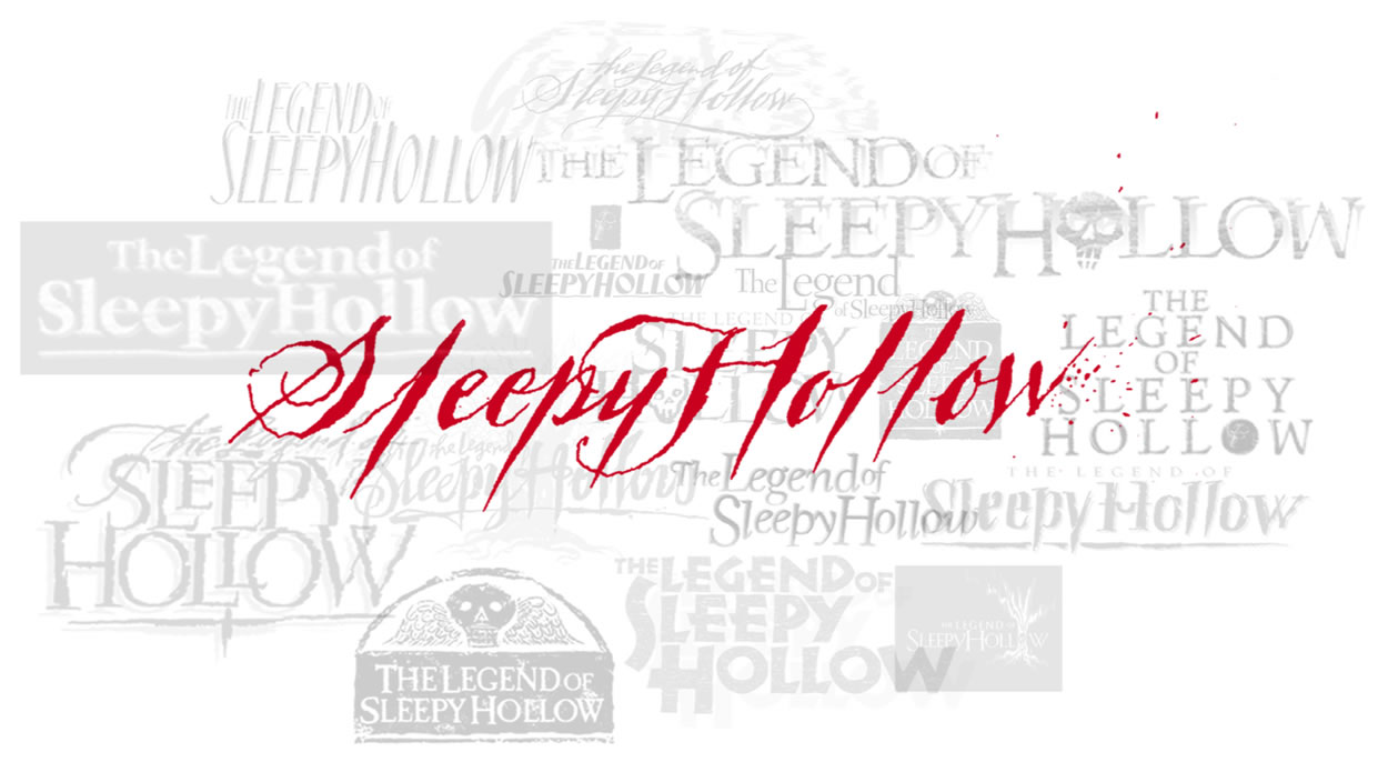
Our layering, towards the final pages
of the type work, was to
reach to a more impassioned and emotional rendering—
that is, “if there was a penman from the 18th century,
who was drafting an frightened and fast draft,
with a steel pen of the period,
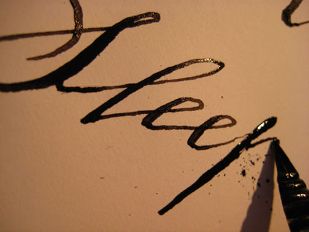
what would it be?
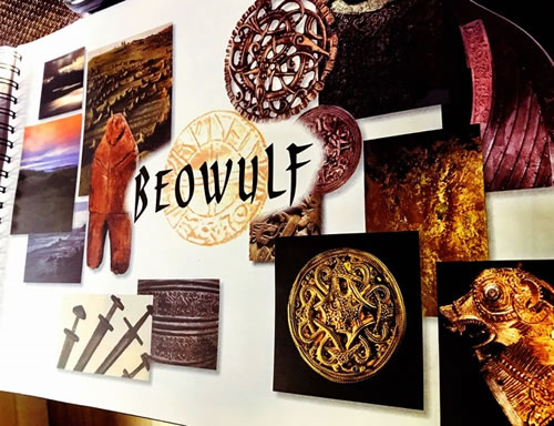
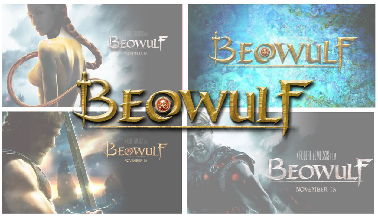
To a general backgrounder, Beowulf, the story, was written somewhere in the timeframe of the 8th-11th century [as early as the 6th]—scribed in England, set in Scandinavia. This version is
from the British Library
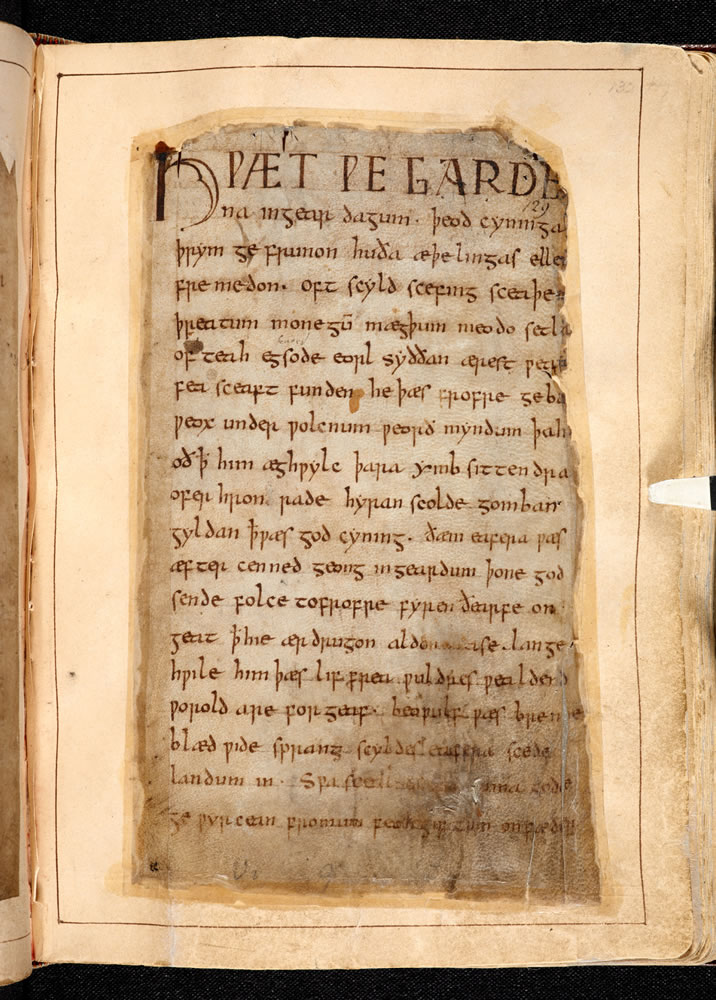
c.1000.
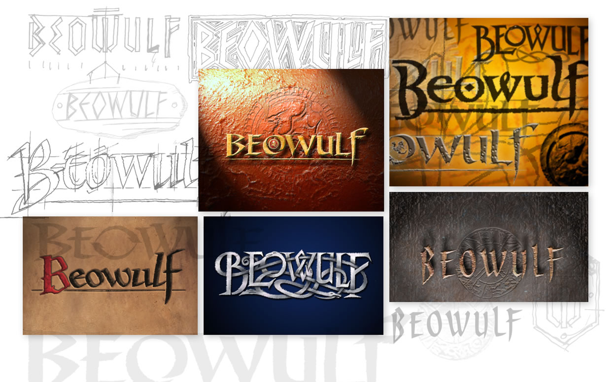
We walked around this story—
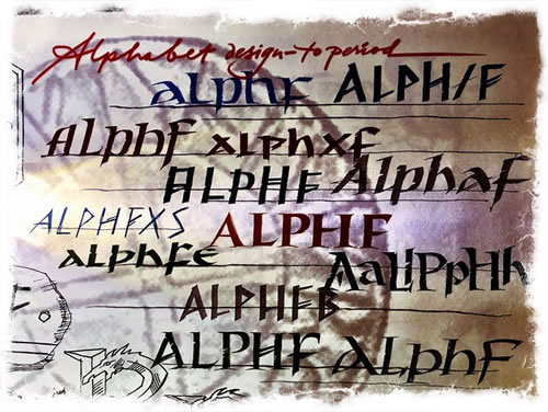
in this design journal,
 g
g
walking back, breathing time.
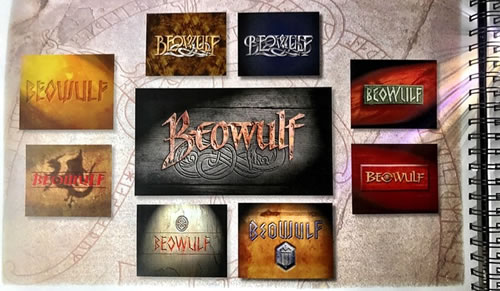
manuscripts, written references, art—
I didn’t talk to Zemeckis to learn more.
I wasn’t allowed. So we researched, dug in, went deeper.
And something came out—a letter rendering from the time, that wasn’t from the time, but it told the story of the time.
The read—an illustration.
All that comes down to font work—if there are a series of strokes that could demarcate—that would be the alphabet, a string of teeth that puts a character into a title, a key bite for storytelling for decades, building custom has been the core solution offering of GIRVIN’s.
So we’ve applied that line of thinking to a variety of scenarios—from Department store campaign and environmental graphics.
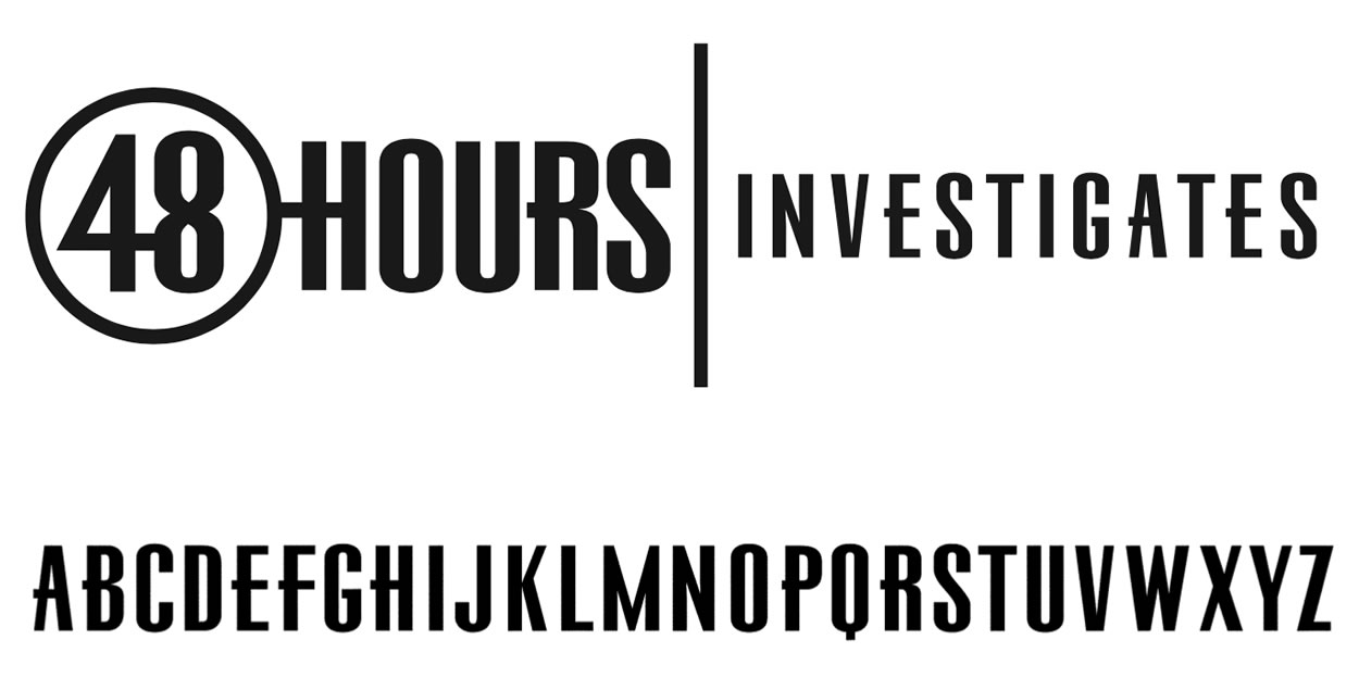
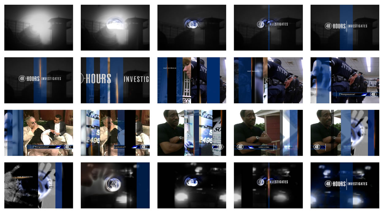
Like Susan Zirinsky and CBSNews.
Font work: Broadcast Design
Font work: pharmaceutical branding
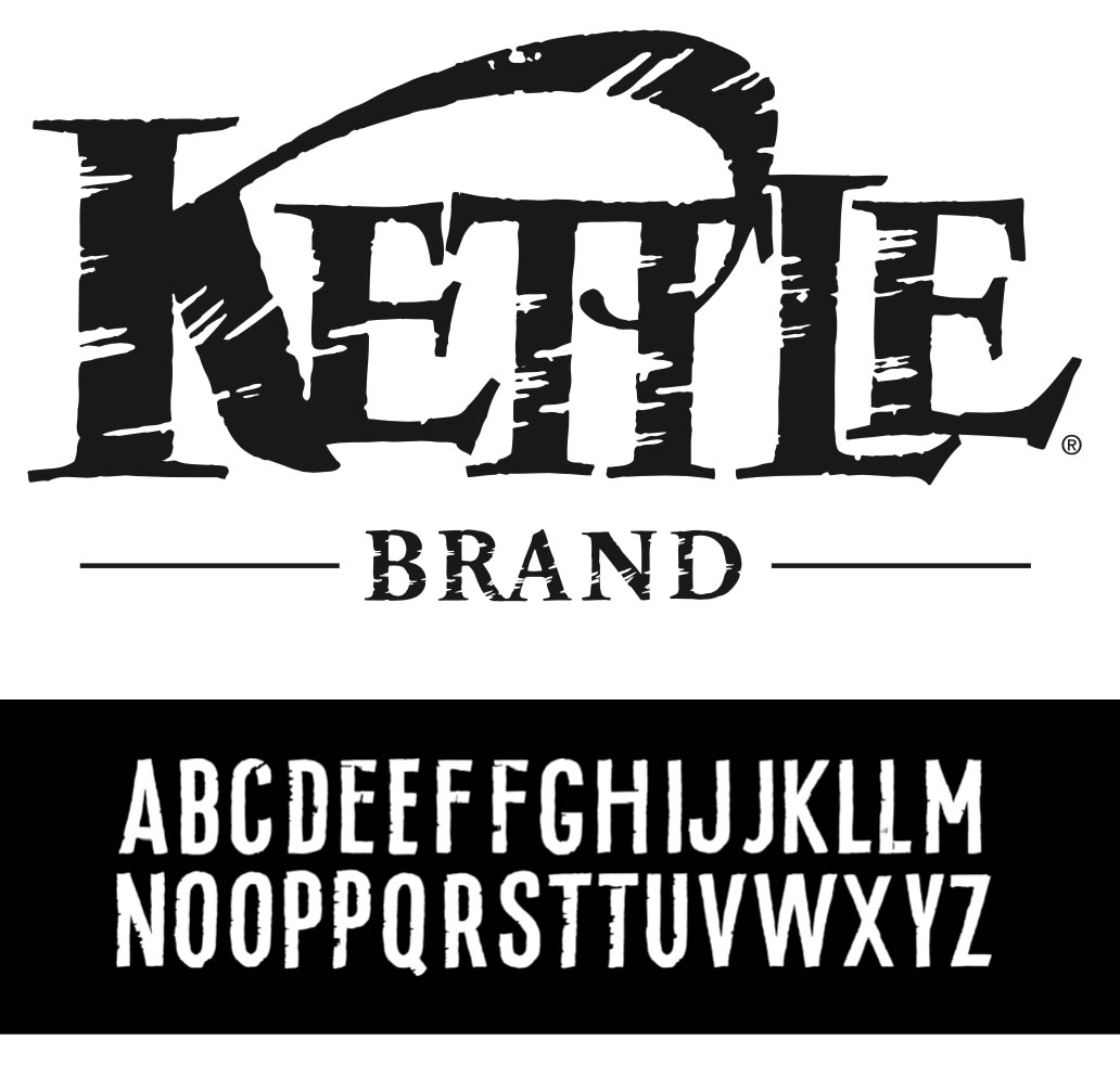
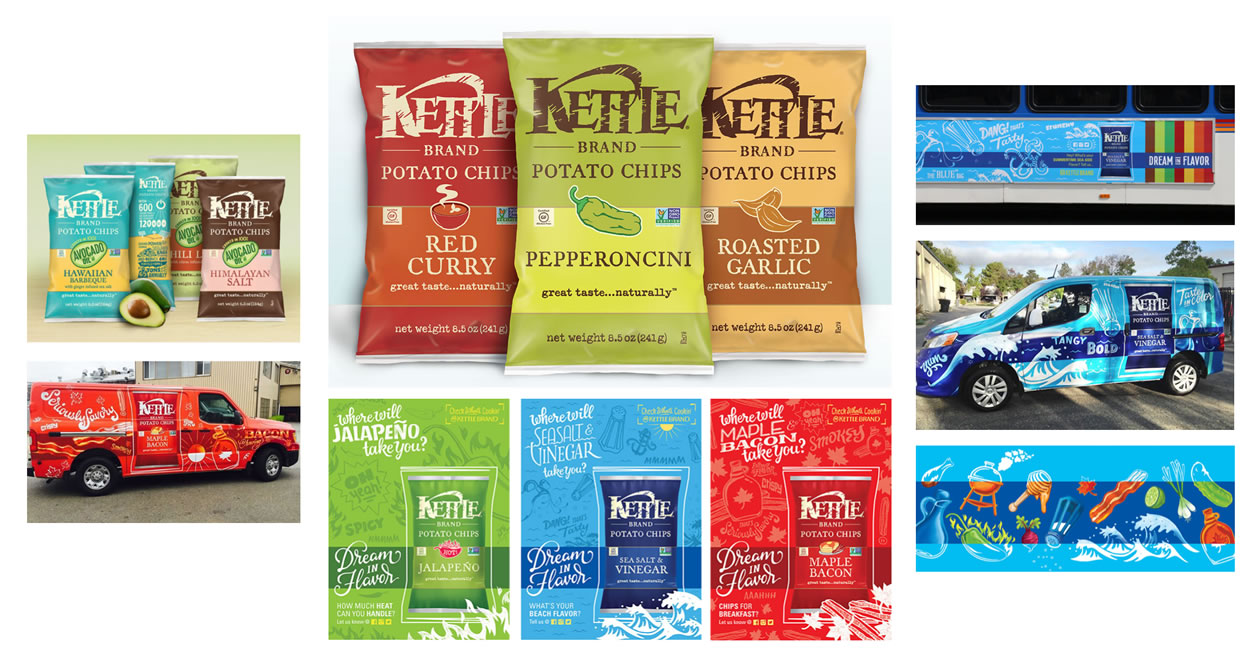
Font work: foods
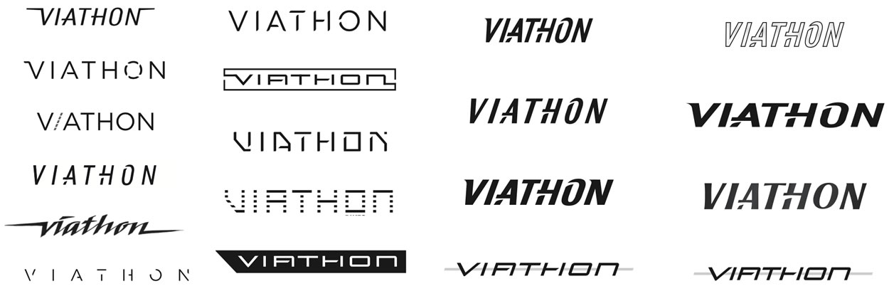
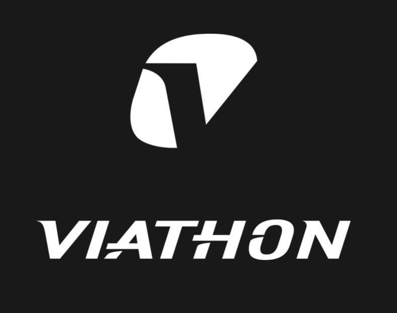
Font work: sports graphics
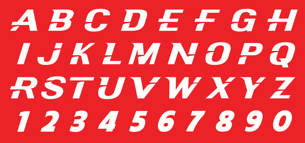
Think of the alphabet as the first read of brand.
It’s the melody of the story, it’s the notes
that sing the song that everyone knows.
Better bespoke, than out of the box.
Purpose. Precision. Perfection.
t i m | GIRVIN SEATTLE STUDIOS
GIRVIN on innovation
Technology & Design thinking:
goo.gl/YUdmMa
LIBRARIES | LABORATORIES | GALLERIES | DESIGN TEAMS
Mobile Direct: 206.890.0621
Talk it up
Drafting creativity | Girvin Journals: goo.gl/quTxT1
GIRVIN TEAMS | SFO + SV | NYC | SEA | TYO