MEDITATIONS ON THE SHAPE OF CONTENT
In the moment of inspiration, everyone “thinks” something and converts this to some framing of expression. Could be handwritten, a journal entry, a sketched missive, drawn on an iPad or typed out. It’s the shaping of content that plays out in the manner of its execution. To anyone’s review, it will be what that content actually looks like, and to that proposition, how easily can it be accessed and studied by anyone. And, most critically, for the perspective of the designer
In my own history, the nature of the hand-crafted draft plays larger than anything. In my college days, working in Marine Biology and comparative zoology, in an earlier non-digital realm, I made my observations as a string of handwritten notes with drawings—more like a journal. I made other notations, that were more expansive—exploring messaging and imagery, interplayed.
Entomological renderings—drawings, hand lettering, observations.
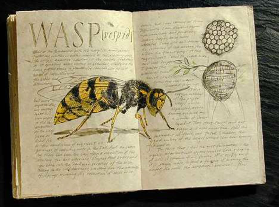
I thought, back then, about abstracted notations—general visualizations—foliate fluency, and context.
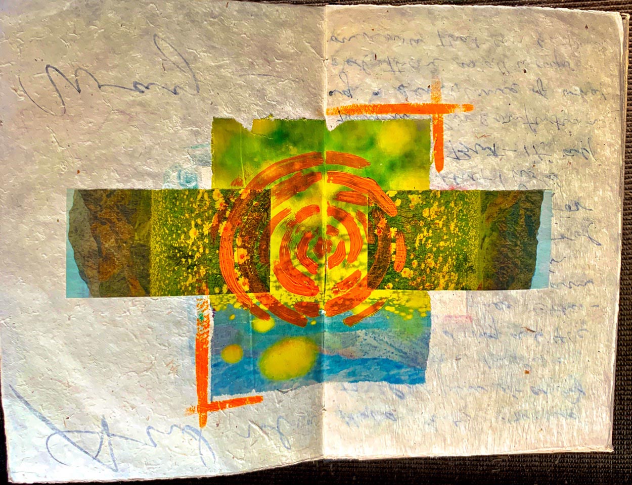
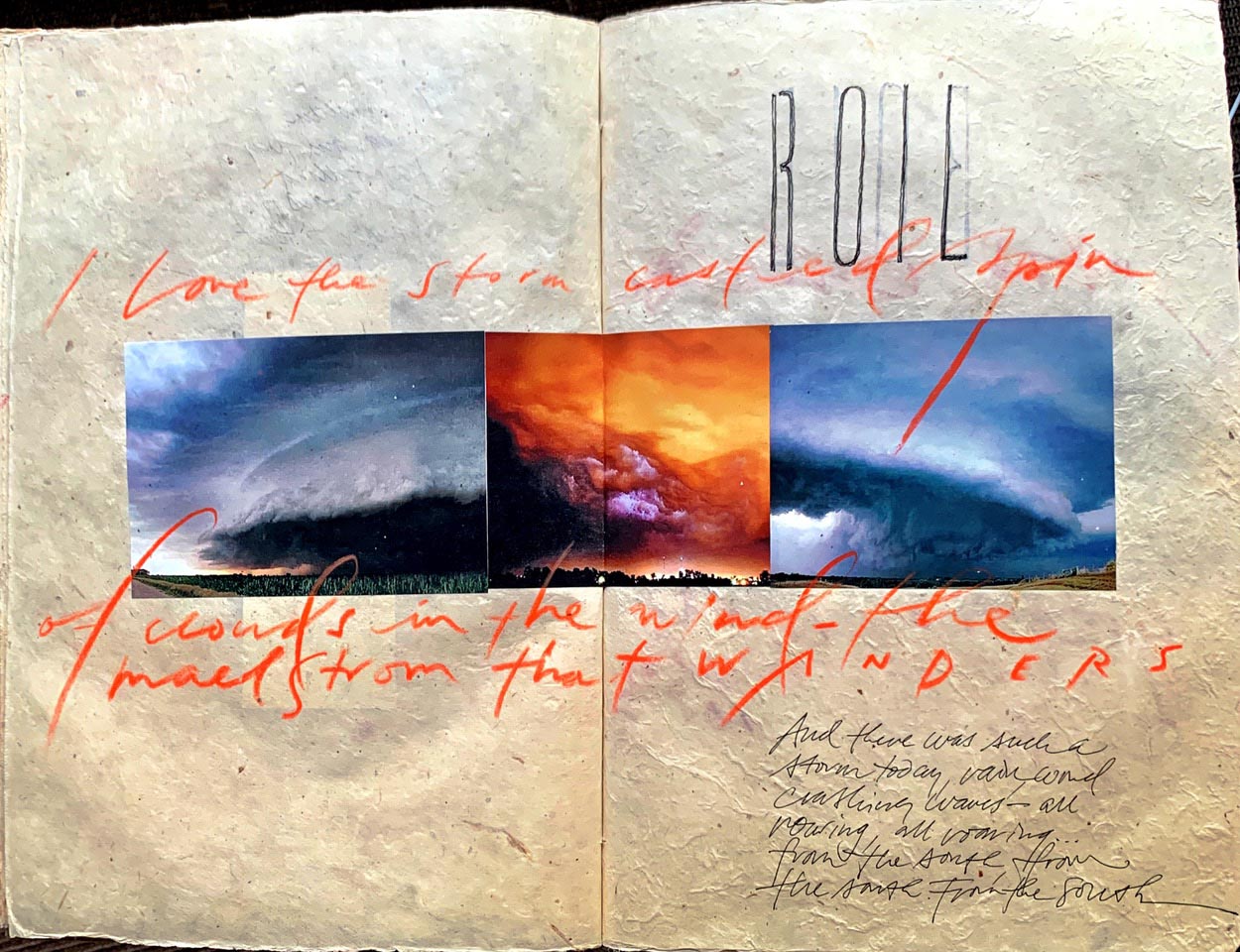
Meterology and storm character.
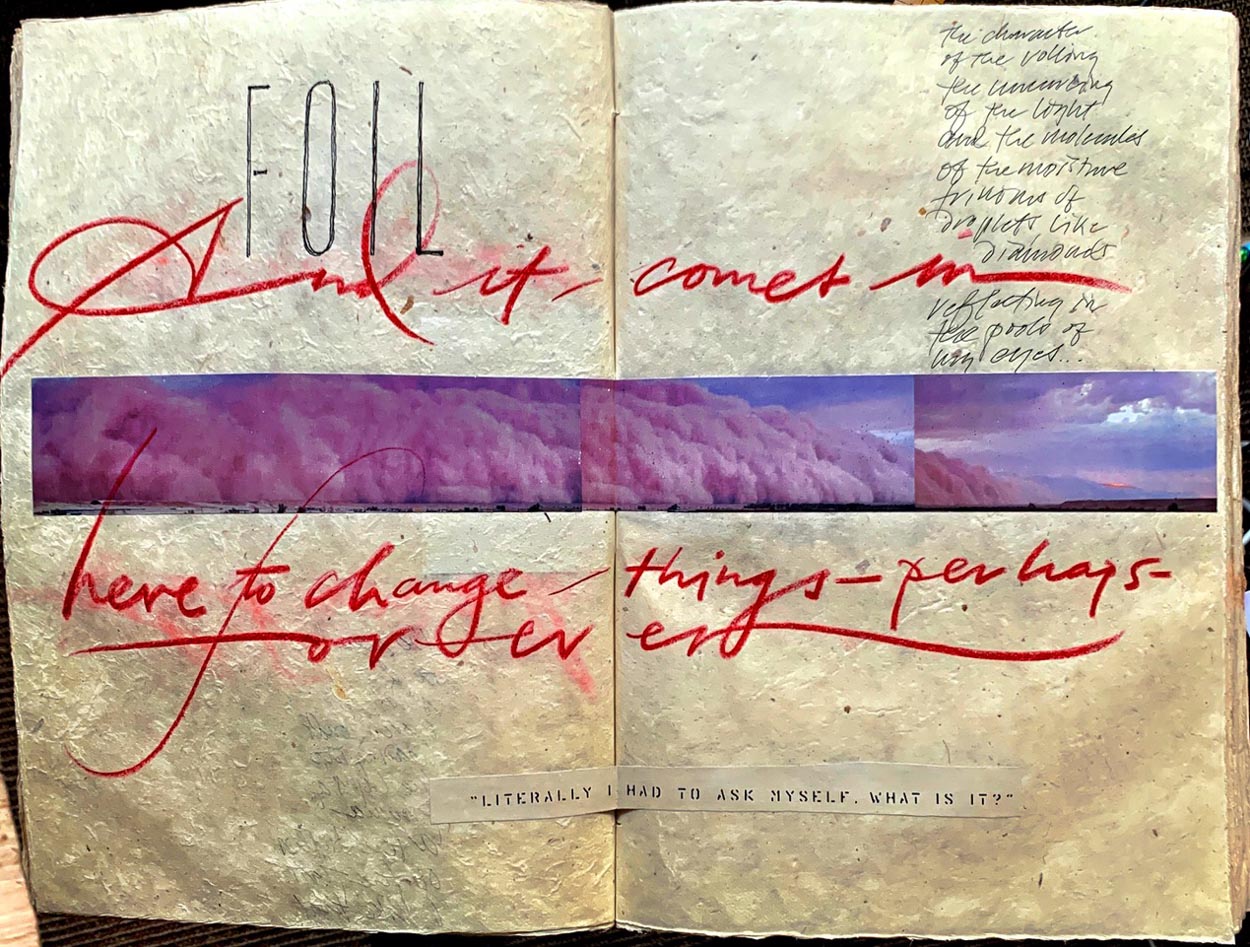
Cumularity and cloud character.
The bite as a proposition of learning.
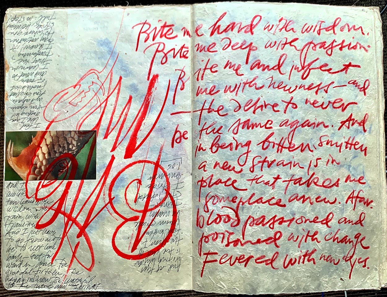
The electricity of life.
And that marked a change in my entire creative evolution in a sidebar course of studies in medieval history with another professor, who taught me more about the legacy of the handmade in a construct of guilds, craftsmen’s circles, monastic life and the production of books and other predominantly sacred arts—in glass, stone, wood.
So too, he taught me the notion of the craft having a deeper intention and higher calling—making beauty as a kind of spiritual journey. And, in working brands, spirit counts for everything—one might think of spirituality as the breath of brands—the spirit, vibe, intention and stance of an enterprise and the teams that have, literally, breathed life into a proposition of action, the roll-forward into the market.
That journal work set me onto a path
of examining the history of the book,
the medieval principles of book design
inspired by ancient explorations,
and I continued that for decades.
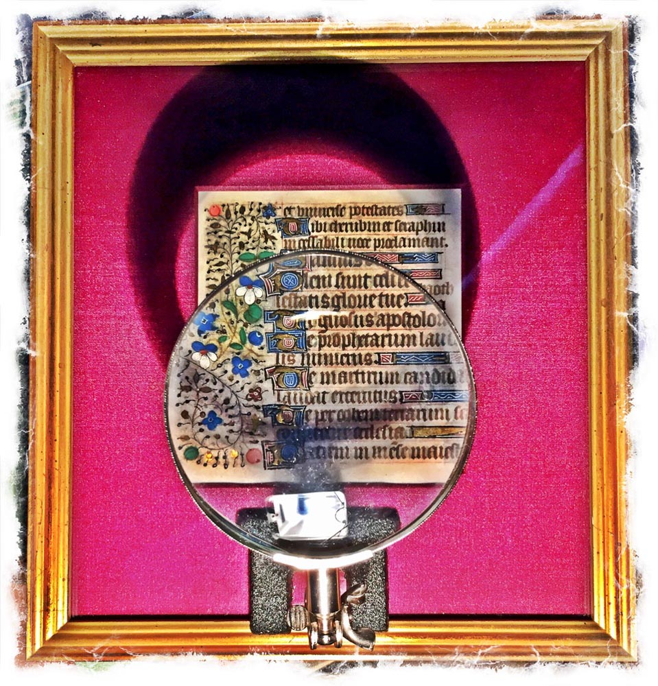
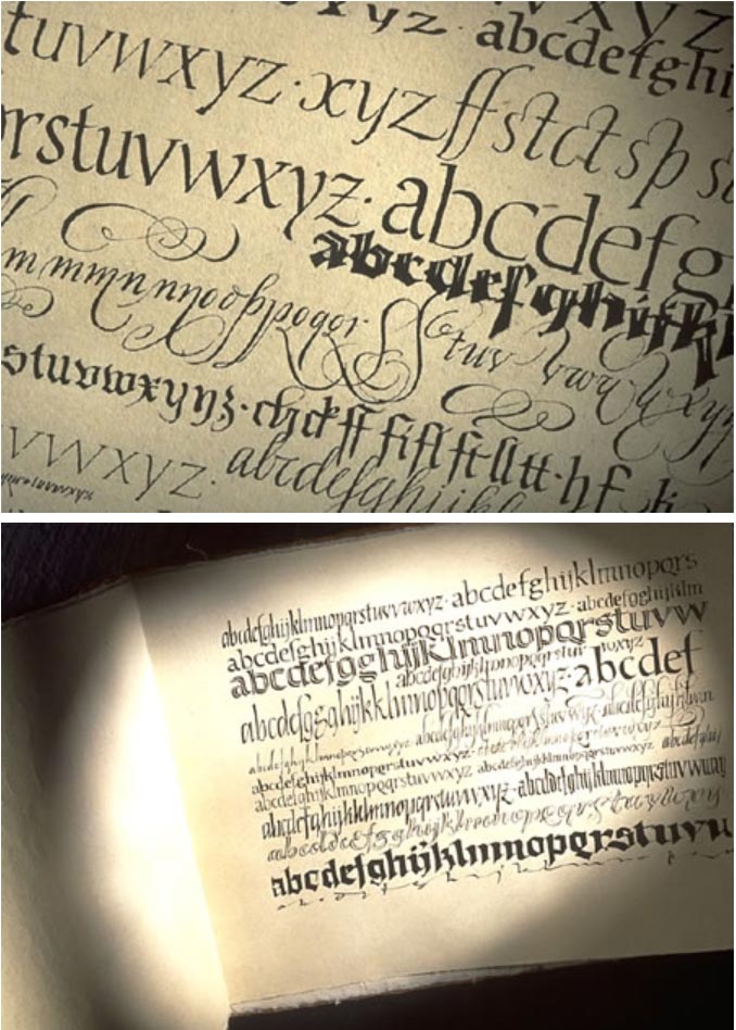
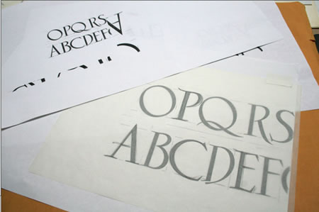
Go back, to go forward. To that historical review—for the application to the now—studying 2000 years of paleography teaches the letterform aficionado how the alphabet is made, the curvatures of its manufacture. Learning the principles of an alphabet from a couple of thousand years back—there is a grace and character that will find itself insinuated into the genetics of hundreds of alphabets, made in individual cultural periods—made by people, in their time. And it goes on.
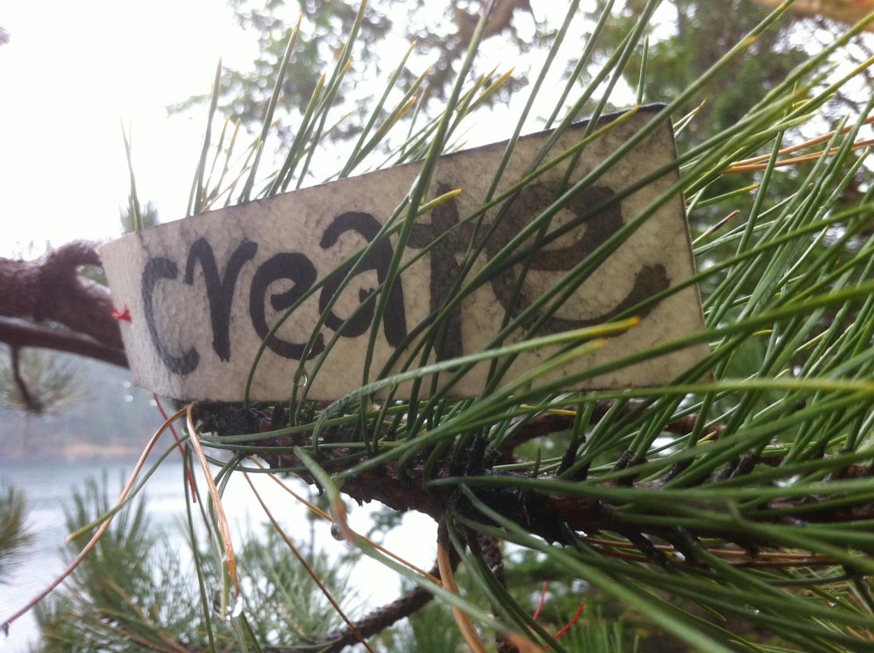
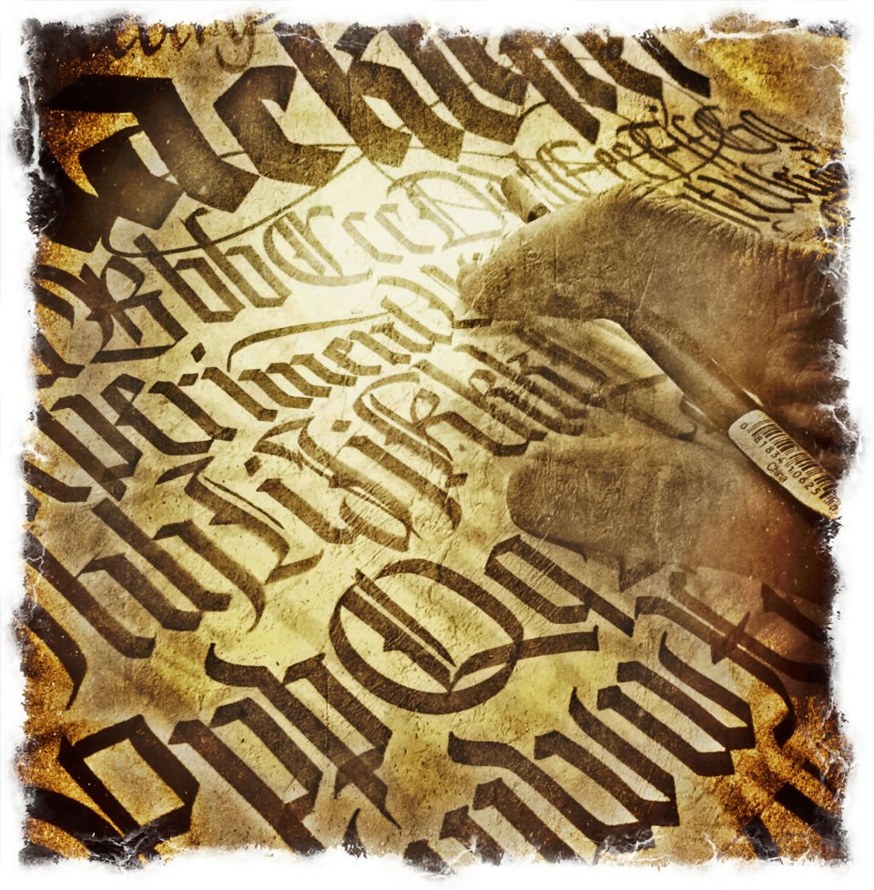
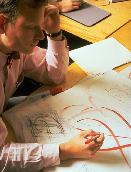
When I was in college, there was a founding principle to the work at hand, early design assignments—stationeries, logos, signage, vehicular graphics, motorcycle pin-striping, tattoos, shopfronts—everything custom, everything by hand. And that premise, in the ages since the founding of GIRVIN, 1976, goes on to this day. As much as possible,
made by hand.
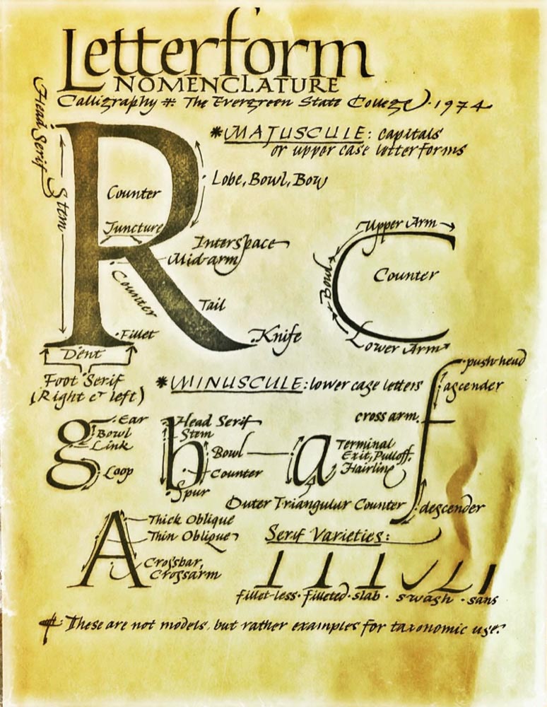
An exemplar from 1974,
The Evergreen State College
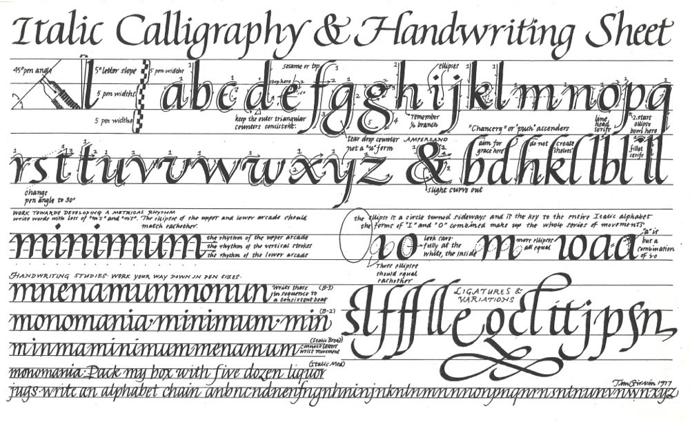
And 1977.
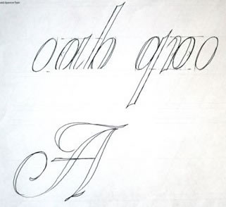
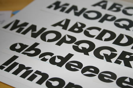
Teaching people, students, employees, friends and others lays the foundations to practice the musculature of the strokes—as in: today.
A calligrapher at GIRVIN | 2021
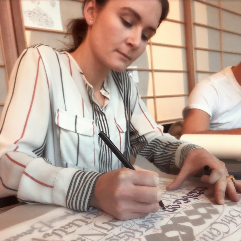
They learn.
I learn.
Some ask, with thousands of typefaces available, what’s the point—why not just choose a typeface?
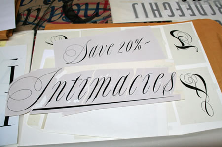
The point would be that a bespoke rendering is entirely specific to the layering of the brand story, the construct is illustrative, as in the lustration of an idea—the shine, the epiphanic moment. Surely, there’s a potential that a font could be an approximation, but what of a solution that is built solely with the idea of capturing the essence of anything?
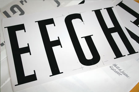
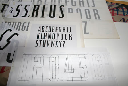
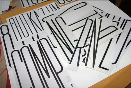
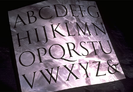
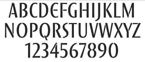
During those early years, I began to build fonts for projects—starting with a logo, which was entirely hand-drawn, whether completely improvisational and freehanded, spontaneously splashed; or as a solution that was built with a kind of scientific precision—measured and metrically drawn in a mathematical construction of a rightly-proportioned characters. In all, it starts with the illustration of an idea, that becomes a string of stories— as an earlier posting:
A font that was created for the identity for Travel & Leisure, an American Express publication, working with acclaimed art director Bob Ciano:
A logo and typeface study for a salon, which included signing and collateral, to that end — an entire font was created, Portland, OR.
Going back to an earlier era, for the design of a special retro font for the PanAm airline “ClipperFont.”
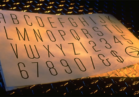
A scripted font created for a floor signing treatment at Bloomingdale’s, under the direction of John Jay—the original drafts:
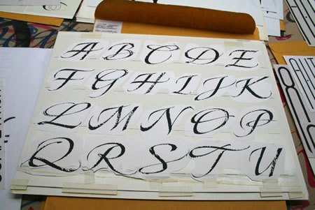
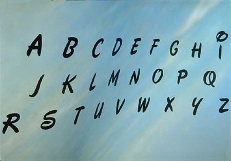
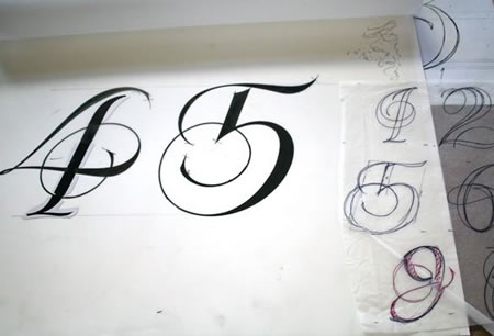
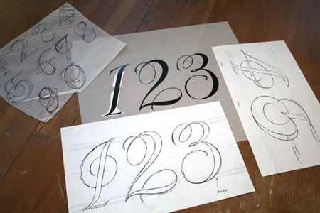
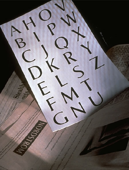
A rough hewn calligraphic alphabet
for Nordstrom—a catalog font.
Disneyfont, designed for Disney Stores, for packaging,
signing and indoor merchandising.
A trial brush script font built for Wall Data, a software emulation group, based in Seattle, working worldwide.
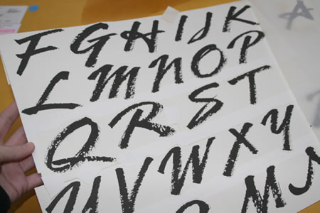
A looser, extended brush script font for Nordstrom, based on an identity and packaging treatment for a national store-wide campaign.
A steel pen script font, designed with rubrics
and color knock out, for initials.
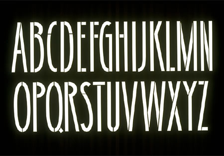
An alphabet for Douglas Trumbull, for the film Brainstorm.
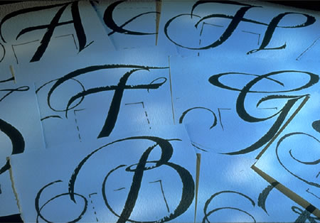
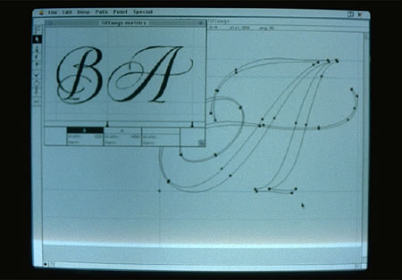
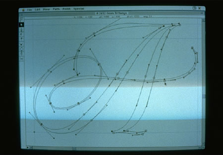
A series of font treatments for Tiffany & Co.—drawn first with a brushed tool, then redrawn, digitally built during the early days.
A layered font—base art and gridded overlay—created for Pennzoil,
an annual report application.
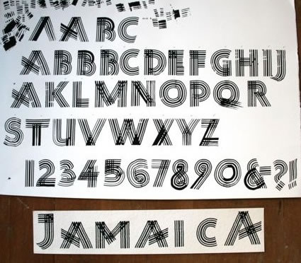
A font drawn with a steel pen, cut and ribbed—for
a Bloomingdale’s campaign on Jamaica.
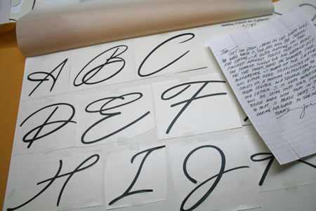
A customized font, drawn for the Nordstrom family, for print, for signing and identity applications.
A alphabet originally designed for Sharon Stone, for her company, Chaos; and applied to her film: Sliver.
A font drawn for the Horvitz family, a series of trusts and foundations, in the name of the estate.
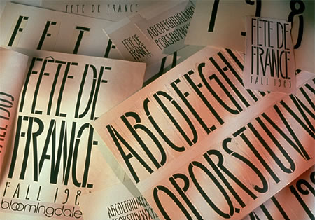
A font designed for Bloomingdale’s, for the French celebration,
Fete De France, a fortnight event organized by Marvin Traub, former CEO of the store group.
A typeface designed for Massimo Vignelli and Michael Bierut, for a building property in NYC
A customized font built for the pharmaceutical group, Omeros.
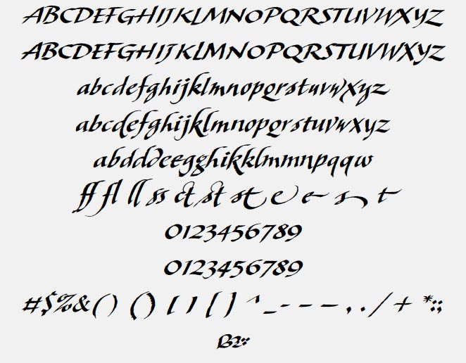
A calligraphic, poetry-focused book font.
In all, when you touch someone, or you touch anything, it’s a sensate thing—it’s like seeing, but it’s a different sense.
When you draw something—literally, drawing it out of yourself, it’s different. Screen time is relevant, but touch, the hand, it’s immanent.
Tim Girvin | OSEAN STUDIOS + GIRVIN
Strategic Branding & Design
www.girvin.com
F O N D É E E N
1 9 7 6