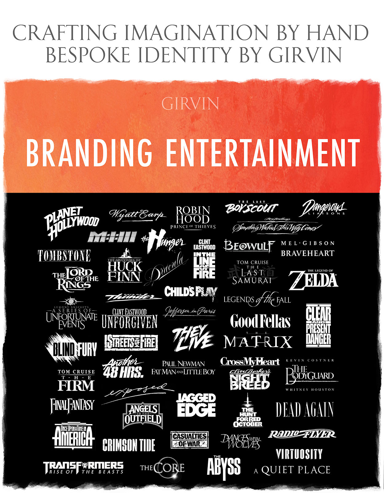
In my history, I’ve often thought, looking at, literally, any logo—“that could be better.” Or, “why such an off-the-shelf solution—there’s nothing distinct, ownable or registrable with this asset?”
Of course, all of us, as brand strategists, designers and logo aficionados think, “I could do that better…” But the key question is, “just how would you create a better solution.” And, similarly, to the response to query, “it’s the client’s fault—that’s what they wanted.” But how did they get to a position of choice?
In our process—any identity project, even one working for movie stars, celebrity directors, motion picture studio leaders or on-location production designers—comes down to an exploration of “what’s the story, who’s telling it, what’s the audience, and most crucially, why do they care?”
What’s unforgettable?
And in meeting with motion picture teams, which might be in the studio offices, or working with a team on a script, talking to writers there is always a listening phase, and, too—a pitch. So, in this processional manner, it would be a listening and exchange, the narrative, the set design, palette, actors and then there’s an expectation: “hearing all this, what’s your take, what’s your pitch to us?”
So it’s listening intently, asking questions, then pitching the framing of your solution pathway.
Sometimes these are onsite at the Studios, at the Lot, on set or a phone call discussion.
What about this process? Here are some exemplars,
from an interview with Steve Heller, Print magazine.
Talk to me.
“Speaking of talking to people, learning more, I’ve had the opportunity for direct interpretations for J.J. Abrams, Keith Barish, Jerry Bruckheimer, Tim Burton, Tom Cruise, Clint Eastwood, David Fincher, Walter Hill, Sergio Leone, Barry Levinson, Don Simpson, Joel Silver, Doug Trumbull, The Wachowski sisters, Robert Zemeckis and plenty of others, over time.”
“I’m always a collaborative listener—it’s their work, I’m merely an interpreter.”
What has been your favorite and why?
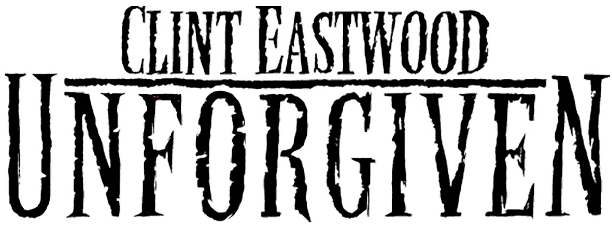
“I like working optimistically, almost pre-shoot. Speaking with Clint Eastwood while he was on set, shooting in Alberta, he told me the story of Unforgiven, and—“I don’t usually do much about logos for my films, but this one’s different. How could you design a logo for a story around redemption—and a man that’s gone to hell and is trying to find his way back to redeeming his life?””
“That logo is entirely drawn by hand on Italian handmade paper, with a broad-edged metal tool. It was something that could’ve been drawn on a plank, as a sign, printed and distressed, woodblock printed on an old Victorian broadside—but emotionally it evinced anguish, coupled with strength, tinged with pain. There are lots of favorites, but another was working for Sergio Leone on Once Upon a Time in America. Which was as a pitch package, the design treatment to get the project rolling. Listening to him, it was about the solidity of the storyline, something speaking to the broad characteristics and personalities of crime in the time period of 1930s America. So I designed it as a marquee, something that could be built, an epic, a pageant, something that stands up, strong heritage, legendary in scope. And indeed it was Leone’s last film.”
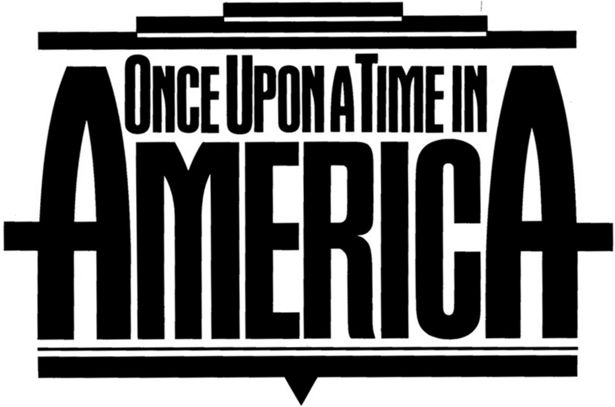
“The core for these solutions is built around a instinctual sense of structure and emphasis—how to render the title in a manner to create the most minimal X-height allocation—cap-height for a logo sets the credit height for the entire poster. I look for emphatic character—the core soul of the story. An distressed anguish is integrated in Unforgiven, while an almost architectural banner is reflected in the grand saga of Once Upon A Time In America. Still, for example, the modeling for the posters of Unforgiven and Once Upon a Time in America were based on two director-led programs—one, Sergio Leone’s, a dynamic pitch for a film presentation—a cover to the pitch book. And for Clint, a direct call to illustrative action.”
What other films were the most
intriguing brand storytelling design scenarios?
“Each, interviews, narrative review, scripts read—and design pitch to punchier solutions, color drama, impactful font work and interplay—and invariably, completely customized, hand-built fonts.”
A desperate 19th century scrawl.
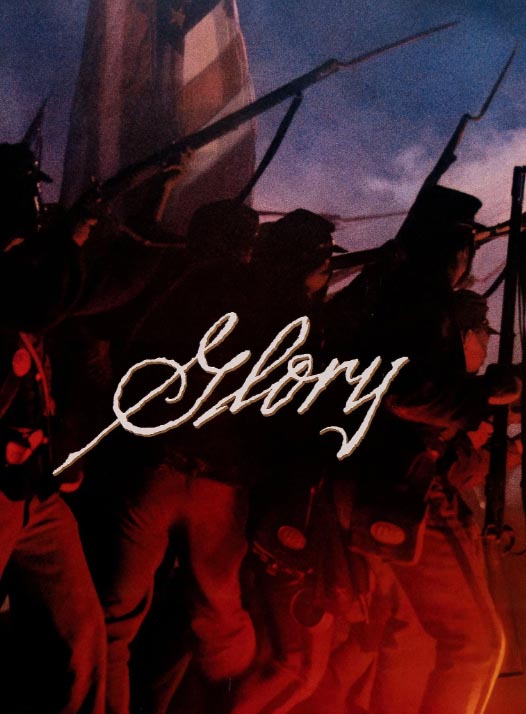
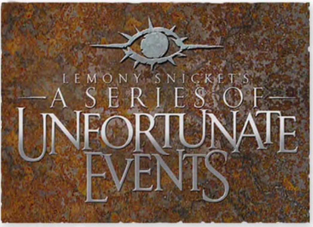
It’s all about the eye.
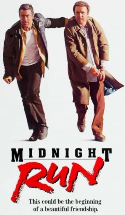
Punch and pound—pavement.
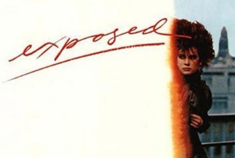
Lipsticked.
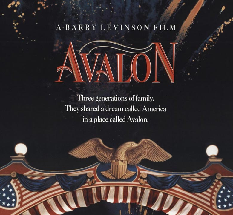
An American banner.
A crucial call.
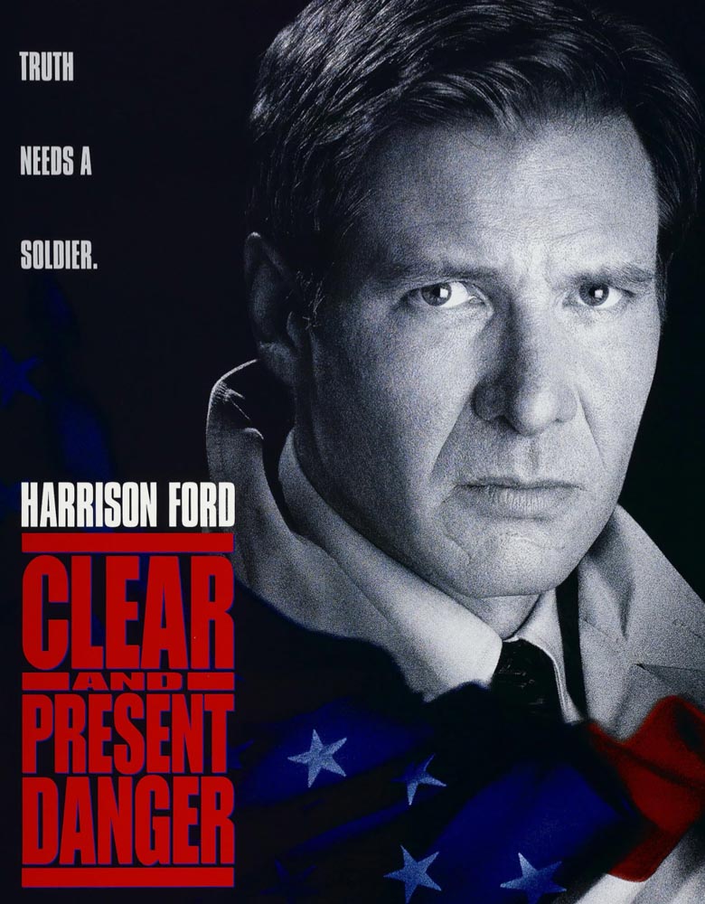
A badge for the highway.
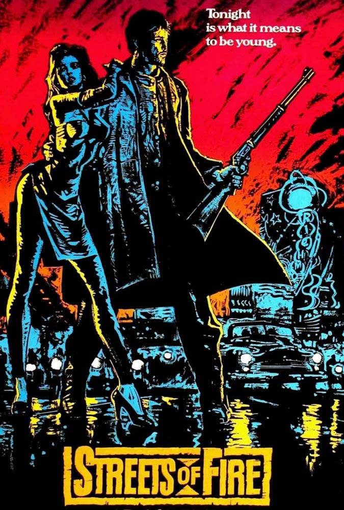
Zoological.
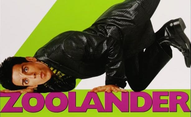
Whacked and wild.
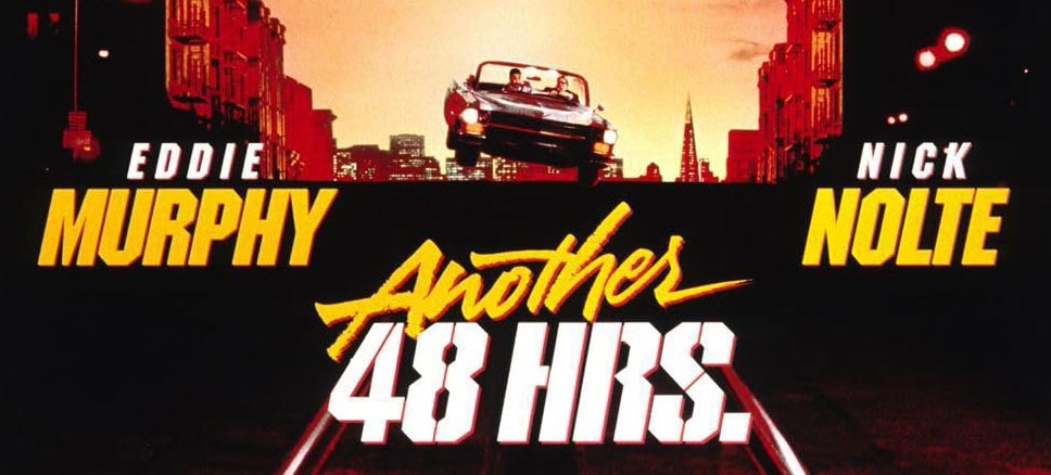
Because it’s made of gold.

And a place. That’s quiet.

Each of these gatherings, from hundreds of projects, over decades of work
relies on the premise of observation, seeing the story
and listening with the hands—to draw-out the narrative.
Any grand story, hand drawn, draws you in.
And you draw it out.
Like breathing.
Tim
GIRVIN | Strategic Brands @ Osean
Digital | Built environments by Osean | Theatrical Branding |
Talismanika™ | Oom Carpet Arts | Technology Branding

