
Examining the concept of set design, visuals and production reflected in experience and branding:
It took me a long time to determine whether this structure for the film Quantum of Solace was real, or a production design concept for the movie. As it was, the building exists, it’s the Residencia, or housing for scientists for the European Space Organization, scoping the stars from massive telescopes on the hillock you can see in the distance. But the idea that a building would be created especially for a film is relatively commonplace; and, as it was, the notion of the spectacularly modernist interiors were, in fact, a set design.
There is a link between motion picture marketing and set production design for films — and while it would seem obvious, the intention of closely defining place making in film design and the outcomes in theatrical promotion is a critical component in creating context.
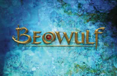
For the last several decades, I’ve been working, Girvin’s teams have been working, on designing motion picture identity. And one of the crucial points of marketing connectivity lies in understanding production design. Our work aligns. So working on The Matrix, Beowulf, all of the Mission:Impossible(s), Last Samurai or (m)any of the other films we’ve created solutions for, invariably involved a reach to understanding how the film is actually designed.
That often means that we are designing well in advance — sometimes years — before a film is released. In creating the design journals for Beowulf, there was tremendous attention paid to the period and the artistic production drawings that we reviewed.
Who’s shooting it, where will it be, what are the characters performing in, and finally — held in the spirit of the story itself — is the design of the production. These are profound evocations for what drives our solutions.
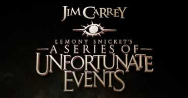
It all started with the “eye”. Sometimes, we’ve started out more as production designers themselves, for example, creating the styling for Count Olaf’s “eye” in A Series of Unfortunate Events. That project started there, then moved into the other layers of design, working in “committee” fashion with a whole group of people (directors, stylists, production designers, the whole shebang).
Designing for films is rarely a one strike deal — “great logo, you’re done”. It’s ripples of efforts and sometimes what appear to be countless variations and solutions in building to a final; it’s completely different than conventional brand identity assignments — more so, since often times the solutions are not strategically founded, they are based more on the idea of subjective instinct. And, more often than not, the idea of intuition in motion picture marketing is right on target, given the expertise of the teams involved.
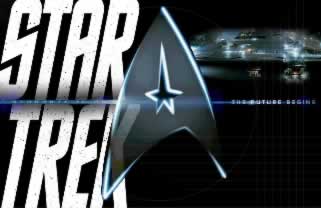
Working with J.J. Abrams and Scott Chambliss on Star Trek, the only exposure I had was being in the production design trailer and reviewing the design sketches and imagery collections for the film. So secret were the preparations for the film that the plot was concealed, the production drawings were wrapped up every night, to prevent any release from outside interlopers. And, to Scott’s remarks, “believe me, it’s happened.” So powerful is the Star Trek brand that millions of fans would quickly spread the word on any release of detail thereby diluting the premiere power of the story.
And that’s what it’s all about — story, place, brand.
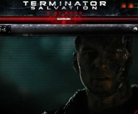
Terminator Salvation
Being a fan of James Cameron’s original innovations on Terminator, and the subsequent evocations of SkyNet and the cyborgs, Cameron’s legacy continues in Terminator IV | Salvation.

Christian Bale as John Connor / Warner Brothers
A recent article in the NYTimes offers a better overview of production design and the merits of strategic design evolution than I’ve seen in a while. Presently, we’re not involved with the film, though we have been in the past — working with Cameron, creating solutions for the Abyss and, at Paramount, working on Titanic. A designer I was exposed to there, at Paramount, on Titanic played a pivotal role in the visualization of the new film, out this month.
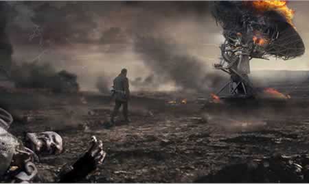
Martin Laing’s rendering, a painting and photographic composite, built to approximate the post SkyNet takeover of the world (2018, by the way…) New York Times / Warner Brothers
What is compelling in this story is the marvelously expressive storytelling that is captured by the production designer for the project, a long-running collaborator on the Terminator franchise, Martin Laing.
He comes with some genetic credentials. According to the art director wiki “Martin Laing was born and raised in England, the son of Oscar® wining Production Designer Robert Laing. During his childhood he traveled the world on location with his father and spent all of his free time on film sets. After attending design college in London, he joined the Film Industry in 1985 and began what is now a 21 year career in the Art department. Laing moved to Los Angeles in 1993 for what he thought would be only a short visit, but I have been here ever since. He received the Guild’s Excellence in Production Design Award in 1997, assisting Peter Lamont on Titanic.”
What is compelling about production designers is that they tend to represent a kind of amalgam between industrial designers, illustrators and fine artists and theatrical stylists, all rolled into one composite. In my experience, I’ve found them to be passionate, extraordinary observers of detail and capable of endless invention to arrive at solutions.
But what is actually more captivating about Laing’s interpretations is his discussion of them, at the NYTimes interactive feature online. In this grouping of discussions, he offers his sense of history and experience. His reach, interestingly enough, is marvelously artistic, as he references his review of the script, and his immediate interpretation of the story, in image — as paintings and digital assemblies. Sounds familiar.
These come from the NYTimes, among some other sources, rendered by Martin Laing and are the property of Warner Brothers.
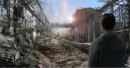
John Connor’s hope for another human — engineered in a painting based on the interpretation of a extant building location in Albuquerque, New Mexico.
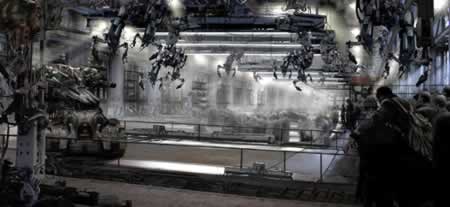
A human sorting station, designed like a cattle scenario.
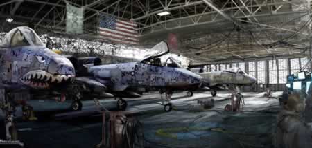
The revolution of design for a fighter station (New Mexico)
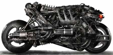
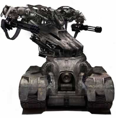
The industrial design for a rolling cyborg human catchment:
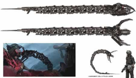
A biometric design treatment, for hunting humans — industrially envisioned by Laing — based on the eel.
Engineering new composite tank designs.
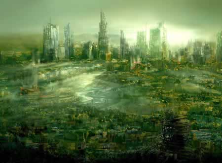
A “cancerously” green and toxic world, as envisioned by Martin Laing.
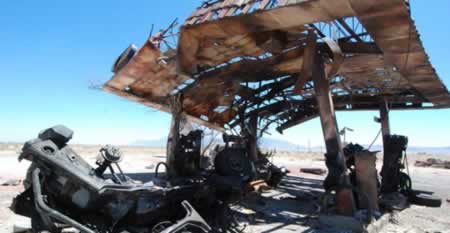
An installation, designed and built, then destroyed — for set utilization.
The point, to all, is the story — and how place making fits with the layering of the telling — any great storytelling requires a sense of place; and working in the realm of motion picture design, it’s always fascinating to dig further into the root of how the telling is envisioned — literally.
And how, in the tactical development of a film, how the story goes from start to finish — from the initialization of an idea, to newly building out, frame by frame, storyboard image after image, lens tweak by move, every single instance of what is viewed. And, in that story, are we drawn into that other world?
It’s tantalizing still, for us, to be part of that process.
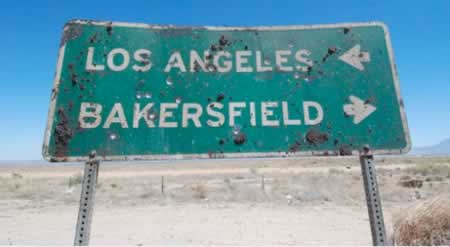
Getting that idea, from here…
to there.
A bit of environmental graphics, newly made: old.
Where to, next?
tsg | seattle
….
E x p l o r i n g m o t i o n p i c t u r e m a r k e t i n g
motion picture: https://www.girvin.com/about/thinking/blasts.php?movies=movie-titling
blogs:
https://www.girvin.com/blog
https://tim.girvin.com/index.php
Facebook: http://www.facebook.com/people/Tim-Girvin/644114347
Twitter: http://twitter.com/tgirvin