Frustro, Martzi Hegedüs and Escher
The puzzlement of design, translated as an impossibility of form in space.
A friend of mine, type and design hunter, blogger and musician, Stuart Balcomb [Los Angeles] pointed this reference out — the font.
Earlier in my career, working on a puzzlingly abstract product concept — a development for software branding, I partnered with a woman, leading that effort for Wall Data.
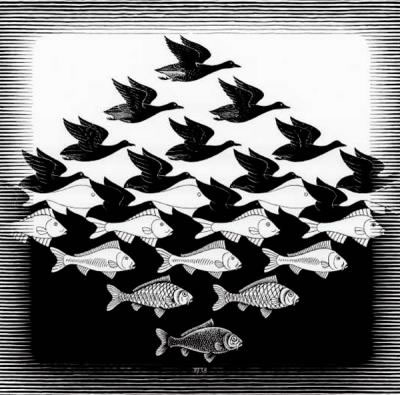
During a working session with her, I noted, on the wall of her office was this [above] engraving by Escher. She bought it from a mysterious broker of Escher’s, based in Seattle. [Having dinner with him, he said “no one really owns an Escher — I’m just leasing them.”]
To her, it was the symbolic exemplar of the product ideation — and ultimately, its branding “sequence.” From name, to identity, to UX to packaging and ultimately, the delivery to the market. To her and to our take, the archetypal symbolism of the branding effort speaks to finding the inner meaning [the deeper “why”] of the brand story, excavating the soul [the characteristic psyche and heart of brand dimension] — intentions, spirit and values — to build the underlying principles of culture and cult for the brand.
Designing brand patterning, for the strategically founded, authentic opening story and visualization, there is what is seen, and what — in scene — is unseen; defined, but not necessarily what is immediately visible.
In a way, the parable of our naming strategy for John Wall and his leadership team, we voiced into life: Salsa, Tango, Rumba [and others] — all built as a conceptual string on the allegory of dance.
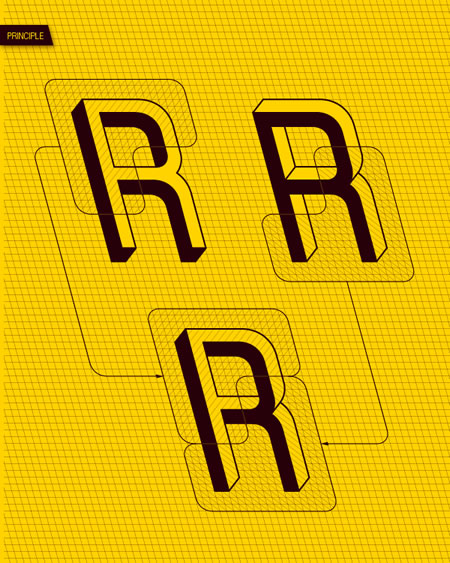
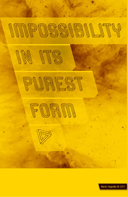
The inversion of the Penrose triangle folding gracefully rounded space, in a flip/flop of perceptive curiously “impossible” typographic grace — designed by Hungarian Martzi Hegedüs, the font, Frustro, on Behance.

So too, the design strategy of Frustro — a font that wheels back and forth in the planes of time, folding space unto itself.
More, here, the wondrous typographic site of Jeannie Jeannie [to ply her journey] explore:
The imagery below, from the site noted above:

In working with clients at Girvin, as well as Girvin team members, I’m perpetually curious about what truth lies behind the bend of transitioning time — every nuance, a proverbial story, told.
Authentes, the true self will be, finally, shown freely to the world — but, invariably, there is depth, contrariness, and layering of meaning and content beneath the surface.
TSG | ISLAND STUDIOS | GIRVIN DECATUR
…..
G I R V I N | SOCIALITY + MEDIATION
DESIGNING BRAND STORYTELLING IN HYBRID MEDIA
http://bit.ly/sJ4IjO