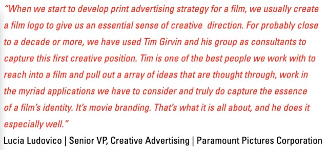
Creative input
from motion picture leadership
Out—looking in. In—looking out.
Exploring questions, questing for answers.
In the history of our efforts in motion picture design, advertising brand design packages for films, it’s not infrequent that there is a direct interplay to—and with—the creative leadership, producers, directors, and stars of each production. Part of this comes down to team participants direct involvement in creative strategy—
they have a direction they’d like to see.
And expect it to be visualized.
In our partnerships with this type of creative collaborative scenario, it comes down to team-based listening, that is, everyone on the core team, gathering points of view and narrowing that towards a strategically-founded tactical plan—
“what, as a team, do we stand for?”
What, as a team, are we looking for?”
And “what, lead team, is your answer to these questions?”
Director, producer, set design, stars—each, their take?
That comes down to—
“who are we listening to?”
E V E R Y
O N E.
Appreciative listening—I call it feelingness,
which comes this string of inquiries:
“what do you ask of experiencers,
what do you see, and what shall they see?”
And for the designer, “what do you hear,
how will you channel
the answers and
define, and design towards, the outcomes?”
It’s one thing to ask, it’s another
to answer the results and define the creative direction.
Year by year.
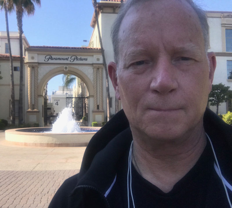
86.
Tuning-in to the creative team—including Tom Cruise—pushed us, and studio leadership, towards the badge-like solution for the original Top Gun—whose definitive winged structure found credence and mnemonic reference in Maverick.
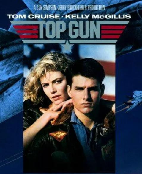
89.
We were involved in, as design agents, in the design development for “Born on the Fourth of July”—
mostly on an emboldened typographic reference, later patriotically emblazoned.
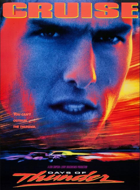
90.
This was followed in a creative effort for Tom’s work on “Days of Thunder” which evolved into a string of script references that, in the end, was digitally compressed towards a percentage of x-height reduction in support of one-sheet credit registers [Title X-height being the standard by which all other titling elements are measured, including star credits.]
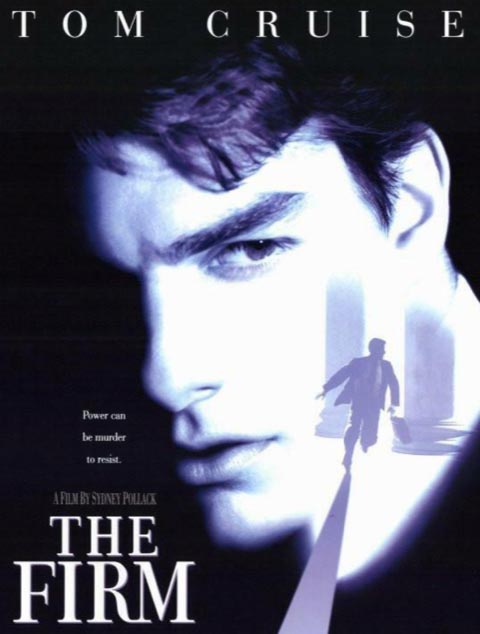
93.
For another example, working with Tom [crisp, elegant, upscale and corporate] and the Paramount team,
we built the master identity for The Firm—
with directorial commentary by Sydney Pollack.
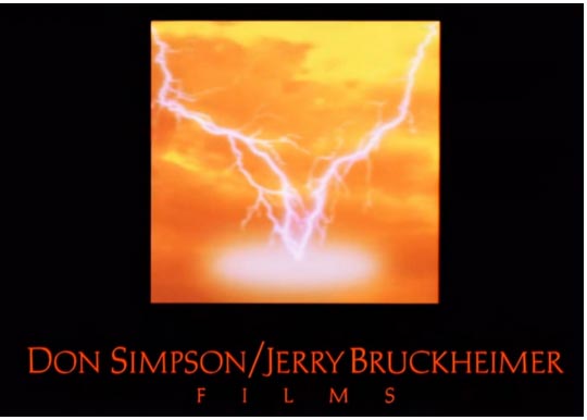
And, through many of these propositions, working with Tony Scott and Don Simpson and Jerry Bruckheimer—along with Tom Cruise—on the aforementioned string of productions—as well as their twined lightning that we envisioned, back then, as a corporate device—later retained as a single lightning strike for Jerry Bruckheimer, after Don’s passage;

GIRVIN
concept arts
96.
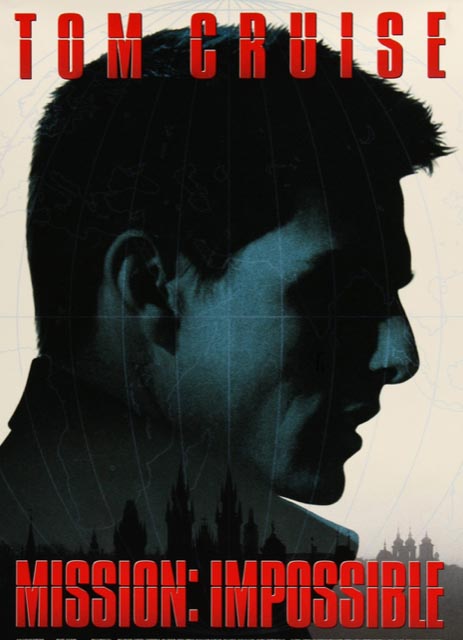
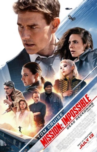
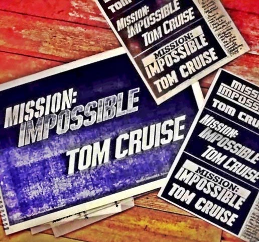
This creative proximity, working inside Paramount’s marketing team, we built a string of typographic solutions for many Mission:Impossible theatrical productions.
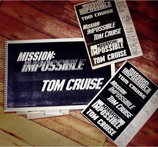
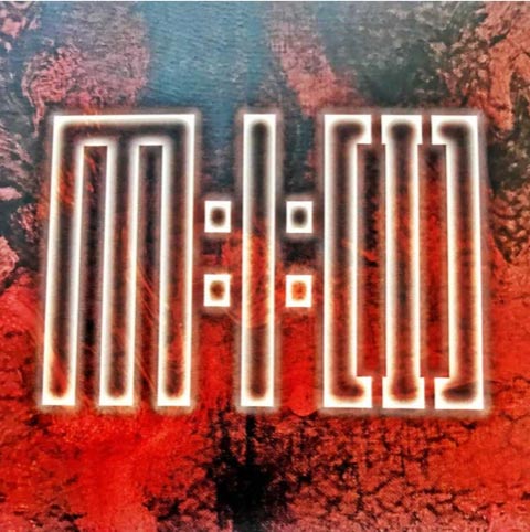
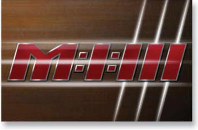
The original M:I series was first more complexly multi-titled—with the core identity and subtitling [now returning in M:I:7]—I’ve laid out the storytelling in a more detail here; and that would be full title styling, which then evolved to a monogrammatic treatment, which has been directly applied, in reverse, as a design strategy to the entire series as in M:I 1, etc.
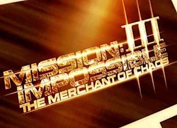
06.
I offer that this monogramed orientation was derived from Tom Cruise. In our efforts for Mission:Impossible 3, for J.J.Abrams, it was his direct leadership that pushed towards the notion of
a balanced triple structure:
M:I:III.
Tom shipped us, back then, faxes with sketches that he’d drawn—
and it evolved from there—now retroactively applied to the entire series.
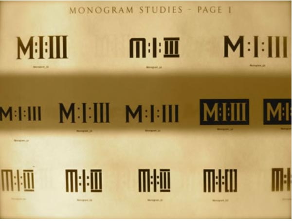
That to-date strategy—the initialized, monogrammed numeration—
as likely you’ve noticed—is returning to an earlier modeling; which recollects
the strategy of M:I:I—
main title, support narrative—
where we started.
03.
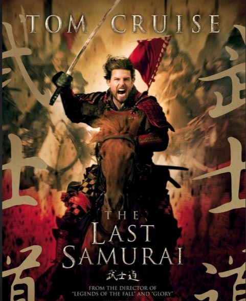
In our efforts for “The Last Samurai, we built a paleographical and cultural study deck that examined art-related points of reflection—Civil War, late 19th century, as inspired by the 1877 Satsuma Rebellion, defined in the period of the post Meiji Restoration.
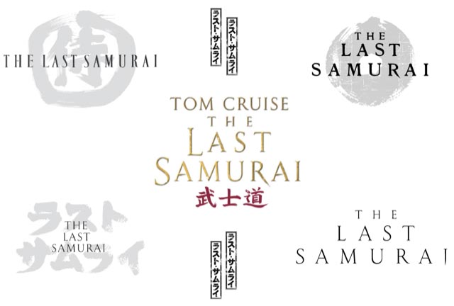
While there was, in this instance, less commentary by Tom directly—though he co-produced this production—there were added directorial remarks by Edward Zwick, for whom we designed “Glory” and “Legends of the Fall.”
05.
Then, in another call from Paramount Studio leadership, we were asked to develop solutions for “War of the Worlds” in another Cruise and Spielberg collaboration. Again, we built a book of cross-referenced reinterpretations of earlier motion picture studies,
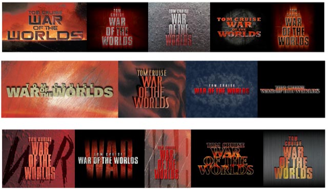
which were newly modeled for the contemporary era, as well as studies of classical renderings of the original H.G.Wells titled treatments, books and other filmic expressions.
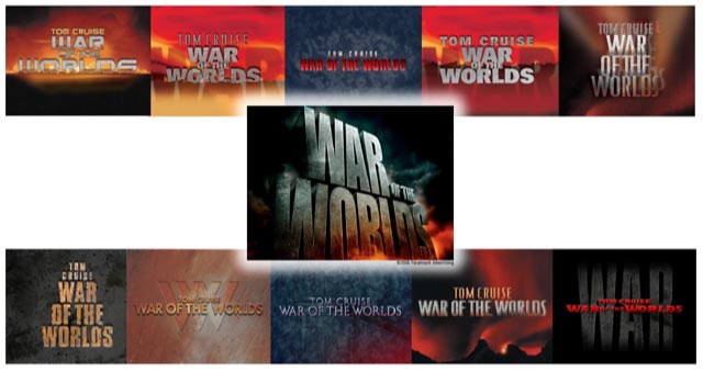
Then “bold, dimensional, towering” and distressed, matching the industrial styling of the film’s production design.
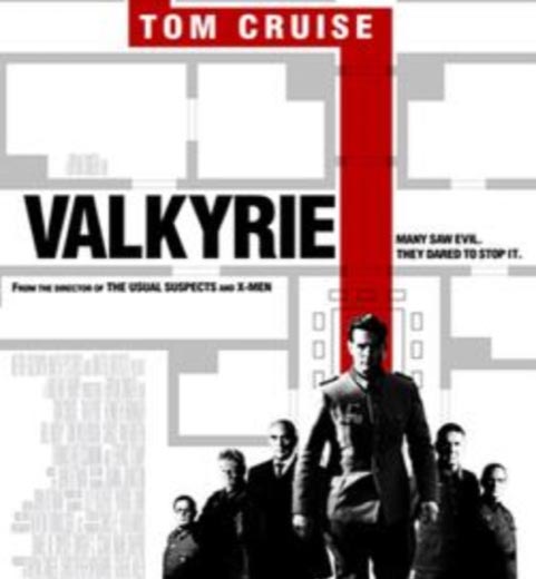
08.
GIRVIN’s team worked on Valkyrie in direct development with Cruise’s team—Tom Cruise and Paula Wagner at United Artists; thenthe finalized identity solution was less than
customized as an outcome, finished in-house.
It’s been our pleasure to develop direct solutions for various motion picture creative leadership—it’s an opportunity to listen. There’s a story in a story, and every motion picture tells a story—so too, the production of a film. It’s the illustration of a narrative, making that production, often involving hundreds of team members—still, they are all led by the producers and directors; it’s good to speak to them, know their strategy,
ask what they want the film to stand for.
And what the film
shall look like.
And while working in Los Angeles,
that’s led to creative collaborations with
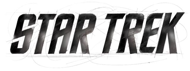
J.J.Abrams, and specific stylistic insights
from set designer Scott Chambliss,
Star Trek;
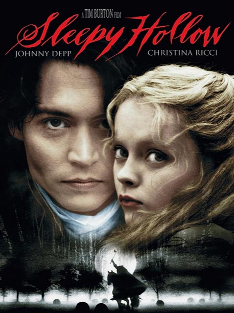
Tim Burton’s paleographical stance towards
the handwriting of the period,
Sleepy Hollow;
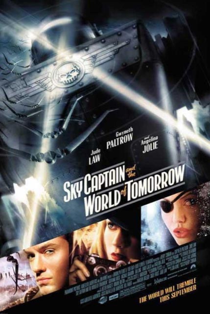
Kerry Conran,
Sky Captain and the World of Tomorrow.
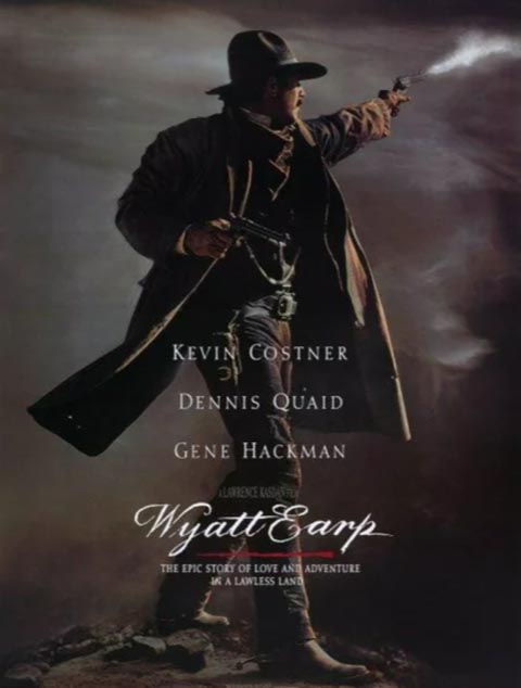
Kevin Costner,
“I’ve got a replica of his weapon,
can you match it?”
This being Wyatt Earp;
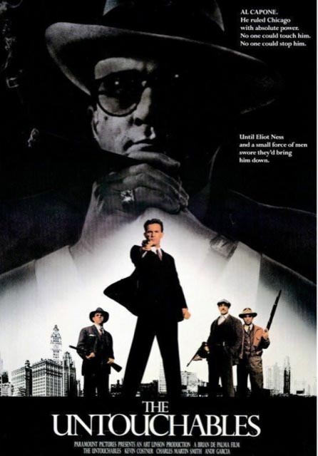
Brian De Palma, simple classicism, in
The Untouchables;
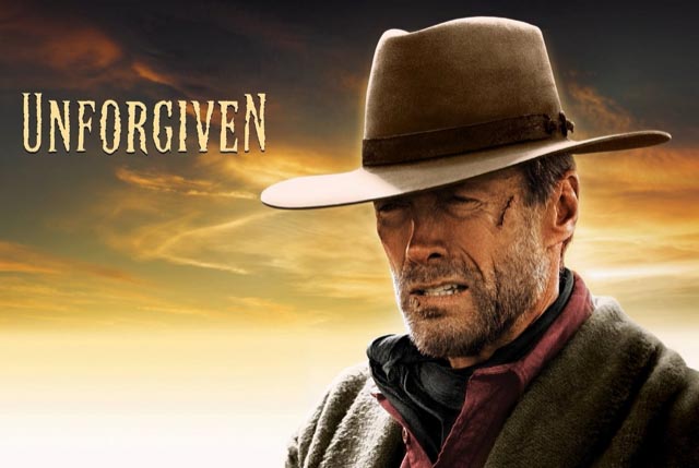
Clint Eastwood, a redemptive quest beyond anguish, as in
Unforgiven;
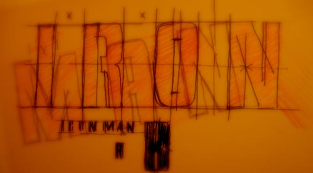
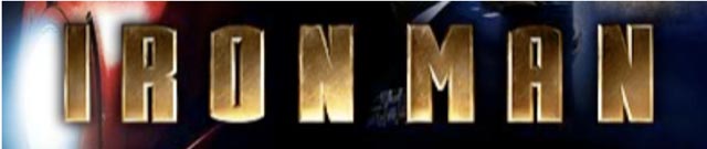
Jon Favreau, in Paramount’s first collaboration with Marvel Studios,
an industrial grasp of the armature of
Iron Man;
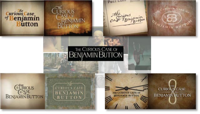
David Fincher, a font synchrony–
Benjamin Button;
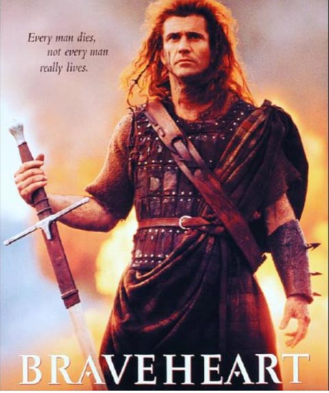
Mel Gibson, classical detailing for
Braveheart;
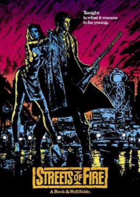
Walter Hill, an asphalt stencil, for
Streets of Fire;
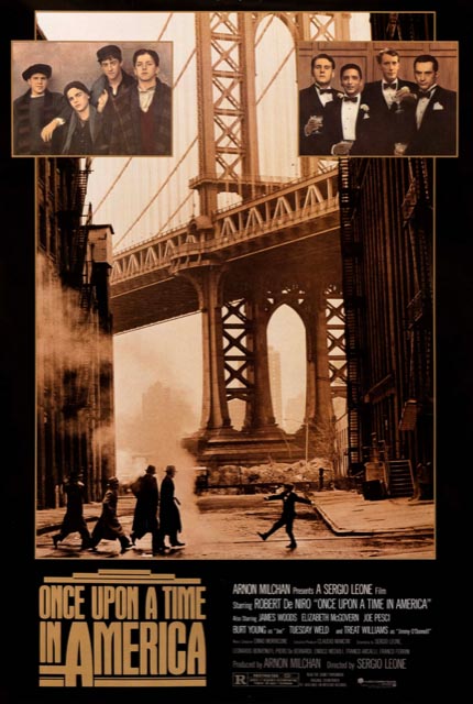
Sergio Leone, benchmarking a saga for
Once Upon A Time In America;
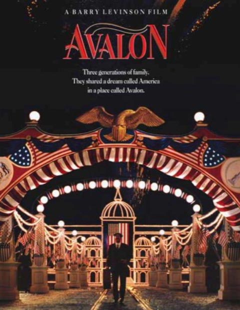
Barry Levinson—upscale and celebrative for
Avalon;
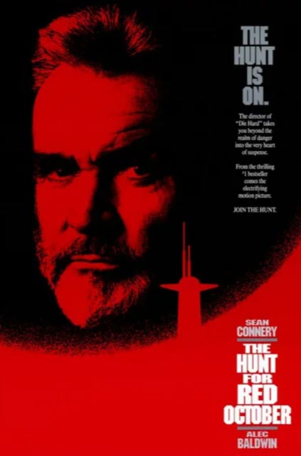
Mace Neufeld, block-stacked for
The Hunt For Red October;
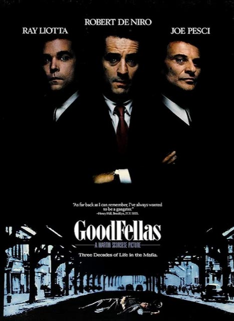
for Martin Scorsese, unexpectedly elegant in
Good Fellas;
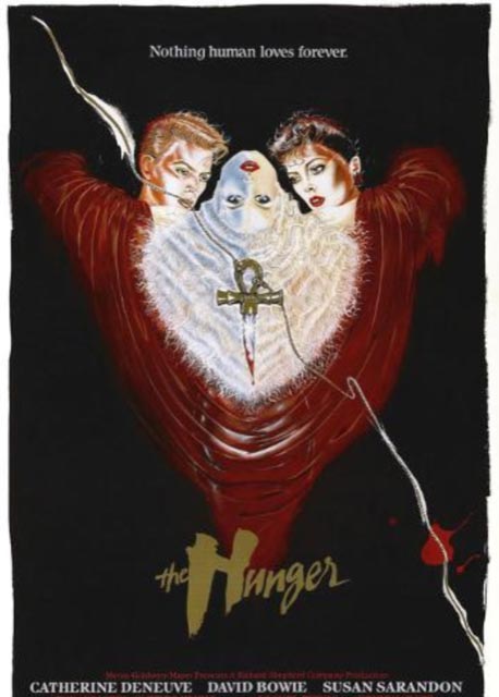
Tony Scott, feverishly brutal, for
The Hunger;
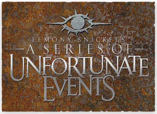
Barry Sonnenfeld, the solution for a complex title,
GIRVIN bespoke styling and fonts in the capture of
A Series of Unfortunate Events;
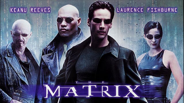
the Wachowskis, “we’re looking for a new font, something invented,”
The Matrix;
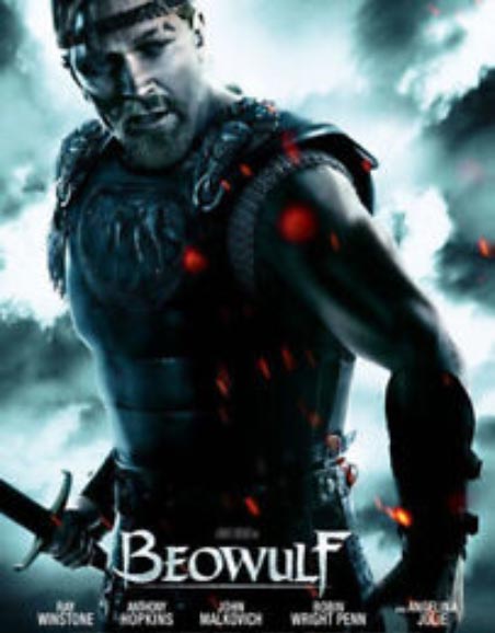
Robert Zemeckis, designed to the time—
the 6th century rendering of
Beowulf;
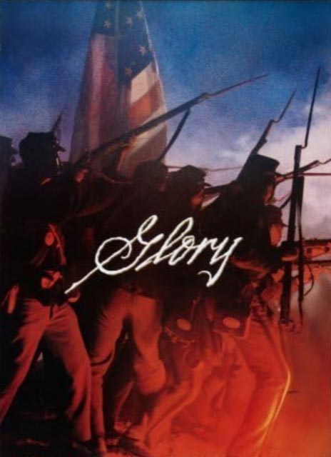
and for
Ed Zwick, a historical interpretation,
Glory.
Whether it comes down to the presentations to, and discussions with, Tom Cruise,
or other members of motion picture production team members, it’s in GIRVIN’s legacy to listen.
That is a specific reach-out—asking to talk, flying into meetings at the studios, meeting with executives, reading scripts on the studio lots, studying production drawings and set design, researching story backgrounders, earlier iterations of the narrative, exploring the historical and paleographic references for synchronous stylistic reference.
For us, custom fonts and precisely-drawn, bespoke design typographical treatments has been our distinction in working remotely to Hollywood, Burbank, Culver City and NYC.
We’ve worked on films in all locations.
Tim
GIRVIN | Strategic Brands
digital | built
waves
Projects in strategy | story | naming | messaging | print |
identity | built environments | packaging | social media | websites | interactive
––––––––––––––––––––