THE INTEGRATION OF MESSAGE: GRAPHICAL EXPRESSIONS IN A SCALABLE SOLUTION. TINY CAN BE GIGANTIC, SMALLER CAN BE EMULATED IN A TIERING OF ENLARGEABLE OR REDUCIBLE DESIGN TREATMENTS, NOT MERELY AS DESIGN THINKING—BUT AS A DIRECT LINK THE GENETICS OF THE DESIGN. THE MASTERWORK OF A MINUSCULE DRAWING CAN BE, TOO—THE SAME HANDDRAWN SOLUTION FOR A SIGN OF MASSIVE SCALE.
In my own history—as a designer, I really started with calligraphy—which ignited as an afternoon discussion,
lunch and workshop with Lloyd Reynolds. Everybody knows something about him,
But there are two important distinctions to my experiences with him after that moment in time—the 1970s.
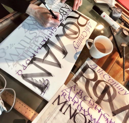
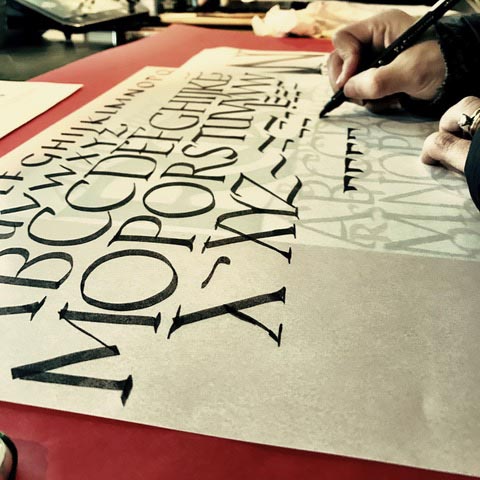
One, in a classical method of thinking, to the spirit of the design-thinking of the Italian Renaissance, there was an integration between the expertly skillful document rendering—the courier-carried chancery proclamations, as a handwritten, adroitly embellished bit of calligraphy—something, actually, that you could utilize in your everyday handwriting notations; and two, that this could be enlarged to any tiering of scale. It’s the principle of design—something of beauty could be drawn by hand, and then, too, enlarged as an object of significant size. Tiny type to be read in a letter—monster type for a four story hanging banner.
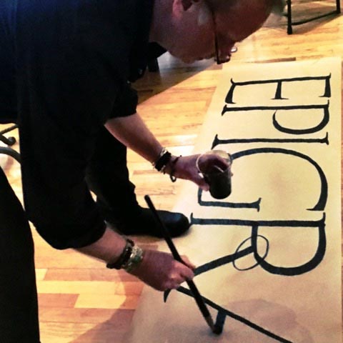
While, as a teacher of calligraphy at the Evergreen State College, I taught students how to experience–directly as a practitioner—the hands of the Italian Renaissance, then we drew the letters large with bigger tools on gigantic rolls of paper.
That same principle I used in announcing events on the campus—big banners, made by hand.
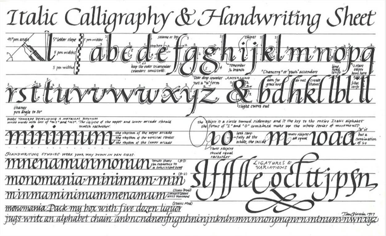
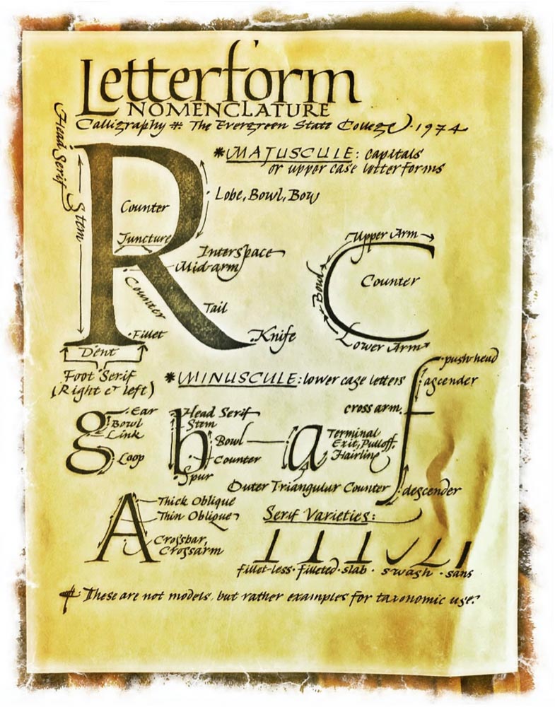
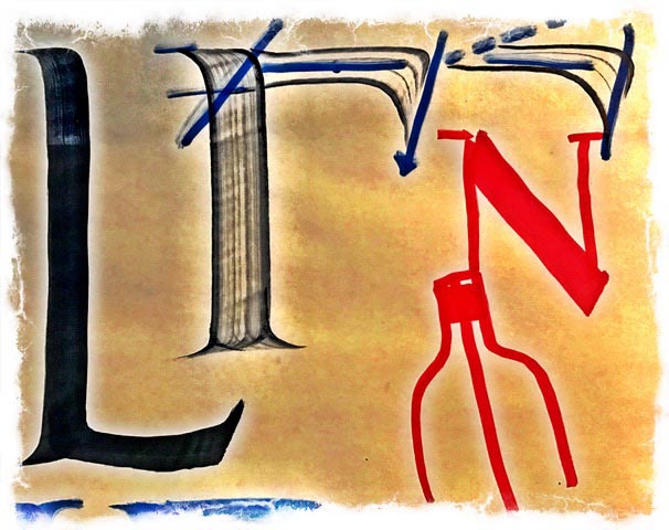
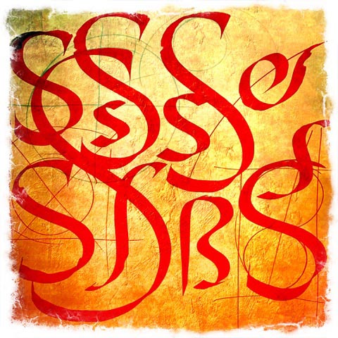
And structure, the naming of the letter—here from 1974.
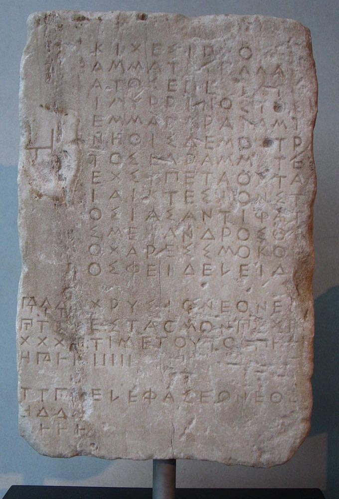
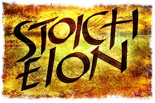
This was a profound prelude to typographical design thinking—learning the rudiments of letterform architecture — the study of the movement of scripts, paleography, cultural history and the gestures of the wrist in 2500 years of scripted evolvement. I started with pre-Christian Hellenic script treatments—scratched in stone, scribed on papyrus. I title it—Stoicheion—as in the elements, the array of the teeth—“all in a row,”
as the elements of those which are unnamed—and in each, the letters provide a kind of cartography for being.
My interpretation:
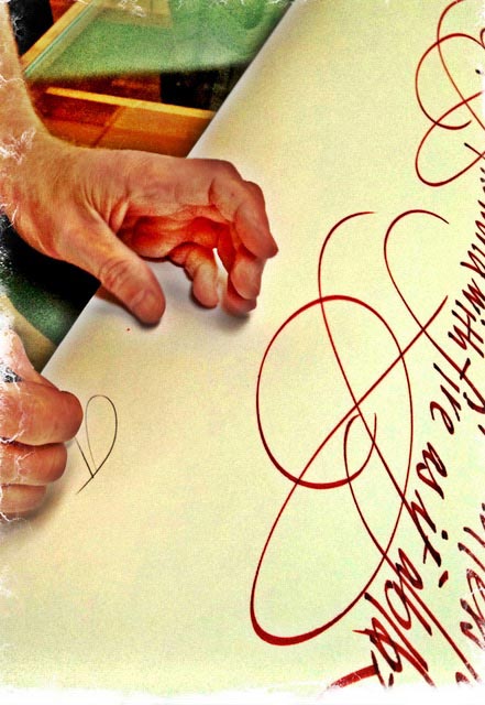
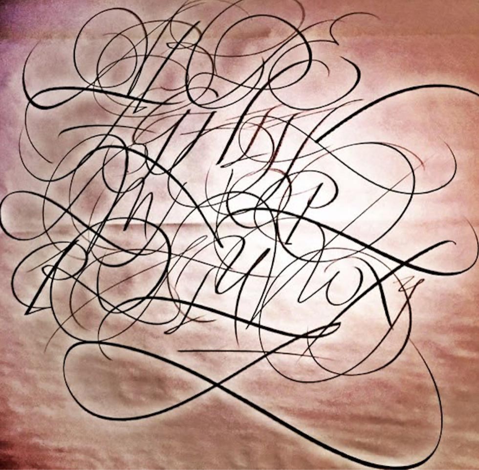
For an added example, in the above illustration—at the header of this blog. This was a tiny script that was drawn in the character of 16th century Cancellescha Corsiva. And then redrafted as a massive installation in a Lama’s meditation cave in the Himalaya. Seriously.
His prayers illustrated: from a tiny manual scripted study—and then drawn to an enlarged sizing— to line the walls of a remote meditation hermitage.
In the pre-Pandemic days, we’ve held weekly calligraphic sessions, studying calligraphic approaches to beauty in the alphabet, walking back in time to rewrite the future—from 1000 BC to the late 19th century.
Real manuscripts of the period.
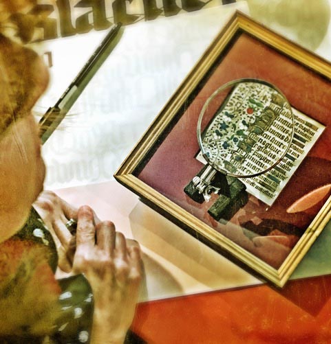
Experiments with tools of the time frame.
Exemplars of example—along with the code of x-height, y-height and letter-width geometries and percentages.
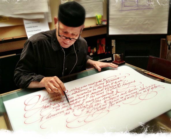
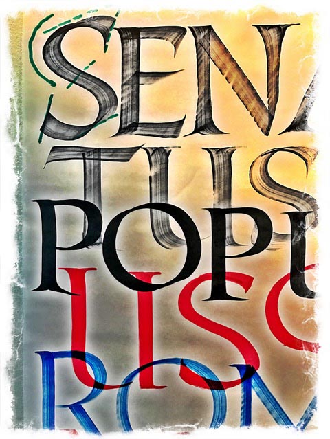
Calligraphy, as I’ve defined it, is “the dance of the pen,” an illustration of language as a lilting, drifting, lively set of strides, moves, curves and flourish to liberate the statement—language and meaning, intertwined, becomes alive.
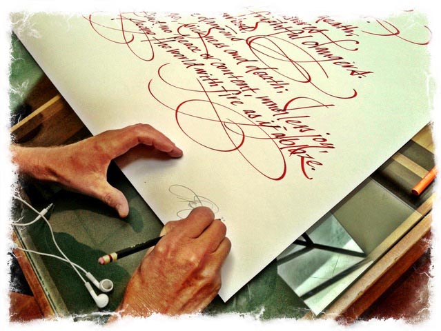
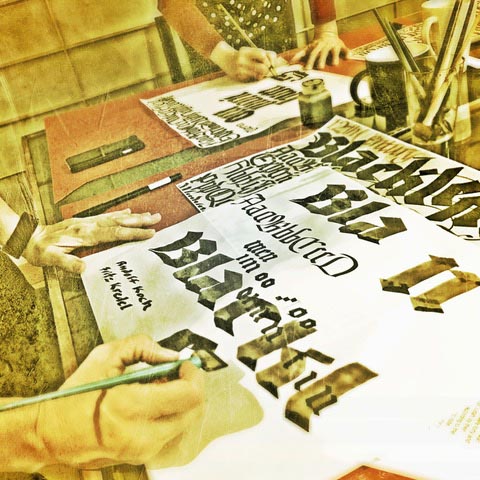
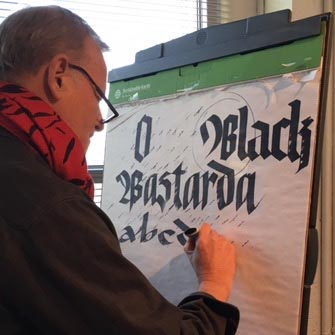
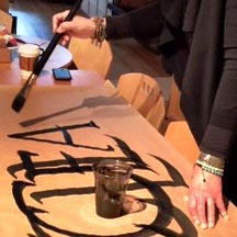
An intermingled alphabet in the Renaissance style, drawn with a chisel-cut carpenter’s pencil during one of our workshop sessions.
The plan of action is a walk back in time—studying our paleographic legacy—the heritage of a couple thousand years in the evolution of letterform design. In the beginnings of my career—starting back in the 70s—I was interested in a particular approach to bespoke design—all hand-crafted, everything touched by an eye towards the manually made.
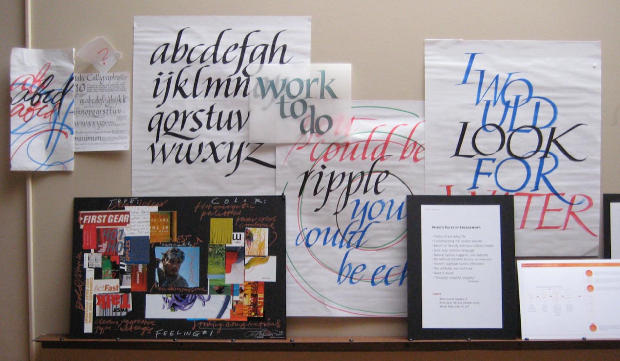
Now, nearly 50 years later, though digital, it’s still about what could be built to illustrate an ideal, as a tailored exercise in making the imaginative leap from mind to outcome—a solution pathway that is imbued—the captivation of the energy of a brand, a team, their enterprise. It finds motion, gesticulates the curve, interplays the light and the dark, what is seen and stroked, and what is left blank — untouched. Teaching calligraphy, once again.
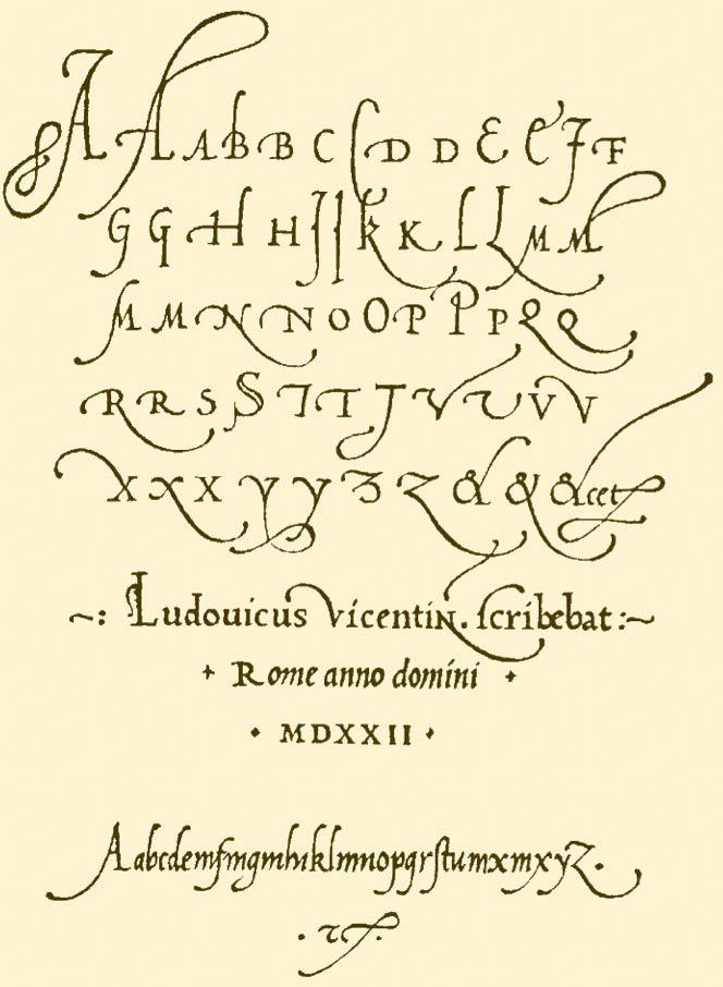
I walk back, start in the present, and move back in time—with a particular focus on classical renderings of the Renaissance—
the 16th century—here, La Operina, Ludovico Arrighi, 1522.
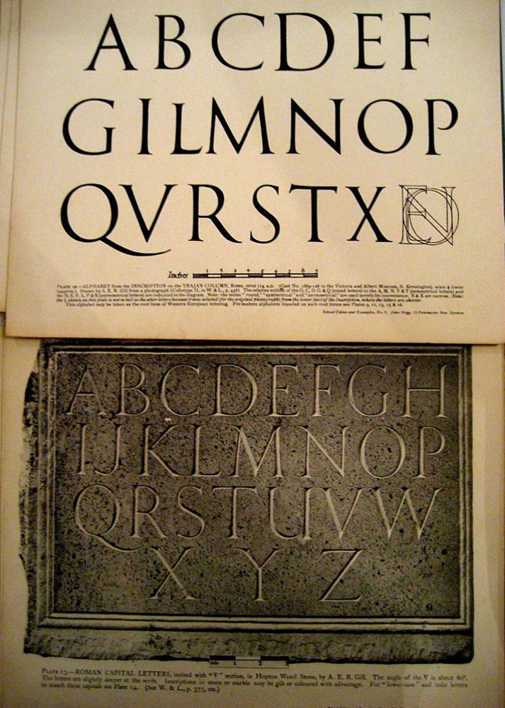
And then one thousand five hundred years earlier, the brush-drawn capitalis monumentalis
of the Imperial Roman epigraphers, as in the graphic exemplar by Eric Gill.
An actual inscription from Rome, 3rd century.
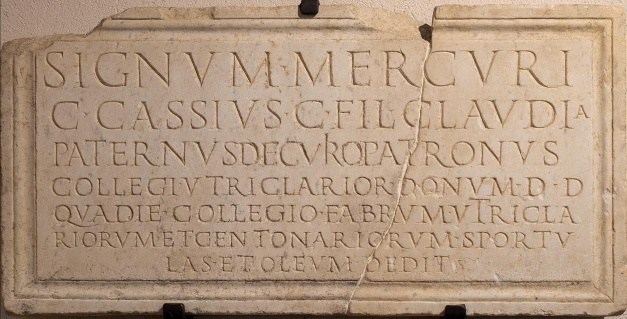
And our studies. The brush-drawn wall treatments of Imperial Rome.
In a way, it all comes back to the idea of how the story is told? And what of the design of that telling? Our dictum: “there is a story, it’s important to know who’s telling it, and who’s listening? One, the breath of the teller, recalling the tales of that narrative experiencer; another, two, the transcribing of that story—what is called beyond and carried into a point of new certainty, it has a place. And three, the imagination of the listener — a listener that might be sitting, sifting into the telling of the story, to another, who is reading and yet another embracement in the telling of a story.
And you can draw it.
Calligraphy is, literally, the beautiful alphabet—what was old, could be now what is new; what could be found then,
and what is recalled anew, and freshly discovered.
The letterform sequenced is a bundling of the idea: it’s curves. And it is black, and it is light; it comprises openings, their architecture and structuring, the marked cartography of speech; which is the thought—scribed.
But it—the transformational scribing, too, is magical—it is a transformational art—capturing the spoken and placing it in text.
This is the core principle of design—a mark creates a place, a plane, a portal that wasn’t there before. Mark, and the door opens. And you—the viewer and journeyer–pass through to the other side of understanding.
tim | Seattle Girvin | Queen Anne
We are making wellbeing: GIRVIN | HOLISTIC WELL
THE STRATEGY OF CREATINGHEALTHY PLACES OF BEING
Sometimes you go back, to go forward;
an exemplar from 1976 | The Evergreen State College